
Reference Sites and Discretion
Using builder discretion during the website development can help create beautiful website designs. Having reference websites can help inform the design and layout choices for initial build and revisions.
Important! If a design choice is different from the instructions in the sendup, you must NOTATE these changes and provide a brief valid reason for the choice.
Reference Websites
The Intake Tool
A new addition to the intake tool is a section to add reference sites. Located on the Branding tab, this section includes the URL for the website(s) and what the customer liked about the website. These sites are used as inspiration before starting the build. This will help builders see which elements the customer is fond of, and will help them try to build a site with a similar look and feel or similar elements so they can get the site right for the customer and have fewer revisions.
This section includes the URL for the website(s) and what the customer liked about the website. The reference sites should be used as inspiration before starting the build. This section reviews how to use a reference website or multiple sites to create a similar look and feel based the design of the reference site.

Common Comments for Reference Sites
Below is a tag cloud of actual comments from the intake tool. Design, images, and layout are the most common words customers use to describe what they like about websites. Website style, elements, and layout are what the customer is communicating with their reference sites.

Style, Elements, Visuals
 Did the customer send examples?
What do they have in common? Notice the widths, the header types, the kinds of hero images and font types, the page content, calls to action and interactive modules on these sites.
 Does the customer have a logo?
If so, notice the color patterns, font types, spacing, positioning, etc.
 Did the customer give us any social links?
Look at the imagery used on their business social pages that can give us a better idea of their aesthetic and what appeals to them.
 What is the business category of the site?
We created business verticals based on our most common industries.
Learn more about site verticals HERE
Incorporating Site Elements
When reviewing reference sites look for common elements. What do sites have in common? Below we'll review how to define the elements in a reference website for use in the current website design. To make sure the new website is visually appealing to the customer we can use similar style, elements, and visuals in their new website design. Notice the font types, header style, hero layouts, page content, and calls to action to help inform the new site design.
The font category, size, weight, and color use on a website is visually impactful. For reference sites using similar fonts to example sites will help align the new site design with designs that the customer already likes. As we design we want to align the visuals provided with the new website.

Prebuilt header templates available in WDS builds.
Prebuilt top bar header template demos
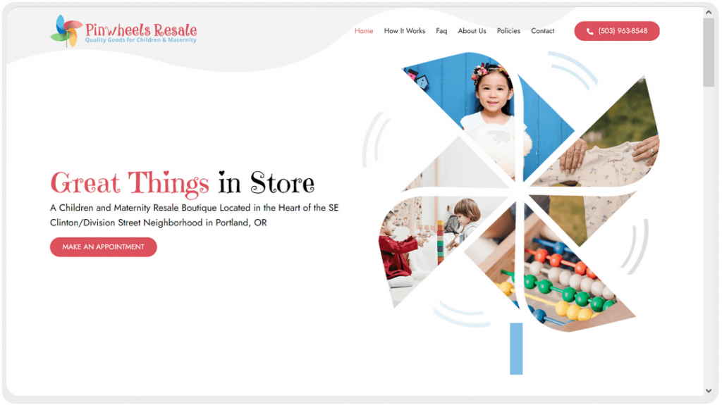
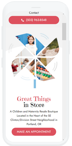
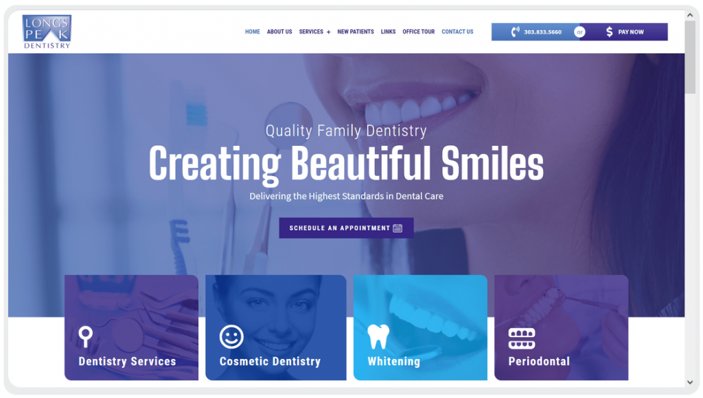
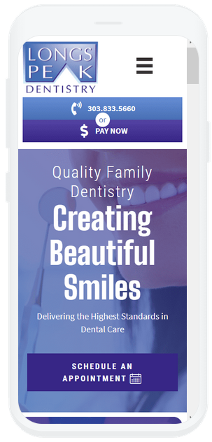
Hero examples, don't forget mobile!
For page layout "below the fold" look to see how the content on the page is organized. Look for how images are laid out with the copy. Do the rows alternate colors, include background images, have certain design features such as image borders or bullet lists? These are the visuals customers identify with they look at a site they like.

CTA/Button style is an incredibly impactful visual on a website. When reference sites have similar button styles (flat, radius, gradient, bordered, etc.) make sure to include similar button styles in the new website.
Prebuilt header templates available in WDS builds.

Final Thoughts
Customer provided reference websites should be reviewed before starting a new design. Using the sites and the customer provided comments can help drive the design for their new website by incorporating design elements, layouts, imagery, and visuals similar to the references. The goal is not duplication, but using builder discretion to create a website in the style the customer provided.
Table of Contents
Add a header to begin generating the table of contents
Next Steps
Click below for more information on page layouts design.