
Hero Options
A "hero" is usually the first thing anyone sees when they arrive to a site's homepage. A hero is meant to be eye catching, attention grabbing and should intrigue visitors stay on the site. The internal page's hero layouts can either be the same one from the homepage, or similar but toned down a bit. The media you choose for the row background will determine what kind of hero layout will work best. You can also pair your hero with a row separator.
Hero Placement & Size
Hero Placement
Depending on the kind of hero image you are working with and the color of the logo, you can decide whether you want the header to overlay the hero row or to be placed before the hero row starts. For example, if the hero image is busy or if the logo has a white background or colors in it that wont stand out atop the hero image, the header should be placed before the hero row starts. However, if the hero image is subtle or if the logo image is a solid color that will stand out atop the hero image, then the header can overlay the hero row. Use discretion here to make your best judgment when deciding to overlay the header or to keep it placed before the hero area.


Hero Size
Choosing the right hero size depends on how big the images/videos provided by the customer are, and how much of these media files are required to be seen.
Hero Width
Hero on all header options can be Full Width or Content (Fixed) Width - but fixed width won't look good on headers that overlay the hero.
Full Width is the most common and the industry standard for modern sites. We would only choose content width if the customer specifically requested it, or if the images they want in the hero are too small to stretch across the screen.


Hero Height
Hero rows can range from full height to half height to no hero at all. A full height hero is most commonly seen on homepages at the very top. This is great for sites that want a very high quality image or full-size video to be seen upon arrival.
The most common hero type seen on homepages, however, takes up about 3/4 of the height of the screen. Most people prefer this so people can see the first paragraph or indication to scroll down to see the content below. Internal page heroes normally take up 1/2 of the screen height or less.
Some informational sites may request there not be a hero at all.


Hero Layout Options
Style 1 - Rule of Thirds

Visually divide the hero section into thirds. The focal point is generally in 1/3 to 1/2 of the image on its right or left. The text content will go on the side opposite the focal point.
Style 2 - The Stripe

Similar to the "Rule of Thirds" hero layout, but the text content might need more contrast or more of the image might need to show.
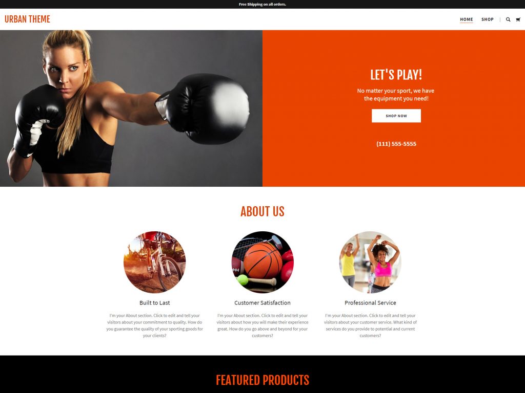
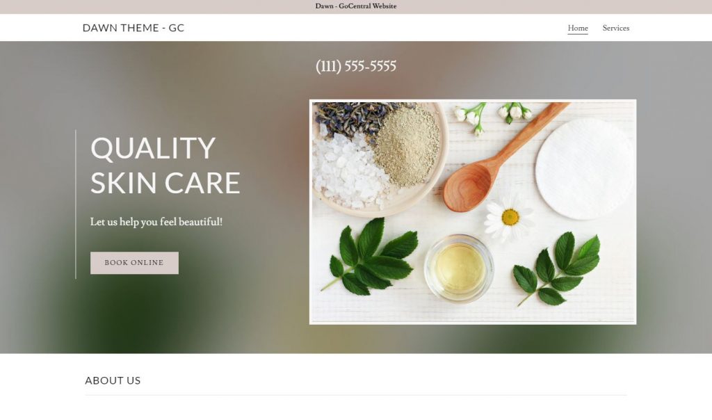
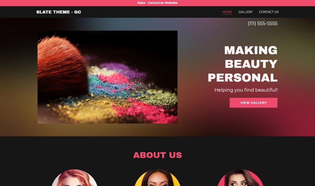
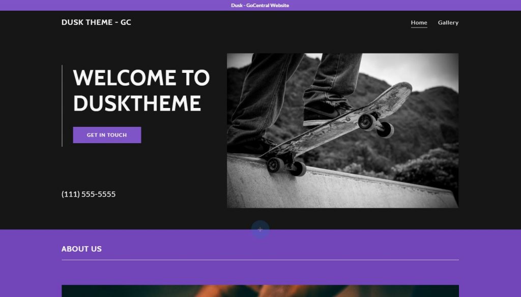
Style 3 - Split Screen

This layout is great for hero images with a center focal point. This means if you placed the text on top of the hero image, it would cover the important parts, so the content is placed beside the image instead.
Style 4 - Text Overlay

The text content in this hero layout is centered directly over the image. This is a good layout if the hero image is not too busy, has no real focal point or has lots of negative space along the top. If the text on top is still too hard to read, we'll add an opaque overlay for contrast.
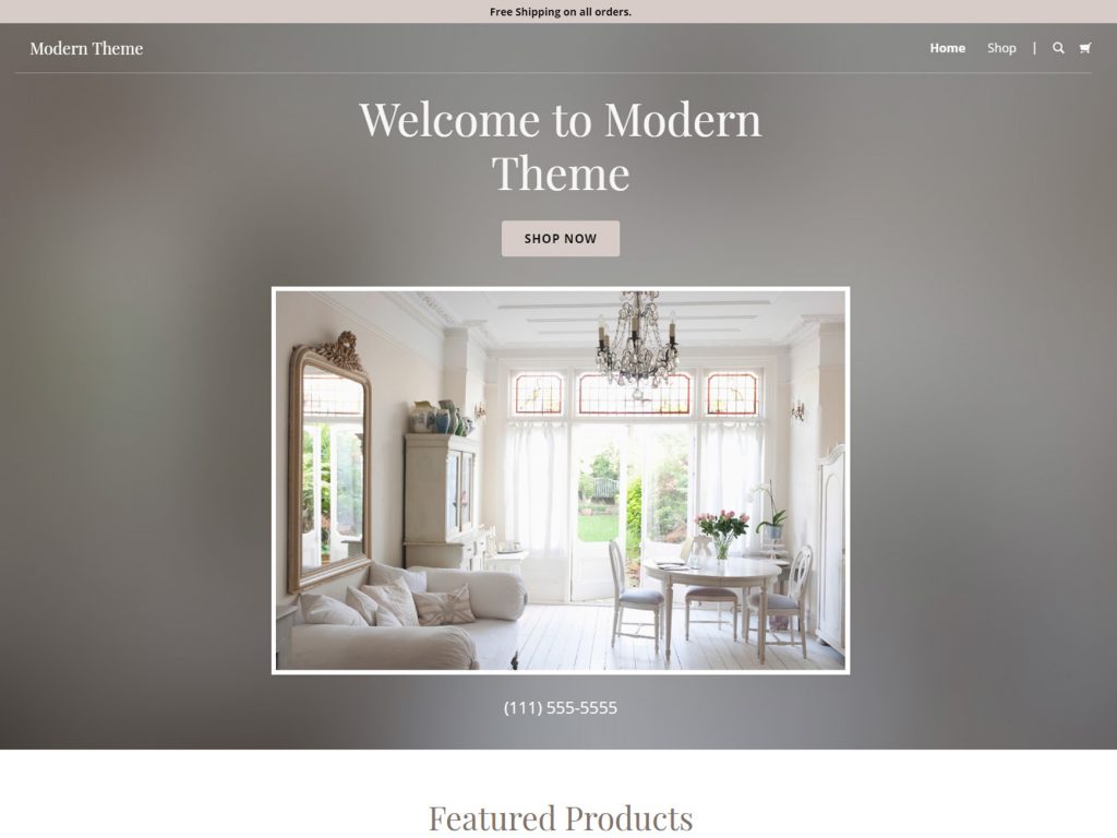
Style 5 - Floating Image

This layout works best for cases where the hero image is too small to fill the screen, or if everything in the image is so important that it can't be cropped or hidden. The background of the row is usually a solid color, a gradient or a blurred image.
Style 6 - Blog Slider

Use this hero layout if you have a blog-centric site with posts that get regularly updated, and you would like for your latest posts to be the first thing people see on the site.
Style 7 - Product Slider

Use this hero layout if you have a premium shop with many products that get regularly added, and you would like for your latest or featured products to be the first thing people see on the site.
Alternative Layout Options
What if the Hero Image is Too Small?
In the case that the picture the customer wants isn’t large enough for a full height or full width hero, but they requested a large hero, present them with some alternatives. If you're unable to get in touch with the PL, use your best judgement so that the first impression of the site leaves a positive impact on the customer. Make sure you notate why you did it differently, so its clear to the QA team and can be conveyed back to the customer.
What Other Options Do I Have?
How to Blur Your Hero
In the case that you choose to use the blur option, you can actually achieve this effect with purely CSS rather than needing to do it in Photoshop, and here's how:
- You'd set the row background as the desired image, then place a photo module within the row using the same image set to favor its dimensions/aspect
- Assign the main row a custom class that you'd assign to all rows that require the backgrounds to be blurred
Then, use the CSS snippet:
Technically this would work, however, Beaver Builder doesn't like to make the distinction between the background row and the items inside it on a regular row. this technique works well with content sliders or any module that clearly define div hierarchy and allow you to choose a background image and place text in a container on top.
For now, if you're trying to avoid photoshop and get an image background of a simple row blurred without affecting the contents, use a free online tool like Fotoram.io to get the job done.
Examples of a Smaller Width/Poor Resolution Hero
Have a small hero image or don't like the full width? Try a "blur" or "inset" option. This would look good for small/low-resolution hero banners that need to include an h1/description/cta, but may have text on the image already or get distorted when stretched across the screen.
Check out the images below for inspiration:
Blur - Items Aligned Center

Blur - Text Aligned Right
Half Image Half Color
Blur - Text Aligned Left
Blur - Text Aligned Right
Inset - Text Aligned Left
Table of Contents
Add a header to begin generating the table of contents
Hero Setup
Use the following templates as a starting point if you need it, else use them as a reference and create your own masterpiece based on the content provided.