
Standard Modules
It can be difficult to remember all the modules Beaver Builder has that can be used to place content. The WDS Demo Site has a comprehensive overview of all the main modules available with tool tips on any outstanding pointers to keep in mind when choosing the module. Knowing which modules to use and how to properly style them can drastically improve efficiency while also bringing a dull or text-heavy site to life. There are a few modules that are considered standards for basic content placement - these have been listed below. Read through this page to learn about the best modules chosen for content placement and how to make best use of the demo site.
Using The Demo Site
It can be difficult to remember all the modules Beaver Builder has that can be used to place content. The Demo Site has a comprehensive overview of all the main modules available with the exception of the very new additions to Beaver Builder. Since the demo site is shown via screen share to customers by the website specialist reps during the consultation intake process, any style specific or configuration notes must be kept hidden. The demo site has a tool tip feature that can be unlocked via the konami code.
To unlock tool tips:
Go to demo.wdsgallery.com > then execute the following sequence quickly on your keyboard:
up
up
down
down
left
right
left
right
B"B"
A"A"
Enter
When tool tips are unlocked, you should see a red " Hide Tooltips" link to the top left of the screen allowing you to disable them again. If you're a builder, and do not interact with customers, keep it enabled for your own convenience.
With the tooltip feature unlocked, you should be able to see light-gray "" info icons to the right on module pages or on layouts that have extra information to give you. If the tooltip refers to all the modules on the page, you'll probably see it in the hero row.
For all module / layout-specific tooltips, the icon will appear beside that module or layout. These tooltips can range from telling you which module to select for it or how to style it. For custom layouts as seen in the example image, the tooltips describe how the layouts are made, what modules they're using and how they're styled.
Knowing which modules to use and how to properly style them can drastically improve efficiency while also bringing a dull or text-heavy site to life. There are a few modules that are considered standards for basic content placement, and some modules with limitations that are good for use as creative accents - these have been listed out and discussed in the sections below.

Best Content Modules
Read This First: If you choose to use a certain module for a certain purpose on a site, don't use a different module for the same purpose in a different place on the same site. For example, if you choose the standard button module to use in a CTA row, don't use the PowerPack smart button or UABB button in another place on the site, use the same standard button that you've styled, used the first time and then saved. If the PowerPack or UABB button modules for some reason have more features and you like them for a purpose in another place on the site, use it in all places then, and don't use the standard button at all.
Best Header and Footer Modules
Header and Footer Content
Modules Recommended for Headers or Footer layouts.
Standard Photo:
Ideal for basic images without heavy customization, keeping the page lightweight, which aids SEO by reducing DOM complexity.
Standard Button:
A great lightweight option for simple buttons, offering essential functionality without extra styling, helping speed up page loading.
Perfect for displaying a logo with extensive customization, allowing responsive logo display and varied styling options that can enhance branding. View module
Excellent for creating complex, mobile-friendly navigation. Features include styling, and hover effects for a polished, interactive navigation experience. View module
Ideal for making navigation interactive with advanced hover effects. Great for adding visual appeal to menus without extensive coding. View module
This button is highly customizable with advanced styling, animations, and responsiveness, making it ideal for call-to-action elements in everywhere on the website. View module
For phone and email in the header to ensure easy customization, mobile responsiveness, quick updates, and clickable links, enhancing design consistency, user experience and access. This is an alternative to the PowerPack SmartButton as you can do the same things but this also offers the possibility of not placing a link if you need to place opening hours for example which should not be linked to anything. View module
Useful for menus with a lot of information, offering customizable, responsive menus with smooth animations, flexible layouts, and user engagement. View module
PowerPack Social Icons:
A quick and simple solution to display social links, allowing easy access for users and supporting consistent branding.
A customizable search option for seamless navigation, enhancing user experience by making the site content easier to find. View module
This could be used for social icons because it provides design flexibility, customizable icon styles, easy alignment options and enhanced responsiveness, ensuring consistency and professional appearance across devices. View module
This module can be used in combination with contact forms to create more visual appealing interactions. The modal pop-up will most likely be used in the footer area in most cases for many types of forms. View module
Best Body Modules
Basic Text Content
Modules Recommended for Basic Text Placement
Standard HTML Module:
The HTML module can be used to display text but can be also used in other various ways. Great for embedding custom HTML like maps, ensuring control over layout and responsiveness without extra plugins or modules.
Standard Heading Module:
Simple and lightweight, this module is perfect for SEO-friendly headings without advanced customization, maintaining page speed and structure.
Standard Text Editor
Provides clean, customizable text content and avoids unnecessary inline styling, ensuring content consistency across the site.
Option for dual heading, Option to enable link, Thorough styling options, Built-in gradient or text shadow options, Option for separator lines/images/icons. View module
List Items
If there are ordered/unordered list items provided in the text content, Don’t just paste the list in the text editor - use any of the following modules depending on the level of styling needed:
PowerPack Icon/Number list:
Suitable for stylized bullet points, enhancing list aesthetics with icons and a consistent look. View module
Offers more styling options, including responsive design and icon/hover customization, making it versatile for highlighting important content. View module
Supports unique icons, links per item, and separate headings, giving flexibility for customized list layouts. View module
Regular Page Content
Modules Recommended for Regular Site Content on a page.
Buttons:
Standard Button Module -Lightweight, with essential button functionality for quick setup and performance.
PowerPack Smart Button Module - Use when advanced hover effects are needed, offering more styling options than the standard button.
PowerPack Dual Button - Ideal for sections needing two call-to-actions (e.g., "Learn More" and "Buy Now"). A dual button allows for greater flexibility in guiding user actions without overcrowding the design.
(Do NOT use CSS to add effects to the Standard Button)
Images:
Standard Photo Module or PowerPack Image Module - Both modules allow custom size, crop, borders and shadows, caption styling and custom linking
Gallery:
PowerPack Photo Gallery -The most versatile gallery option, allowing styling flexibility to create visually engaging image layouts.
Testimonials:
PowerPack Testimonials or UABB Testimonials - Display client testimonials or reviews in a visually engaging format. Testimonials are crucial for social proof, and these modules provide styling flexibility to make reviews stand out while matching the site’s branding.
Video:
UABB Video Module - Highly customizable for video embeds or uploads, supporting custom posters, styling, and playback options, ideal for multimedia sections.
Blog Posts:
Standard Posts Module or PowerPack Content Grid - Enhances blog post display with styling options, including uniform image cropping for visual consistency.
UABB Advanced Posts - Advanced layouts and filtering options, making it a top choice for displaying blog posts effectively and improving the user experience.
Tables:
PowerPack Table Module - Provides a clean, standard table layout with sorting and scrolling options, making data more accessible and readable on smaller screens.
Pricing:
PowerPack Restaurant / Services Menu and/or PowerPack Pricing Table or UABB Price Box - Designed for price lists, these modules are perfect for visually engaging and easy-to-read pricing information.
Map:
Don’t use the maps modules as they will require that you have a Google Maps API key, Find the address in Google Maps and then copy the embed code over to a Standard HTML module, Adjust the width of the iframe embed to 100% so its responsive and then adjust the height to the desired amount as needed
Forms:
PowerPack Gravity Forms Styler and/or
PowerPack Subscribe Form - Enhances form styling for consistent, user-friendly design in various layouts.Anchor Links:
UABB Creative Links and/or
PowerPack Dot / One Page Navigation - Great for anchor link navigation, ensuring a smooth, visually appealing user journey.
Sliders & Slideshows
Hero or Full-Width Slideshows:
Row background slideshow - Has more transition options but the images don’t really adjust for responsive screens, The content must stay the same across all slides - only the background will change.
Hero or Full-Width Slideshows:
Standard Content Slider - Responsive slides - stacks on mobile and the slide background image adjusts to fit, Option to have different content per slide.
Fixed-Width Slideshows / Image Sliders:
PowerPack Image Carousel - Most customizable module for image sliders, Option to choose from slideshow, coverflow and carousel.
Carousel gives the option for defining number of columns and slides to scroll at a time, give a custom height and style the images to cover or contain the slides
Slideshow gives the option to display thumbnails below the slide show, define a custom height and style the images to cover or contain the slides
Coverflow is a 3D slider option that is super customizable and gives the appearance of something being on display
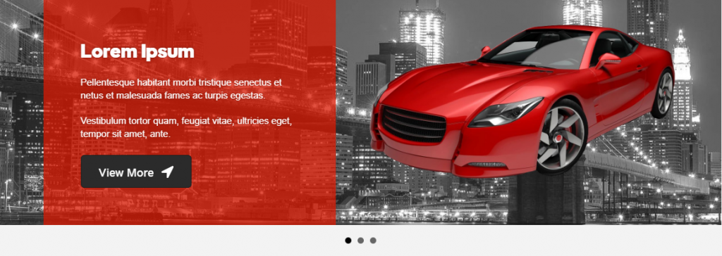
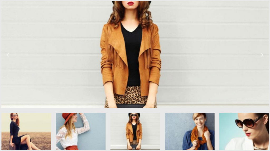
Table of Contents
Add a header to begin generating the table of contents