
Callouts & Creatives
It can be difficult to remember all the modules Beaver Builder has that can be used to place content. The WDS Demo Site has a comprehensive overview of all the main modules available with tool tips on any outstanding pointers to keep in mind when choosing the module. Knowing which modules to use and how to properly style them can drastically improve efficiency while also bringing a dull or text-heavy site to life. Read through this page to learn how to find the best modules for callouts, how to make callouts yourself, and to learn about the content limitations of creative modules.
Modules for Callouts
Making your own (see DIY Below):
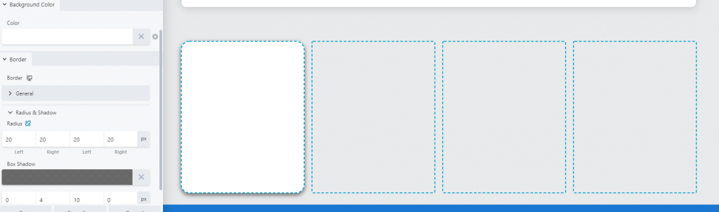
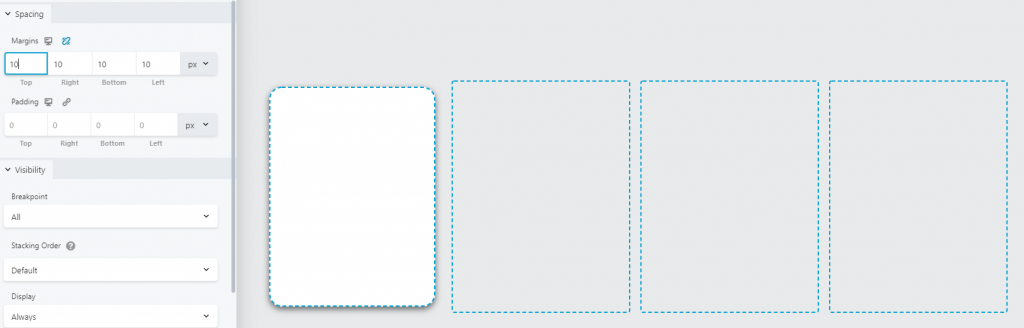
Use Columns with margins/padding/shadow
Add heading/text, button and image or icon module within it as needed
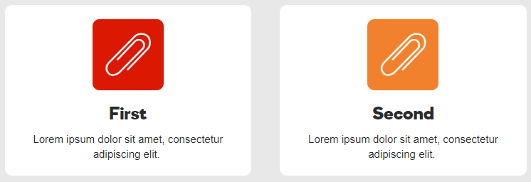
Add other modules within it as needed for design/functionalityUABB Info box:
Heading, subheading, text, image/icon and link options
Alignment option for stacked or inline layout
Min height option and custom styling
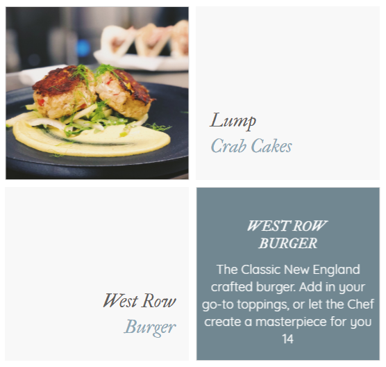
infobox in columns
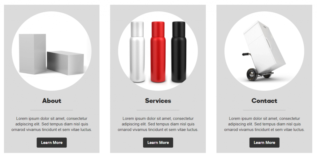
infobox in columns
infobox in columns
infobox in columns
Making Callouts DIY
Use Cases
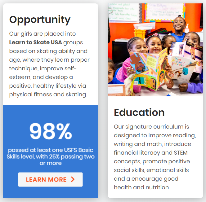
This option is great for creating your own custom callout layout by styling columns to look like a callout. Once styled, you can choose what functionality it will hold by deciding what modules you want to put in it. It is great for making use of creative modules with limitations (discussed in the section below) such as Hover Cards or iHovers that provide the interactive hover action the customer may have requested, but placing any extra text that cant fit in the creative module above or below in within the column.
Pull a new empty row of 3 or 4 columns depending on how many callouts you need for your layout.

Then, In the column settings:
Once the column is styled:


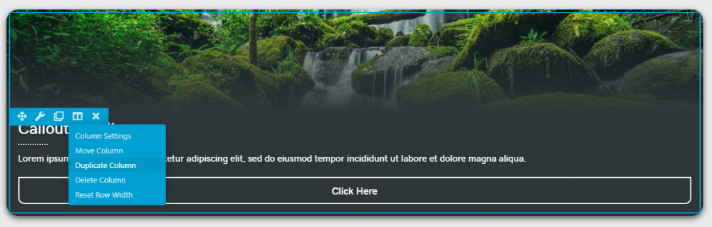
then...
Once you're happy with how the callout column you created looks, how the contents fit within it and everything is styled properly:
You can also save this column for reuse or save the callouts row you created for use on other pages. Follow the guidelines for saving and naming under Beaver Builder Best Practices.
In the example:

Creative Module Limitations
Using them as Accents for Callouts
These creative modules for callouts have limits on the amount of content you can put in them. Don’t try to pack a lot of content into them. They are creative / decorative and should be used to accent a site, not hold all the content you'd like to put in them.
UABB Flip Box
These modules are great for creating callouts that have only a short blurb of text in them, but the text for each callout is uneven in character length when compared to one another, causing the callouts to look off-balance.
In the billiards flip boxes example below, the flip box modules are being used as the callouts themselves. However, notice the flip boxes for menu callouts and stats in the gallery to the right. In addition to content being placed in a styled column, these layouts employ the flip box module as a creative addon to the callout, as opposed to simply placing the text in the column.
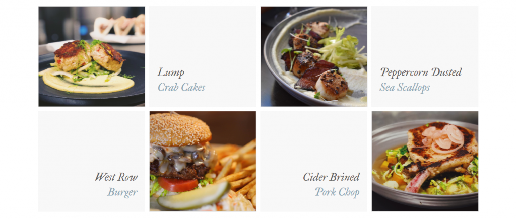
Flipbox for menu callouts
Flipbox for menu callouts - flipped
Flipbox for stat callouts - flipped
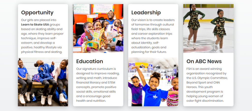
Flipbox for stat callouts with cta

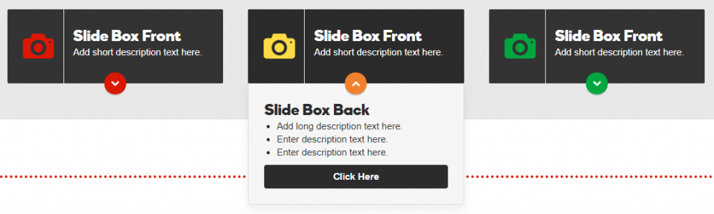
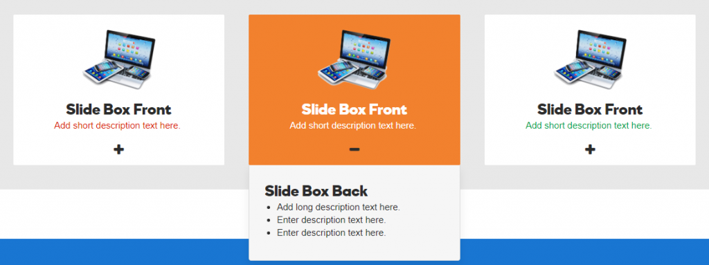
UABB Slide Box
These modules are great for creating callouts that have a lot of text in them and are uneven in character length when compared to the text placed in the other callouts. Slide boxes can be a good alternative to flip boxes if there's around a paragraph of content to be placed in the callout - which is too much for a flip box but is appropriate for a slide box module.
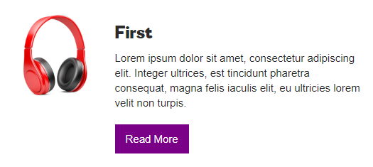
PowerPack Hover Cards
Hover cards are great modules for a stylish callout setting but they must be properly styled to look good, otherwise it can get messy.
In the example to the right, the hover card modules are used as the callouts themselves. There is a single line of text for the heading, a very small blurb of description text, and the hover card link is a link when clicked.

PowerPack Image Panels
Image panels are a creative way to display categories, collections or callouts with only a single line of text needed.
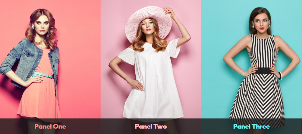
Image Panels
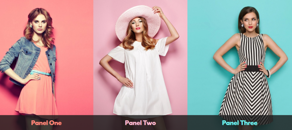
Image Panels - hover
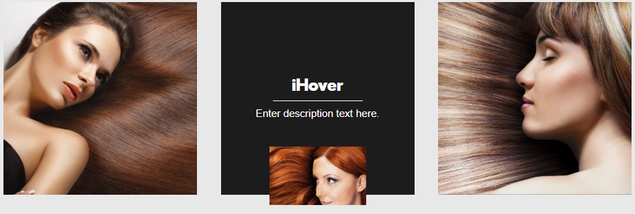
UABB iHover Module
This module has many styles and hover effects to choose from, but as with image panels, is quite limited in what it can/should be used for.
The iHovers shown to the right are being used as callouts themselves. These are limited in functionality by the iHover module's settings. However, as shown below, iHovers are great accents to an existing callout made with a custom styled column.
In the case that a customer requests the use of an iHover but the content they give us falls beyond the the module's limits, or if they are concerned about link clicks by mobile users, compromise with the request by using the module as an accent instead, still incorporating the content they want. See an example of how to use the iHover as an accent to a custom column below.

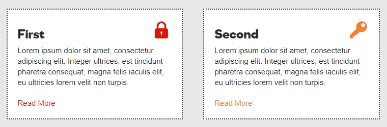
Regular iHover as callout
Regular iHover as callout - hover
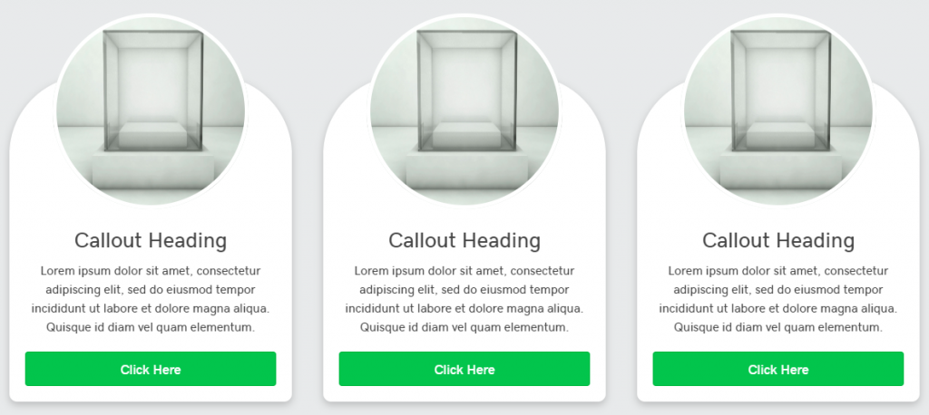
iHover added to Custom styled column
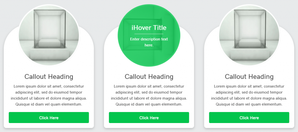
iHover added to Custom styled column - hover
Table of Contents
Add a header to begin generating the table of contents