
Beaver Builder Best Practices
This page contains information on some of the ways to make the most use of Beaver Builder's functionality to help a build take less time while maintaining consistency across the site.
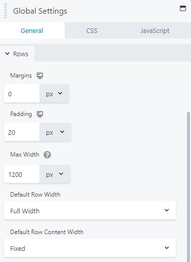
Global Settings
Set global (site-wide) default row widths
The global settings in the Beaver Builder editor determine the default width settings of all of the rows in your site. This means that when you add a row to a module, it will have that setting unless you modify it in that specific row.
You can customize the following global settings for row width and row content width:
- Row width: Full width or Fixed
- Row content width: Full width or Fixed - Content width can be set only when row width is set to Full width.
- Max width
Here's what happens to new and existing rows when you change global width settings:
- New settings apply to new rows
If you change the global row or row content width setting from Full width to Fixed or vice versa, the new settings only apply to new rows that you create. You can override these settings in individual row settings. - Modified settings apply to certain rows
If you change the global Max width setting to a different value or unit, the change applies to all existing rows across your entire site that meet the following conditions: Either the individual row width or content width is set to Fixed, OR the individual row doesn't have a custom max-width setting
Notes:
- Changing global settings may not be reflected in individual row settings unless you flush your site cache and reload the page.
- Exact row and row content widths are affected by row, column, and module margin and padding settings. See the Related Article on full- and fixed-width row layouts for more details.
- If you set the row width to Fixed, either in Global Settings or in individual rows, this setting can get overridden if your theme is set to full-width rows.
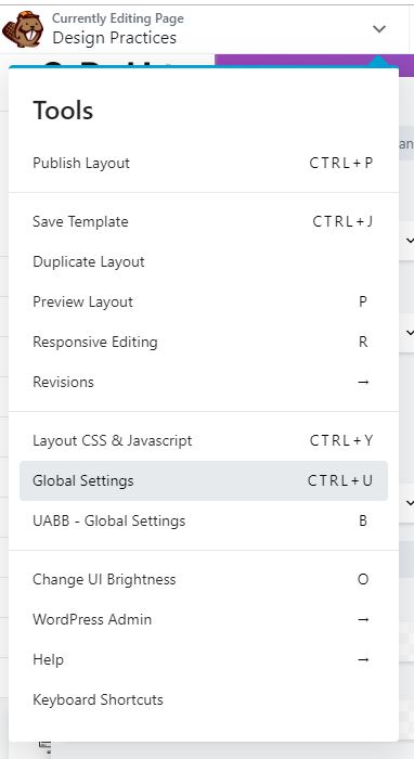
Tools Menu
Global Settings
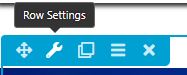
Row Settings
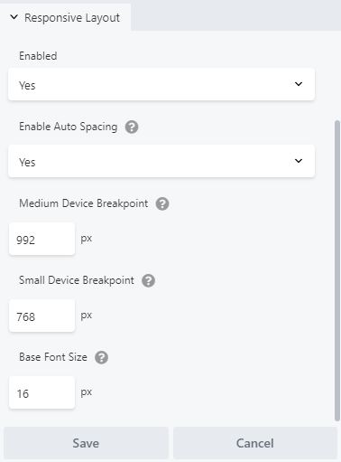
Global Responsive Layout
Change device breakpoints site-wide
By default the Beaver Builder browser-width breakpoints are as follows:
- Large device breakpoint: 1366px
Device behavior changes from Extra Large to Large at 1366px. - Medium device breakpoint: 768px
Device behavior changes from Large to Medium at 768px. - Small device breakpoint: 480px
Device behavior changes from Medium to Small at 480px.
You can modify these breakpoints site-wide in the Page Builder global settings. If you change these breakpoints globally, be sure to adjust any custom CSS rules you've written accordingly.
Important:
Aside from adjusting the row settings, default content max-widths, and occasionally the responsive breakpoints, there's nothing else you need to touch in global settings.
Do NOT add any CSS or scripts to the Global settings built-in tabs for these items - we are using the Beaver Builder theme which gives us an Additional CSS tab and Code tab in the customizer and there is no reason to scatter code in other places - keep it all in one place!
Source: Beaver Builder Knowledgebase - global row widths | site-wide breakpoints
Saving Templates
Save a Row, Column, or Module for Reuse
You can save a row, column or module for reuse on your site. You can also export saved rows, columns, and modules for use in other websites. You can save your row, column, or module as standard or global.
How to save a row, column, or module
Open the page that contains the row, column, or module you want to save.
Open the row or module for editing by clicking the wrench tool.
Click Save as
Enter a name for your saved module
decide if it will be standard (No) or Global (Yes) and click Save.
Your saved rows and columns can be accessed on both the Rows tab and the Saved tab in the Content panel. Saved modules are accessed on the Saved tab.
Tip: Global rows, columns, or modules have an orange overlay after they are inserted. Any modification you make to them will affect the saved version and all other instances in your site. Standard rows, columns, or modules don't have any special formatting in your layout because they no longer have any association with the saved version.
To insert a saved row, column, or module into your layout:
Source: Beaver Builder KB - save for reuse | How to Insert Saved | How to Edit Saved
Save a Custom Layout Template
You can create a custom layout template from a page you have already designed in Beaver Builder (including a Themer layout), or you can create a layout template from scratch starting from the Beaver Builder admin panel.
How to save a template
Tools Menu > Save Template
On the Tools menu, click Save template. The Tools menu is in the upper left corner of your screen. You can access it by clicking the down arrow in the title bar.
Name it > Save it
Give the template a name and click Save.
Note: Layout templates are not public pages on your site and are not available for indexing by search engines - Layout templates are pre-built page layouts with content that you can either append to an existing page layout or use to replace an existing layout.
To replace existing content or append a layout template to your Beaver Builder content:
Source: Beaver Builder KB - Layout Templates | Add a Layout Template to Page
Rules for Saving !important;
Why Save a Row, Column, Module or Template?
CONSISTENCY! In the beginning of a site build during the design stage, you're in the process of figuring out what modules to use across the site and what styling they will carry. Using the same styled module on each page allows little room for error, e.g. accidentally giving an image a 4px border instead of the 3px border used everywhere else on the site. It also is far more time efficient, preventing you from having to restyle a module to match the branding every time you want to use it.
After reading how to save templates, rows, columns and modules, you must read through the important rules for saving before proceeding!
Rules for Styling a Module - Before Saving for Reuse
When you have decided on the colors, sizing, alignment, shadows, borders and other design elements that you wish to consistently use across the build, grab some modules that you know you will be repeating across most pages and style them using the built in style tab on the module.
When styling a module, make sure you are choosing items to style that aren't already included in the customizer.
Styling included in the customizer applies to:
- Heading typography font family, color and size, body text typography font family, color, spacing, case and font size
- The customizer gives the option to have a separate style for H1 tags
- Link and site-wide accent colors
- Button typography font-family, colors and font size... etc.
See WordPress Installation - Customizer Settings [ 2 ] for details on all customizer settings.
Keeping this in mind:
Give the module, column or row a custom class!
Use the "Standard Modules" page when selecting modules to use on a site. Learn how to make best use of the demo site, how to find the best modules for callouts, and about the best modules chosen for content placement.
Rules for Naming when Saving
It is beneficial to both you as the designer, and a future builder, to name modules or layouts appropriately.
Checklist
Make sure these items are covered before you save!
Hints & Pointers
Overview of Settings > Beaver Builder
There are 3 different sections of the Beaver Builder's backend settings that need to be discussed.
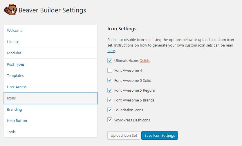
Icons tab
Beaver Builder comes with the Font Awesome, Foundation, and WordPress Dashicons icon sets. You can also add your own icon sets through this UI, by helping you upload custom sets from Fontello or IcoMoon to your Media Library.
In the customizer settings when starting a new build as seen In WordPress Installation - Customizer Settings [ 2 ] > general tab > layout, you want to make sure that font awesome 5 is enabled. You may come across a site during revisions or updates in which you are unable to see the font awesome 5 libraries appearing. If you've checked the customizer, and font awesome 5 is enabled there already, you can also check the Icons tab under Beaver Builder settings from the dashboard. When you enable font awesome 5's solid, regular, and brands libraries, make sure you disable the font awesome 4 set.
Back-end Settings
Icons Tab

Tools Tab

Post Types Tab
Tools tab
The Tools tab has a Cache section, a Cache Clearing Tool section (as of Beaver Builder 2.1.5), a Debug mode section, and an Uninstall section. This is a good spot to check if there's some heavy site caching issues that you can't seem to shake.
Post Types tab
By default, Beaver Builder is only enabled for Pages. You can enable it to insert layouts into the content areas of single Posts. If you have WooCommerce plugin installed, you'll see a Products post type, and if you have other custom post types, they'll appear here also.
Note: The Beaver Builder plugin applies to layouts in the content area of your page or post. Standard WordPress headers, footers, and sidebars are controlled by your theme, or by using Beaver Themer, which lets you apply Beaver Builder layouts to theme-controlled areas. If you have Beaver Themer installed and create a Singular layout for Posts or Pages, you will not be able to use Beaver Builder to edit the content area of the page.
Source: Beaver Builder KB - Settings Overview
Other Pointers
Table of Contents