
Beyond The Fold - Layout
Learn about ways to gather the content you need for the "Below The Fold" area and how to distribute it properly in a layout that represents the customer's site goal. Learn about the components you should try to include on the homepage based on the site goal the customer has selected. You may be limited by the content you were given, but read about the best component-based layouts to include to place the content in an appealing way. Read through the information on the "Standard Modules" page to learn how to use the demo site, how to find the best modules for callouts and for content placement.
Component Breakdown
The following components have been discussed in detail (what they are and how they are relevant) in the "Components to Include" section of the "Below The Fold - Includes" page. The layout examples shown below for each Below-Fold Component act as visual guides for different ways to properly distribute content and what to put in sections for these components if you must include them on the site.
The layouts will help give us a better insight on how content could be placed and balanced - they don't have to be copied or used in every build and they can always be altered, rearranged or added on to. They should help designers visualize more creative ways they can apply content to a page and tie it together with the rest of the site. If the text needed to fill a certain component isn't evidently present in the design tool's page content section, the fields you can use to gather the content you need for each component (if any) are also mentioned below.
Secondary Component Layouts
Content that is not important enough to make it Above-The-Fold, but is still crucial to convincing your visitors to become customers or loyal followers. Reference the detailed component descriptions from the "Components to Include" section of the "Below The Fold - Includes" page.
Component: Benefits
- Content to include:
Why choose us blurb - "now that you've scrolled below the fold, here's why you should stay…" - Where to find content for this component:
Design tool fields to look in: "What sets you apart from competitors?", "What is your mission/vision?" - Page Content text section for homepage or about page may also have something you can find to use here. - Component layout options:
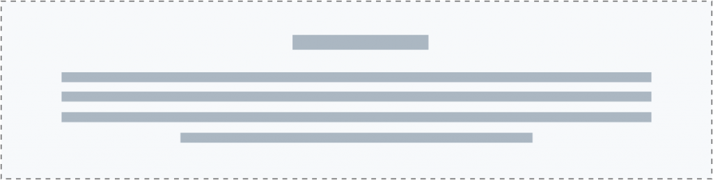
(1) Heading and text content
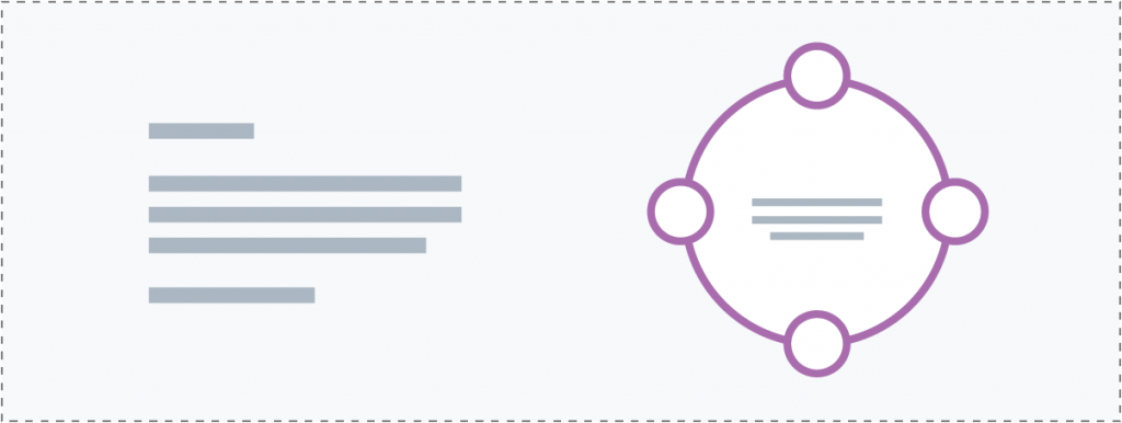
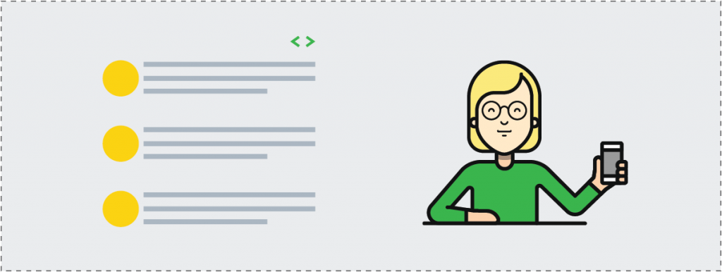
(2) Text blurb and info circle
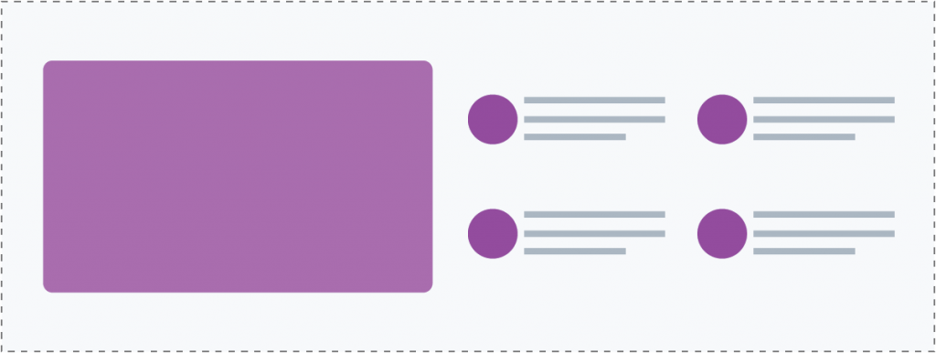
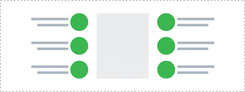
(3) Image and info list columns - Suitable modules for component layouts:
PowerPack Smart Heading - H2, UABB Info box, UABB Info list, UABB Info circle
(1) Heading and text content
(2) Text blurb and info circle
(3) Image and info list columns
(2) Text blurb and info circle
(3) Image and info list columns

(4) Custom column callouts

(5) Flipboxes as callouts
(6) Flipboxes as callout accent

(7) Slideboxes as callouts
(8) Icon list columns
(9) Info list with image
Component: Features
- Content to include:
What we do/offer - list of main services/amenities/products/listings - Where to find content for this component:
Design tool fields to look in: "What are 3-5 key terms, services, or products you want to focus on promoting?" - Page Content text section for a services page or the items in the product worksheet labeled as featured. - Component layout options:
(2) Text blurb and info circle
(3) Image and info list columns
(4) Custom column callouts
(5) Flipboxes as callouts
(6) Flipboxes as callout accent
(7) Slideboxes as callouts
(8) Icon list columns
(9) Info list with image - Suitable modules for component layouts:
Custom Callouts, UABB Slide box, UABB Flip box, UABB Info box, UABB Info list, UABB Info circle, PowerPack Icon / Number List, Featured Products carousel / grid, Main Product Categories callouts / grid
Component: Trust & Success Indicators
- Content to include:
What we do/offer - list of main reasons why we're credible, why you should trust us - Client testimonials, Awards / Certs - Where to find content for this component:
Design tool fields to look in: "How long have you been in business?" (only if they've been in business for a credible amount of time) - Page Content text section for a testimonials page, logos provided of companies they work with, etc. - Component layout options:
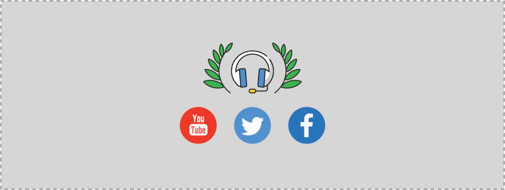
(17) Social Follow
(18) Logo carousel
(19) Stats and data
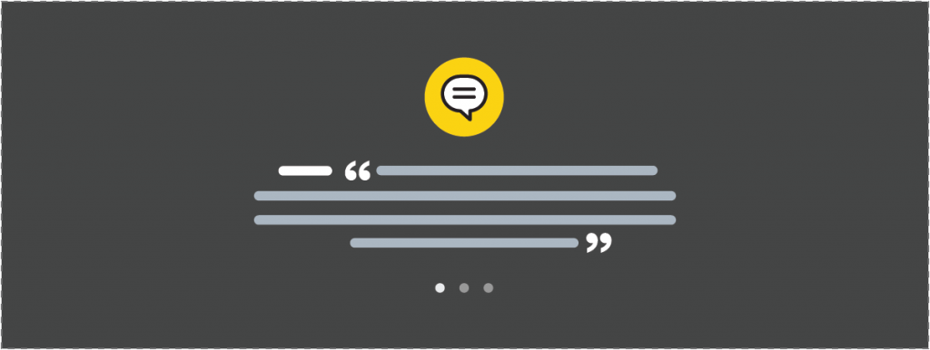
(20) Testimonial boxes
(21) Testimonial horizontal slider
(22) Testimonial vertical slider - Suitable modules for component layouts:
PowerPack Testimonials Slider (horizontal or vertical setting), UABB Testimonials Boxes, Logo grid / carousel, Social Follow / Social Share buttons, Progress Bar, Number Counter
(17) Social Follow
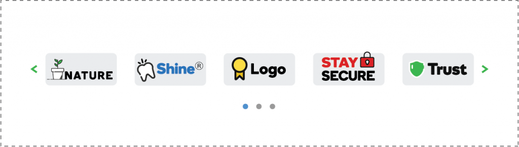
(18) Logo carousel

(19) Stats and data

(20) Testimonial boxes
(21) Testimonial horizontal slider
(22) Testimonial vertical slider
Additional Component Layouts
These are the “nice-to-have” information, but are not critical in making your website effective for making a strong first impression. For example, blog articles, company announcements, event schedules, industry updates, location map (if you are not in the restaurant business). Reference the detailed component descriptions from the "Components to Include" section of the "Below The Fold - Includes" page.
Component: Secondary Call-to-Action
- Content to include:
Get more info, Request quote, Subscribe for updates, etc. - Where to find content for this component:
Design tool fields to look in: "Social Media Accounts", "What action do you want your customer to take on the home page? i.e. Learn More (link to About us or services), Shop Now (link to shop pages), Contact Us (link to contact us page)" - Page Content text section for a contact page, etc. - Component layout options:
(14) Secondary CTA full-width
(15) Secondary CTA and image
(16) Secondary CTA subscribe
(17) Social Follow - Suitable modules for component layouts:
PowerPack Subscribe form, Contact / Quote Form (PowerPack Gravity form styler), Buttons / Dual Buttons, Social Follow / Social Share buttons

(14) Secondary CTA full-width
(15) Secondary CTA and image
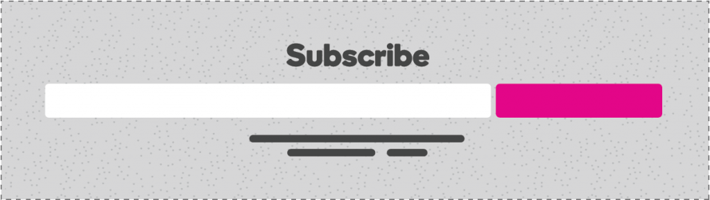
(16) Secondary CTA subscribe
(17) Social Follow

(11) Image and content row
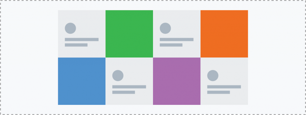
(12) Gallery tiles

(13) Content and image row
Component: Content Offer
- Content to include:
Feature a content offer, such as a whitepaper, ebook, or guide - Where to find content for this component:
Dependent on page content provided - Component layout options:
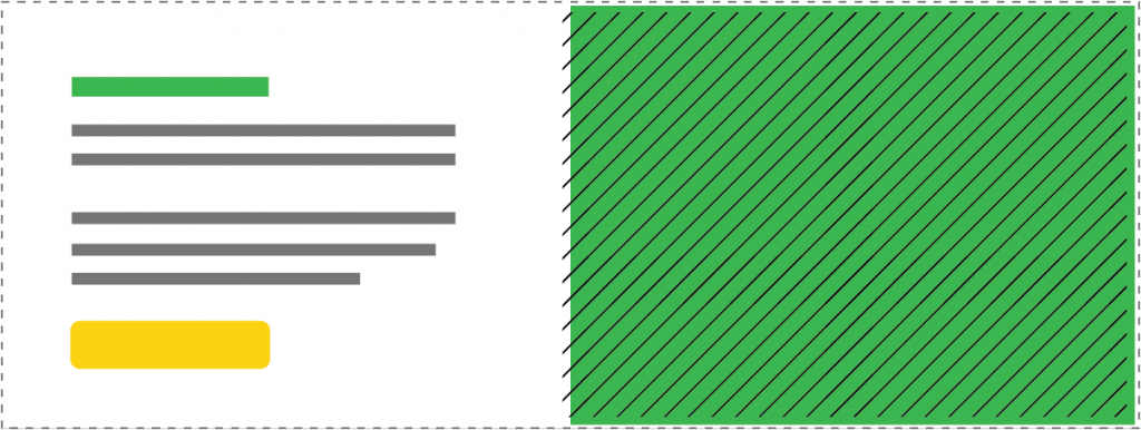
(11) Image and content row
(12) Gallery tiles
(13) Content and image row - Suitable modules for component layouts:
Gallery (PowerPack Photo Gallery), Latest blog posts grid / slider (PowerPack Content Grid), Standard Textbox module, Smart Headings, Image Module, Table, Price Box, Menu / Service List
Component: Blog Highlights
- Content to include:
Encourage people to view and subscribe to your blog by highlighting it on your homepage - Where to find content for this component:
Dependent on whether the site has blog posts or not - if it does and we don't have content, create a few placeholder blog posts so that you can see something show up when you place a layout on the homepage or even on the themer pages when designing them - Component layout options:
(10) Blog post highlights
(12) Gallery tiles
(15) Secondary CTA and image - Suitable modules for component layouts:
Latest blog posts grid / slider (PowerPack Content Grid), Latest blog posts magazine layout (PowerPack Content Tiles), Standard Post Slider Module

(10) Blog post highlights
(12) Gallery tiles
(15) Secondary CTA and image
(3) Image and info list columns
(4) Custom column callouts
(8) Icon list columns
(17) Social Follow
(18) Logo carousel
(19) Stats and data
Component: Resources
- Content to include:
For folks who are looking for more information, offer a link to a resource center where they can browse relevant information - Where to find content for this component:
Dependent on page content provided - Component layout options:
(3) Image and info list columns
(4) Custom column callouts
(8) Icon list columns
(17) Social Follow
(18) Logo carousel
(19) Stats and data - Suitable modules for component layouts:
Custom Callouts, UABB Info list, PowerPack Icon / Number List, Logo grid / carousel, Progress Bar, Number Counter
Site Goal Breakdown
The answer chosen for the design tool field "What is the main goal of your website?" plays a part in determining what Below-Fold Components need to be included on the homepage in order to help the customer achieve this goal.
- Generate leads
- showcase your work
- provide information
- sell a product/service
- other
Site Goal - Component Influence
These have been discussed in detail for determining an appropriate "call-to-action" section of the "Top-Fold Components" discussion on the "Above The Fold - Layout" page. This section covers how to decide on the best below-fold components to use for the site's homepage based on the answer chosen by the customer for the same site goal field - Generate leads, Showcase your work, Provide information, Sell a product or service, or Other.
The recommended components for achieving the customer's site goal have been listed below under the goal they are best suited to. Every site doesn't need to include all of these components - what we actually end up including in the layout will heavily depend on the business type and the content the customer provides. However, these components will give us a general idea of how to design the site and properly distribute the content we get to work with, and what kind of content should be included depending on what the customer hopes to gain from the site we're building for them.
Regardless of what the customer has asked us to place on the homepage, we can look through all the pages and resources we've been given to try and fill in as many key components as we can for the site to achieve the goal the customer selected.
Create A Layout
Use the below-fold component layout ideas to help you compile your own by following these steps:
- Check the customer's answer for the field in the design tool "What is the main goal of your website?"
- Compare the customer's selected answer to the info about that site goal from the "site goal breakdown" section above
- Using the info from step 2, make note of the recommended below-fold components for the site based on the selected goal
- Filter through the gallery below using all the components listed in your notes from step 3
- Keeping the content provided in mind, select the best fit layout option for each component from its filtered results
- Using the best fit layouts you've chosen for each component, compile a layout outline to use on the site
- During site build-out, recreate the layout outline from step 6 using the modules mentioned or similar ones as seen fit
- Adjust or alter or the layouts as needed to best suit the content
Use the "layout maker" page to test out how your page will look once you've selected which layouts you'll be using for each component.
Table of Contents
Add a header to begin generating the table of contents
Next Steps
After completing the layout and content placement on the homepage, its time to build out the interior pages. Learn about the best practices of internal page design.