
Design Practices
Best Practices for maintaining layout consistency, properly styling rows and appropriate ways to separate content in them.
Layout Consistency
Margins & Padding
Using the box model to better understand margins vs padding:
- Content - The content of the box, where text and images appear.
- Padding - Clears an area around the content. The padding is transparent.
- Border - A border that goes around the padding and content.
- Margin - Clears an area outside the border. The margin is transparent.

Source: W3schools – CSS Box model
General Styling Rules
- Change page padding to match the content contained on the page.
- Let your content breathe. Even in full width designs you should have space between the website edge and the content of the site.
- Do not leave the large spaces empty, make use of negative space.
- Margins and padding in themes should be observed and remain consistent in custom builds. Consider the theme as the style-guide.
- Try to ensure there's a similar amount of padding above and below the content in all the rows on a page.
- There should not be unnecessary space above/below the footer.
- Make sure there is the same amount of padding above and below content in a row - a small difference in top and bottom padding can cause a site to look inconsistent and unprofessional.
- Directly edit pixel values and column percentages when sizing elements for consistent results. Avoid simply dragging an element to size based on visual feedback or leaving content areas unbalanced.
- Let your content breathe. Even in full width designs you should have space between the website edge and the content of the site.
- When removing page elements that are key to the visual design or composition/layout of the page be sure to adjust remaining content on the page to account for the missing element.


In Beaver Builder
If you do want more control, there are several ways you can change spacing in Beaver Builder layouts:
Locally
You can change the margins and padding of individual rows and columns, and you can change the margins of individual modules. You can set different values for each device size.
Site-wide
You can change the global default settings, which are then used as the defaults in individual rows and modules. As of Beaver Builder 2.2, you can set global margins and padding values for each device size. By default, the desktop global setting propagates to all device sizes.
Mobile auto spacing
You can disable mobile auto spacing or override it by setting your own values for small devices.
Source: Beaver Builder Knowledgebase - Margins and padding
Row Widths
In a fresh build, when you pull a new row onto a page, it will be "fixed width" by default. The grayed out number inside the fixed width field is set to 1100px by default.
Instead of changing each row to full width and adjusting the fixed width for the content every time you pull a new row (assuming you want a larger/smaller than 1100px fixed width across the site in this particular build), leave the default field as is, and change the row settings globally. Learn more about global settings from the Beaver Builder Best Practices page by clicking here.


Understanding Row Widths
When you create a row in Beaver Builder, you can specify whether the row is full width or fixed width. If you set the row to full width, you also have a choice of whether the row's content is full width or fixed width.

Row 1: Full-width row, full-width content
When row width is set to full width, the row background stretches to either the full width of the browser or the full width of the page's boxed content area, a choice set by the theme.
Row 2: Full-width row, fixed-width content
In the second row, the row is set to full width, and content is set to fixed width. The default fixed-width setting is 1100px, but you can change it, either in Beaver Builder's global settings or for individual rows.
Row 3: Fixed-width row
In the third row, row width is set to Fixed. This means the row background will stretch to a custom width that you specify, or to a global value you have set for row width.
Source: Beaver Builder Knowledgebase - Row layouts
Alignment & Balance
Consistency in Alignment
It’s a good practice to maintain consistency in how headings or text content on a page in similar rows are aligned. For example if the headings in a hero row are left aligned, make the rest of the content on the page left aligned.
If a site has mainly left aligned text, and there is text that seems like it should be bolded and centered in a "call-to-action" manner, make sure this text is depicted as separate from the rest of the body content using a separator line or by placing the text in its own row. Its okay to alternate alignment of text/list icons/images as long as a balanced layout is achieved.

Creating Balance
Alternating content placement in consecutive rows on a page is usually a good practice as well, to avoid seeming repetitive and to create a balanced appearance. For example if one row has text to the left and an image to the right, the row below should have the image to the left and text in the right column. The text doesn't have to be aligned right in this case, it can stay consistent with the alignment in the above row. This layout isn't necessary every time content is to be laid out on a page, in the case that there's only one image or there are several images and little text.


If, in your layout, the images provided are not the same size and aren't large enough to fill up an even amount of space, find images that are similar in size to create balance OR change the layout to accommodate the size difference, perhaps make the larger image smaller to match the others or decrease the column width for all images in the alternating row layout.
These are only suggestions, each site building experience and the content you are given for each build will vary. Being the designer, you must use your discretion to create the best possible layout using the content you were given.
Visit the page Using Discretion to learn more about making choices for layout based on the content you're provided. Reference Homepage - Below the Fold page to learn more about choosing modules and deciding page layout based on the content you're provided.
Branding Consistency
When Styling Modules
When designing the site, its important to maintain consistency across the design for sake of branding in colors, fonts as well as in subtle appearance and layout choices such as:
Border-radius
Are the edges in the logo/branding round or pointed? This could determine whether we decide to use call-outs, buttons, image modules throughout the site with rounded edges vs straight or pointy edges.
Border-style/color/weight
Is there a defined border around components in the logo/branding? How thick is the border and what does it look like? A light-gray, thin double lined border around text in the logo, for example, may be a good feature to use across the site as a separator between headings and text or between rows. You could use it to highlight certain headings or images across the site to carry the branding along with the build.
Box/text-shadow
Is there a shadow? Is it blurred, or sharp? If there's a shadow that you think plays an important role in conveying a certain look that appeals to the brand, it may be wise to use this shadow on certain appropriate modules throughout the site as a good branding practice.
Such items may not have stuck out to you before, however, they play a significant role in branding and conveying the brand throughout an entire site. If we use rounded buttons and images across the site and then decide to use square call-outs on a page, it will look out of place and create an inconsistency in branding. Its important to decide on a certain consistent style for the modules you will be using across the site before you actually start the page build-out process, and make sure you use that style throughout the build.
When Pasting Content
Keeping the styling and brand consistency in mind, when copy/pasting content from documents or third party sites, you may also copy over inline styling still attached to the text content. When pasting in a beaver builder module, make sure you void the content of any source formatting it may be trying to bring along. Here are some ways to be sure your pasted content is clean:
"Ctrl + shift + V"
Use "Ctrl + shift + V" instead of "Ctrl + V" when pasting directly into the module's editor interface - this pastes plain text without source formatting
Paste in the "text" tab
Switch to the "text" tab instead of the "visual" tab in the module's editor interface before pasting your content
Notepad to remove styling
Paste your content in a notepad or sublime text before copying it again and pasting it into the module's editor interface

Row Styling
Using Rows
When writing an essay in school, you're taught to separate changes in topic by starting a new paragraph. Similarly, when building a site, a change in topic direction is usually best reflected by placing the different content in its own row.
Other reasons to put content in its own row may be:
Its important to balance the content you choose to place in a new row with the rows above and below it. For example, if you're highlighting a quote or a phrase in its own row, make sure it stands out from the rows above and below it by perhaps centering the text or changing the background of the row its in. Make sure the padding above and below the content in the new row is consistent with the padding above and below the content in the other rows on the page. Again, these scenarios are completely subjective and rely on the amount of content you have to work with, and the room for discretion you have been given by the customer.
Row Backgrounds
Image Backgrounds
Its okay to use images as row backgrounds, and this is often a great way to separate content on a page in a manner pleasing to the eye, but there are some rules to get behind when deciding to do so:
Image Aspect
Make sure the image is the correct aspect ratio - it should not be a portrait if its aiming to fill a landscape aspect.
Image Size
Make sure the image is large enough to fit all the way across the screen without visible loss in resolution - also resize any large images for web to ensure a faster page load time.
Image Visibility
There isn't a super important part of the image that needs to be visible at all times - if so, it shouldn't be used as a row background due to responsiveness causing its positioning to alter when the size of the screen changes. If a certain part of the image is so important, it should be used as an image in content rather than as a row background.
Image Contents
The image contents are background worthy - If its an image of a family with visible faces, those will probably be expected to show at all times. As with the point above, it shouldn't be a row background. If the family is running or engaging in a far away activity that can be cut off, then it would make more sense to be used as a background image.
Image Text
The background image doesn't have text on it. If it does, chances are it needs to be visible at some point. Even if the text on the image isn't important, it will still end up clashing with any text in the content placed on top of it.
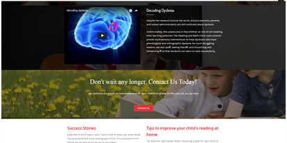
NO - Consecutive rows background images clash, focal point of main image is covered

YES - Adjusted row spacing and removed clashing background images

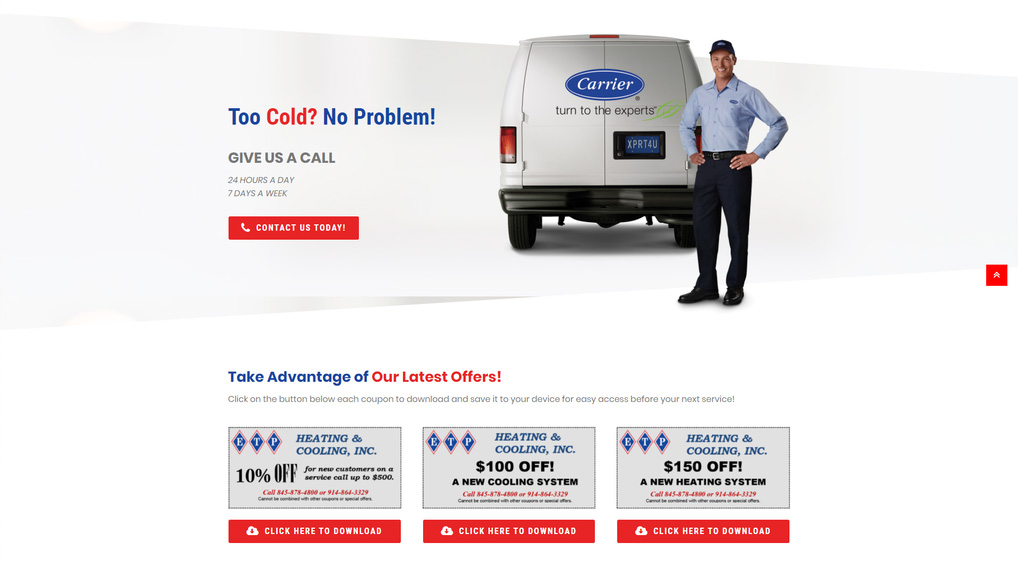
NO - Image has text that clashes with content in row
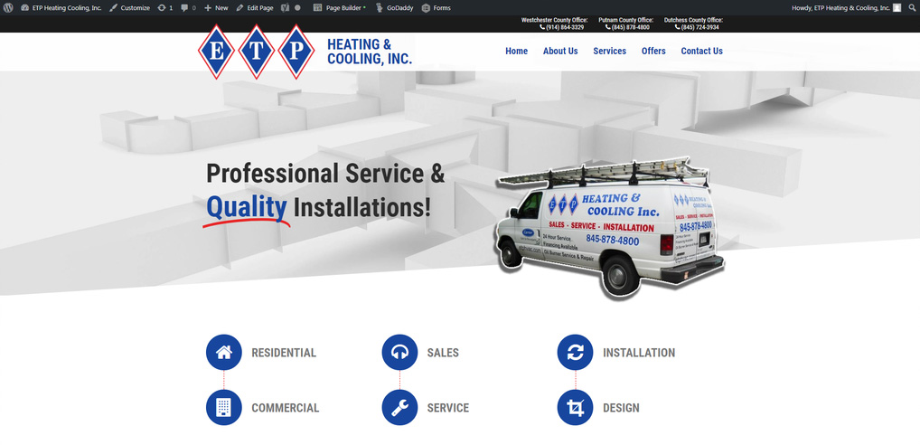
YES - Subtle background image with heavy overlay, van with text is included in content rather than as a background image

NO - Background clashes with content image and with text
NO - Clahsing row backgrounds, bad padding and color choice
Image Busyness
The image isn't too busy - if the image is really busy, it may wipe out the content that's placed on top of it. In the case of a busy image, we could use a heavy overlay to keep the text above it visible.
Image Clash
The content in the row doesn't already include an image - this is a case-by-case issue. Often when you place a background image on a row that already has an image in it, the images clash. The image in the content must be closed off with some kind of border, within some module, or the row background must have a heavy-set overlay to avoid clashing.
If the row above or below your row already has a background image, you may want to avoid giving it one. The background images may clash on consecutive rows if they aren't synonymous in appearance or color. It’s a good practice to alternate rows with background images with rows with no backgrounds or textured backgrounds. In the case that two consecutive rows have image backgrounds, it may work if the rows are tall enough to take up the full height of the screen at a time so you don't see two different images on your screen at once.
Patterns & Textured backgrounds
When to use them, where to find them and how to place content over them aesthetically.
You can see in these examples that the different sections of the site are broken up into aesthetically pleasing pieces, using the general color scheme of the site but generating visual interest. This allows each piece to standout while remaining in harmony with the over all design.
Tips for when using patterns or textures as row backgrounds:
Make it relevant to your site content
When searching for your look find something related to your site and its contents
Often you can utilize one of your clients images and photoshop them to make your own backgroundMake sure your background does not become more important than its contents
Keep your contrast low
Make sure the color profile matches your theme
Use font, images, and border that will standout against their backgroundKeep it minimal
It is rare that you will use more than 1-2 patterns in a site
Decide what your pattern is meant to do and stay consistent
Here are some great resources for finding textures and patterns to use in your sites:
- photos.wdsgallery.com
Our free image gallery try searching “Texture” or “Pattern” - pexels.com
Free Images, also works off a “Creative Commons Zero (CC0) license”
Shapes & Separators
Row Shapes
There used to be a feature called "row separator" from both UABB and PowerPack addons to Beaver Builder. In the update to Beaver Builder 2.0 they included a feature called "Row Shape" which create various shapes for row edges with extreme editing flexibility. These allow you to color them with a solid color or gradient, and give you the option to clip the contents of the row with the shape.
Tip: To make the shape look clipped, select the same color for the edge as the content background color on your page. If you select a different color from the content background, you'll see a rectangular row or column with the shape overlaid on it. For example, in the Slanted Edge example in the next section, the first screenshot shows an example in which the shape color matches the content background (white), while the second screenshot shows an example in which the entire shape is visible because the shape color is different from the background.
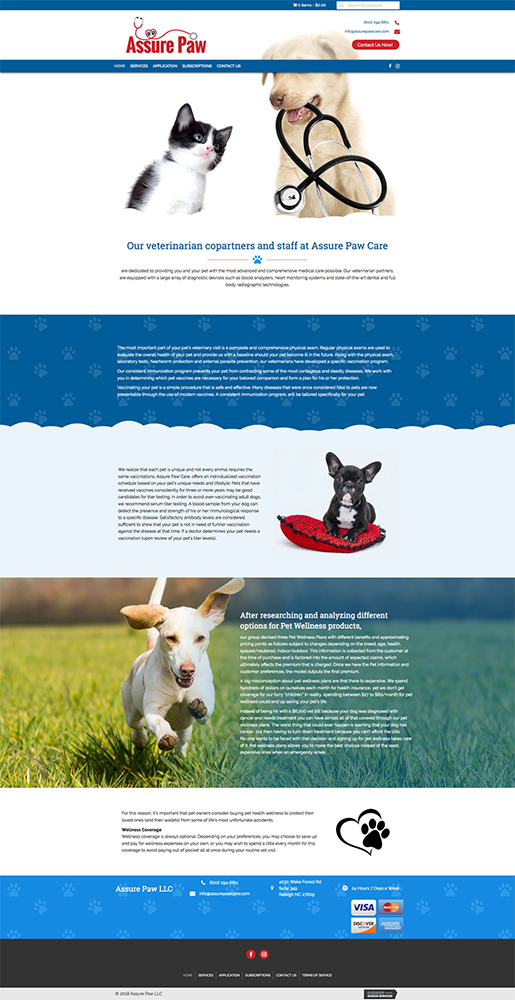
The topography shape produces concentric circles of the type that appear on topographic maps. Here's an example of a topographic shape with stretched height to cover the entire height of the background image.

The concave shape is flat on one edge and has a concave arc at the other end. In the following screenshot, there's a Concave shape at the row bottom with a height of 440px so it stretches up along the sides of the row.

The rectangle shape is a rectangle placed where you want it. In the following screenshot, a rectangle shape at the top of the row was rotated to produce an angled band of color.

In the following screenshot, the slanted edge is applied to both the top and bottom edges. The background photo also has a background color overlay with a gradient.

Here's an example of a white top wave.
SOURCE: BEAVER BUILDER KNOWLEDGEBASE - ROW SHAPE OVERLAYS
Image Separators
Another cool module to use to spice up a layout is the Image Seprator. This allows you to place an image in between two rows overlaying both, along with a link or animation attached.
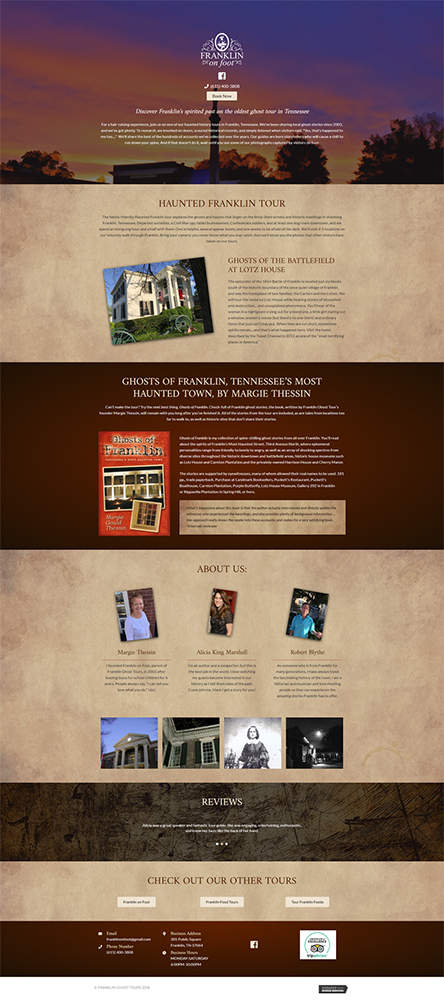
This module is usually best paired with a .png image - a transparent background allows the image to sit between the two rows and overlap them without looking out of place. Usually if the brand includes a mascot or a figure separate from what's already in the logo, it may be a good idea to add this somewhere on the page in this module.
In the examples in the gallery to the right, the customer had many images pertaining to the overall brand that had transparent backgrounds and ended up being perfect candidates for this image separator module which was used to enhance the minimalist layout of the site and its contents.

Example 1
Example 2
Example 3
Example 4
SOURCE: ULTIMATE ADDONS FOR BEAVER BUILDER - IMAGE SEPARATOR MODULE
Table of Contents