
Site Design Flow by Vertical
Step 1. Determine site vertical
How to use
The following items by vertical are only suggestions. There will always be instances where the requests of the customer may contradict the design research done. If the contradictions look good, go for it, however, if they look bad, use the research by vertical to help you choose a better course of action and use it to notate why you decided to do so.
Step 1. Determine site vertical
Look for the industry of the site in the send up and categorize it as part of or similar to one of the verticals shown here.
Step 2. Customizer Setup
Read details of the vertical under which the site falls. If no specific colors/fonts/examples or instructions on design have been requested, use the research from the vertical to help you select a color palette and fonts.
Step 3. Theme Setup
The specs for the header and footer layouts within the vertical act as a reference to what "most" sites in that vertical have. The templates for headers and footers are applicable for that vertical, contain all/most of the mentioned specs, and act as a good starting base.
Choose headers based on the number of pages, the logo size and orientation and the content to be present in the header. You can use hamburger headers for sites with any number of pages, you cannot use non-hamburger headers for sites with more than 5-6 pages. Choose footers based on the content requested to be in the footer and based on the amount of information present on the site. Use the relevant site templates area on the vertical and the flowcharts in step 3c to select and apply archive and singular layouts and/or relevant pods layouts.
Step 4. Page Layout
The specs for the hero area within the vertical act as a reference to what "most" sites in that vertical have. Use the hero media, the suggestions in the vertical and the flowchart in step 4a.i to help you select and style your hero. Use the relevant site templates area on the vertical and the contact section in step 4b to select a contact layout that works with the information provided.
Step 2. Customizer Setup: Site-wide
2a. Colors
The site verticals provide an overall color tone and background recommend as well as common primary and secondary colors. Each color is linked to a palette containing that color - these palettes don’t have to be used especially if the site has a logo or an already provided color scheme, however, they help in situations where there is no logo or where the color is to be chosen by the builder.
Basic Color Rules:
- Only use bright colors as accents or for overlays where appropriate
- If colors can look better in a darker/lighter shade, use colorhexa and pull another shade that works
- Avoid bright colors for solid row backgrounds and for use in large layout components

2b. Typography
The site verticals provide an overall font type recommendation and font categories that apply to headings/subheadings, body text and navigation menu links.
Basic Font Rules:
- Feel free to choose any Google Font that falls under the appearance of the available categories for each site vertical - If you choose a Google font that isn't listed on styleguide and that falls within an applicable category, that's okay - just make sure you notate it
- If the customer has a logo with text, try to find a font similar to the logo text instead
- Don't use fancy or illegible fonts for important content like main headings or body text, use them as accents only (see example)
2c. Favicon
- For Logo w/ legible icon: Crop the icon from the logo in a square aspect ratio and use it as the favicon
- For Text logo OR for logo w/ illegible icon: Use relevant icon from iconsdb
Step 3. Theme Setup: Header, Footer, Archive & Singular
3a. Header Themer Layout
Header Templates
The following are header and top bar template suggestions based on the components of the templates that match with the research done by site vertical. These are only suggestions, other headers not listed can also be used if the content provided by the customer fits those better.
Use these templates as a base to start with and feel free to rearrange/remove/add items as needed based on the content provided by the customer. If the customer provides something to be placed in the header which doesn’t fit or doesn’t look right, try fitting it into the hero area instead or in the footer and then notate why you did so.
3a. i) Logo
Modify logo during new build process with notation:
IF logo is low quality
IF background is solid/non-white and cannot be easily removed
IF logo text is illegible when shrunk down to fit in the header space
Click here for logo/business name best practices.
3a. ii) Navigation Menu
Consider the following when choosing a header template from the list of options:
- How many pages are there? Which headers would work best with the number of pages and the length of the page names?
- Can the nav be set to display the responsive hamburger menu on all screen sizes? OR can the nav be split into main core page links with the remainder being placed in a hamburger menu beside it?
Site Headers | Store Headers | Site Top Bars | Store Top Bars
Click here to see all site templates that are site or store headers or top bars.
3b. Footer Themer Layout
The following are footer template suggestions based on the components of the templates that match the research done by site vertical. These are only suggestions, other footers not listed can also be used if the content provided by the customer fits those better.
Feel free use these as base templates and add/remove or adjust positioning of the elements within them per request/provided example from customer or per their site goal.
Click here to see all site/store footer templates.
3c. Archive & Singular Themer Layouts
Use the flowcharts to help you determine which templates to download for import and usage depending on the site.
Standard Site (WP)
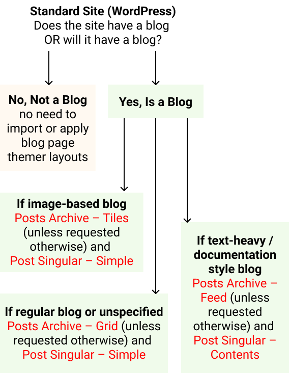 The following layouts must be set up when building a standard site that either currently features or is going to feature a blog:
1. Post archive themer layout (apply to post archive, all archives, search results)
2. Post singular themer layout (apply to singular posts only - NOT all singular)
If the site is not expected to be a blog, and will not have search functionality of any sort, then there's no need to import and apply themer layouts for blog posts on a standard site.
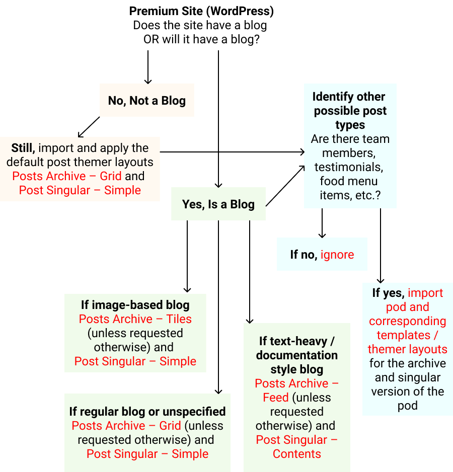
Premium Site (WP)
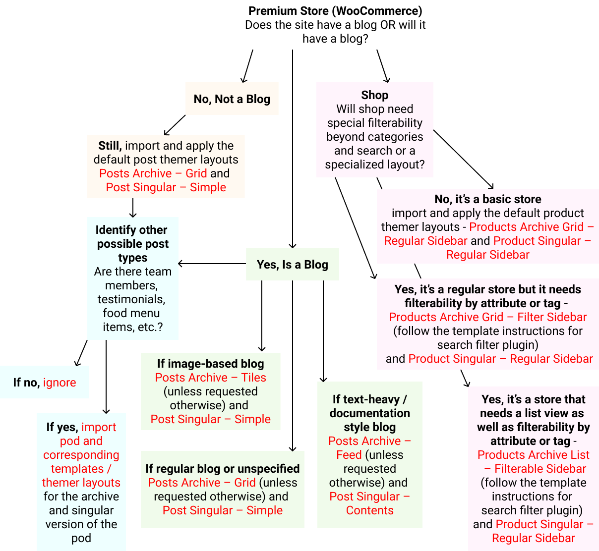
Premium Store (Woo)
Step 4. Page Layout: Hero & Contact
4a. Hero Layout Options
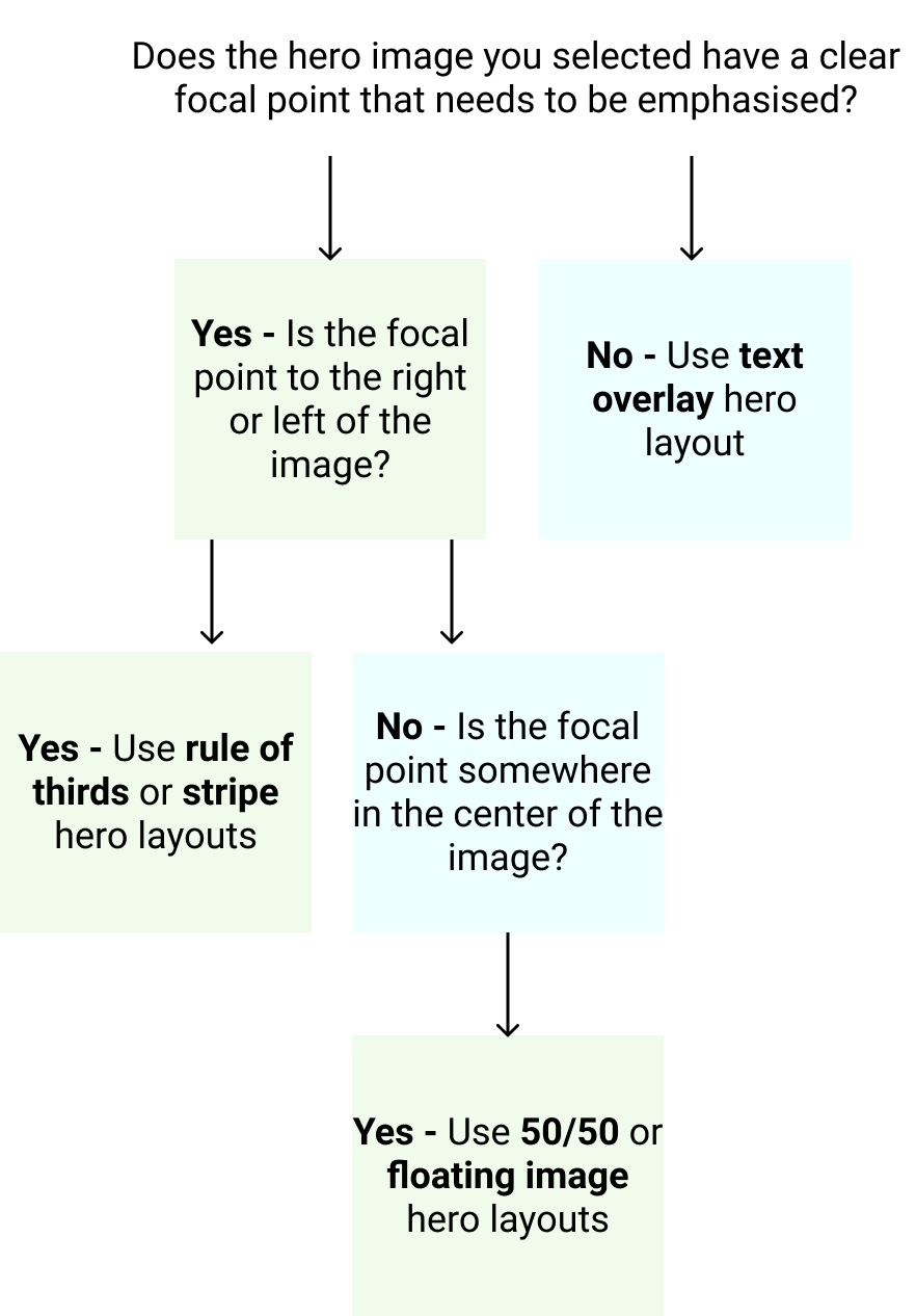
These homepage hero layouts are only suggestions based on design research per site vertical. Ultimately, the media chosen for the hero row background will determine what kind of hero layout will work best. Pair the hero with a row separator or create your own layout, if the content and media provided suits it better.

Visually divide the hero section into thirds. The focal point is generally in 1/3 to 1/2 of the image on its right or left. Include a gradient overlay behind the text if there is insufficient color contrast.

Similar to the "Rule of Thirds" hero layout, but the content might need more contrast. Content box does not “float”, it touches the top and bottom of the hero image container.

Apply a 50/50 split or 60/40 split to the hero area with the image on one side and text on the other. Solid color or heavy overlay behind the text.

Text laid out over the image - usually centered, sometimes left aligned. May require overlay for contrast. Might also have negative space along the top half of the image.

Usually use a solid color or heavily blurred image in the background. Often the header matches hero background by being transparent.

Blog-centric site with posts that get regularly updated, and customer would like for their latest posts to be the first thing people see.

Premium store with many products that get regularly added, and customer wants latest or featured products to be the first thing people see.
Click here to see all hero layout templates.
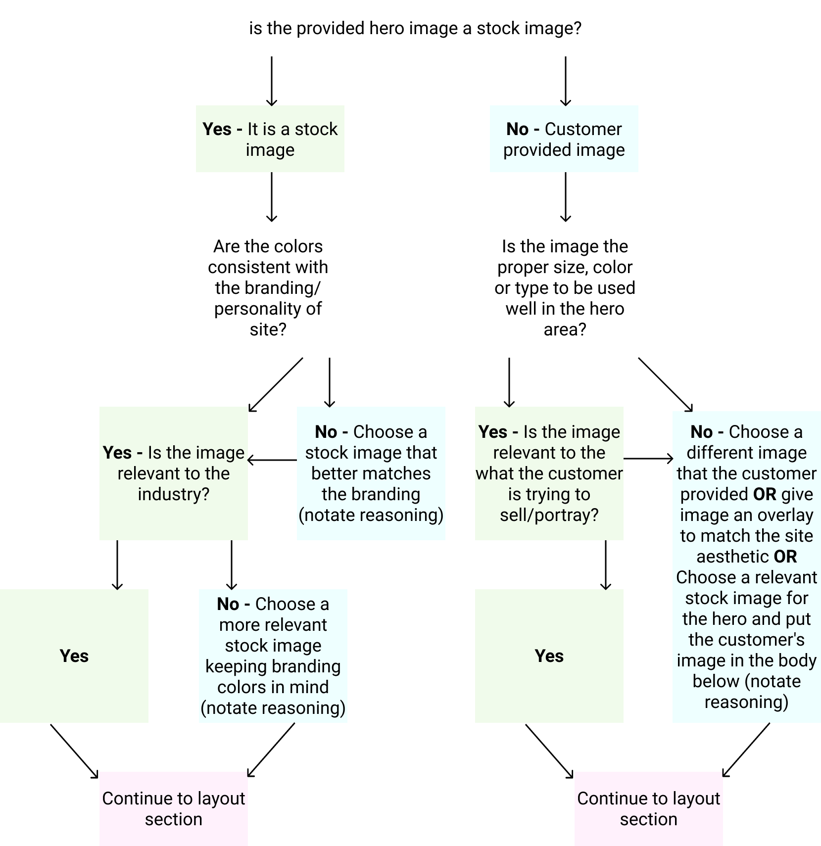
4a. i) Select a Hero Layout
After selecting a good hero image using the flow chart in Step 1, use the flow chart in Step 2 to place it in the layout that suits it best.
4b. Contact Layouts
The following are contact layouts designed for different amounts of contact information for different kinds of sites. If it’s a starter site, append the layout to the bottom of the home scroll page. For all other plans, create a contact page and place the layout by itself on that page. If a standard already has 4 pages, that is fine, add a fifth page "Contact" and use the selected layout template with the customer's information. Use the site vertical suggestions and the flow chart to determine which contact layout to use on the site.
- Contact Layout 1 – Basic
Use if no contact information provided
- Contact Layout 2 – Leads OR Contact Layout 3 – Singular Contact
Use if very little contact info provided, and no location given
- Contact Layout 4 – Multiple Contacts
Use if contact info provided for multiple entities
- Contact Layout 5 – Single Location
Use if basic contact info provided along with location
- Contact Layout 6 – Multiple Locations
Use if contact info provided for multiple locations
- Contact Layout 7 – Personality
Use if contact info provided is only social media or agency information, or if site belongs to a celebrity/personality who doesn't want a contact form
- Contact Layout 8 – Info Only
Use if contact info provided but requested not to include a form
Click here to see all contact page layouts.