
Above The Fold - Includes
Learn about the importance of the "Above The Fold" area, the impact it has on visitors and the components you should include on a homepage above the fold to be immediately visible to the target audience. Learn about what makes up an effective call-to-action. How to gather content for the top-fold area and ways to apply what you read below are covered in the next step Above The Fold - Layout. The goal is to make visitors aware of what the site is about, why its better than other sites that do the same things/what helps it stand out, and what steps a visitor can take to reach their goal while scoring the site owner a possible conversion.
What Is "Above The Fold"?
Above the fold, as it applies to Web design, is the portion of a Web page that is visible in a browser window when the page first loads. The portion of the page that requires scrolling in order to see content is called "below the fold."
Why it's Important
During the 90’s, due to slow connection speeds and ponderously slow websites, it was common for most “Surfers” to rarely read anything below the fold. These days people are far more likely to use the scroll wheel on their mouse. This has mercifully led to cramming, whereby information was stuffed above the fold, largely dying out. It is far more common these days to be greeted with minimalist and elegant designs that allow the visitor to discover what the site has to offer.
A recent Google study showed that ads appearing above the fold had a 73% visibility, whereas those below it had just 44%. But this should be weighed up with the fact that content that draws the viewer in narrows that gap considerably, and ads can be an obstacle for that. Context and balance are key.

What Is Value Proposition?
Your value proposition should answer the following questions:
Source: AbTasty - Above the fold | Value Proposition | Whatis.com
How does All this Relate to SEO?
First impressions! When a user is turned off by how the above-the-fold looks, the chances of that user staying on the website to check out more information is greatly decreased – you can be sure that they will not stay any longer than 10 seconds. When a user clicks-through to your webpage from the search engine results page (SERP), the search engine starts counting.
If there are 1,000 visitors who click-through to your page and stay there for less than 10 seconds, the search engines will see that and deem the site uninteresting or irrelevant, placing it lower in search results. There goes your great SEO.
Above the fold content is a great way to impress the target audience – intrigue them by an interesting/relevant hero image or an interactive module. This will create more dwell time so that even if the visitor decides to bounce, they will have stayed on the site for at least 10 seconds and may retain some of your information. Sites that capture the eye of the visitor leave an impression and are more likely to be revisited and remembered when seen again.
What To Include Here
Choose a Hero - Visually describe your brand
Choose a hero type from the available options (Solid Color, Parallax Image, Gradient, Static Image, Video Hero, Slideshow) or a layout as shown on the "Hero Options" page. The most common option and the most practical/desirable option is the static or parallax image hero. This is because an image will take less time to load than a video or slideshow and can be more representative of a brand than a solid color or gradient. Pick a high quality image (ideally 1920 x 1080) optimized for web (around 200 KB - needs to be under 500 KB) as the row background and apply an overlay if necessary to allow the hero text to stand out.

Hero Example 1

Hero Example 2
Hero Example 3
Top-Fold Components
The formula for what to include above the fold on your homepage is pretty straightforward.
While there are other elements you could include, these are the essentials:
Site-wide Components
Components that should always be included for convenience, creating a positive user experience while familiarizing visitors with the brand.
These components are pretty standard across all websites and the information you need for each of them is usually included in the design tool for every build. There are ways to make proper use of these components for the best impact. Gathering content / placement tactics for these will be covered in detail in the next step: Content - Above The Fold [ 2b ] > Site-Wide Components.
Your branded logo
You want to establish consistent branding across the board and take every opportunity to reinforce brand identity.
Read: "Logo" section under "First Impressions"Simple, intuitive navigation
Provide visitors with the framework to explore the site in a streamlined, systematic fashion through simple, intuitive navigation.
How to Arrange the NavContact info
According to a web usability report from KoMarketing, "51% of people think ‘thorough contact information’ is the most important element missing from many company websites." and "64% of people want to see contact information on a vendor website homepage."
Contact Details - Content & Placement
Hero Section Vitals
Components put in place to capture the attention of a visitor and convince them to stay / scroll / act, which if done well, lead to conversions.
The content for these components can be found in existing fields on the design tool, but a little effort must be put into manipulating and arranging the content to make effective use of the top-fold area and help the customer get conversions. Gathering / arranging content for these will be covered in detail in the next step: Content - Above The Fold [ 2b ] > Hero Section Vitals.
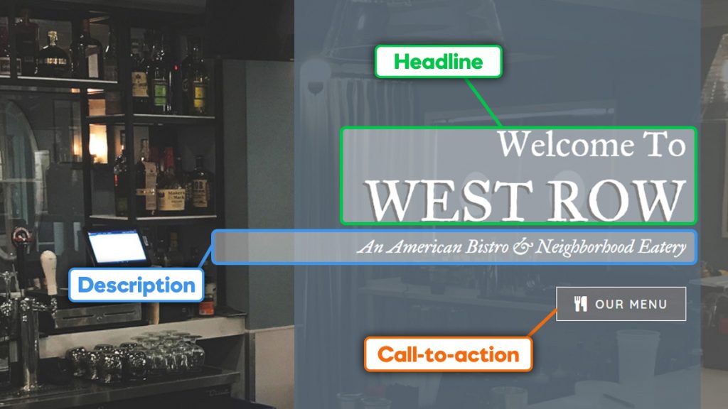
Headline - A well-written USP
A unique selling proposition (USP, also seen as unique selling point/value proposition) is a factor that differentiates a product from its competitors.
USP Definition | How to Find the USPDescription - Some brief "explainer" copy
It elaborates upon the headline and explains what the product does. In turn, this should raise the interest level of visitors and encourage them to keep exploring the website further.
Finding Content for The DescriptionCall-to-Action
It should be understood as being part of an ‘action phase’ following an introductory phase, or even an entire campaign.
Making Effective CTAs | Gathering Content for CTAs
One of the worst things a website can do is present a “False bottom” to the page.
This is where a site has further information that requires scrolling, but its existence is not apparent to the visitor. This is the worst of all worlds.
A fold need not be an obstacle, it should flow naturally and draw the visitor in.
Source: QuickSprout - above the fold | See More: Attention-Grabbing Homepages - crazyegg
Effective Calls-To-Action
Should They Go Above Or Below The Fold?
Where to put the calls-to-action depends on several factors, most consequentially:

Certain visitors
likely to react to the call to action, made up mind
Certain visitors have largely made their mind up before visiting the site. This is where known brands have an advantage, as there is little for the “certain visitor” to learn about a product or service. In these cases, placing a call to action above the fold is only a matter of convenience.

Uncertain visitors
familiar with the product / the proposition is simple
For uncertain visitors that understand the call to action simply or that have some knowledge of the product or service, placing the call to action above the fold is generally best practice for convenience along with informative content to better help them make up their mind.

Uncertain visitors
that are presented with a complex proposition
For uncertain visitors that are presented with a complex proposition, such as a product or service that isn’t obviously beneficial to them, placing the call to action above the fold will not suffice. A more in-depth explanation of why your CTA should be acted upon is required.
The call to action should be placed in a position whereby the visitor will be most persuaded to act upon it. Your visitors click on a CTA in response to the right mix of three elements:
(past)
What your visitors have learned about you
(present)
What your visitors feel as they browse
(future)
What your visitors expect after they click
How to Create an Effective Call-To-Action
A call-to-action isn’t one single button, introduced without any introduction to your visitors. A good call-to-action should be considered a culmination of sorts. It should be understood as being part of an ‘action phase’ following an introductory phase, or even an entire campaign. There are certain tips and best practices for creating effective CTAs that are sure to boost your conversion rates.
- Visual
Absolutely essential, your visuals need to be attractive. You should also avoid images that are too ‘salesy’ and go for ones that are more personal or original, and even opt for a video format, which often leads to a higher CTR.
- Wording
Keep it short – around 5 words is ideal. The value proposition needs to be short, sweet and convincing. Obviously, adapt the message to the audience you’re targeting.
- Action
Using action verbs and creating a sense of urgency are two widely used techniques that allow you to increase conversions. By highlighting the time-limited or exceptional nature of an offer, you up the pressure on your audience.
- Placement
The placement of your CTA should feel natural, and it should appear naturally in the context of the rest of the page. You should, therefore, avoid putting it in illogical places where it won’t be seen.
- Colors
To create the highest level of impact, it’s recommended to design your CTA in a different color than the rest of the page. This having been said, you should make sure the color doesn’t clash with the rest of the page, either.
- Size
It should be visible enough that it doesn’t get overlooked (so don’t be ashamed to show it!) but it shouldn’t be so big that it distracts from the content of the rest of the page. Your visitors are there for a reason, so you shouldn’t get in the way of their browsing or reading.
- Understanding
Your value proposition should be clear and easy to understand. Clearly explain the benefits your visitors will gain by clicking on the link.
- Note:
The placement and button color of your call-to-action buttons is just as important as the message. Many people have found that placing an opt-in box on the bottom of the copy works best, while other marketers get more conversions when the button is placed at the right of the opt-in field. And the button color often works best contrasting the main color theme of the page. (Source: NeilPatel - How to Create the Perfect CTA)
Examples
Check out these well-known sites and the notable factors contributing to their successful CTA:
1. Squarespace

2. Udemy

3. AdEspresso

Click to see other examples of top fold content on commonly recognizable and modern sites
Table of Contents
Add a header to begin generating the table of contents
Next Steps
Now that you know what goes above the fold, learn how to place content in each area using the answers from the design intake tool.