
Using CSS
CSS (Cascading Style Sheets) is a sheet containing formatting rules used to style the design and layout of HTML content on a web page. Considering that the interface we work in, Beaver Builder, gives us plenty of styling opportunity using little to no CSS, its our goal to minimize the use of CSS to only when its absolutely necessary. Too much CSS can also contribute to slowing site loading speeds and we should try to avoid it if possible. Learn about the best practices for using CSS vs built in module styling features, how to write it properly and where to put it.
Coding Standards
Create Code that is Meaningful, Consistent & Readable
1. Keep your code organized (CSS Structure)
The use of our CSS template is required
This top to bottom > sitewide > page specific > module specific > mobile approach keeps things organized, and easier to find for future updates (see accordion below)
It helps if you think of your CSS as a house. It makes no sense to add a textured wall before adding a roof. Some classes are already added to the template, but you don’t have to use them, unless you feel it’s needed.Consistent Indentation
Use tab, not spaces, to indent each property.
Spacing & Clarity
Add two blank lines between sections and one blank line between blocks in a section.
Readability
Write each selector on its own line, ending in either a comma or an opening curly brace. Include one space between the selector and the opening brace. Property-value pairs should be on their own line, with one tab of indentation and an ending semicolon. The closing brace should be flush left, using the same level of indentation as the opening selector.
Use dashes in class names
Don’t use under_scores or “camelCase” to name classes or IDs.
Write hex values in lowercase
#fff vs #FFFFFF
Shorthand Properties
If you have several properties that are alike, group them in an order that makes sense, and use shorthand properties whenever possible.
Instead of:
border-width: 1px;
border-style: solid;
border-color: black;
Use:
border: 1px solid black;Enclose URLs in single quotes
url('/image.png') vs url("/image.png")
Don’t use units for zero (0) values
except for angles (deg) and time (s or ms)
margin-right: 0; vs margin-right: 0px;
Don’t use IDs and overly-specific selectors to style
Only use these when absolutely necessary (e.g. form controls or page anchors).
Do not place media queries outside of the designated areas within the template
but comment the related area as having media queries, as delineated in the suggested template.
Organize the code within the template from top to bottom
do not dump styles at the end of the CSS, and notate sections/pages appropriately.

(4) DO:
(4) DON'T:
DO:
2. Notate appropriately
Comment liberally. If the code doesn’t explain itself, explain it with detailed comments. Examples are uses of z-index or browser-specific hacks/fixes.
3. Name your classes and IDs in a meaningful or generic way
Read more about properly naming elements and classes in the "Styling with CSS" section below.
Be careful of creating classes that already exist.
4. Don't write CSS for things you can style in the builder or Customizer
- Only write CSS for things that cannot be accomplished through Beaver Builder or through the customizer. Things like font styles, width, margins, and padding can all be accomplished without CSS.
- Before writing CSS, make sure that there are no modules that can achieve the look you are going for, as many times there are at least two variations of the same type of module, due to the fact that our plugin package includes two premium add-ons (Ultimate Add-ons and PowerPack). In the event that the styling/function doesn’t exist on one of them, it probably exists within the other.
- The vast majority of new websites built with GD Core do not need ANY CSS.
- When you write code referencing a module (especially if you mark it !important, which you shouldn’t), you are overwriting the module settings. So what happens is that when you go into the actual Beaver Builder to edit that module, the changes you are trying to apply, just won't, because the code is overwriting it. That makes the customer experience very frustrating and also our work when updating, more complicated than it should.
5. Do not target Beaver Builder auto generated classes/IDs
(any class/ID that starts with .fl-)
If you look at Beaver Builder HTML outputs, you see a lot of class names that start with "fl-". Those classes are generated by Beaver Builder theme and plugin. Some of them have names that make sense (like .fl-page-content, for example), but a lot of them will have a sequence of numbers that are not easily identifiable. You should not target those classes in your CSS, but create custom classes instead, and target those. Always keep in mind the guidelines on how to name classes (read more about properly naming elements and classes in the section below), so you don’t run the risk of creating a class that already exist, or that can easily become obsolete throughout the life of the website.
Examples of bad CSS
This is a classic example of bad CSS. Let’s go through it to see why:


Source: Beaver Builder KB - Theme CSS Reference
CSS Template
CSS Template For Beaver Builder Sites - MUST USE - Place in Customizer > Additional CSS Tab
Styling With CSS
Follow This Order of Operation
First, Use the Customizer
Use the customizer to style your headings, body text, buttons, accent colors, and anything you can define for defaults being used across the theme. Reference: Customizer > Style Controls
Next, Style the Module
Once in Beaver Builder, use modules to style any items that aren't defined in customizer defaults such as module specific styling, font sizes in callouts, background images and row separators for CTA rows dividing page content, etc. Give the modules and rows you're styling classes especially if you're using them in different places across the site or if there are styling items that the module itself doesn't give you an option to modify. Reference: Beaver Builder Practices > Saving Templates Important Rules
Finally, Use CSS
Use CSS to target the custom classes of those modules that didn't give you the specific modification options you were looking for. Use CSS after the site is built and you need to perhaps change all styled dual Heading H3 modules from a light green to a dark teal color per the customer's request by targeting the custom class you assigned this module before saving it and using it on every page.
How to Style
Use the information below to learn how custom CSS class names or IDs should be assigned to modules.
Add a CSS ID or Class Name to a Module
You can enter a custom ID or class name for any row, column, or module, and that name can be used as a selector in any custom CSS rules that you write.
To assign a custom CSS ID or class value to a row, column, or module:
About the ID selector
An ID selector must be unique, meaning it should only be used for only one element (meaning a row, column, or module).
IDs are used for two purposes:
- To write custom CSS rules that apply to a single element.
- To create an anchor so you can link to that element, for purposes such as scrolling down a page to a particular spot. (See the Related reference Article below for instructions on how to do that.)
Here are the rules for ID selectors:
- They must start with a letter
- They cannot contain spaces
- The only characters they can use are letters, numbers, dashes, or underscores
The symbol used to refer to an ID selector in a CSS rule is the pound sign (#). For example, if you assign an ID named my-element to a module, you can target that ID by writing a CSS rule for #my-element.
The following rule says that the element with the ID "my-element" must be right-aligned:
Note: You should use the pound sign to name IDs in your CSS rule, but you should not use the pound symbol when you assign the ID name to the row, column, or module.
About the class selector
The same class selector can be used with as many elements as you want your CSS rule to apply to.
A class selector has the same constraints as IDs in terms of the letters, numbers, and symbols it can contain.
Suppose you have several modules that you want to center on the page. Assign the same class name, my-elements, to each of the modules.
The CSS symbol to refer to a class is a period (.), so your CSS rule would look like this:
Note: Keep in mind that classes in the CSS rule should start with a period, but the value you enter into the CSS setting for an element should not include the period.
Source: Beaver Builder KB - Add a CSS ID or class name to a module
Examples
Use the information below to learn how we can use custom class names/IDs to target modules and determine the correct amount of specificity to apply.
Specificity
When giving custom styled modules - especially ones you want to continue to use across the site - a custom class, its probably because you want to be able to make a simple change with CSS later on, to avoid having to adjust the styling in every single instance of the module across the site. In the case that we want to make a change to one module in particular that has been used once across the site, using CSS wont be necessary because you will be able to alter the module's styling in the builder within the single instance of its use...unless the style change you want to make doesn't exist as a modifiable property of the module's style tab.
Follow the below sequence to best style all instances of a module type using the custom CSS class assigned:
Custom class name given to module > class name of the section of module > class name of the item within the module you want to target
Task
"Target all H4 headings used across the site that are currently green, and make them blue."
- Custom class name given to module:
.green-heading - Module type: PowerPack Smart Headings
- Class name belonging to component within the module you want to make changes to:
span.title-text.pp-primary-title


Solution:
Our goal is to use the least amount of specificity necessary to reflect the change, while still specifically targeting all H4 headings in modules given the custom class .green-heading, without using !important and without manually changing the style in every single instance of the module site-wide.
Solution:
CSS Placement
If CSS Could Play Hide & Seek...
Learn about the different places you can put custom styling when building a site... but where should you put it?
Note: The only place you should put any custom CSS you write during a build is in #3 The Customizer's Additional CSS Panel. If for some reason, you want to put CSS in another area discussed under #1 or #2, put a commented out note in the customizer telling the next builder where the CSS for that item can be found. It's still important to learn about the other areas you can put CSS in case there is a reason you encounter needing to use it or if you are troubleshooting a site, looking in all the places CSS could be put.
Restrict Custom CSS to a Single Beaver Builder Page
This procedure applies if you only want your CSS to apply to the content layout on a single Page Builder page. For example, suppose you have a contact form and know that you only want your custom CSS to apply to that form on that single page.
1. Set CSS Using Beaver Builder (for full PAGE Content Only)
You can add site-wide rules right in your Page Builder editing screen. The rules will apply to the content area of every page, whether or not the page or post is built with Page Builder. Don't use this location for rules that apply to areas controlled by your theme, such as header, footer, and sidebar. This method is very handy when you're adding custom ID or class selector names to individual rows, columns, or modules on a page, because you don't have to leave the page to add the rule and they still apply site-wide, and you can see the site-wide rules from any Page Builder editing page. On the other hand, you might prefer to keep all your rules in a single place so you can find them easily later. In that case, you one of the other methods below.
To add CSS and restrict it to a single Page Builder page or saved row/module/template:

Tools Menu > Layout CSS & JavaScript
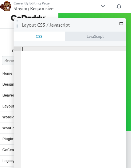
CSS tab > Enter your CSS
In GD Core, the saved templates for headers 1-8 for WooCommerce for example, have some template specific CSS in this area. These styles may apply to the cart module and search bar and there may be one fixing the of the positioning of WooCommerce notices when using a checkout page built with beaver builder.
Any pre-loaded header templates that have CSS in them can be found in this area when editing the header using Beaver Builder. If you want to remove this template-specific CSS once you select a header that has some, you can, but if you want to modify it, its recommended to cut it from this area and paste it in the Additional CSS panel of the customizer with your changes and a comment to specify what you changed.
Note: There is no good reason to use this area to put any CSS - use the customizer instead.
If for some reason, you want to put CSS here, put a commented out note in the customizer telling the next builder where the CSS for this region can be found.
Apply Custom CSS Site-Wide
2. Using Beaver Builder (for ALL Content regardless of what it was built with)
This code will now appear in Tools > Global Settings on any Page Builder page, but the CSS rules will apply to all content areas of your site, whether or not they were built with Page Builder.
Note: There is no good reason to use this area to put any CSS - use the customizer instead.
There is really no point to use this area at all considering the customizer is already technically considered site-wide and global.
If for some reason, you still want to put CSS here, put a commented out note in the customizer telling the next builder where the CSS for this region can be found.
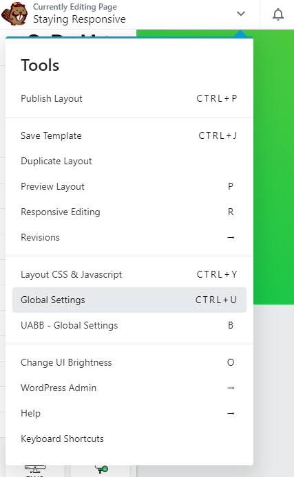
Tools menu > Global Settings
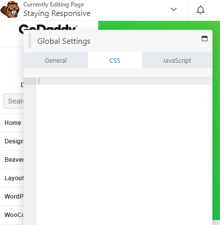
Global Settings > CSS Tab
3. Using The Customizer (Appearance > Customize > Additional CSS Tab)
This method applies the CSS code everywhere on your site: Page Builder and non-Page Builder content areas and any theme.
Note: USE THIS METHOD - All CSS you write during a new build should go here and this is where you should expect to find any custom styling.
In the rare event that you use some other place for custom CSS in your build, use this area to add a comment telling the next builder where they can find the custom CSS that you didn't include here and why you put it somewhere else.
The CSS you enter at Customize > Additional CSS is stored in the database. If a custom CSS rule contains a url attribute, the relative path to a file in your WordPress installation may need to change. In most cases, if you are pointing to any directory within the wp-content directory, the relative path should start with wp-content as seen here:

See Image Path:
Source: Beaver Builder KB - Where to put custom CSS code
Table of Contents
Add a header to begin generating the table of contents