
Using Animations
Animations help draw attention to specific elements like contact forms or buttons. They also add ‘life’ to the site, taking a flat, motionless page and adding movement and depth. When animating an element it is also a good to add a box shadow or a drop shadow which helps the element stand out more and adds another level of depth to the element. Learn the best practices for using animations - when to use them/how often, where to find them in beaver builder and how to custom code them if needed.
Animation Practices
When to Animate
Great animations add a layer of enjoyment and engagement to your projects for your users. You can animate pretty much anything you like, whether that’s widths, heights, positions, colors, or backgrounds, but you need to be aware of potential performance bottlenecks and how animations affect the personality of your application. Stuttering or poorly chosen animations can negatively affect user experience.
- Use animations as a way to add life to your projects
Don’t just animate something because you can; it just annoys users and feels obstructive. Instead, use strategically placed animations to reinforce the user interactions. If they tap the menu icon, swipe to reveal a navigation drawer, or tap a button, use perhaps a subtle glow or bounce to acknowledge the interaction.
- Be careful which properties you animate; some are more expensive than others
Avoid animations that interrupt or obstruct the user's activity unnecessarily. The only thing worse than animations that are poorly placed are those that cause the page to stutter. This type of animation leaves users feeling frustrated and unhappy, and likely wishing you didn't animate things at all.
- What are "expensive" properties?
Some properties are more expensive to change than others, and are therefore more likely to make things stutter. So, for example, changing the
box-shadowof an element requires a much more expensive paint operation than changing, say, its text color. Similarly, changing thewidthof an element is likely to be more expensive than changing itstransform.
Its probably a good idea, if you're going to animate anything, that you wait until the site design is complete and ready to send out, to avoid low site speed/performance caused by any animations while you're still working on the build.
Source: Google Dev Design & User Experience - Animations Overview
When Not to Animate
Having too many animations can hurt the design of the site. When you have a lot of elements moving around it can be disorienting causing visitors to ‘panic’ or become agitated. These animations also add to the load time (slightly, but they add up). Drastic animations are also not the best because long transitions, animation distances, and intensity of the animation (ie. Animating a button to ‘shake’ and the animation is either too long or exaggerated).
The animation should also echo the design of the site. If the site is ‘smooth’ or ‘soft’ the animations should align with that design.
Less is more.
Beaver Builder Animation
You can animate any row, column, or module when it becomes visible for the first time on a page using Beaver Builder.
To animate a row, column, or module:
Select module
Open the row, column, or module for editing by clicking the wrench icon.
Go to "advanced"
Click the Advanced tab and scroll to the Animation section.
Apply "delay" time
Specify a time delay in seconds for the animation to begin. Decimals are allowed.
Tip: During the delay period the item will not display, so don't set the delay time so long that your visitors scroll past the item without seeing it.
Note: Animations aren’t currently supported on iOS devices.

Advanced Tab
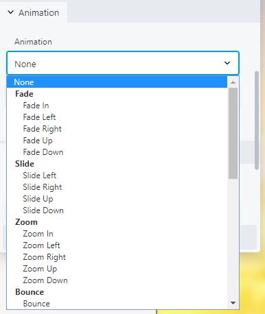
Animation Drop-down
Select Animation
Source: Beaver Builder Knowledgebase - Animations
Types of Animation
- Fade
the element will start out transparent but become opaque
- Slide
the element will originate from a fixed position to is landing spot
- Zoom
the element will start small then grow to it’s natural size, this uses scale to change from 0 to 1
- Bounce
the element will start from it’s landing spot and bounce in the direction selected back to it’s landing spot
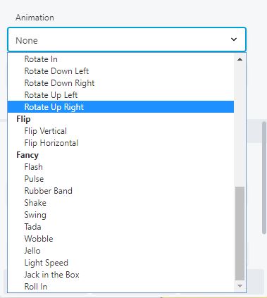
- Rotate
the element will start from a fixed rotation angle then rotate to it’s landing position
- Flip
the element will either flip from top to bottom or from left to right
- Fancy
these animations vary, but they are usually combinations of other animations to give the desired effect
What Is Delay?
Using a delay to animate an element is a good way to draw attention to it after the page has loaded. An important thing to remember is that the animation will not start on an element until it is in the viewport (window).
Elements further down the page do not need to be delayed based on other elements already in the viewport. The animated element must reach 20% from the bottom of the screen to begin the animation. So, if you have a heading below the hero image that should be visible on page load but isn’t showing until you scroll down further it would either need to be moved up higher or the animation shouldn’t be applied to that element because it can give the appearance of missing content.
Duration
This is how long the animation will take from start to finish.
Times that are divisible by 3 tend to have a more natural flow. Starting at .3s then increasing from there will allow enough time for the animation to occur without animating too quickly and not being seen. You also don’t want the animation to take too long because it can appear like something is wrong with the site or the customer might think their connection is acting up causing them to leave the site or restart their machine.
Custom CSS & Scripts
Using CSS
You can also use CSS to animate elements. By adding ‘fl-animation fl-[slide-in-left] fl-animated’ where [slide-in-left] is the animation name. You can add an ID to the same module so that you can target the element in CSS and add any kind of delay or animation timing to it. Adding animation in this way allows you to have more control over the animations by using javascript or jQuery to add the class to the element after an event like a button click or a form submission. You can also change the animation easing function (ie ease-in-out, linear, ease…)
Page Navigation Animations
Creating buttons in html and including an ‘onclick’ function is an easy way to reverse an animation to elements when navigating to another page. By adding a class to an already animated element, then telling that class in CSS to ‘reverse’ the animation you can make elements appear to leave or disappear from the page. Depending on the site visitors’ connection speed they may or may not see these animations if the internal page they are navigating to loads before the animation can complete.
Using an ‘onclick’ function is also another way to animate an element on a page after the visitor completes a task (ie the visitor fills out a form and you want to draw attention to a CTA or a row of products). You can also include an anchor link to that element on the page so that once clicked the page scrolls to that element and it animates.
Onclick function
The CSS class to add to the element is structured like this:
fl-animation fl-bounce fl-animated
where ‘fl-bounce’ is the animation name, this can be changed to any of the listed animations available to that version (ie ‘fl-fade-in’, ‘fl-bounce-up’, ‘fl-fancy-pulse’). The classes of ‘fl-animation’ and ‘fl-bounce’ can be pre-added to the element in the ‘Advanced’ tab so that the only class that needs to be added to the element is ‘fl-animated’ which makes the function easier to write and can be globally applied using very little javascript or jQuery.
You can also leave out the animation name ‘fl-bounce’ and have that added along with the ‘fl-animated’ class so that one button might make the element shake while another makes it fade in. These differences can be used to influence the user’s feelings depending on their selections.
See Below
Animations Per Platform
V1 –
In V1 sites the animations are limited to adding a class or an ID to an element then writing the animation in CSS using either a transition with timing or keyframes using set timing.
See Below
V2 –
In V2 sites there we started using Beaver Builder with built-in animation options including animating columns not just modules. If an animation is not available in the drop down it can be added the same way as in a V1 site.
V3 –
In V3 sites the options for animating was expanded to rows. There are also several more animations available along with delay and animation duration.
Table of Contents
Add a header to begin generating the table of contents