Color Palettes
Choosing a good color palette is essential to building a brand.
Color Theory
The Psychology of Color
Red
Represents passion, energy, urgency, excitement, vibrancy & danger - Often used to create urgency for people to buy. Effective in triggering strong emotional reactions. Restaurants use it to stimulate appetite.
Pink
Represents feminine, sweetness, innocence, fertility & romance - Often used to market services and products to women and young girls.
Orange
Represents friendliness, enthusiasm & creativity - Promotes people to take action: Buy & Subscribe. Orange attracts impulse shoppers.
Yellow
Represents youthfulness, optimism & cheerfulness - Often used to grab the attention of the audience. Yellow can put strain on the eye, so you want to use it sparingly.
Green
Represents wealth, health, tranquility, and nature - The easiest color for the eye to process, so it has relaxation effects. Green is the second most preferred color by both men and women.
Blue
Represents trust, security, stablility, peace, and calmness - Often used in businesses and banks to create sense of security & trust in the brand. Blue is the No.1 preferred color by both men & women.
Purple
Represents royalty, wealth, success & wisdom - Often used in beauty or anti-aging products. Purple has a soothing and calming effect on people.
Gray
Represents neutral, simplicity, calm, futuristic & logic - It lacks emotion and is associated with technology, industry, precision, control, competence and even sophistication.
Black
Represents power, luxury, sophistication & elegance - Often used to market luxury brands to evoke professionalism, strength & precision.
Palettes & Packages
Learn how to create the right color palette for the customer based on what color theme they chose during the intake process, their logo, their site vertical, and the top industry standards.
The site verticals provide an overall color tone and background recommend as well as common primary and secondary colors. Each color is linked to a palette containing that color - these palettes don’t have to be used especially if the site has a logo or an already provided color scheme, however, they help in situations where there is no logo or where the color is to be chosen by the builder.
Feel free to use the generic color palettes created and shown on the Styleguide Color Palettes Archive or create one using logo colors or recommended colors based on the site vertical. (mycolor.space | coolors.co)
Basic Color Rules
- Only use bright colors as accents or for overlays where appropriate
- If colors can look better in a darker/lighter shade, use colorhexa and pull another shade that works
- Avoid bright colors for solid row backgrounds and for use in large layout components
- If the customer chooses a light or dark color theme, make either white or dark gray/black the neutral color for backgrounds and adjust the palette placements as needed.
Intake Tool Scenarios
If "Compliment Logo" Selected
- Use subtle colors from logo in layout
For bright colors in logo, use as site accent only - For logos with one color, use colorhexa and pull another shade of that color for the second accent
- You can also create your own color palettes for the site based on the logo or colors requested. Here are some tools to do so:
- Place logo primary color here https://mycolor.space/ to generate a palette
Or use https://coolors.co/ - this one is the most comprehensive tool
- Place logo primary color here https://mycolor.space/ to generate a palette
If "Choose For Me" Is Selected OR If Black/White Logo
- In the case that the color is to be chosen by the builder, a palette can be chosen from the available options that either contain the primary or secondary colors or a palette can be chosen that is labeled "generic."
- You can also create your own color palettes for the site based on the logo or colors requested. Here are some tools to do so:
- Place logo primary color here https://mycolor.space/ to generate a palette
Or use https://coolors.co/ - this one is the most comprehensive tool
- Place logo primary color here https://mycolor.space/ to generate a palette
If "Custom Color" Is Selected
- Use colors chosen by customer
- If colors chosen by customer are an obnoxious combination, use colorhexa and pull another shade of those colors or of one of them that work better together or in general
- You can also create your own color palettes for the site based on the logo or colors requested. Here are some tools to do so:
- Place logo primary color here https://mycolor.space/ to generate a palette
Or use https://coolors.co/ - this one is the most comprehensive tool
- Place logo primary color here https://mycolor.space/ to generate a palette
Applying The Color Scheme - Which Colors Go Where/Why?
How do you go about applying the website color scheme?
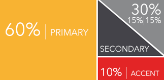
- Primary colors go to the “hot spots” on your web page. You should use these bold, vibrant colors to attract users’ attention and prompt them to take action. CTA buttons, headlines, benefits icons, download forms, and other important information should be highlighted using primary colors.
- Secondary colors are used to highlight the less important information on the website, such as secondary buttons, subheadings, active menu items, backgrounds, or supporting content like FAQs and testimonials.
- Neutral colors will most likely be used for text and background but could come in handy in particularly colorful sections of the site, just to help tone it down and refocus the eye.
Resources:
Industry Standards
Since we are working with websites, we will work with RGB/Hex colors. There are no industry standard specific colors, just common choices when it comes to certain industries. E.g. blue/green for healthcare, blue/white for technology, orange/black for construction.
The colors used depend on branding. If no brand is established, colors are generally used to help convey a certain look and feel such as friendly, aggressive, luxurious, etc. The feeling you want to convey can be further established by using an appropriate typeface/fonts.
Refer to the site vertical closest to the industry type to learn which colors are appropriate for the business.
Industry-standard color formats are as follows:
Web/Digital:
RGB Uses red, green, blue for colors used on screen/web/TV.
Hex: Uses six digit combination of letters/numbers. Short code for RGB.
RGB/Hex can achieve colors that appear neon/glowing, while CMYK/print colors are generally not able to produce colors as vibrant as RGB colors can.
Print:
PMS (Pantone) for color accuracy and matching colors. High-end print jobs. Matching colors on different collateral/materials for branding.
CMYK for full color print jobs. Uses 4 colors.
Implementation
Using Dominant Color vs Accent Color
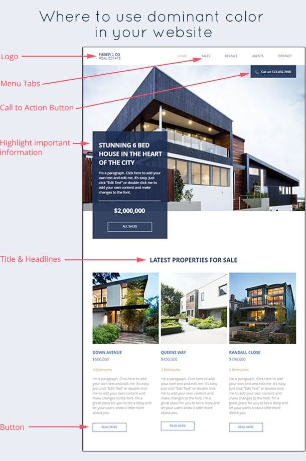
The colors used should be from your branding. This includes the logo, website, and all other materials used for the business. Use your dominant color in a limited number of places where you want your website visitors to pay attention to, or if you want your visitors to take certain actions. It can be used for certain sections as well depending on the color combination used. We do not want colors to be overwhelming nor make things hard to see, so using a yellow background with white text, for example, is a bad idea.
It is pretty boring to have just one color throughout your entire website.
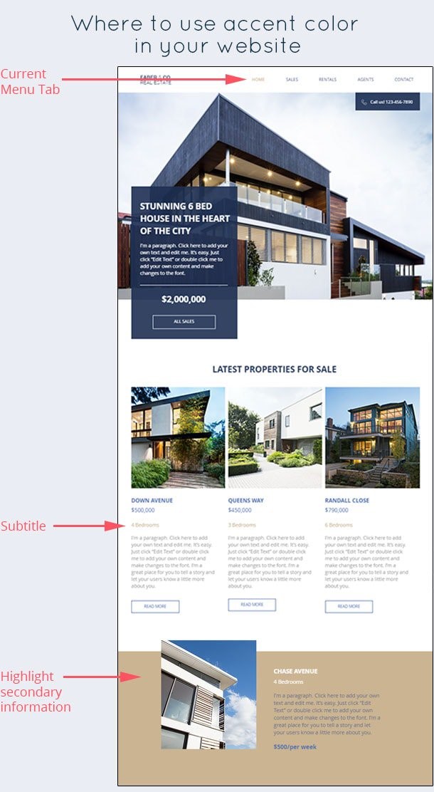
The accent color shouldn’t be the main focal points of your page, but they can help make other elements stand out, such as secondary buttons, underlines, sub-headings, etc.
Image source: websitebuilderexpert.com/designing-websites/how-to-choose-color-for-your-websites
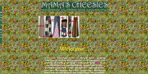
BAD COLOR COMBINATIONS
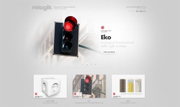
Never choose a background that makes your text or content hard to read. Avoid color combinations that strain the eye or cause a “vibrating” effect. Make sure the text and background have enough contrast so that it is easily readable. Too many colors will make things look too busy and unprofessional.
More to read on bad color combinations: https://designwebkit.com/web-and-trends/color-combinations-hell-death-sentence-designs/


