
Typography
Learn about the fonts available for use from google, best ways to pair fonts aesthetically, examples of such font pairings being put to use and the industry standards of font choice for web design. Read the "Font Selection - Important Rules" section to learn about the do's and don’ts of the typography world and how to use the font options we offer in the best possible way.
Using the font options archive
The site verticals provide an overall font type recommendation and font categories that apply to headings/subheadings, body text and navigation menu links. (Google Fonts | Styleguide Font Options Archive)
Basic Rules for choosing a font:
- Feel free to choose any Google Font that falls under the appearance of the available categories for each site vertical - If you choose a Google font that isn't listed on styleguide and that falls within an applicable category, that's okay - just make sure you notate it
- If the customer has a logo with text, try to find a font similar to the logo text instead
- Don't use fancy or illegible fonts for important content like main headings or body text, use them as accents only (see example)
Example: Mix-Matching Font Categories
Each font category is linked to an archive with different options in each.
These categories can be mixed and matched if needed, e.g. for the site vertical "Corporate/Professional Services" the H1 could be a bold serif, the subheadings could be circular geometric sans and the body and nav could also be circular geometric sans OR the H1 could be bold fancy serif, the subheadings could be condensed sans, and the body and nav could be standard sans.
Example: Logo Uses Fancy Fonts
In the case that the main text on the logo is using some sort of fancy font, you can use this font as an accent. Don't use this font for all headings or subheadings, only use it as an accent in the hero areas or in applicable CTA rows or places on the site where it makes sense. For all headings use a different legible font from the categories by site vertical that compliments this fancy font.
Font Pairing
The best way to combine fonts or pair them together is to choose fonts that are similar but also contrast. The similarities shared between paired fonts can be that the characters have similar x-heights, character widths, or that the fonts are variants from the same family. Healthy contrasts for pairing can be in the font weight, case, and presence of serifs.
Below are some contrasting font combinations that work together:
Lorem ipsum
Lorem ipsum dolor sit amet, consectetur adipiscing elit. Sed pellentesque eu nulla eget accumsan. Integer iaculis augue at ex bibendum, quis sodales sem tincidunt.
Title: Eczar
Body: Work Sans
Lorem ipsum
Lorem ipsum dolor sit amet, consectetur adipiscing elit. Sed pellentesque eu nulla eget accumsan. Integer iaculis augue at ex bibendum, quis sodales sem tincidunt.
Title: Archive Black
Body: Georgia
Lorem ipsum
Lorem ipsum dolor sit amet, consectetur adipiscing elit. Sed pellentesque eu nulla eget accumsan. Integer iaculis augue at ex bibendum, quis sodales sem tincidunt.
Title: Rubik
Body: Roboto Mono
Lorem ipsum
Lorem ipsum dolor sit amet, consectetur adipiscing elit. Sed pellentesque eu nulla eget accumsan. Integer iaculis augue at ex bibendum, quis sodales sem tincidunt.
Title: Pathway Gothic One
Body: Dosis
Lorem ipsum
Lorem ipsum dolor sit amet, consectetur adipiscing elit. Sed pellentesque eu nulla eget accumsan. Integer iaculis augue at ex bibendum, quis sodales sem tincidunt.
Title: Exo
Body: Saira Semi Condensed
Lorem ipsum
Lorem ipsum dolor sit amet, consectetur adipiscing elit. Sed pellentesque eu nulla eget accumsan. Integer iaculis augue at ex bibendum, quis sodales sem tincidunt.
Title: Denk One
Body: Roboto Condensed
Industry Standards & Current Trends
Below are a couple selected trends in modern-day web design that are important to point out. There's no limit to using "Minimal Sans Serif" fonts, however, the 3 trends below it are better suited to being used in hero sections or call-to-action rows.
Go Bold or Go Home
The number of things vying for our attention keeps growing every year. Amidst all the social media notifications, emails, and subscription offers, it can get extremely hard for Internet users to pay attention to websites.
That is why bold and brash typography is on the rise. Making a strong impression as soon as users land on the website is the name of the game that many brands, advertisers, and web designers are playing this year. Bold fonts (also described as ‘loud’ fonts) have an “in your face” effect on users.
Brutalism
Brutalism is a typography style that is typified by the use of bold, geometric fonts, with sharp contrasts.
When brutalism is used correctly in web design, it conveys a sense of strength and urgency.
Brutalist fonts are more ‘in your face’ than standard bold typefaces.
They add a sense of visual tension to the readers’ experience.
Highlighted Text
Your website has less than a second to create an impression on the average Internet user. From this fact, we can assume that most Internet users ‘skim’ through websites instead of exploring them in depth. That’s why the typography trend of using highlighted text is rising in popularity.
Font Selection !important Rules
Font Don'ts
Please refrain from making the following choices in font design:
1. Don’t use tacky fonts
It might be something you want to use on your kid’s birthday party invitation, but tacky and funky fonts have no place on any websites that want to be taken seriously.
-

- Tacky Font Design
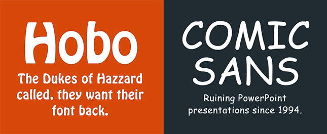
-
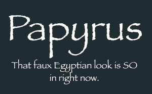
- Tacky / Messy Font
2. Don’t use messy fonts that are hard to read
Picking a font design for your main content is very different than choosing a font for your title / headline / logo. The purpose of your website content is to deliver useful information about your product or service offerings to your readers. So readability is very important here. Don’t complicate things with stylized font designs that can be hard to read.
3. Not giving your lines enough space
One of the easiest ways to make your content easier to read is to add enough spacing between each line. The magic number of a perfect line-height is 150% of the font size you are using (1.5 em).
4. Don’t use too many different font designs
Less is always more when it come to design. You want to keep the number of font designs on your website to no more than 4. Too many styles of fonts can make your website look messy and unprofessional. People might have a hard time figuring out what are the important messages you are trying to communicate.
- 1 font style for Headline or Page Title
- 1 font style for Subtitles (optional – this is not a must. You can always use the same font style for your subtitle and body content. You can simply change the font size for the subtitle for it to stand out more)
- 1 font style for body content areas
- 1 font style for quotes
Font Do's
Best practices for choosing fonts and styling them:
Pick a font that actually matches your message or brand identity
There are 5 main types of personalities when it comes to font designs. Consider which personality you want to represent your website or business:
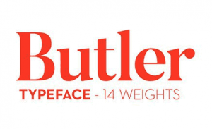
Font Personality #1) Traditional, Respectable, Comfort, Reliable:
If you want your website to represent this personality, the fonts you should consider should be designs that have been around for a very long time, such as Georgia, Trajan, and Times New Roman. These fonts have traditionally been used in prints like newspapers, magazines, and books. Since most people are very familiar with these classic font designs, they instantly give off the impressions of heritage, reliability, and trust.
Font Package Category: Industrial/Traditional font variant
Image Source: http://fabiandesmet.com/portfolio/butler-font/
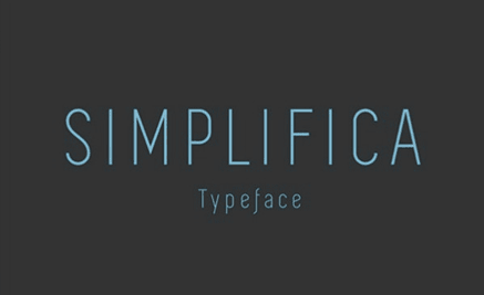
Font Personality #2) Contemporary, Modern, Minimalistic, Progressive:
These are fonts with very clean designs and has less handwriting qualities. They often have either very bold or very thin profiles. These designs tend to have less personality so they appear more modern. If you want your website to give off a more contemporary feel, then consider using this type of font design.
Font Package Category: Modern/Impact font variant
Image Source: http://freetypography.com/2014/03/24/free-font-simplifica/
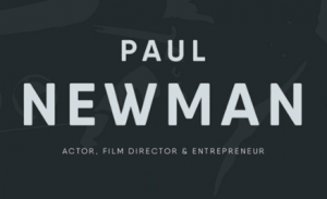
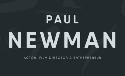
Font Personality #3) Strong, Stable, Defined:
These fonts are very bold and have a blocky design. The boldness of the font designs give the design substance and give off the impression of strength. If you want to make a statement or want to appear robust, this is the type of font you should use.
Font Package Category: Modern/Impact font variant
Image Source: https://www.tinkov.info/qanelas-soft.html
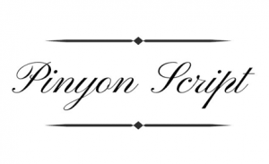
Font Personality #4) Romance, Elegance, Beauty, Vintage:
These are handwritten-type font designs with lots of curves. The curves are what give the designs a romantic and elegant feel. Not all handwritten font designs are romantic, they can also be quirky and free-spirited. The more italic and curvy the font design, the more vintage it will look. The rounder the font design, the more quirky and retro it will appear to be.
Font Package Category: Formal/Handwriting font variant
Image Source: https://www.ffonts.net/PinyonScript.font
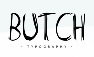
Font Personality #5) Themed Font Design:
These are font designs that don’t fall into any specific category because they are so stylized. They have various characteristics and so it’s hard to cover all of them. These font designs are handy if you want to create a unique brand identity. It will require more design skills to pick out the right design since all of them are very specialized.
Font Package Category: Edgy/Playful font variant
Image Source: https://befonts.com/butch-font.html
-
- Font Personality 1

-

- Font Personality 2
-
- Font Personality 3
-
- Font Personality 4

-
- Font Personality 5
-
- Font Versitility
Choose a font that is versatile
You will be using the same font(s) throughout your website, and your website could be viewed on different devices with different screen sizes. As such, you want the font design to look good regardless of its size, weight or style. When you are picking your font, ask yourself these questions:
- Does it look good in different weight like bold, italics or normal?
- Does it look good in various sizes?
Pick a font design that matches the type of audience or customer you want to attract
Ask yourself probing questions to identify the perfect audience or customers you want to attract. What is the ideal age group? What is the preferred gender? What profession is he/she in? Does he/she have more/less disposable income?
These sort of questions will help you understand who your brand is trying to attract. For example, if you have a trendy coffee house that has a retro and rustic feel, you might want to use a very contemporary and retro font design to attract design-oriented and younger coffee lovers.

Is the font design easily readable? Prioritize readability!
Don’t pick a super complex font design that’s challenging to read. I know this sounds like an obvious point, but I’ve seen random websites that try to get too fancy in its design to try to stand out. Never give up readability for design! If you can’t read the text with a quick glance, scrap it!
Whatever you design, make sure people can easily read your message. This means dark text on a dark background is a big no-no. Even worse, avoid using a small font over a high-contrast image. You can have a striking design, but all your efforts will go to waste if your text is unintelligible.
Limit your fonts
One of the common slipups designers - especially newbies - do is using too many fonts and styles. If you need more than one, make sure to limit your fonts to just two to three typefaces. Use one font and size for the body, another for the header, and another for the subhead. Don’t hesitate to choose fonts from different typeface families, as long as there is cohesiveness in the pairing. Working with two very similar fonts can translate as a mistake on your part. Some would think you’re not careful enough and accidently used the wrong font.
Practice correct alignment
Alignment is an imperative concept in typography. Many non-designers tend to choose between Center Aligned and Justified, which makes paragraphs quite hard to read. If you've used MS Word, you're already familiar with the four key alignment options: Left Aligned, Center Aligned, Right Aligned, and Justified.
Left alignment, aka Flushed Left, is the most common position used in practically everything because it’s easy on the eyes. Using right alignment, aka Flushed Right, to get text nicely arranged on one side only works if it the alignment is used properly. Justified is usually a nightmare for designers.
Implementation
When using fonts in a hero image or as the center of focus when arriving at a web page, pair the fonts to draw attention to the focus words representing the site or leading towards the defined call-to-action. Focus can be drawn from large differences in size, color contrast or by using two different fonts in sequence.
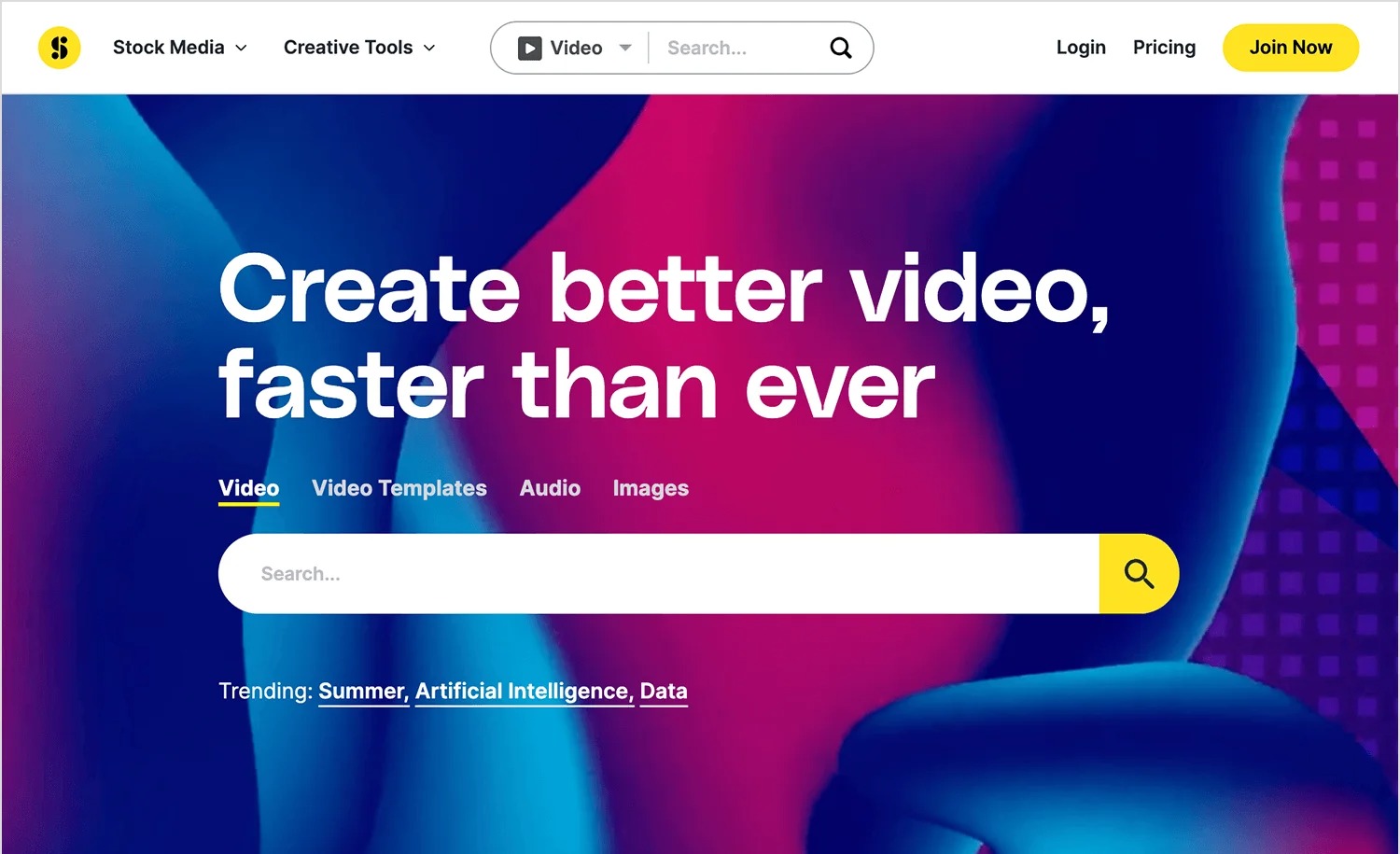
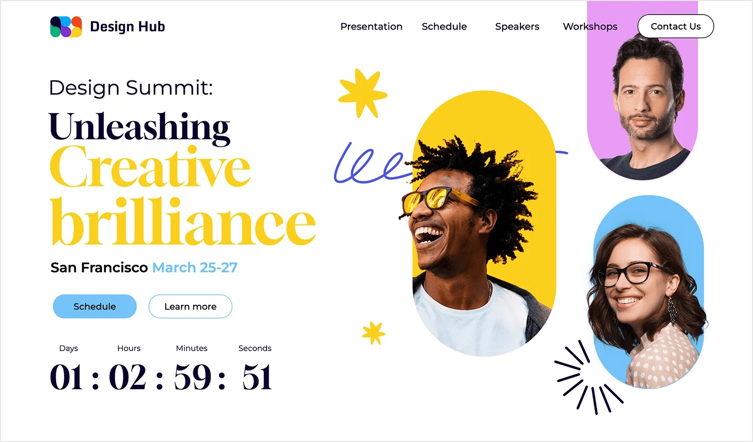
Table of Contents
Add a header to begin generating the table of contents