
Beyond The Fold - Includes
Learn about the importance of the "Below The Fold" area, the impact it has on visitors and the components you should include on a homepage below the fold to be found immediately after the site visitor chooses to stay on the site and scroll down below the top-fold. How to gather content for the bottom-fold area and ways to apply what you read below are covered in the next step Beyond The Fold - Layout.
What Is "Below The Fold"?
Below the fold refers to the section of a web page that is only visible after scrolling down. The digital marketing conventional wisdom is that above the fold content gets more attention, and is therefore more valuable than below the fold content.
Why it's Important
Site visitors will make a very simple, split second choice when they arrive on your home page – stay or leave. How you choose to lay out your home page will affect that decision — and will impact the fate of the business.
100% of site visitors will see the content Above-The-Fold, as it is the displayed on their computer screen right away. Statistically speaking, as you scroll down the page, the number of people who will continue to pay attention to the content will drop dramatically.
Visitors who will actually scroll down your home page to see more are those who are interested in what you have to offer after reading your headline and sub-headline (your Above-The-Fold content). Otherwise, they would have left your site already. So, the type of content you want to insert Below-The-Fold is to support your Above-The-Fold content (what you offer and how you can solve your customers’ problems).

Here are the 2 types of content you should display Below-The-Fold:
Secondary Content:
Content that is not important enough to make it Above-The-Fold, but is still crucial to convincing your visitors to become customers or loyal followers.
Additional Content:
These are the “nice-to-have” information, but are not critical in making your website effective for making a strong first impression.
Below-Fold Components
1. Secondary Content:
Content that is not important enough to make it Above-The-Fold, but is still crucial to convincing your visitors to become customers or loyal followers.
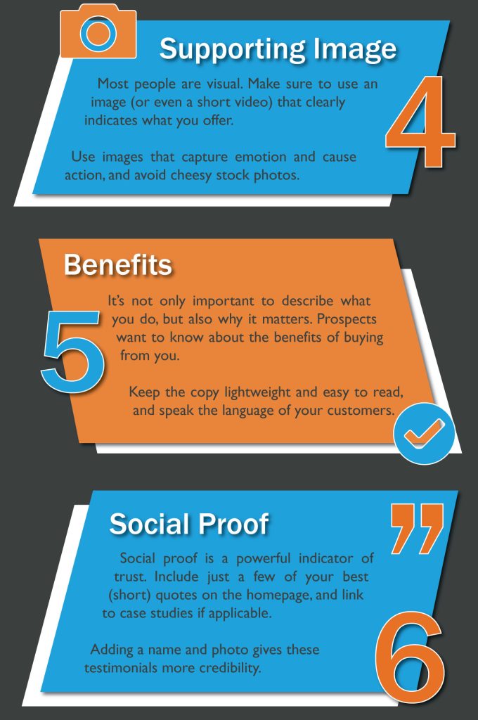
Benefits
It's not only important to describe what you do, but also why what you do matters. Prospects want to know about the benefits of buying from you because that's what'll compel them to stick around.
Pro Tip: Listing out features are only helpful after you convince your visitors that you can benefit them tremendously. Don’t unload a boring list of features on your visitors. Focus on communicating how your visitors can truly benefit from you.
Features (Services/Amenities/Products)
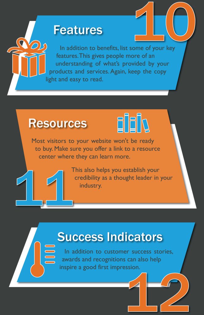
In addition to benefits, list some of your key features. Your value proposition and video may give customers a brief overview of what your company does, but it in terms of content, it is still important to include these features, products, or services on your homepage. This gives people more of an understanding of what's provided by your products and services. Again, keep the copy light and easy to ready. Having this information present on the page offers a bit more detail for prospects and also helps your page rank higher for those services in search engines.
Pro Tip: If you have a lot of features to list, instead of listing them all, pick the most important top few to insert into your home page. For the other features, create a separate, dedicated features page where your visitors can view the entire list of features there.

homepage critical elements infographic (4,5,6) - Hubspot
homepage critical elements infographic (10,11,12) - Hubspot
Trust & Success Indicators
The key is here is to positively associate your business with external parties and show that your business is operated by people, not robots. Trust indicators are very powerful to help bring your visitors one step closer to becoming customers — especially when they are close to crossing that line, but they just need a gentle nudge. Remember – people like to follow other people. So when they see others (just like them) do business with you, they are more likely to follow.
In addition to customer success stories, both awards and recognition can also help inspire a good first impression. Is your company a critically acclaimed restaurant? Were you voted best new app this year? Let your homepage visitors know of your accomplishments. Like social proof, it'll give your business more credibility to those who don't know you. See some examples of these in the column to the right.
- Social Proof
Social proof is a powerful indicator of trust. Your product or service could be the best in the world, and it's okay to lay that claim -- it's just that people may not believe you unless they hear it from other people, too. And that's exactly what social proof does. Include just a few of your best (short) quotes on the homepage, and link to case studies if applicable. Adding a name and photo gives these testimonials more credibility.
- Client Testimonials
Research shows that 79% of consumers trust online reviews and testimonials as personal recommendations from their friends or peers. So, if your company has positive reviews from your previous or current customers, capitalize on them! Let your potential customers know that you're not just boasting about accomplishments. Testimonials build trust and lets people know they can feel confident in choosing you -- you the social proof that shows it.
- Any Awards, Certifications, or Associations
Has your company received any awards or recognition lately? Don’t let those awards just collect dust in your office; put them on display! Industry recognition like this builds credibility, speaks to the quality of your work, and supports your image as an expert in your field and a trusted business partner. Like testimonials, awards, certifications, and associations prove that you're not just tooting your own horn; your work lives up to the hype!
2. Additional Content:
These are the “nice-to-have” information, but are not critical in making your website effective for making a strong first impression. For example, blog articles, company announcements, event schedules, industry updates, location map (if you are not in the restaurant business).
Secondary Calls-to-Action
What Is a Secondary CTA? A secondary CTA is a call-to-action that provides an alternative conversion opportunity or action to the primary action you ideally want visitors, prospects, or leads to take. Your secondary CTA is generally featured less prominently than your primary CTA, and it can be a great way to further engage and capture people who may not find the offer in your primary call-to-action appealing.
Include secondary CTAs on your homepage to offer additional conversion opportunities for prospects who aren't interested in your primary objective. Think of them like the contingency plan: They offer another path for visitors who are not yet ready for something as high-commitment as you're asking. While your primary CTAs should be above the fold, place secondary CTAs below the fold to give visitors things to click on when they scroll down.
Blog Highlights
Since your blog is the heart of your content strategy, encourage people to view and subscribe to it by highlighting it on your homepage. Your blog content shows your expertise and helpfulness and offers people a low-risk option to converting and starting a relationship with your brand. Consider adding a subscription box with a lead magnet or simply including a live feed of your most recent publications.
Content Offer
To generate even more leads from your homepage, feature a really great content offer, such as a whitepaper, ebook, or guide. Folks who may not be ready to buy might rather download an offer that gives them more information about a topic they're interested in.
Resources
Again, most visitors to your website won't be ready to buy ... yet. For folks who are looking for more information, offer a link to a resource center where they can browse relevant information. Not only does this keep them on your webpage for longer, but it also helps you establish your credibility as a thought leader in your industry.
Gallery - High-Quality and Original Images
Stock images are convenient, but they won't build credibility for your company or engage your audience especially if your objective is to showcase work of your own. The same can be said for low-resolution or small images. Using real photos of your team and office on your homepage paints a realistic portrait of what people can expect when working with you, while high-quality images show professionalism and attention to detail.
Sources: WordStream - Below The fold | Hubspot [Infographic] | Impact Bnd
Effective Layouts & Examples
A lot of the time in the design tool, along with the page content, you'll see something like "designer discretion on layout" in the additional notes field. Sometimes the design rep will ask you to use a certain module from the demo site or to replicate a certain layout from a visual reference. Sometimes there will be no guidance at all on how the content is to be laid out - use your discretion in this case too. This section will discuss how to determine whether the layout requested is suitable for the customer's content, and what to do when tasked with designer discretion and a lack of direction.
When Asked to Use a Specific Module
In this case, you must decide if it’s the right module to use for the task. Don't blatantly do what has been asked without assessing if it’s the best option.
A lot of the time, the design rep or the customer don't know the actual features of the module they like and whether or not it will work with the content they want to put in it. They usually just like how it looks or what interactive features it has, and there may be a better option out there for them that they just don't know about yet.
Should we use it?
Use the following points to determine whether or not the module they requested is the best option for the task at hand:

If the answers to any of the above questions are "no"
Use the following points to determine what to do next:
These are just a few of the questions you could ask yourself when faced with such a situation. If you decide there's a better module out there, use it instead to deliver a great first impression, and make sure you notate why you chose it over the one they asked for. If the module they asked for lacks the features or functionality they want, mention this in your notation so the design rep can relay this information to the customer and tell them how your choice better suits their site. This way, if the customer is adamant on using the module they originally requested, they'll be aware of the features it lacks and that they may have to modify their content to fit in it.
When Asked to Use Designer Discretion
If the design rep requested that you use designer discretion on layout, or if nothing was requested at all, use your best judgement to determine what modules to use and how to lay the content out.
- Don’t just paste the content in a textbox module and leave it as is
there are plenty of modules that give you a better, more modern and interactive way to place it on the page.
- Choose a module to use based on the page content
Make sure the module you choose is a good option for the content they have and won't be an obstacle for them to modify in the future.
- If images were provided, use them
if they weren't provided, find relevant stock images to use.
- When pasting content in a text editor
paste it void of source formatting - make sure there's no pre-existing inline styling (read the rules of pasting content)
- Consistency in branding styles
Make sure the module is styled to be consistent with the branding of the rest of the site (read the rules of maintaining branding consistency)
- When placing content to create a layout
make sure the spacing is consistent - the margins, padding and sizing are accurate (read more on layout consistency)

When Making styling choices for modules
Read through the rules for styling a module and follow the items from the checklist:
Save the styled module
Once you're happy with the module's styling, and the checklist pointers have been met, save the module for conistent reuse on other pages - reference the rules for naming when saving. Using the same styled module on each page allows little room for error. It also is far more time efficient, preventing you from having to restyle a module to match the branding every time you want to use it.
Layout Examples
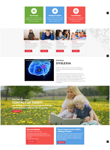
See the before and after screenshots of the site layouts below that were polished to drastically improve how the content was placed and to make best use of the content provided. The "before" images are examples of poorly laid out site content. The "after" images show how those layouts were redesigned using appropriate modules, consistency in branding, sizing and balanced spacing.
Before

After
| Before - Issues | After - Corrections |
|---|---|
| Strange use of the row separator and overlay covers the hero image's focus | Changed the hero image to a less busy one and included important info in the hero |
| None of their contact information was placed on the site | Added callouts with contact info that someone would look for right away |
| Not a good use of space and the logo grid looked unpolished | Better distributed content from top to bottom and moved the logos into a carousel |
Before
After
| Before - Issues | After - Corrections |
|---|---|
| Site was off balance with top row being light and minimalist and bottom row being crammed with color | Used their branding colors to even out the color scheme from top to bottom |
| Video was placed in a row with a dark background image and it clashed | Moved video to a light row and made sure to alternate rows with background images |
| Padding was inconsistent | Adjusted padding and spacing to allow the content to breathe |
| Call-to-Action row had an image that wasn't being properly utilized | Added spacing and reduced overlay to show the people's faces and make better use of the image |

Before
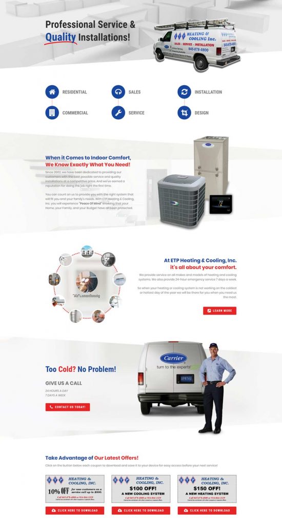
After
| Before - Issues | After - Corrections |
|---|---|
| Hero had dark overlay and text was placed on top of image of truck that has text on it | Replaced hero with a more overlay-friendly image and used .png of their van in an image separator with its text clearly visible |
| Improper use of row separators - no alternating dark and light rows | Alternated rows - very bright colors should be used as accents or overlays instead of being used solid in large spaces |
| Rows were poorly laid out with unequal padding and uneven distribution | Balanced the rows from top to bottom of the page with even padding and equal spacing |
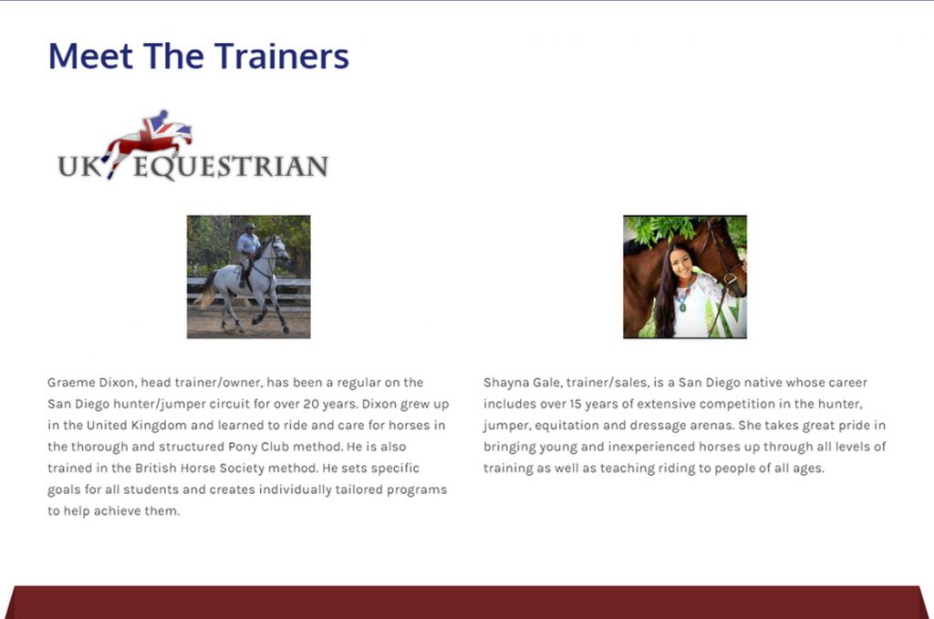
Before
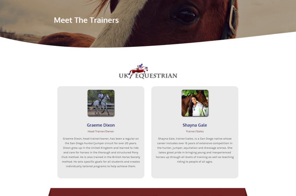
After
| Before - Issues | After - Corrections |
|---|---|
| Content placed on page in text box | Changed to team module and styled it |
| Uneven content in column | Colored columns and added spacing for a balanced appearance |
| Lazy placement of heading and secondary logo image | Added a hero image row and row separator, balanced the secondary logo image with page content |
Table of Contents
Add a header to begin generating the table of contents
Next Steps
Now that we're familiar with the below-fold components, learn how to create the below-fold content layout.