
Interior Page - Layout
Learn how to use the main modules you chose for the homepage layout to create a template for use on internal pages. Make sure you read through the "Why Save a Row, Column, Module or Template?" section under "Saving Templates Important Rules" on the Beaver Builder best practices page before you start following the steps listed in the sections below.
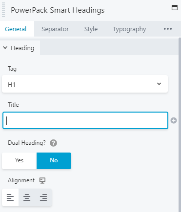
Select Styled Layouts
Picking Styled Modules to Save
Now that the homepage is complete and styled properly, you'll go through the homepage and select certain styled rows, columns and modules that you believe will be used consistently across the site on all interior pages. Before you save any layout from the homepage, make sure it passes the checklist at the end of "Rules for Styling a Module - Before Saving for Reuse" section on the Beaver Builder best practices page:
Homepage Hero Row
Once you're happy with how the homepage hero looks and it passes the above checklist:

Homepage Content Layouts
For all modules that have been styled in some way to vary from the default settings assigned in the customizer, that have been used on the homepage, and that you plan to use again on the site somewhere: Make sure they pass the checklist, then save them.
Styled modules
To get a better idea of the kinds of modules you should save, here are some examples of modules commonly saved for reuse:
You don't have to save everything right away if you aren't sure you'll be using it - just what you think you might use. If you are building out an internal page and realize you used a module somewhere else that you already styled a certain way and haven't saved:
Styled columns
If you created callouts for use on the homepage by styling a column a certain way (read how to do this), you may want to use the same styling for columns on interior pages or for columns used as sidebars:
Styled rows
If there are rows you styled differently from the others e.g. you subtly styled a row differently to create an alternating appearance on a long-scroll page, you added an image parallax background to a row with a heavy overlay with specifically styled row separators or top/bottom shapes, created a call-to-action row with larger text that usual or exaggerated color styling, chances are you may want to use similar styling again for rows on internal pages.
Styled creative modules or row layouts containing them
If you've used a specific kind of module on the homepage, styled it to match the site's branding and may need to use it again on an internal page - make sure it passes the checklist, then save it. Examples of such modules could be: styled list icons, info circles, accordions or tabs, etc.
Interior Page Build-Out
Choose an internal page to start with that has simpler page content - mostly text and a couple rows. If all the pages on the site are very content-heavy or are requested to employ the use of fancier modules, just build out a few content rows for the initial part of this section, and once you have a good template to work with, you can continue building out the rows containing the fancier modules.
Interior Page Hero Row
The hero row on internal pages should be a more "toned down" version of homepage hero, remaining consistent with it in styling and layout.
Guidelines for styling the internal page hero based on the homepage hero's styling:
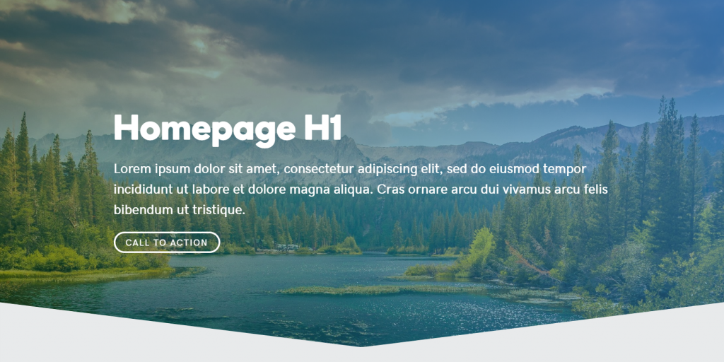
Homepage Hero Row
Internal Hero Row
Steps
Using the homepage hero that you saved, implement the above guidelines to create the internal page hero:
Making Use of Themer
The following two items are optional modifications to the hero area that make use of Beaver Themer's functionality to automate processes for efficiency. These are not mandatory, but can help a lot by shaving some extra time off the build - they are to be used only if applicable.
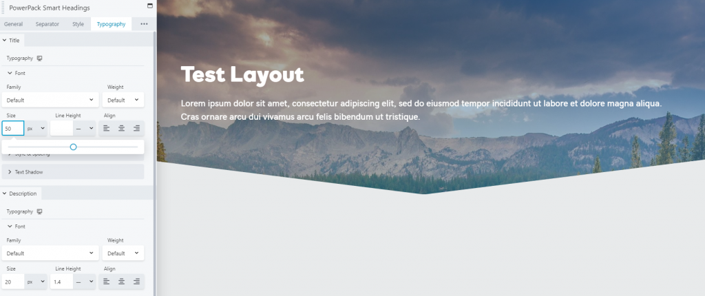
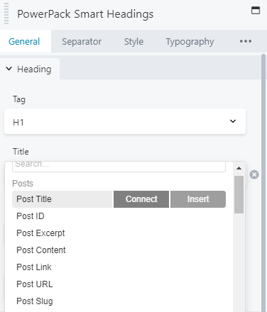
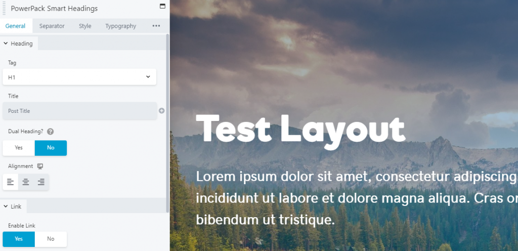
Optional adjustment to H1 module
"Make the H1 heading module always pull the page title on which ever page it Is used"
Whether this should be done depends on if the H1 module heading in the hero mirrors the page title and if it will on every internal page. If the H1 module heading is different from the page title, don't do this. Otherwise, follow the steps below:
Internal Page
Step 1
Step 2
Step 3
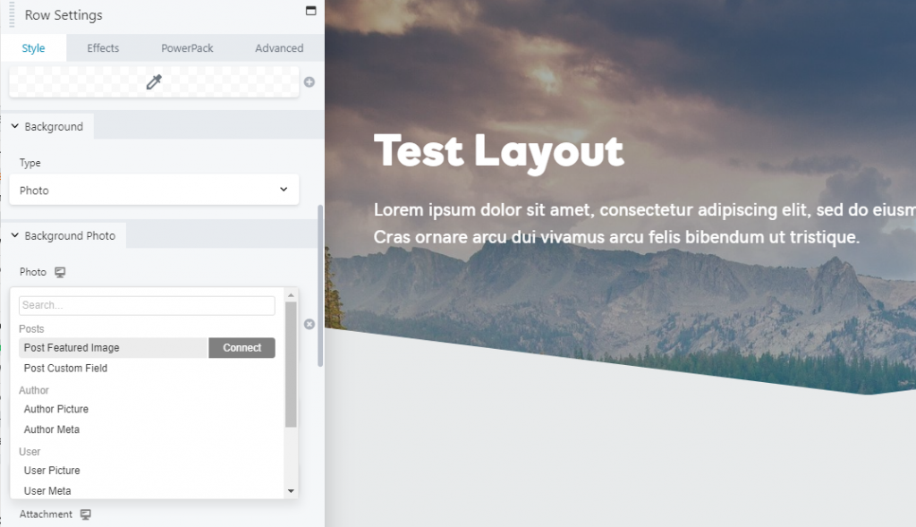
Optional adjustment to Hero Image
"Allow the background image of the hero row to always pull the assigned featured image of each page its placed on" - its time efficient and its simpler for the customer to change themselves in the future
Step 1
Step 2
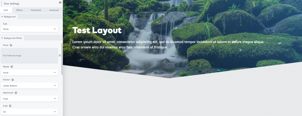
Step 4
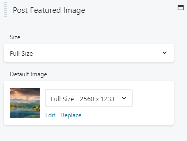
Step 3
The hero row will now always pull the assigned featured image of every page its used on as its background image, and in the cases that no featured image is assigned to the page, the default fallback image will appear as the background instead
Template Creation
Interior Page Content
After completing the internal hero layout:

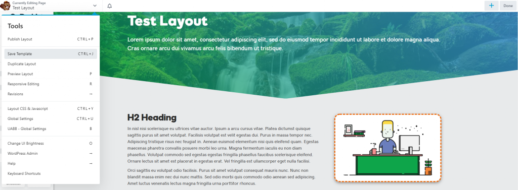
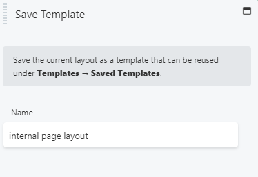
Save The Template
When you are happy with the basic few items that you'll use as a foundation for each internal page, and add to or subtract from based on the content, save your layout as a template. Name the template something like "internal page layout."
Step 1
Step 2
Continue with page build
Once your foundation template is saved, add all the extra content and additional rows or features specific to the page you're working on, if any. When you're done, head over to the next page and open beaver builder:
Table of Contents
Add a header to begin generating the table of contents