
Page Build Process: Site-wide
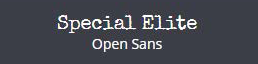
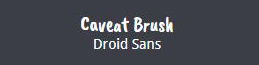
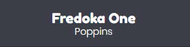
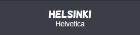
Typography
Basic Font Rules:
- Feel free to choose any Google Font that falls under the appearance of the 8 available categories - see alternative font options & pairings in the filterable gallery below
- If the customer has a logo with text, try to find a font similar to the logo text
- Don't use fancy or illegible fonts for important content like main headings or body text, use them as accents only in few areas on the page
All
- Edgy, Playful
- Formal, Handwriting
- Traditional, Industrial
- Impact, Modern
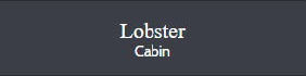
Edgy
Edgy
Playful
Playful

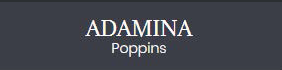
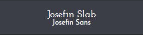
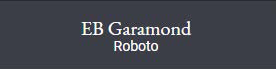
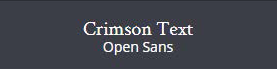
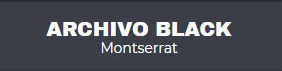
Formal

Formal
Formal
Formal
Formal
Formal

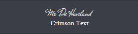
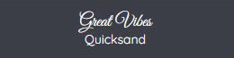
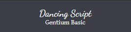
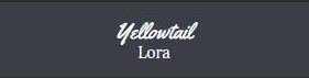
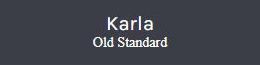
Handwriting

Handwriting
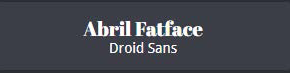
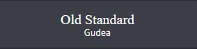
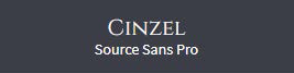
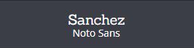
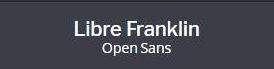
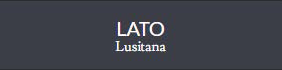
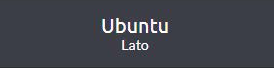
Traditional
Traditional
Traditional

Traditional
Traditional
Traditional
Traditional
Traditional
Traditional
Traditional
Traditional
Traditional
Traditional
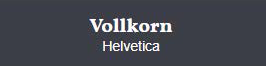
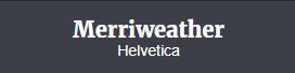
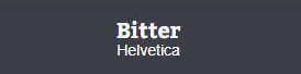
Industrial
Industrial

Industrial
Industrial

Industrial
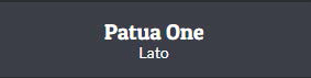
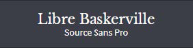
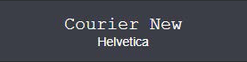
Modern

Modern

Modern

Modern
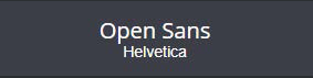
Modern

Modern
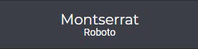
Modern
Modern
Modern
Modern

Modern
Modern
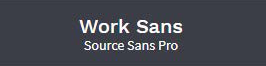
Modern
Modern

Modern
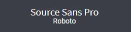
Impact
Impact
Impact
Impact
Impact
Color
Basic Color Rules:
- Only use bright colors as accents or for overlays where appropriate
- If colors can look better in a darker/lighter shade, use colorhexa and pull another shade that works
- Avoid bright colors for solid row backgrounds and for use in large layout components
- "What overall look/feeling are you trying to achieve?" - ignore the answer to this field - don’t use colors from these palettes
Favicon
- For Logo w/ legible icon:Crop the icon from the logo in a square aspect ratio and use it as the favicon
- For Text logo OR for logo w/ illegible icon: Use relevant icon from iconsdb
Logo
Modify logo during new build process with notation:
IF logo is low quality
IF background is solid/non-white and cannot be easily removed
IF logo is vertical when not using header 7, and if icon can't be placed to the left of the text
IF logo is horizontal or vertical when using header 7, and if text is illegible when shrunk down to fit in the header space
Navigation
Modify header menu during new build process with notation:
- IF nav links and characters within them don't fit in the header nav area with room to breathe
- IF nav items start wrapping as soon as the screen size is shrunk down to laptop view
Page Build Process: Hero
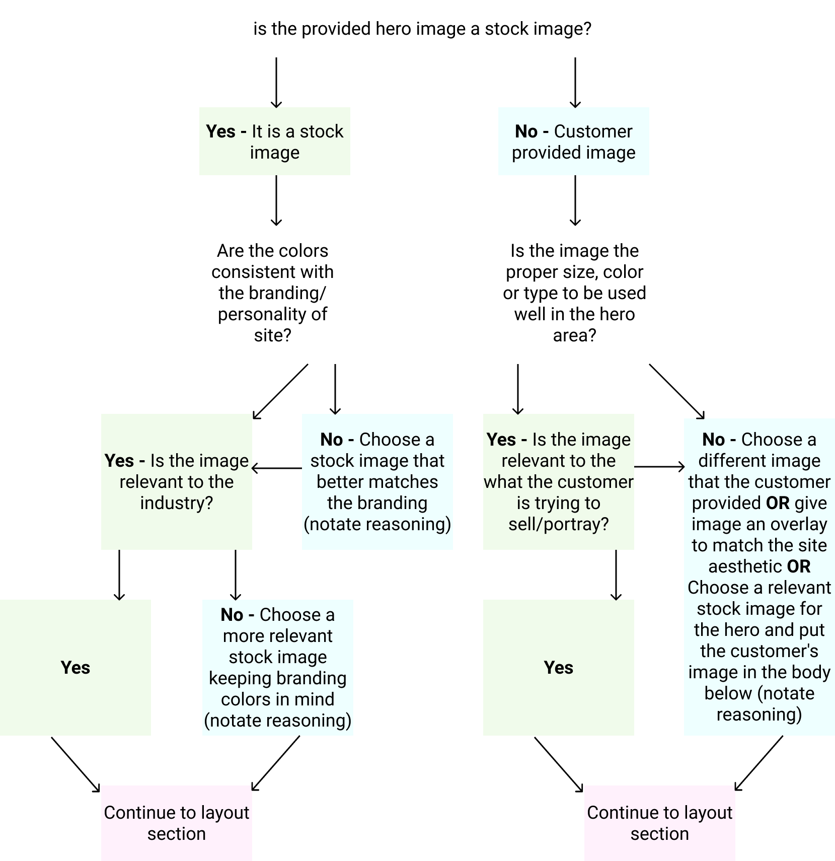
Hero Layout Options
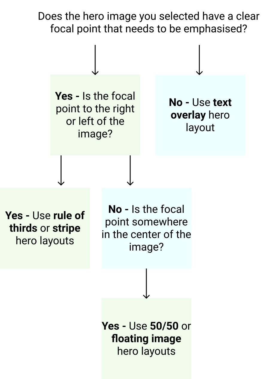
The image you choose will determine what kind of hero layout you want to use.
After selecting a good hero image using the flow chart in Step 1, use the flow chart in Step 2 to place it in the layout that suits it best.
The Stripe

Similar to the "Rule of Thirds" hero layout, but the content might need more contrast. Content box does not “float”, it touches the top and bottom of the hero image container.
Rule of Thirds

Visually divide the hero section into thirds. The focal point is generally in 1/3 to 1/2 of the image on its right or left. Include a gradient overlay behind the text if there is insufficient color contrast.
Split Screen - 50/50

Apply a 50/50 split or 60/40 split to the hero area with the image on one side and text on the other. Solid color or heavy overlay behind the text.
Text Overlay

Text laid out over the image - usually centered, sometimes left aligned. May require overlay for contrast. Might also have negative space along the top half of the image.
Floating image

Usually use a solid color or heavily blurred image in the background. Often the header matches hero background by being transparent.
Page Build Process: Content
Step 3A. Blocks of Paragraph Text

Layouts for Blocks of Text
(1) Short Paragraph & Heading

If you want to center a heading and text in a row it must be: short in character length, be condensed in width so it doesn't stretch from one side of the screen to the other, have larger font size, and have sufficient white-space/padding above and below.
Module(s):
Smart Headings
(13) Short Paragraph & Image

If a heading and paragraph is short in character length and can't be broken up, you can place it to the left or right of an image module. Ensure equal padding on top and bottom of the row.
Module(s):
Smart Headings, Photo
(13) Long Paragraph & Image

If a heading and paragraph is long in character length, break it up into two paragraphs and place them each to the left or right of an image module.
Module(s):
Smart Headings, Photo, Text Box
Step 3B. Lists or Distributed Content

Multiple Sentences - Equal character lengths
Use the following layouts if: You can break up a long paragraph into equally distributed sentences OR if content was already distributed into sentences of equal character lengths.
Module(s):
- UABB Info List (Examples)
- UABB Info Box (Examples)
- PowerPack Icon Number List (Examples)
- Custom Callouts w/ Columns (Tutorial)
Reference the Callouts & Creative Modules page for details on the best modules to use for callouts and how to properly use them.
(3) Info List & Image

(4) Custom Column Callouts

(9) Info list with image or icons

(8) Icon list for bulleted items
Multiple Sentences - Unequal character lengths
Use the following layouts if: You can break up a long paragraph into sentences of unequal character length OR if content was already distributed into sentences/small paragraphs, but their character lengths are unequal.
Module(s):
Reference the Callouts & Creative Modules page - Creative Module Limitations section for details on the best practices for creative modules, how to use them and how not to use them.
(2) Text blurb & Info List

(5) Flipboxes as Callouts

(6) Flipboxes as Callout Accent

(6) Slideboxes as Callouts
