Using Discretion
Pointers for when to make a discretionary choice over following the exact instructions of the intake form. No matter what discretion you use, make sure you NOTATE what you've done when you submit your ticket to the QA team IF your design choice is in any way different from the ticket's original instructions. Never make a discretionary choice without providing a brief valid reason for doing so. If you do not notate, the QA team will wonder why the work does not match the original ticket's requests and will assume you misread the ticket or did it wrong. If you leave a note, they will be able to see that you made that choice voluntarily and will pass your advice forward to the design rep and the customer.
Layout Options
The Intake Tool
The intake tool is what the Website Specialists use to consult with the customer and collect all their information and content needed for their new website.
The Current Intake Tool
The new design tool removed the layouts from the view of the customer and replaced them with checkboxes to ask the customer what template appropriate items the header and footer should have. Instead of using the pre-built headers from the intake tool like before, there are completely new layouts separate from the tool that can be imported and used that have elements from the checkboxes present.
There are also complete guidelines for builders on how to determine which templates to use based on the customer's industry vertical and their choices from intake tool's checkboxes for each area.
- The good thing about this process is that customers get to tell us what they'd like to appear in their header/footer regions and they don’t get an expectation for a certain layout embedded in their minds that may not work for their content.
- Another good thing about having the templates separate is that we can now update them quarterly based on design trends for each site industry.
Reference Sites
A huge new addition to the new and current intake tool is that there is now a section to add reference sites with fields to fill out what the customer likes about each site. Instead of getting buried in the content, the reference sites and what they like about each site will be front and clear for the builders to look through as inspiration before starting the build. This will help builders see which elements the customer is fond of, and will help them try to build a site with a similar look and feel or similar elements so they can get the site right for the customer and have fewer revisions.
First Impressions
Making a Good First Impression
The point is to deliver the customer with a site that can inspire a positive first impression. A lot of the time if we follow what the customer chose in the design tool word-for-word, the site will come out looking dull and not be what the customer visualized. You'll run into a few builds every so often where a customer is extremely particular and knows exactly what they want - those are often easier because chances are we have something very exact to reference.
Most of the time, however, customers hire designers because they aren't very creative themselves and want us to make choices that help them visually appeal to their audience. Its better to take a risk to override a choice they made in the design tool with a better one and show them a professional-looking first draft, rather than give them exactly what they want and leave them feeling dissatisfied with our design potential.
How can you better understand the customer?
If you're feeling creative, you can do a little research on the customer and their business to help you get started on a path that will result in fewer revisions and a better overall first impression:
- Did the customer send examples?
What do they have in common? Notice the widths, the header types, the kinds of hero images and font types, the page content, calls to action and interactive modules on these sites.
- Does the customer have a logo?
Do they have branding material or brochures? If so, notice the color patterns, font types, spacing, positioning, etc. Its very possible that they already went through a long and tedious process with a designer getting their branding straightened out to where they like it, and chances are they want their site to eventually look very similar to this.
- Did the customer give us any social links?
If not, can we find them on social media? Not to put their links on the site (if they didn't give them to us), but to look at the imagery used on their business social pages that can give us a better idea of their aesthetic and what appeals to them.
- What is the business category of the site?
What do they do? Who is their audience? Where are they located? You can look up other businesses in their area that would technically qualify as competitors because chances are they have looked through their competitors sites and want something worthy of competition.
Favicons
A little extra touch can go a long way. If the customer has a logo with a graphic that could visibly fit in the tiny space on the page title tab, crop the graphic and put it there. No one likes to see a little paper icon up there, it looks unfinished.
Logos
Is it a vertical or horizontal logo? Is the quality good?
Does it have a transparent background? If not, does it have crisp white edges / can the background be removed or is it pixelated?
Header Choice
Selecting the Right Header
Does the Content Fit? Which of the headers in the design flow work best for the content the customer wants to have in their header? The content (header elements) they chose to include in the header may change the structure of the header type, and that is okay. When deciding on the right header layout for a customer based on their content, ask yourself the following questions to determine if its the right fit:
- Elements - How many header elements did they choose, and which ones?
- Logo - Is the logo horizontal or vertical?
- Navigation Menu - How many pages are there?
- Which headers would work best with the number of pages and the length of the page names?
- Can the nav be set to display the responsive hamburger menu on all screen sizes? OR can the nav be split into main core page links with the remainder being placed in a secondary hamburger menu beside it?
Site Headers | Store Headers | Site Top Bars | Store Top Bars
Click here to see all site templates that are site or store headers or top bars.
Header Pointers
Keep these pointers in mind when selecting a header and styling it:
Headers should Always be minimal
The goal is to minimize space taken up by the header on the page and condense as much of it into as little space as possible, still keeping it balanced and able to breathe. If there is extra content in the header, you can choose to hide it on mobile or at least make sure to style it to fit on mobile to keep the mobile header minimal as well and to avoid causing the header to take up half of the mobile screen.
Headers should never be a dark color
(unless the site is dark)... White or transparent is standard for headers. Never choose a solid color for the header background other than white on a regular site, or grays/blacks on a dark site, unless its been made clear that the customer is adamant on a certain style. Headers should never drown out the logo or any items in them. Make sure the color you choose for a header doesn't clash with the menu text color or logo color. Any items in the header should stand out and be very clear.
Rearranging The Layout
Feel free to move items in a layout around. Start with a base template if you'd like, then add or remove or rearrange items in the template to best suit the content chosen by the customer.
Does the customer have a lot of nav links? Do they have social icons? Do they have a tagline? How big is their logo? If we can condense the content they want in the header to take up as little space as possible and make use of any empty space, we should.
Adjusting the Menu
Best practices for styling a menu to work best in the header area, and to help reduce the amount of space taken up by it:
Placement:
If there are a fewer than 6 nav links, it would always make sense to float them to the left of the logo
If there are many nav links, or links with longer labels, use a hamburger menu or split the menu into primary and secondary menusLink Length:
If the page names are quite long and you think you can remove extra wording from the nav links in the menu while keeping the main word in place, do it. For example, reduce a page named "Contact Richard & Sons Co." to "Contact" in the nav menu, leaving the actual page name as is. You can change pages like "About Us" to "About" and "Our Services" to "Services" in the nav menu as well.
Grouping:
See if you can group pages or links into sub navs under a main topic. For example, if they have pages called "Our History", "Our Team" and "Customer Reviews", these can probably go in a sub nav dropdown together under a dead link "About".
Header Elements
What content should we bother including in a header? If the customer specifically asked for certain content to be placed in the header, why did they want it there? How can we position it or place it for both, aesthetic appeal and to please the customer?
Contact Info:
Adding the phone number to the header is appropriate for some businesses, however, if they ask for other contact info like an address or email, place a map icon or envelope icon linked to these items beside the phone number and don't put the whole address or email in the header area.
Call-to-Action (CTA):
What is the call to action they want in the header? Can it be replaced with a button in the menu? Is it something we can put in its own row above the logo row? Is it something that should be included in the hero instead?
If the call-to-action they want in the header is "Contact us for a quote" with a button pointed to the contact page, chances are they have "contact" as a page linked in the nav already right below the CTA button. Repetition looks unprofessional. You could omit that entirely, and change the link to the contact page in the nav menu to say "Get a Quote" instead, then style it to look like a button. Then, you could write out the call to action above a button in the hero section below the hero text.
If, for the same call to action, they had a phone number below it rather than a button pointed to the contact page, you could move the entire CTA sentence including the number up into its own row above the logo row and align it to the right.
Footer Choice
Footer Pointers
Footers are a lot simpler to work with because we don't have to worry too much about condensing the space, or it being the first thing a customer sees. Read through the points below to learn about better ways of arranging content in the footer area:
Click here to see all site/store footer templates.
The subscribe form:
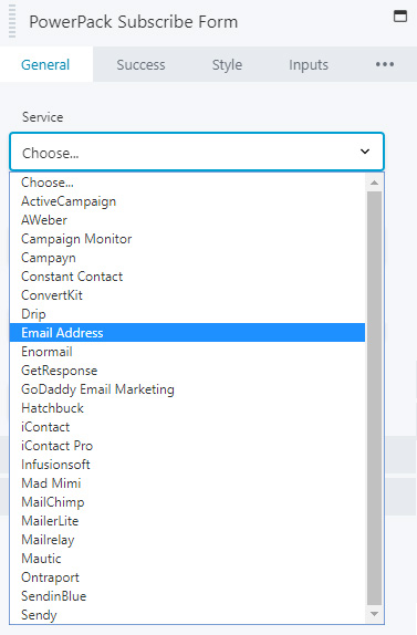
Chances are very high that the customer did not tell us what email marketing platform they use, and chances are even higher that they didn't proactively get us an API key for us to attach to the form that they asked us to include in their footer.
When styling the form, you'll notice the module will not let you save changes to it without choosing a "service". In this very likely scenario, choose "email address" as the service and set it to the customer's email on their account. That way if they don't have an email marketing platform set up yet, they'll at least get sent the email addresses of all the people subscribing using the form. Read about setting up, styling and connecting subscribe forms using the PowerPack module (click here).
Next Steps
After installation and customizer setup, its time to create the themer layouts.


