
Subscribe Forms
This section covers how to style the subscribe form module and connect it to an email marketing platform.
Styles & Options
Subscribe Modules Overview
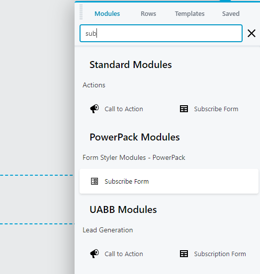
There are 3 modules to choose from when selecting a subscribe form - Standard, PowerPack or UABB. Standard is the simplest of the three. UABB Subscription Form has the ability to add fields for both first and last name, and has before/after form text options available, BUT it can only appear by default on a page, it cannot simulate a popup or appear on scroll. PowerPack Subscribe Form has fields only for name and email, allows the option for a terms checkbox, BUT has more styling options and gives the option to appear as a popup, be fixed at bottom or slide-in automatically. See them styled in different ways and in action on the WDS Demo site.
In this section PowerPack's subscribe form will be discussed since it provides us with the most customizability options of the three. The module that is used in the layout templates for footers that have subscribe forms in them is the standard beaver builder module since it is the most lightweight. This can be replaced with PowerPack's subscribe form module if more customizability and functionality is requested.
Styling the Module
Add a module, then select the PowerPack subscribe form module and place it on the page.
Type
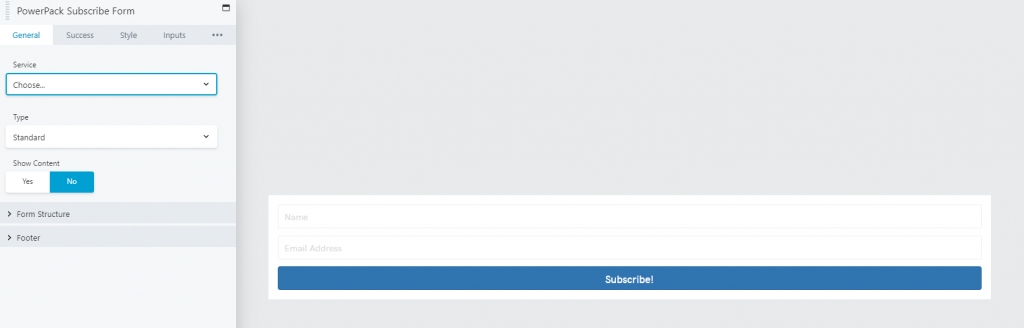
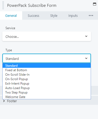
You can choose whether to display the form in standard in page body (default), as a popup, OR fixed to bottom of page
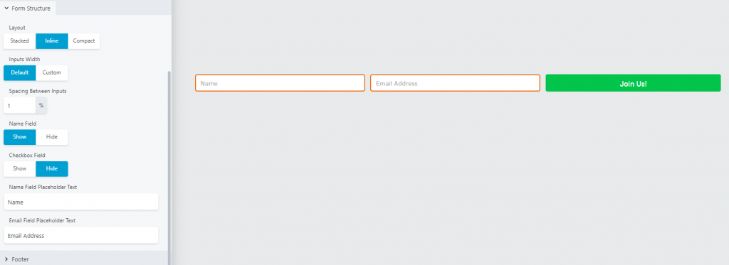
Form Structure
You can choose between stacked (default), inline or compact layout structures, select whether to display or hide the name field or checkbox, and customize the placeholder text. If additional text should be added be added below the form use the footer section to add it.
Style Tab
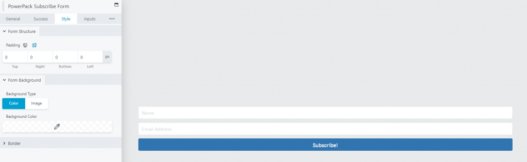
Use this tab to style the form’s appearance as a whole. By default the PowerPack form adds a 15px padding with a white background that you should remove or adjust to better match the theme of the site or to make it fit aesthetically where you place it.
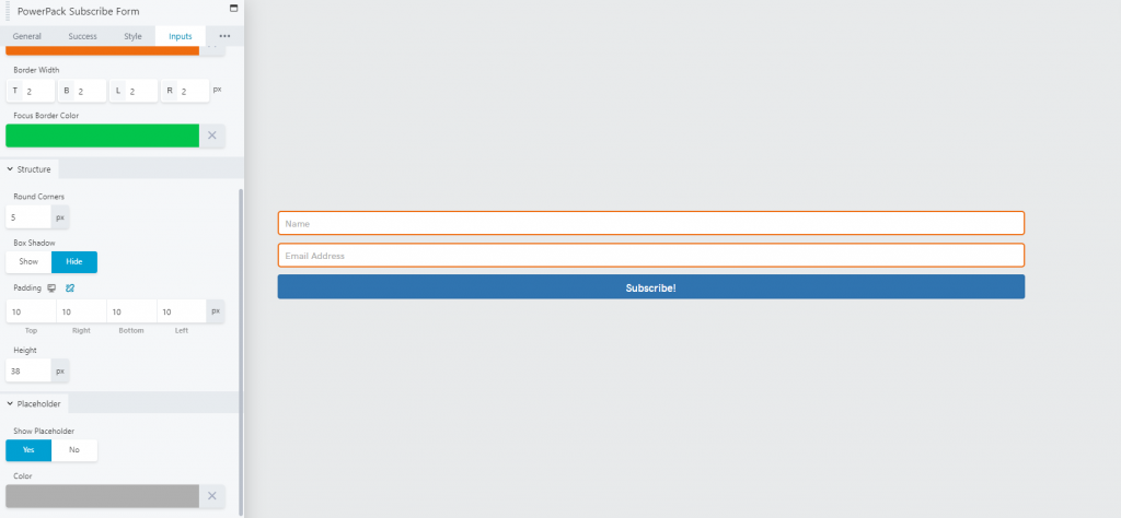
Inputs Tab
This tab lets you customize the appearance of the input fields, their height, colors, and whether to show or hide placeholders.
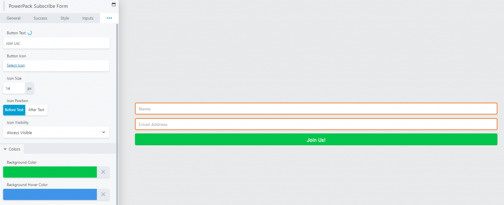
Button Tab
This tab contains settings to customize button text, icon, icon size, its position, and visibility. You can use this to custom style the button if you'd like it to be different than the default button settings from customizer.
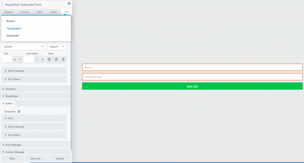
Typography Tab
This tab sets typography settings such as font type and size for the content, Input fields, Error and Success messages, placeholder text and button text.
Search for the module
Default view
Form type - Standard
Style tab
Inputs tab
Button tab
Typography tab
Form Structure
Supported Services

Services Overview
The Subscribe Form module supports a connection to all the services listed in the image shown to the left. Read additional notes about the two options.
The subscribe form module will not allow you to save any styling if you don't choose a service. As mentioned on the "Using Discretion" page under the "footer choice" section if no service was provided, or if no api key was given, set it up to connect to the customer's email (making the account name the email as well) during build, and then notate that in build notes upon completion.
Connecting to a Service
When connecting the form to a service, what each service requires to connect may be a little different. Most services require an "account name" which just helps you identify which account is connected - it can be anything, and an "API key" which comes from the service in use - some may require more fields.
The two most common services connected to by PWS customers are MailChimp and GoDaddy Email Marketing (GEM). Follow these steps from Gravity Form's documentation that cover the steps of obtaining the MailChimp API Key - this must be provided by the customer. The section below discusses connecting to GEM and explains how to do it in case the customer has one set up in their account.
Connecting to GEM

GoDaddy Email Marketing
When connecting to GEM, the following fields will be required to connect:
Account name:
Used to identify this connection within the accounts list - it can be anything you like.
API username:
The username associated with your GoDaddy Email Marketing account.
API Key:
Your API key from your GoDaddy Email Marketing account.
Assuming the customer has initiated their GEM plan, has a signup form set up and a list that they'd like their subscribers from the site to be added to, the "sign in" link on the subscribe form module can be clicked which takes you directly to obtaining the API credentials.
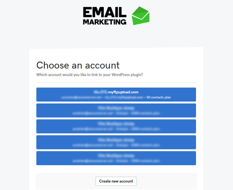
Choose a GEM account
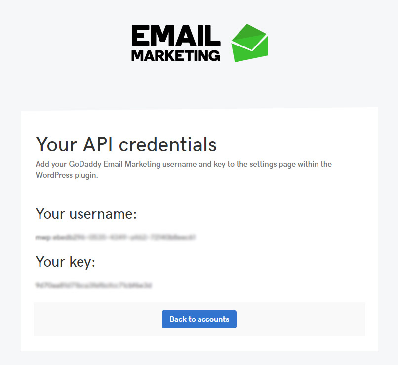
API Credentials page
Getting started with GEM
The following articles can be browsed or sent to the customer if they haven't created a campaign or set up a signup form with a connected subscriber list.
Table of Contents
Add a header to begin generating the table of contents