Staying Responsive
Best Practices for styling design components on ipad and mobile screens.
Responsive Behavior
Responsiveness in Beaver Builder
Since its is the only platform we build in that has adjustable responsive properties directly controlled by the designer, we will be discussing a site's responsive behaviors keeping Beaver Builder as the focal point. All Beaver Builder layouts are responsive, meaning they automatically adjust for various screen sizes. By default, layouts are responsive in the following ways:
Device size
Beaver Builder has three device sizes built in: large (typically desktop and laptop displays), medium (tablets) and small (smartphones).
Breakpoints
Breakpoints define the browser width at which the settings for each device size apply. By default the medium device breakpoint is 992px and the small device breakpoint is 768px. These values can be customized - See Global Settings in Beaver Builder Best Practices
Stacking
Stacking determines how rows, columns, and modules are ordered as the width of the display decreases. You can control column stacking by setting custom column widths for each device size, or you can disable column stacking.
Spacing
Margins and padding for rows, columns, and modules are automatically adjusted with the Beaver Builder autospacing feature. For fine-tuning, you can adjust margins and padding for each device size to override autospacing, or you can disable autospacing entirely.
Visibility
By default, all modules are visible at every device size, but you can hide modules on particular device sizes.
Responsive Editing Mode
The Beaver Builder editor's default layout is for large screens, and Responsive Editing Mode makes it much easier to adjust the settings for medium and small devices. If you prefer, you can enter Responsive Editing Mode immediately and build a mobile layout, then adjust for larger screens. Either way, chances are that as you work you will want to tweak your original design to optimize it for every device size.
Enter Responsive Editing Mode in any of the following ways:
Click a responsive icon
Click one of the small responsive icons next to specific settings for a row, column, or module. Your page view will stay in responsive editing mode even if you close the Settings window. Use the Exit button to close responsive editing.
Tools Menu
On the Tools menu, click Responsive editing.
Use the keyboard shortcut "R"
Type the keyboard shortcut R. This keyboard shortcut toggles responsive editing mode to open in medium device view, change from medium to small device view, and close the responsive editing window. Note that keyboard shortcuts are always lowercase letters.
Source: Beaver Builder Knowledgebase - Responsive behavior | Responsive Editing
Column Layouts Overview
In Beaver Builder you cannot have rows within rows, but you can construct complex layouts with column layers and child columns.
Column layers, module layers, and child columns
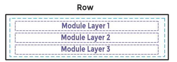
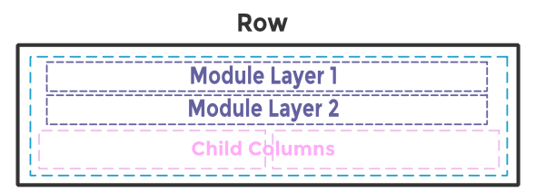
In any row, you can have multiple vertical layers of parent columns, child columns, and modules.
Here are some diagram examples of a single row with various configurations of layers and columns.
Note: By default, when you drag a module into a column, you create a module layer. If you want to create a child column, you usually need to add one or more empty columns inside the main column before you add modules.
Responsive behavior: column stacking
As screen size decreases, column and module stacking occurs left to right, top to bottom first within each column then across columns.
Tip: Beaver Builder has a setting to reverse the stacking order, but you can't choose an arbitrary stacking order. Knowing how columns will stack is an important factor in how you construct your page. As an alternative, you can prevent column stacking by setting column widths for medium and small devices.
Source: Beaver Builder Knowledgebase - Column layouts
Styling for Mobile
Prevent Column Stacking With Custom Widths
You can prevent column stacking as screen width decreases by setting column widths differently for each device size.
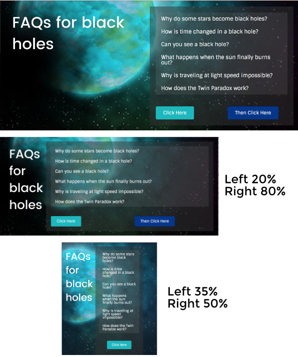
For example, here's a two-column layer in which the columns have equal widths of 50% on large devices, as shown in the top screenshot. For medium devices (tablets), shown in the middle screenshot, the width of the left column was set to 20% and the right column to 80%. For small (mobile) devices, shown bottom screenshot, the width of the left column was set to 35% and the right column to 50%. You can see that the narrower columns are left-aligned in their space.
Column widths set for medium and small devices can be set to total less than 100% for the columns in a layer, as shown in the in the last screenshot above, in which the left column is 35% and the right column is 50%.
Tip: If you set a large-device value for one column, the values in the other columns in the layer will be adjusted automatically to total 100%. This isn't true when you set column width values for medium and small devices. If you set a width value for a medium or small device, it's a best practice to set an explicit value for all the other columns in the same layer.
Column settings
Open Column settings for one of the columns.
Style tab
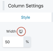
On the Style tab in the Width field, set the percentage for large devices in the normal fashion.
Responsive toggle
Click the responsive toggle to enter Responsive Editing Mode. The view when you enter Responsive Editing Mode is for medium devices, and the values are empty because they are inheriting the setting from the large screen.
Enter custom width for medium devices
If you want to block column stacking for medium devices, enter the % width that you want for that column.
Enter custom width for small devices
If you want to block column stacking for small devices, click the responsive toggle again and enter the % width that you want for small devices for that column. If you leave the Width value blank, it will inherit the value from the medium device setting.
Repeat
Repeat these steps for each column in the layer that you want to modify.
Source: Beaver Builder Knowledgebase - Custom Widths & Stacking
Mobile Alignment
Basic Rules for Alignment
The basic rules for alignment regardless of screen size are discussed on the "Design Practices" page in the "Layout Consistency" section under the heading "Alignment & Balance." It’s a good practice to maintain consistency in how headings or text content on a page in similar rows are aligned.
For example:
In the same way, for mobile layouts, as long as the content appears balanced, any alignment is okay.
Footer Alignment
Is there a right or wrong way to align content in the footer area in mobile view?
There isn't a right or wrong way to align content in the footer. The key is to maintain visual balance.
Should the footer content's alignment be consistent with the rest of the site?
Deciding which direction to align the footer on mobile is different per scenario.
The decision ultimately depends on the content in the footer and the limitations of the modules this content is placed in.Is there a standard alignment tactic for all footers on mobile across the board?
Footer alignment should vary on every site depending on the content in it, so there's no standard that should apply to every footer across the board. A few examples of the proper ways to align footer content on mobile screens are discussed in detail below. The examples should provide a better insight on which footer features should contribute to the alignment decision in different scenarios.
Simple Footer Layouts Like Footer 1
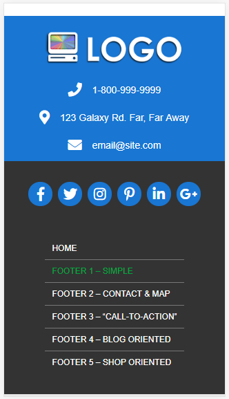
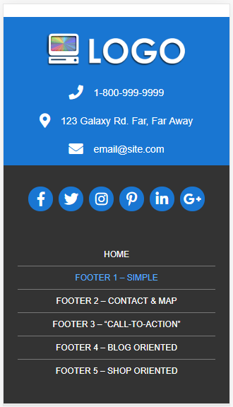
In a footer with a simple layout like footer 1, with icons and maybe a menu, centering the content is a pretty standard practice. The default layout may stack the menu items and not center them but the module's responsive settings or even a simple line of CSS can help center them.
What to look out for when properly aligning content on mobile view in a simple footer:
Content-Heavy Footer Layouts Like 2-5
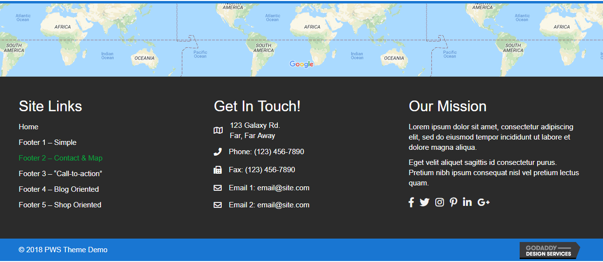
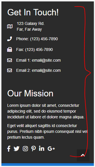
In a layout like footer 2 - footer 5, where there is a lot of content, icons, posts, categories etc - keeping the contents left aligned is standard. Also, in footers like 2 - 5, due to the amount of content in them and the fact that on mobile screens each of the columns stack into their own sections, it would be acceptable to have one section (e.g. the social icons and menu) be centered, and for another section (e.g. the contact info and CTA text) to be left aligned.
Its important to note that: Some modules e.g. contact list, recent posts, post/product categories, etc., do not give you the option to align them differently than their default "left." In order to force them be centered, a builder would have to assign them a class, use CSS to align them on mobile only and hope that it works on all browsers. The contact icons, which are basically a stylized bullet list, would have to be replaced entirely with another module to get them to center on mobile at all.
Bullet lists should never be centered.
Rules to follow when styling a content-heavy footer for mobile screens:
In Conclusion...
Next Steps
After installation and customizer setup, its time to create the themer layouts.

