
Menu Overview
This section covers menus, available menu modules, styling options, responsive layouts, and how to custom-style a menu with CSS classes.
Modules & Layout
The Basics
There are two places menus can be created or altered:
Live Preview
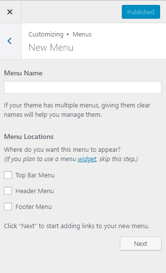
Customizer > Menus
If you're using a beaver themer layout that has a menu placed in it, you may not see live updates as you make them, you'll have to publish and refresh.Backend View
Dashboard > Appearance > Menus
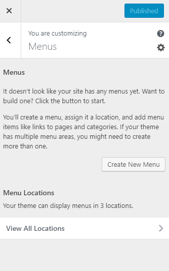
Menus tab in customizer
Screen options in live view
Create new menu in live view
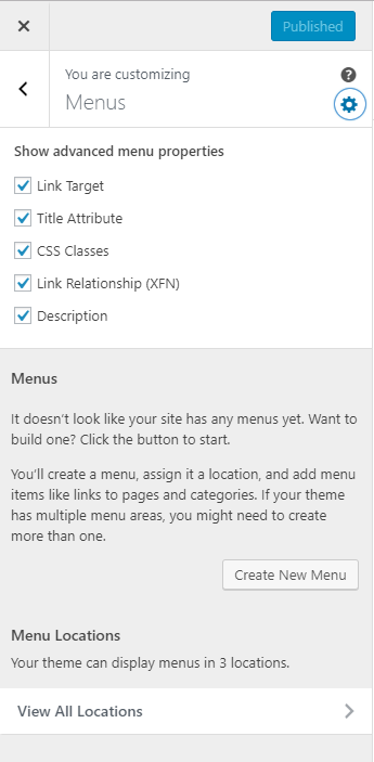
Enable Extra Properties
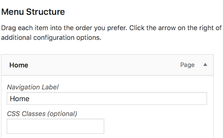
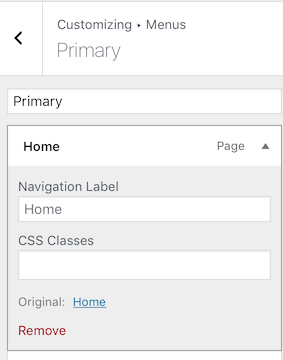
If certain menu features are not visible by default e.g. CSS Classes, Link Target, etc. you must enable them by clicking the settings gear icon which opens a drop-down called "Show advanced menu properties".
If not all items you'd like to enable show up in the customizer view, you can check in the dashboard under "screen options" - the tab at the top-right of the screen in the backend view. Once they have been enabled there, you can refresh the customizer and see those features added to the menu's live preview. Click the link to read more about screen options in the dashboard section of the WordPress Overview page.
Menu Modules
The Menu module can give you more options for menu content, style, and layout than the menu available in your theme or widget area. It also gives you the ability to insert a menu anywhere in your layout. We use it frequently with beaver themer when we create custom headers and footers.
Menu modules for header layouts
For the header menu, in most prebuilt layouts we make use of the PowerPack Advanced Menu since its very customizable and has a lot of styling options. The UABB Advanced Menu is just as good, and has very few differences if any. Its acceptable to use whichever menu works best for the site's header layout.
Menu modules for footer layouts
The standard menu module is great for footer layouts because its lightweight and simple to style. The footer menu doesn't need much styling done, no responsive collapse and if its horizontal, all it really needs to do on a mobile device is to stack to a single column. For footer menus, set the responsive toggle to "none".
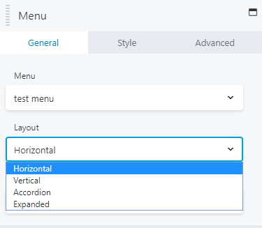
Module Layout Types
The Menu module has the following four different menu layout options:
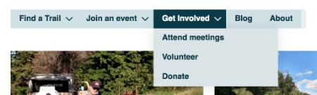
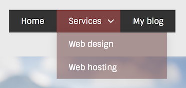
Horizontal
A standard horizontal layout that supports dropdown submenus, with a choice of down arrow, plus sign, or nothing.
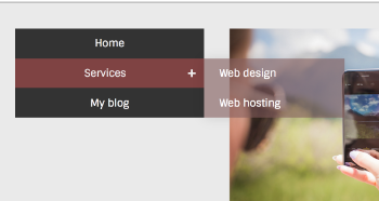
Vertical
A vertical layout that has support for submenus that fly out to either the left or right of the menu.
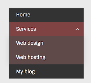
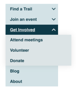
Accordion
A vertical accordion layout that displays submenus inline when the toggle icon is clicked. Note that with accordion layout, submenu opacity background is 100%, no matter how it's set on the Style tab.
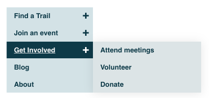
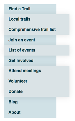
Expanded
Top-level menu and submenu items are displayed in an unordered list style format.
Layout Options
Horizontal
Vertical
Accordion
Expanded
Accordion
Vertical
Responsive Behavior
Responsive Toggle
You can choose how to display the menu on mobile devices using the following settings:
Hamburger Icon
The menu collapses as the screen becomes smaller, and a hamburger icon (horizontal lines) toggle button appears. This is the most common and most standard option.
Hamburger Icon + Label
The menu collapses as the screen becomes smaller, and a hamburger icon toggle button plus the word MENU appears. If a customer requests text beside their hamburger icon, use this option.
Menu Button
This option displays a button labeled MENU, similar to how the Beaver Builder theme works. This is also similar to the menu button from Pharmacy V2 sites - if you're converting a V2 site to V3, and if the customer wants to maintain the exact appearance of their V2 header on mobile, use this option.
None
The menu will not collapse and all of the menu items will show in an unordered list style format. Select this option for menus in the footer nav, custom top bar, or anywhere that the menu is expected to show at all times.
Responsive Style
There's a Responsive style section with the following options for how the menu expands when the hamburger icon is clicked:
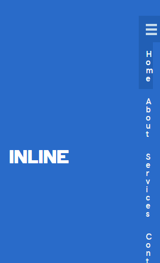
Inline (Standard Module)
Inline means that the expanded menu falls below the hamburger. This works for centered menus but doesn’t work if, for example, you have a hamburger in a small column on the right of your mobile header, with the logo in the column to the left. The menu gets squished.
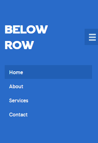
Below row (Standard Module)
Below row removes the menu in the markup and puts it below the column that the menu is in. This means that expanded menus in small columns still appear inline but don’t get squished. This is also iffy though for menus in columns beside logos or anything else.
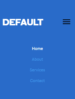
Default (PowerPack)
Like the standard module's "below row" option, the "default" removes the menu in the markup and puts it below the column that the menu is in. This means that expanded menus in small columns still appear inline but don’t get squished. This may be best to avoid unless you've tried it on phone browsers and see that there's no squishing of menu items.
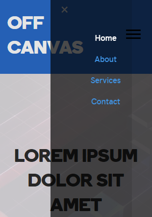
Off-Canvas (PowerPack)
This option creates a fly-out menu overlaying a portion of the screen on the left or right when viewed on desktop, and usually the full screen on mobile. This is the best option for if a customer wants to use a hamburger menu on their site at all screen sizes. (see demo & see styling docs)
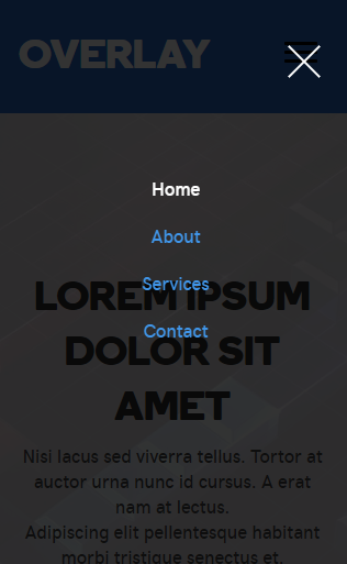
Full-Screen Overlay (PowerPack)
This option will overlay the expanded menu on top of the content below. There are many animations to choose from for how this overlay expands over the content. It covers the entire screen on all screen sizes and its opacity can be adjusted as needed. (see demo & see styling docs)
Notes: Best to avoid inline or below row settings on mobile unless the menu sits in a row of its own. Options for full-screen overlay and off-canvas menu are best/cleanest/most modern-looking options for mobile and provide a better user experience.
Standard - Inline
Standard - Below row
PowerPack - Default
PowerPack - Off-Canvas
PowerPack - Full-Screen Overlay
Responsive Breakpoint
At the bottom of the general tab of the module is a setting for the screen size breakpoint at which the changeover to the hamburger icon appears: By default, it appears on small devices only, but you can change the behavior to medium and small devices, or all devices.
Responsive breakpoint enabled always for all devices can be chosen if the customer wants a hamburger icon at all times or can be chosen with discretion if the site has too many nav menu links to fit across the width of the header without dropping to the second line.
Using CSS Classes
Adding CSS Classes to Menu Items
Using "Screen Options" or the "Show advanced menu properties" gear icon in the customizer as discussed above in the menu overview section above, enable the "CSS classes" field for menu items. Now if you expand a single menu item, you'll see a CSS classes field. (see full rundown)
Common Use Cases
A few applications of CSS Classes on Menu Items are listed below. There are many more use cases, but these are the most common. Search through the "Menus Category" page for detailed posts covering step-by-step tutorials for different menu use cases.
Menu Buttons
Use a custom CSS class assigned to a particular menu item to style it like a button.
Trigger a Modal Popup
Trigger a Modal popup module by clicking a menu item by assigning it a CSS class
Mega Menus
Use a beaver builder built-in CSS class to transform a regular menu item subnav parent into a mega menu
Table of Contents
Add a header to begin generating the table of contents