
Staying Responsive
Best Practices for styling design components on ipad and mobile screens.
Responsive Behavior in Beaver Builder
All Beaver Builder layouts are responsive, meaning they automatically adjust for various screen sizes. For fine-tuning, the designer can directly control each module and section using the responsive features.
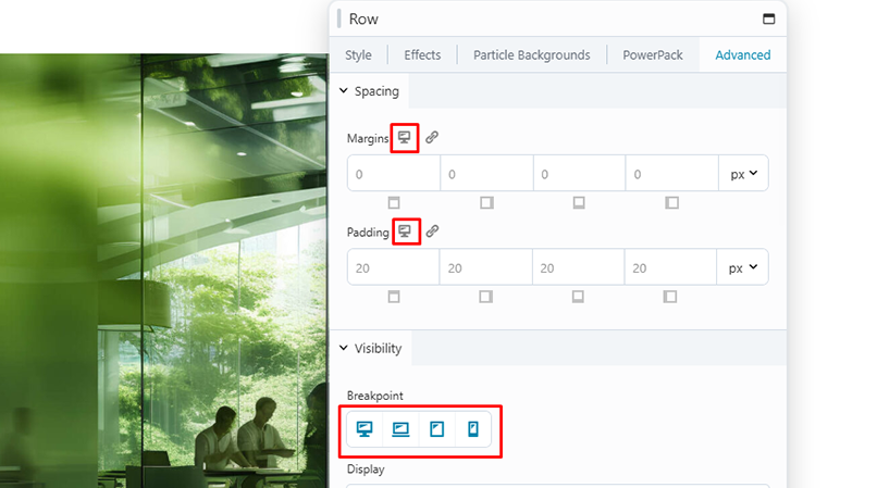
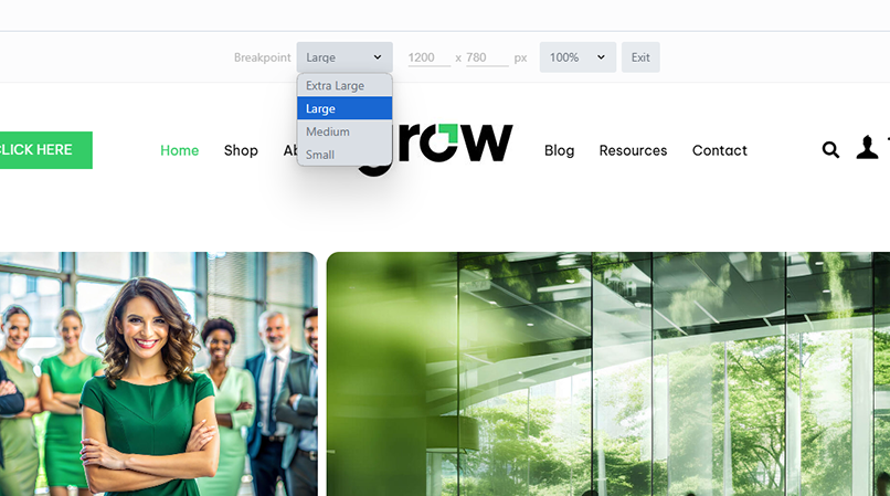
Device size
Beaver Builder has four device sizes built in: extra-large (large desktop, ultrawide displays, laptop displays), large (small laptop screens, large tablets), medium (tablets) and small (smartphones).
Breakpoints
The default values for these breakpoints are: 1500px for extra-large, 1200px for large, 992px for medium devices and 768px for small ones. These values can be customized - See Global Settings in Beaver Builder Best Practices.
Stacking
You can control column stacking by setting custom column widths for each device size, or you can disable column stacking.
Spacing
Margins and padding for rows, columns, and modules are automatically adjusted with the Beaver Builder autospacing feature. For fine-tuning, you can adjust margins and padding for each device size to override autospacing, or you can disable autospacing entirely.
Visibility
By default, all modules are visible at every device size, but you can hide modules on particular device sizes.
Responsive Editing Mode
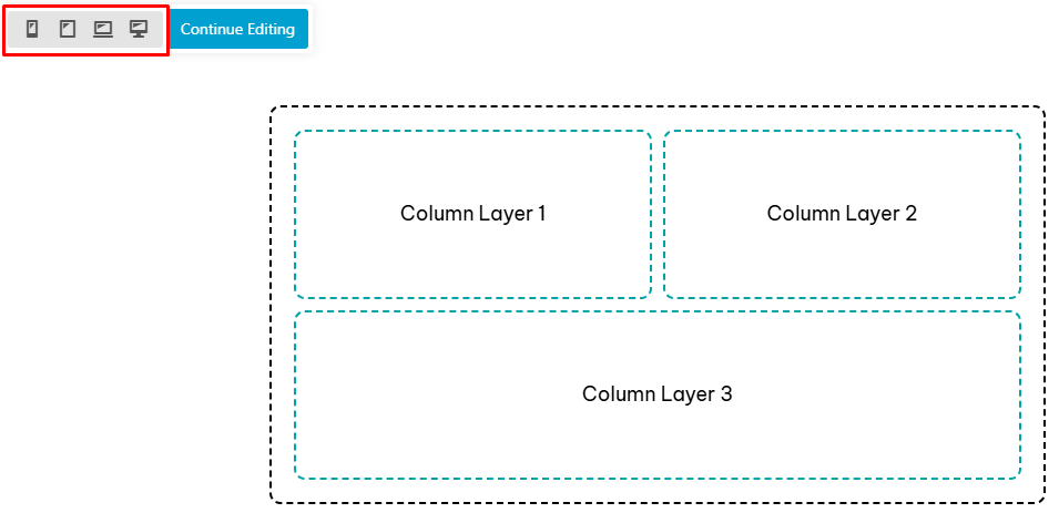
If you prefer, you can enter Responsive Editing Mode immediately and make tweaks on your original design to optimize it for every device size.
Click a responsive icon
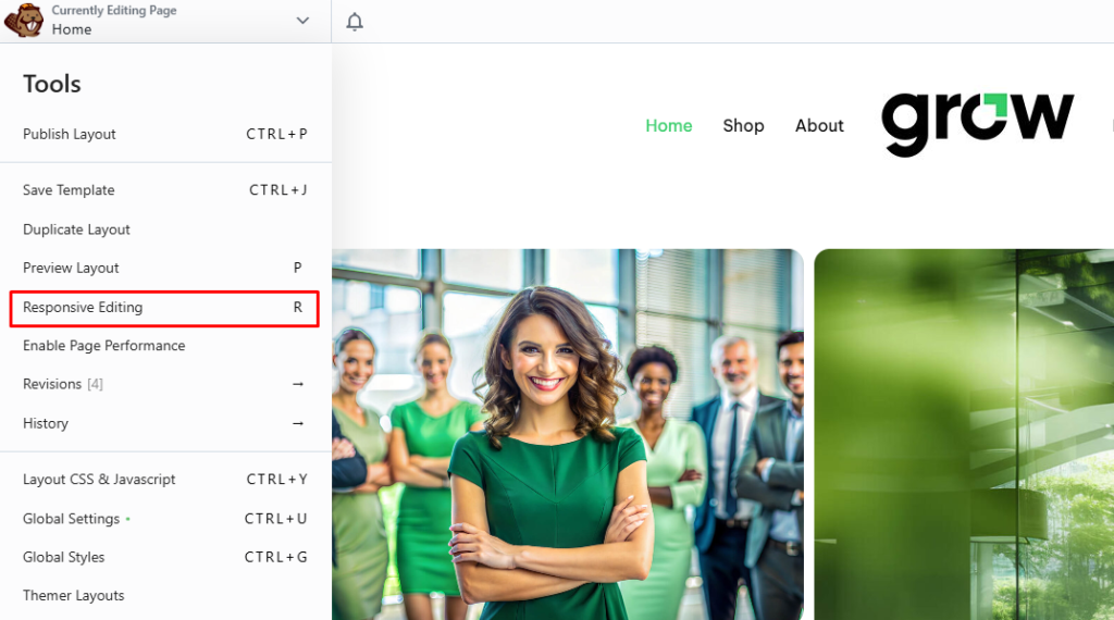
Tools Menu
Use keyboard shortcut "R"
Source: Beaver Builder Knowledgebase - Responsive behavior | Responsive Editing
Column Layouts Overview
In Beaver Builder you can construct complex layouts with column layers and child columns, but the 2.8 version comes with a new feature – Box Module which combines both flexbox and CSS grid to help you create intricate, fluid and flexible layouts.
1. Box Module
The Box module operates similarly to a row or column, acting as a versatile container. You can nest, stack and organize multiple Boxes in both horizontal and vertical orientations, as well as within a grid system.
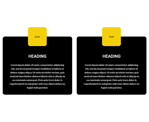
Here are some various layout examples created with Box Module:


-
Usage
The Box module should be placed inside a row. If you try to drag the Box module onto the page than a row will be automatically created for you. To nest boxes within boxes, simply drag a Box module into another Box module. This makes it easy to create intricate layouts.
Follow this article to understand the Box Module Basics and take some time to watch these new tutorials. Even if Box module is user-friendly it is recommended that you have some grasp of Flexbox and CSS Grid.

Header Design
Bento Grid
-
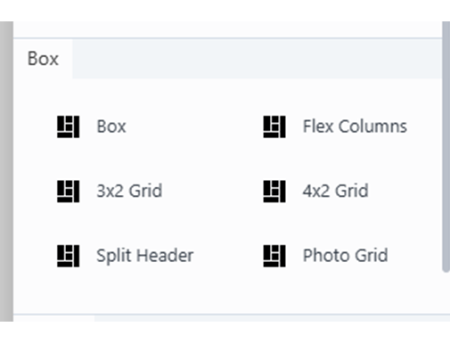
Module Aliases
In the editor’s library panel you can find along with Box Module several Module Aliases which helps you easily create common layouts : Flex Columns, 3x2 Grid, 4x2 Grid, Split Header and Photo Grid.
-
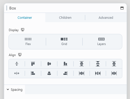
Display Options
In the Box Module settings you will find three different display types: Flex, Grid and Layers. Certain options, such as Direction and Wrapping, vary depending on the display type you have chosen, but settings like Spacing, Sizing & Placement, Appearance and Linking remain consistent across all display selections.
-
Responsive Design
Based on flexbox and CSS grid, the Box Module it’s an ease for the responsive part of your website. You can easily make changes on direction, alignment, size, grid area etc. for small screens. For example on mobile view you can stack columns fast by setting the grid template to one column and multiple rows. A great thing is that you can change from CSS grid to flexbox on other devices, you can customize both container and children or use the span property to rearrange boxes without worrying about setting individual column widths on each device. These new features helps you create fluid and flexible layouts.
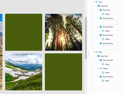
*A better way to take control of Box Modules is to access the outline panel because you can find nested items easier and understand the DOM tree.
Box Module Aliases
Display Options
Outline Panel
Source: Beaver Builder Knowledgebase - Box Module | Box Module Settings
2. Nested modules and columns
In any row, you can have multiple vertical layers of parent columns, child columns, and modules.
Here are some diagram examples of a single row with various configurations of layers and columns:
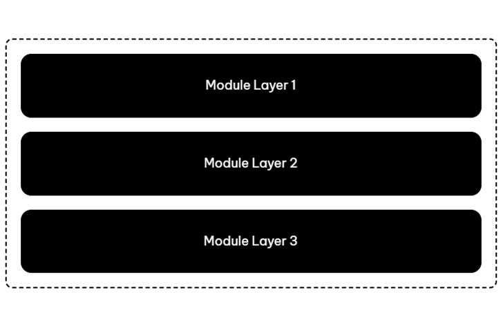
Stacked Layers in Column
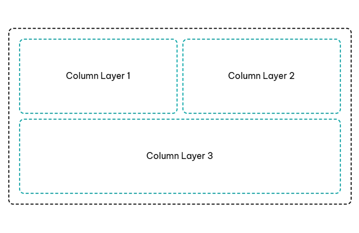
Column Layers in Row
Column Layers in Row
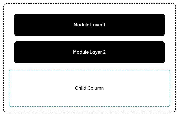
Module Layers & Child Column in Row
-
By default, when you drag a module into a column, you create a module layer. If you want to create a child column, you usually need to add one or more empty columns inside the main column before you add modules.
-
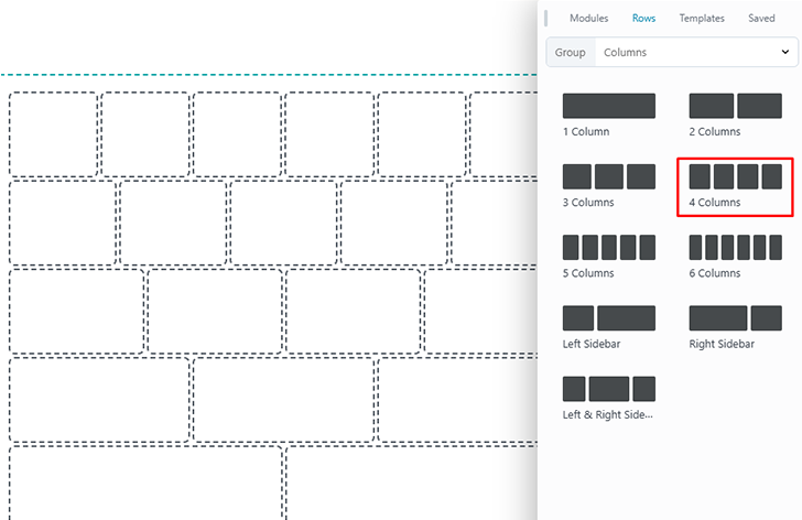
The editor allows only 4 columns to be added within a column, but you can use the duplicate option to create more child columns.
-
Responsive behavior: as screen size decreases, column and module stacking occurs left to right, top to bottom first within each column then across columns. Beaver Builder has a setting to reverse the stacking order, but you can't choose an arbitrary stacking order.
*On laptop & medium devices the column width in a complex structure must be adjusted manually. So for more than 6 child columns it's better to use Box Module as the Display options adjusts column widths automatically.
Source: Beaver Builder Knowledgebase - Column layouts
Styling for Smaller Screens
1. Column Stacking & Column widths
-
In order to have a number of columns sit inline with each other, completely filling a row in width on any device, their percentage widths should always add up to 100%.
-
You can prevent column stacking as screen width decreases by setting column widths differently for each device size.
-
Column widths for medium and small devices can be set to total less than 100% for the columns in a layer.
-
On column settings click the responsive toggle to enter Responsive Editing Mode. On smaller devices the values are empty because they are inheriting the setting from the large screen.
-
Use the keyboard shortcut "P" to preview layout styling for each device.
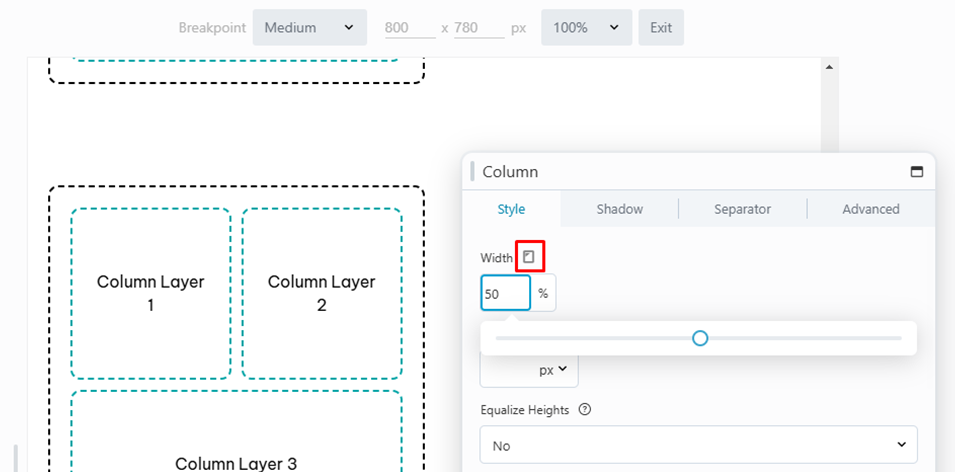
Column Width Option on Beaver Builder 2.8
Preview Mode
Source: Beaver Builder Knowledgebase - Custom Widths & Stacking
2. Mobile Alignment
The basic rules for alignment regardless of screen size are discussed on the "Design Practices" page in the "Layout Consistency" section under the heading "Alignment & Balance." It’s a good practice to maintain consistency in how headings or text content on a page in similar rows are aligned.
-
If the headings in a hero row are left aligned, make the rest of the content on the page left aligned.
-
If a site has mainly left aligned text, and there is text that seems like it should be bold and centered in a "call-to-action" manner, make sure this text is depicted as separate from the rest of the body content using a separator line or by placing the text in its own row.
-
Its okay to alternate alignment of text/ list icons/ images as long as a balanced layout is achieved.
3. Header & Footer Alignment
Header/ footer alignment should vary on every site depending on the content in it, so there's no standard that should apply to every header/ footer across the board.
-
The customer's first impression is at the top of the site and the footer alignment should follow the width and styling from above the fold.
-
Follow UX guidelines when structuring these sections for quick and easy access to the site pages, important links and contact information.
-
The items from header and footer must be aligned in a balanced and professional way. Keep the header clean and minimal as the footer should be the content-heavy part.
-
If the website has a sticky header than don't duplicate menu links on footer. For ecommerce websites is important to add store links on footers - Cart, Checkout, My Account etc.
-
Demo Gallery
Please follow the templates updated on Demo gallery in order to ease design and reduce header/ footer alignment time.
Table of Contents
Next Steps
After installation and customizer setup, its time to create the themer layouts.