Customizer
Learn about the Beaver Builder Theme Customizer and the items in it that play a role in the site build process.
Customizer Overview
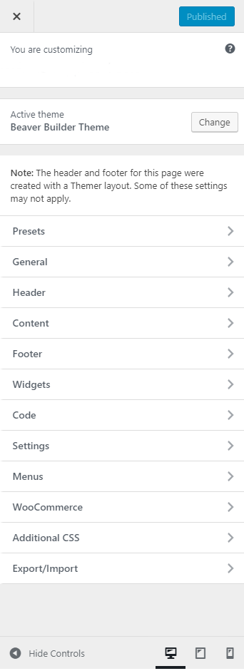
Appearance > Customize
What can you do within the WordPress customizer?
Setting default styles within the customizer is preferred, over writing CSS or customizing each module individually within the Beaver Builder.
Changes done here affect the entire website, as long as CSS and module settings aren’t overwriting them – so you still have the option to change the style of a specific item within the Builder or with CSS if needed be, but since we use the BB Themer Layouts, some settings for Header, Footer, Archive and WooCommerce pages within the customizer might not apply. Read along for a breakdown of available features and best practices.
The Settings Tab
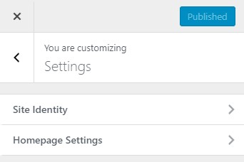
Within the Settings tab, we have Site Identity and Home page settings.
Site Identity
Within the site identity we have the Site Title, Tagline and Icon (favicon). It’s important to keep this information updated, as several places/modules on the website might be pulling information from here. Also, it’s always good practice to add a favicon. It just gives a more professional look/feel to the browser tab. Ideally, we would use the customer’s logo, or a squared crop of part of the logo, but sometimes just an icon or initials with the site colors would do, if their logo was not provided or if it just looks bad.
Homepage Settings
During the initial build, change homepage display to "static page", then add new page > "Home". Then add a new page under "posts page" > "Blog" - to assign a page to your blog or generated posts will reside.
Source: Beaver Builder Knowledgebase - Customizer Settings
Style Controls
Which Customizer Tabs Control Styling?
This section will cover the tabs in the customizer that are responsible for affecting any default site-wide styles.
The General Tab
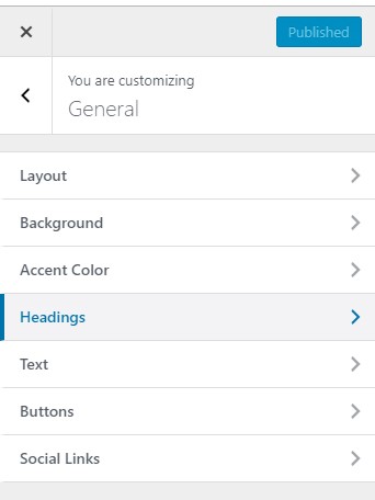
Within the General Tab, we have the option to set a background color for the entire site, an accent color for links and hover effects, and set the style of headings, text and buttons. It is better to set this up here than, to set it up within each Beaver Builder module.
Layout
In "layout" the items to pay attention to are:
Enable scroll to top button
CSS Framework: Minimal Bootstrap 3
Font Awesome Icons: Font Awesome 5Background Color
The default site-wide background color is #f2f2f2, and you can pick a new default color here. This is also a good place to add site-wide background textures, by uploading a background image.
Buttons
Select "custom" to change the default button style.
Accent Color
The accent color will be the default colors used for elements such as links and buttons and various elements throughout the website. Here, you also set the default hover color.
Headings
Set the default heading font and color here - you can make all headings the same font and color or choose to style H1 separately. Letter spacing is also available.
Text
Style the default body font and color.
The Content Tab
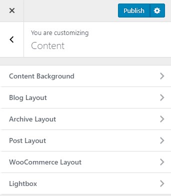
Within the Content Tab, we have the option to set a background color for the content area; style blog, archive, Woo commerce and post layouts. You won’t be doing much here.
Content Background
The default site-wide background color is #ffffff, and you can pick a new default color here, if you’d like. This is also a good place to add content background textures, by uploading images. You might prefer to do that within the Beaver Builder modules, unless all new content areas will follow the same pattern.
Blog, Archive, Post and WooCommerce Layouts
These areas hold the default settings of these auto generated pages, but since we use BB Themer, we won’t be changing anything here. The only thing that you might need if you’re building a store is within the WooCommerce Layouts, setting up the correct amount of columns for the product category pages.
Source: Beaver Builder Knowledgebase - Customizer Settings
Site-wide Code
Where to Place Code
This section will cover the tabs in the customizer that are made for site-wide code and the kind of code you can put in them.
The Code Tab
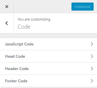
Within the Code Tab, we can add site-wide code. You can add HTML, CSS or JavaScript code into various locations within the HTML page that the Beaver Builder Theme generates. Some examples might be a Google Analytics script, or a Pixel integration code. Read more on how to add page specific code/CSS and our scope of support for custom code entry.
Javascript code
Javascript entered in this area will be rendered within
<script>tags right before the closing<head>tag on every page, so don't include the<script>tags when you paste in code here.Head code
HTML, CSS, or Javascript entered in this area will be rendered in the
<head>tag on every page. If you insert JavaScript into this section, include the<script>tags. This is the place to paste Google Analytics code. (see below)
Header code
HTML, CSS, or Javascript entered in this area will be rendered directly after the opening
<body>tag on every page.Footer code
HTML, CSS, or Javascript entered in this area will be rendered directly before the closing
</body>tag on every page.
How to Insert Google Analytics / Ads / Facebook Pixel code
To insert Google Analytics code into the Beaver Builder theme:
- Go to your Google site and copy the Google Analytics code – the
<script>tags and everything between. - Go to Customize > Code > Head and paste the code there.
- Click Save & Publish.
Follow the same steps for Facebook Pixel or any site-wide script, and put it in the same place. Those scripts usually come with code comments before them - its a good practice to keep these comments as well in case you have a few different scripts in the head section as it helps to distinguish one code from another and clarify script start and endpoints.
The Additional CSS Tab
Any CSS code added to Customize > Additional CSS will apply to any part of any page site-wide, whether it's in a Beaver Builder layout, in a theme area, or in a WordPress content area or generated archive page. Make sure to follow the rules for proper use of CSS before putting anything in this section.
Source: Beaver Builder Knowledgebase - Customizer Settings
WooCommerce
Woo Settings in the Customizer
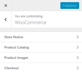
This section will cover the sections in the Customizer that have any influence on WooCommerce and are separate from the settings found in the dashboard. WooCommerce Customizer is part of WordPress > Customize and makes it possible to select options that apply site-wide for Store Notice, Product Catalog and Product Images without touching code. Click here to read more about managing store notice, product catalog and product images.
WooCommerce tab
Store Notice
If enabled, this text will be shown site-wide. You can use it to show events or promotions to visitors.
Checkout
These options let you change the appearance of the WooCommerce checkout.
Company name, address line 2, and phone fields - Choose whether to make these checkout fields optional, required or hidden
Select default pages for Privacy Policy and Terms and Conditions
Privacy policy - Optionally add some text about your store privacy policy to show during checkout.
Terms and conditions - Optionally add some text for the terms checkbox that customers must accept.
Product Catalog
Shop page display - Choose what to display on the main shop page.
Category display - Choose what to display on product category pages.
Default product sorting - How should products be sorted in the catalog by default?Product Images
Main image width - Image size used for the main image on single product pages. These images will remain uncropped.
Thumbnail width - Image size used for products in the catalog.
Thumbnail cropping - Choose from 1:1, custom aspect ratio or uncropped.
The Content Tab > WooCommerce
Some modules, even if you set the columns in the module to a certain number, get overridden sometimes by the settings in this tab. The only item in this tab to keep an eye on in "number of columns". The default setting is usually 4.
If you're experiencing weird column layout issues on a product archive page that has a product grid module set to a different number of columns than 4, it would be a good idea to check this area in the customizer and to change the number of columns to match the number being set in the product grid module. Once that is done, flush the cache, refresh the page, and the layout should correct itself.
Number of Columns - Select how many columns on product category pages? (Choose from 1 to 6)
Source: Beaver Builder KB - Customizer Settings | Woo Docs - Woo Customizer

