
Restaurant / Food Service
Site Colors
General Tone: generally warm palettes are common, or a cool palette with a warm color accent
Site Background: most commonly white, sometimes off-white or light beige unless dark theme is requested
Font Recommends
Use circular geometric sans, rounded display sans or blocky sans in the hero paired with sans serif or condensed subheadings
Fonts for Headings
Fonts for Body
Fonts for Nav Links
Header Specs
- Background: white, dark theme or transparent – or white with top bar using site’s primary color as the background
- Height (pixels): no more than 150px tall
- Main Elements: logo, primary navigation, icons – cart, location, search
- Optional Elements: secondary navigation, cta, banner
- Sticky (Y/N): use only if specifically requested and if the following criteria apply: header is less than 80px tall or all extra header elements are in a hamburger menu
Header Templates
The following are header and top bar template suggestions based on the components of the templates that match with the research done by site vertical. These are only suggestions, other headers not listed can also be used if the content provided by the customer fits those better.
If you use a certain header from this list, make sure to read its details and setup to see whether or not it should be paired with a top bar. Be mindful not to repeat elements in both a header and top bar combination.
Store Topbar – announce, cart, icons [ 2 ]
Components: Call-to-Action, Store Icons
Details & Setup
View Demo
Components: Call-to-Action, Store Icons
Details & Setup
View Demo
Store Topbar – icons, cart, account [ 1 ]
Components: Social Icons, Store Icons
Details & Setup
View Demo
Components: Social Icons, Store Icons
Details & Setup
View Demo
Header Store – logo, hamburger, search, cart, icons [ 2 ]
Components: Hamburger Menu, Logo, Product Search Bar, Store Icons
Details & Setup
View Demo
Components: Hamburger Menu, Logo, Product Search Bar, Store Icons
Details & Setup
View Demo
Header Middle – logo, hamburger, cta, search, icons [ 6 ]
Components: Call-to-Action, Hamburger Menu, Logo, Site Search, Social Icons
Details & Setup
View Demo
Components: Call-to-Action, Hamburger Menu, Logo, Site Search, Social Icons
Details & Setup
View Demo
Header Simple – logo, menu with cta css [ 5 ]
Components: Logo, Menu CSS Class
Details & Setup
View Demo
Components: Logo, Menu CSS Class
Details & Setup
View Demo
Header Simple – logo, hamburger, search [ 2 ]
Components: Hamburger Menu, Logo, Site Search
Details & Setup
View Demo
Components: Hamburger Menu, Logo, Site Search
Details & Setup
View Demo
Header Simple – logo, hamburger, cta [ 1 ]
Components: Call-to-Action, Hamburger Menu, Logo
Details & Setup
View Demo
Components: Call-to-Action, Hamburger Menu, Logo
Details & Setup
View Demo
Footer Specs
The following are the most common elements found in footers of this site vertical:
- social icons
- primary menu
- call-to-action
- copyright
- disclaimers
Footer Templates
The following are footer template suggestions based on the components of the templates that match with the research done by site vertical. These are only suggestions, other footers not listed can also be used if the content provided by the customer fits those better. Feel free use these as base templates and add/remove or adjust positioning of the elements within them per request of the customer or per their site goal.
Footer [ 4 ] – Official
Components: Copyright, GD Badge, Logo, Logo Badges, Primary Menu, Social Icons
Details & Setup
View Demo
Components: Copyright, GD Badge, Logo, Logo Badges, Primary Menu, Social Icons
Details & Setup
View Demo
Footer [ 2 ] – Informational
Components: Copyright, GD Badge, Logo, Primary Menu, Secondary Menu, Social Icons, Subscribe Form, WordPress Widgets
Details & Setup
View Demo
Components: Copyright, GD Badge, Logo, Primary Menu, Secondary Menu, Social Icons, Subscribe Form, WordPress Widgets
Details & Setup
View Demo
Footer [ 1 ] – Basic
Components: Copyright, GD Badge, Logo, Primary Menu, Social Icons
Details & Setup
View Demo
Components: Copyright, GD Badge, Logo, Primary Menu, Social Icons
Details & Setup
View Demo
Hero Specs
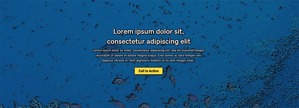
- Height: 1/2 to 3/4 screen height is standard, however, use hero media to make layout decision
- Background: deals slider or image/parallax are most common – other hero options may also be used if they are requested
- Text alignment: left or center are standard – use page layout flow guidelines to change it if hero media better suits a different alignment
- Call to action (Y/N): cta should be included in the top-fold unless specifically requested not to
- Element Padding: regular/normal padding (20px-40px)
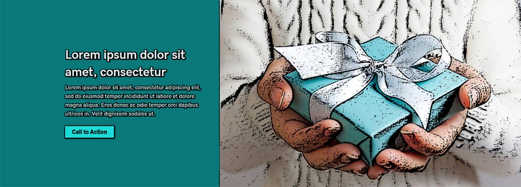
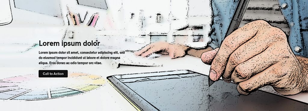
Home Hero Templates
The following homepage hero layouts are only suggestions based on the kinds of hero layouts recorded during design research per vertical. Ultimately, the media chosen for the hero row background will determine what kind of hero layout will work best. You can also pair the hero with a row separator or create a layout of your choosing that isn't shown here, if the content and media provided by the customer fits it better.
Other Elements
Relevant Site Templates
The following are site template suggestions for built-in post types like blogs or products based research done by site vertical. These are only suggestions, other templates not listed can also be used or pages/templates can be custom built if the content provided by the customer fits those better. If you use a certain template from this list, make sure to read its details and setup to see how it should be configured and/or modified.
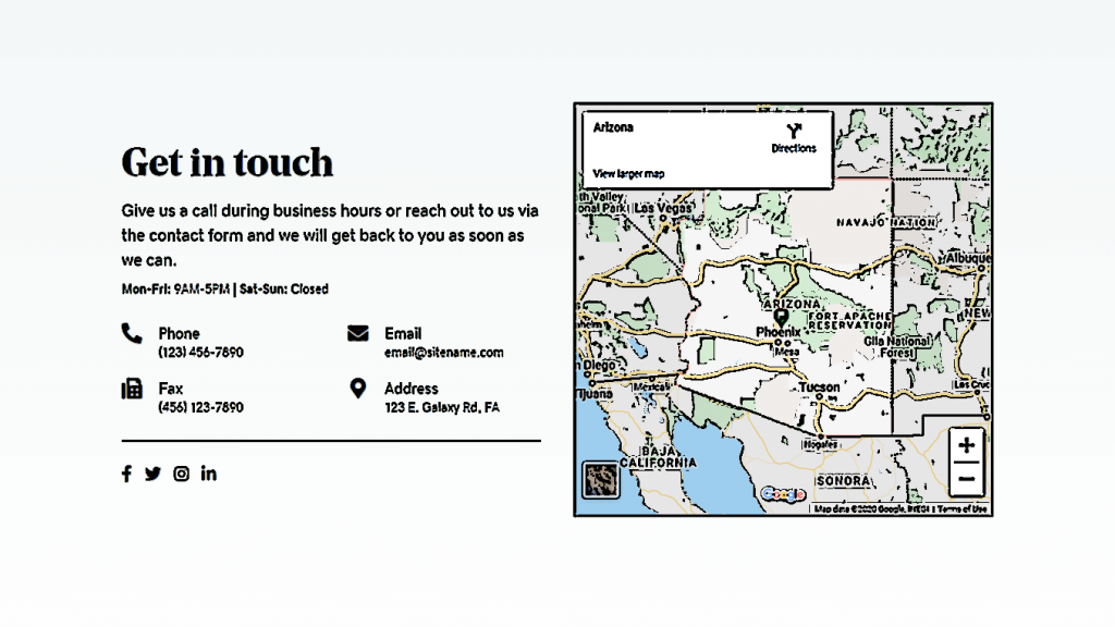
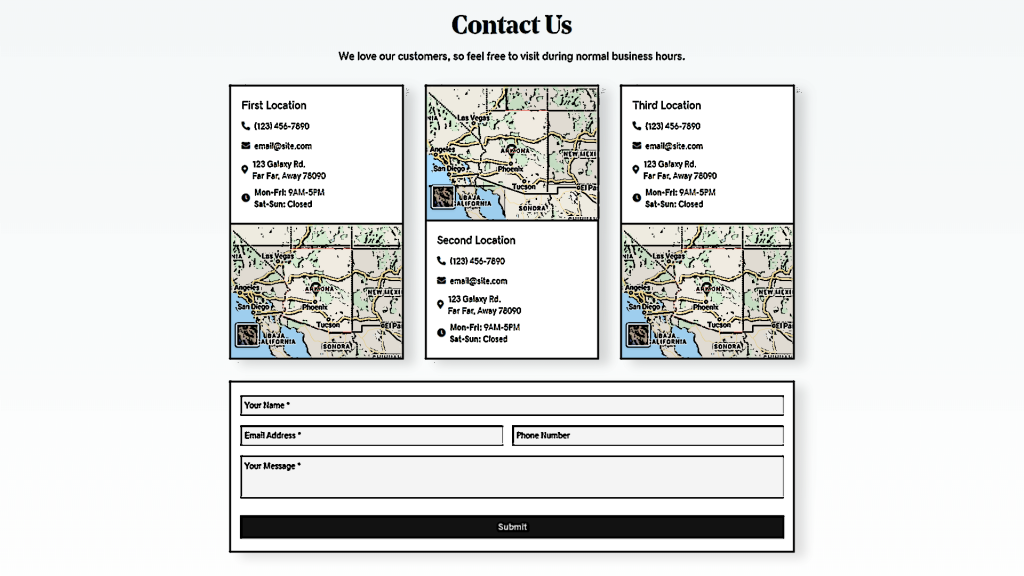
Contact Layout 6 – Multiple Locations
Components: Contact Form, Map, Phone Number
Details & Setup
View Demo
Components: Contact Form, Map, Phone Number
Details & Setup
View Demo
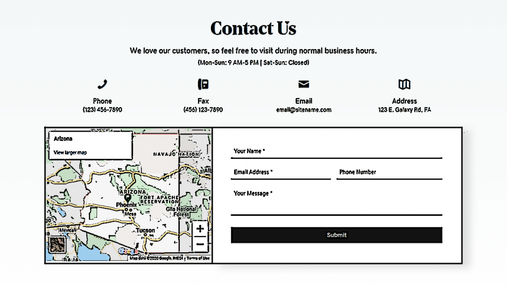
Contact Layout 5 – Single Location
Components: Contact Form, Map, Phone Number
Details & Setup
View Demo
Components: Contact Form, Map, Phone Number
Details & Setup
View Demo
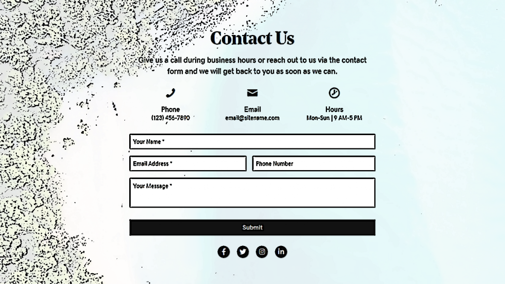
Contact Layout 3 – Singular Contact
Components: Contact Form, Phone Number, Social Icons
Details & Setup
View Demo
Components: Contact Form, Phone Number, Social Icons
Details & Setup
View Demo
Footer [ 4 ] – Official
Components: Copyright, GD Badge, Logo, Logo Badges, Primary Menu, Social Icons
Details & Setup
View Demo
Components: Copyright, GD Badge, Logo, Logo Badges, Primary Menu, Social Icons
Details & Setup
View Demo
Footer [ 2 ] – Informational
Components: Copyright, GD Badge, Logo, Primary Menu, Secondary Menu, Social Icons, Subscribe Form, WordPress Widgets
Details & Setup
View Demo
Components: Copyright, GD Badge, Logo, Primary Menu, Secondary Menu, Social Icons, Subscribe Form, WordPress Widgets
Details & Setup
View Demo
Footer [ 1 ] – Basic
Components: Copyright, GD Badge, Logo, Primary Menu, Social Icons
Details & Setup
View Demo
Components: Copyright, GD Badge, Logo, Primary Menu, Social Icons
Details & Setup
View Demo
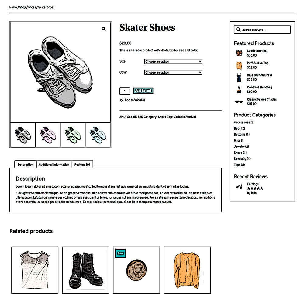
Product Singular – Standard
Components: Product Search Bar, Sidebar, Themer Modules, WordPress Widgets
Details & Setup
View Demo
Components: Product Search Bar, Sidebar, Themer Modules, WordPress Widgets
Details & Setup
View Demo
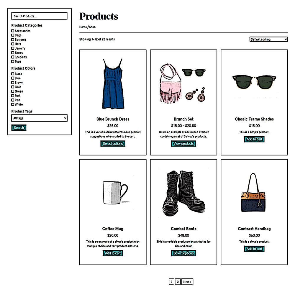
Shop Archive Grid – Sidebar, SF, Sort [Filterable]
Components: Posts Module, Search Filter
Details & Setup
View Demo
Components: Posts Module, Search Filter
Details & Setup
View Demo
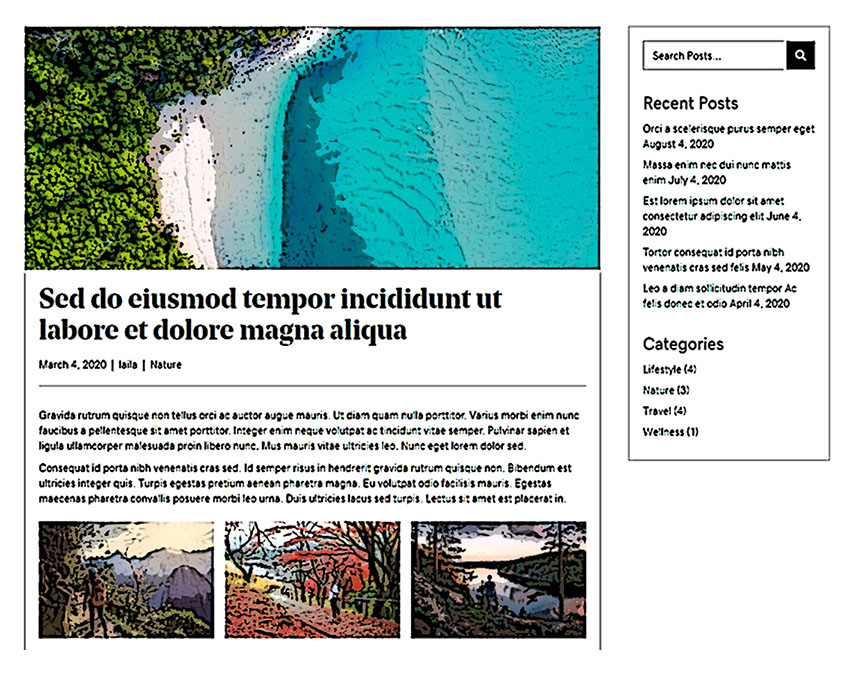
Post Singular Simple – Sidebar, widgets, social
Components: Sidebar, Site Search, Social Share, Themer Modules, WordPress Widgets
Details & Setup
View Demo
Components: Sidebar, Site Search, Social Share, Themer Modules, WordPress Widgets
Details & Setup
View Demo
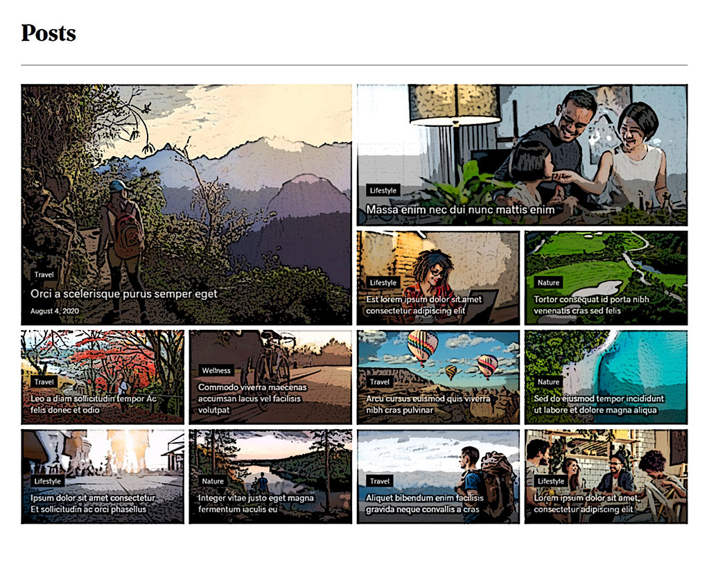
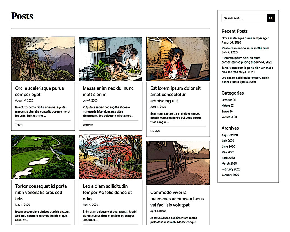
Post Archive Grid – Sidebar, search, widgets
Components: Posts Module, Sidebar, Site Search, WordPress Widgets
Details & Setup
View Demo
Components: Posts Module, Sidebar, Site Search, WordPress Widgets
Details & Setup
View Demo
Store Topbar – announce, cart, icons [ 2 ]
Components: Call-to-Action, Store Icons
Details & Setup
View Demo
Components: Call-to-Action, Store Icons
Details & Setup
View Demo
Store Topbar – icons, cart, account [ 1 ]
Components: Social Icons, Store Icons
Details & Setup
View Demo
Components: Social Icons, Store Icons
Details & Setup
View Demo
Header Store – logo, hamburger, search, cart, icons [ 2 ]
Components: Hamburger Menu, Logo, Product Search Bar, Store Icons
Details & Setup
View Demo
Components: Hamburger Menu, Logo, Product Search Bar, Store Icons
Details & Setup
View Demo
Header Middle – logo, hamburger, cta, search, icons [ 6 ]
Components: Call-to-Action, Hamburger Menu, Logo, Site Search, Social Icons
Details & Setup
View Demo
Components: Call-to-Action, Hamburger Menu, Logo, Site Search, Social Icons
Details & Setup
View Demo
Header Simple – logo, menu with cta css [ 5 ]
Components: Logo, Menu CSS Class
Details & Setup
View Demo
Components: Logo, Menu CSS Class
Details & Setup
View Demo
Header Simple – logo, hamburger, cta [ 1 ]
Components: Call-to-Action, Hamburger Menu, Logo
Details & Setup
View Demo
Components: Call-to-Action, Hamburger Menu, Logo
Details & Setup
View Demo
Relevant Pre-built Pods
The following are suggestions for pre-built pods layouts. These are only suggestions based on what post types the site verticals commonly have. Other pods layouts not listed can also be used or pods can be custom built if the content provided by the customer requires something not yet made. If you use a certain prebuilt pod from this list, make sure to read its details and setup to see how it should be imported, configured and/or modified.

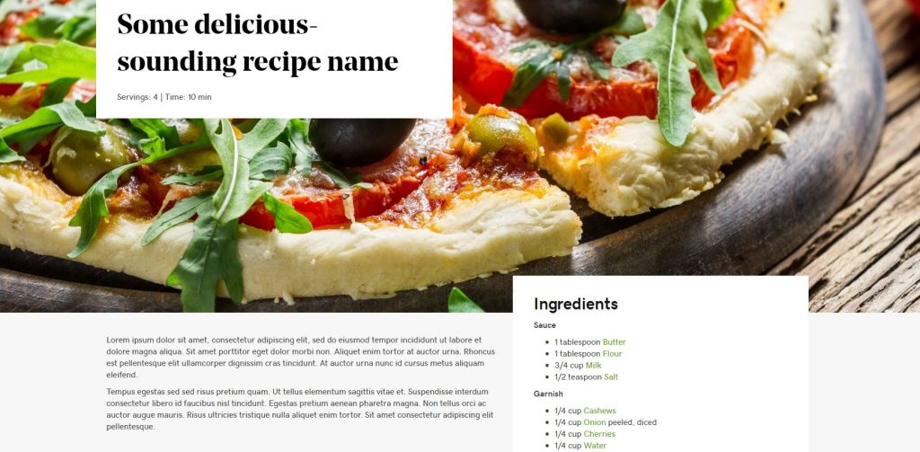

Table of Contents
Add a header to begin generating the table of contents