
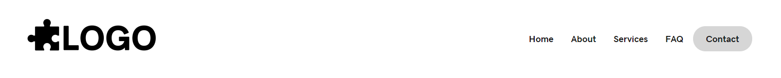
Header Simple – logo, menu with cta css [ 5 ]
Category: Site Header | Components: Logo, Menu CSS Class
Template Details
Header Simple – logo, menu with cta css
Use cases
- Sites with very few menu items e.g. 4-5 pages max.
- Sites that want the last item of their header menu to be styled like a Call-to-action button
- Stores with either of the above cases, paired with a top bar containing store items
- This header can also be used without the CTA class on the menu item, making it a header with simply a menu to the right of the logo
Top Bars
Pair Site Header [ 5 ] with a top bar for additional elements

Component breakdown
- Logo – template uses a standard photo module with the link set to site URL via field connection which can be swapped with an info box for a text business name, an icon with text, or an image with text – make sure that if you swap the photo module for an infobox the link is set to complete box and site URL via field connection
- Menu – template uses a PowerPack advanced menu module aligned to the right with responsive toggle hamburger set to be visible on small screens.
- CTA with CSS – template uses CSS to style the last menu item to look like a button.
Custom code
This header layout uses custom CSS and instructions on how to use/make adjustments to it are as follows:
- Create your menu and make sure to enable custom CSS classes for menu items
- Place this class “menu-cta” on the menu item that you want to be styled like a CTA button
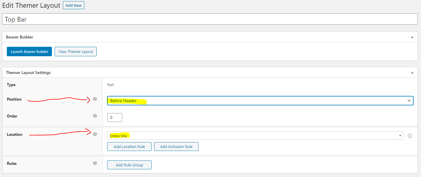
- Load the site header [ 5 ] template into your header themer layout and select the menu that you added the class to – the item with the class should now appear like a CTA button
- While in the builder, click the tools dropdown at the top left of the screen > then click Layout CSS / JavaScript – the CSS for the button color styling should be here, you can change it or adjust it as needed
.menu > li.menu-cta {
	background-color: #d6d6d6;
	border-radius: 25px;
	padding: 0px 10px 2px;
}
The top bars in the site and store packages use custom HTML and CSS and instructions on how to use/make adjustments to these are discussed on the template posts for the individual top bars
How to Use
Download & Import Templates
- Choose one of the available template packages to download from the sidebar to the right
- Click the button to download the .xml for the desired template package
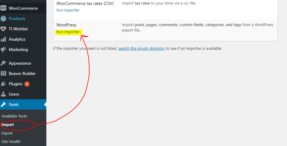
- Go to the site you want to import the template on, once you've installed GD Core and set up all the required plugins
- Go to the dashboard > tools > import - then at the bottom, under WordPress click "install now" > then click "run importer"
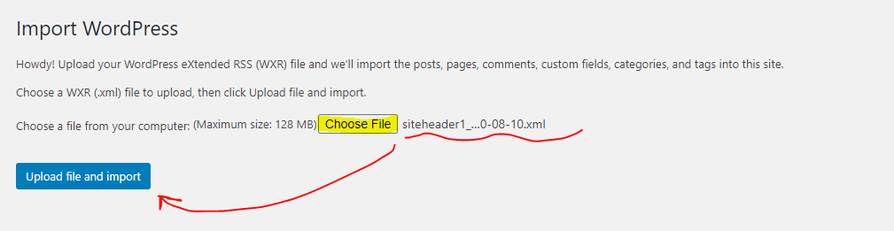
- Select your downloaded template package .xml from the "choose file" button > then click "upload file and import"
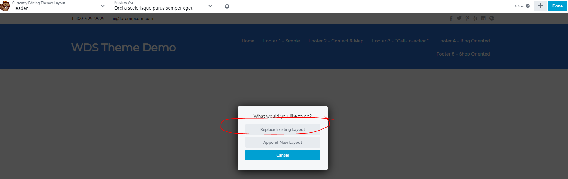
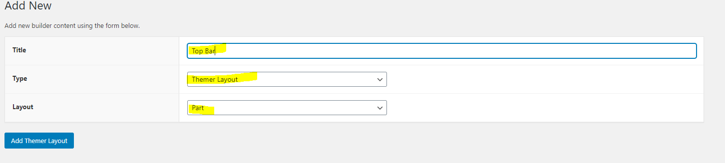
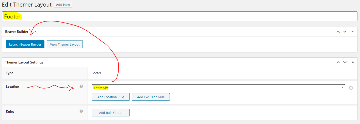
Step 1
Step 2
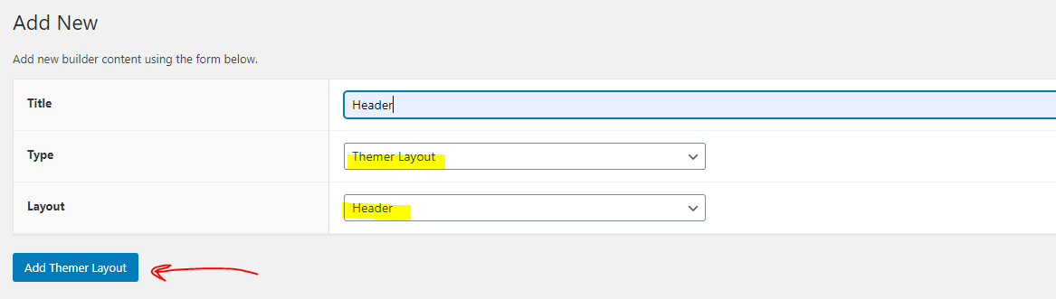
Apply Templates to Layouts

Note:
Feel free to adjust the widths of the columns to work with whatever changes you make to the template's components.
Make sure to check these adjustments on tablet and mobile responsive views as well to make sure the layouts appear correct on all screen sizes.
Table of Contents
Add a header to begin generating the table of contents
View Demo Download Template
Package Template Includes: Site Header [ 5 ] -and- Site Top Bar 1,2
Download PackagePackage Template Includes: Site Header [ 5 ] -and- Store Top Bar 1,2,3
Download Package