Site Templates

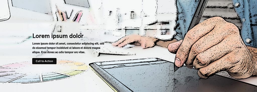
Home Hero – Rule of Thirds
Template Type: Hero
Components: Call-to-Action
Visually divide the hero section into thirds. The focal point is generally in 1/3 to 1/2 of the image on its right or left. The text content will go on the side opposite the focal point.
Template Type: Hero
Components: Call-to-Action

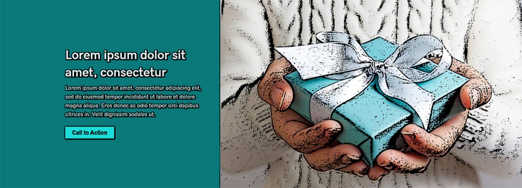
Home Hero – Split Screen
Template Type: Hero
Components: Call-to-Action
This layout is great for hero images with a center focal point – if you place text over the image, it would cover the important parts, so the content is placed beside the image instead.
Template Type: Hero
Components: Call-to-Action

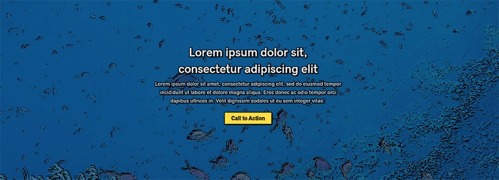
Home Hero – Text Overlay
Template Type: Hero
Components: Call-to-Action
This is a good layout if the hero image is not too busy, has no real focal point or has lots of negative space along the top.
Template Type: Hero
Components: Call-to-Action
- « Previous
- 1
- 2
- 3
- 4
- Next »


