
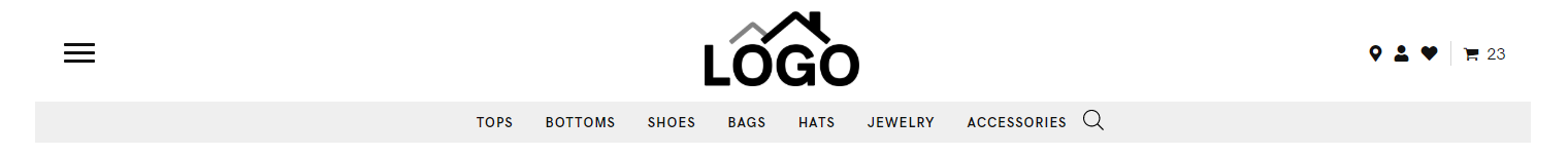
Header Store – logo, hamburger, search, cart, icons, cat nav [ 3 ]
Category: Store Header | Components: Hamburger Menu, Logo, Product Search Icon, Secondary Menu, Store Icons
Template Details
Header Store – logo, hamburger, search, cart, icons, cat nav
Use cases
- Stores with a primary site menu containing lots of menu items or menu links with long character lengths
- Stores that want a secondary menu with categories in the header
- Stores that want product search to be easily accessible in the header on every page
- Stores that use wishlists and want wishlist and cart icons in the header with the number of items in these beside the icons
Component breakdown
- Logo – template uses a standard photo module with the link set to site URL via field connection which can be swapped with an info box for a text business name, an icon with text, or an image with text – make sure that if you swap the photo module for an infobox the link is set to complete box and site URL via field connection
- The logo column is being hidden on mobile screens and another column with the logo is being displayed instead on mobile for stacking purposes, so if you change the logo module, make sure you change it in both places
- Hamburger Menu (primary) – template uses a PowerPack advanced menu module with responsive toggle hamburger set to be always visible. The responsive display is set to off-canvas from left and the hamburger/menu text alignment is also set to left.
- The menu module will appear empty unless you have a menu created and ready to select from the dropdown in the module – so make sure you create a menu first
- Category Menu (secondary) – template uses a standard menu module aligned to the center.
- The menu module will appear empty unless you have a menu created and ready to select from the dropdown in the module – so make sure you create a menu using product categories first
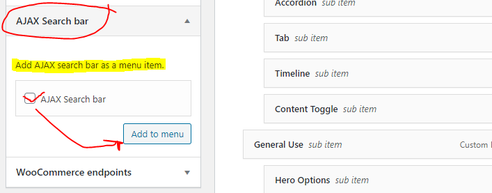
- You’ll also notice that the last menu item is the woo Ajax product search icon – to get this effect:
- Edit your category menu, and you should see “AJAX Search bar” as one of the options for items you can add to the menu – add it as the last item
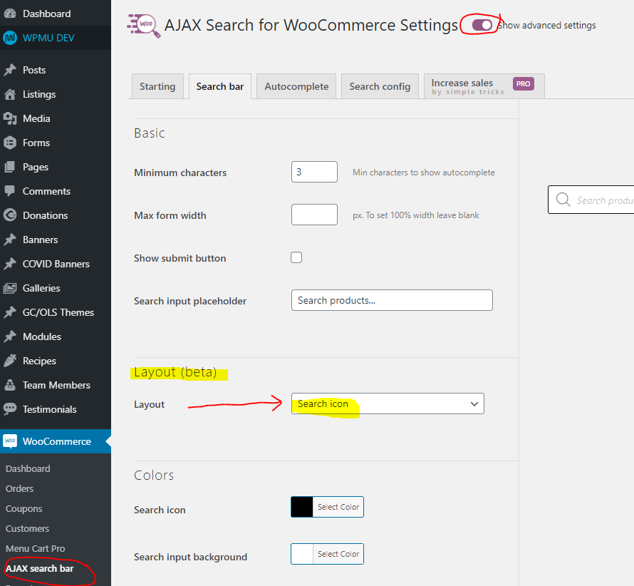
- To get it to be styled like an icon only, go to the dashboard > woocommerce > Ajax search bar – then in the search bar tab, for the second item “Layout (beta),” change it to “Search icon” and save changes
- Store Icons – template uses a custom HTML module with the wishlist and cart shortcode in it along with a bunch of common icons like the location and user icons which can be linked to pages like contact or account/login etc.
Custom code
This header layout uses custom HTML and CSS. If you click the HTML module, you’ll find the following code:
Note: This section contains HTML. Importing the template can cause the custom code to break – after importing the template, you will want to replace the HTML in the module with the fresh HTML below.
<div class="headone">
    <a class="socicon" href="#" target="_blank">
        <i class="fas fa-map-marker-alt"></i>
    </a>

    <a class="socicon" href="#" target="_blank">
        <i class="fas fa-user"></i>
    </a>

    [ti_wishlist_products_counter]

<!-- EXTRA PRELOADED ICON LINKS ----

    <a class="socicon" href="tel:0000000000">
        <i class="fas fa-phone-alt"></i>
    </a>

    <a class="socicon" href="sms:0000000000">
        <i class="fas fa-mobile-alt"></i>
    </a>

    <a class="socicon" href="mailto:email@site.com">
        <i class="fas fa-envelope"></i>
    </a>

    <a class="socicon" href="#" target="_blank">
        <i class="fab fa-facebook-f"></i>
    </a>

    <a class="socicon" href="#" target="_blank">
        <i class="fab fa-twitter"></i>
    </a>

    <a class="socicon" href="#" target="_blank">
        <i class="fab fa-instagram"></i>
    </a>

    <a class="socicon" href="#" target="_blank">
        <i class="fab fa-linkedin-in"></i>
    </a>

    <a class="socicon" href="#" target="_blank">
        <i class="fab fa-pinterest-p"></i>
    </a>

    <a class="socicon" href="#" target="_blank">
        <i class="fab fa-youtube"></i>
    </a>

    <a class="socicon" href="#" target="_blank">
        <i class="fab fa-snapchat-ghost"></i>
    </a>

    <a class="socicon" href="#" target="_blank">
        <i class="fab fa-twitch"></i>
    </a>

    <a class="socicon" href="#" target="_blank">
        <i class="fab fa-tiktok"></i>
    </a>

    <a class="socicon" href="#" target="_blank">
        //replace this string with any icon from
        fontawesome.com/icons
    </a>
-------------- -->

</div>

<div class="headtwo">
    [wpmenucart]
</div>- You can remove the wishlists shortcode if the customer is not using this feature on their site and you can use any of the preloaded icons in the commented out section to display icons as needed.
- All items loaded in the div with the class “headone” will appear before the gray divider line, and all items loaded in the div with the class “headtwo” will appear after the gray divider line with the cart.
- While in the builder, click the tools dropdown at the top left of the screen > then click Layout CSS / JavaScript – the CSS for the CSS styling applied to the custom HTML
.head-custom-icons .fl-html {
    display: flex;
    align-items: center;
    font-size: 15px;
    /*------uncomment for right align------*/
    /*justify-content: flex-start; */
    /*------uncomment for left align------*/
    justify-content: flex-end;
    /*------uncomment for center align------*/
    /*justify-content: center; */
}
.head-custom-icons .fl-html a {
    /*change colors as needed ---
    --- remove color style to keep site's default link color*/
    color: #111111;
}
.head-custom-icons .fl-html a:hover {
    /*change colors as needed ---
    --- remove color style to keep site's default link hover color*/
    color: #444444;
}

/*------uncomment for cart on the left------*/
/* .headtwo {
    padding-right: 8px;
    margin-right: 8px;
    border-right: 1px solid #d6d6d6;
} */
/*------uncomment for cart on the right------*/
.headtwo {
    padding-left: 8px;
    margin-left: 8px;
    border-left: 1px solid #d6d6d6;
}
.headone a, .headtwo a {
    margin: auto;
    padding: 0 4px;
}

/*-------CSS for styling the wishlists shortcode heart icon--------*/
a.wishlist_products_counter.top_wishlist-heart.top_wishlist-.no-txt.wishlist-counter-with-products:before {
    vertical-align: text-bottom;
    margin: 0;
}
WP Menu Cart Pro: Settings
The template is using the [wpmenucart] shortcode in the Custom HTML module along with the wishlist shortcode and store icons. You will need to make sure the following settings are in place in order for the menu to look right in the header template.
- Go to dashboard > WooCommerce > Menu Cart Pro
- Since the shotcode is being used in the template, you don’t need to select a menu to display cart in, unless requested in the footer or somewhere else
- Check the box “always display cart“
- Uncheck the box “use flyout“
- Check the box to display cart icon
- From dropdown “Contents of the menu cart item” select “items only” unless something else is requested
Color of WP Menu Cart Pro is controlled by the CSS above – you can remove the CSS by following the instructions in the commented out portions if you want to revert to using the site’s accent color for links OR you can replace the #111111 color in the CSS with a different color.
How to Use
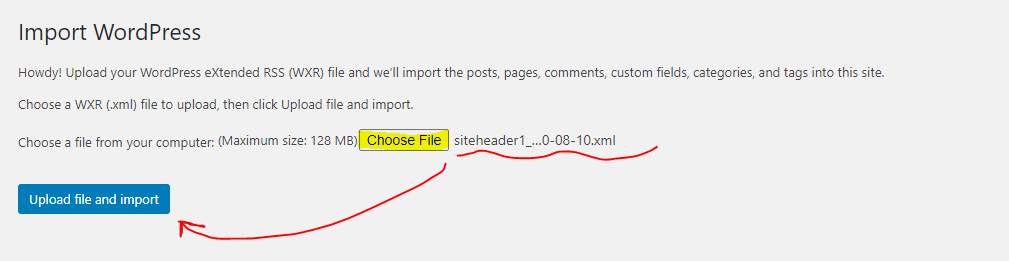
Download & Import Templates
- Choose one of the available template packages to download from the sidebar to the right
- Click the button to download the .xml for the desired template package
- Go to the site you want to import the template on, once you've installed GD Core and set up all the required plugins
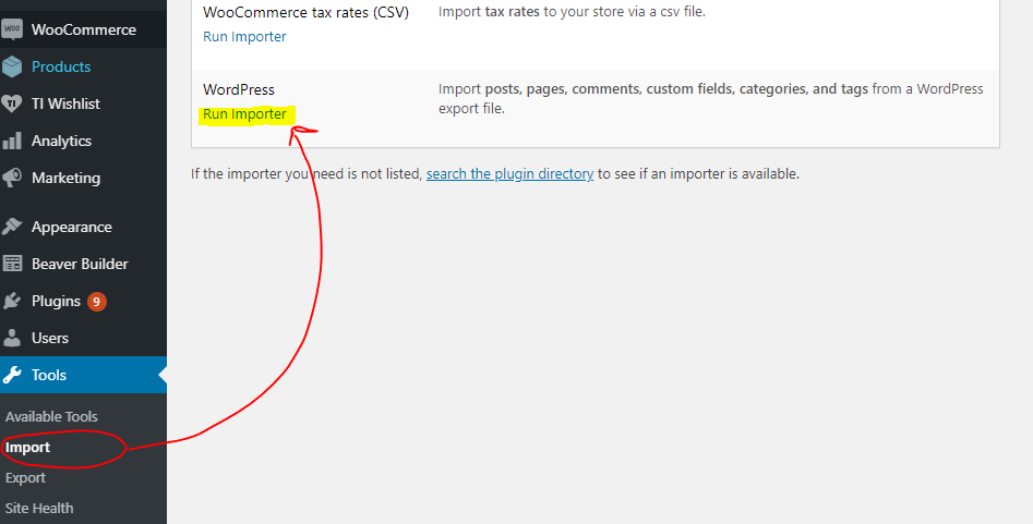
- Go to the dashboard > tools > import - then at the bottom, under WordPress click "install now" > then click "run importer"
- Select your downloaded template package .xml from the "choose file" button > then click "upload file and import"
Step 1
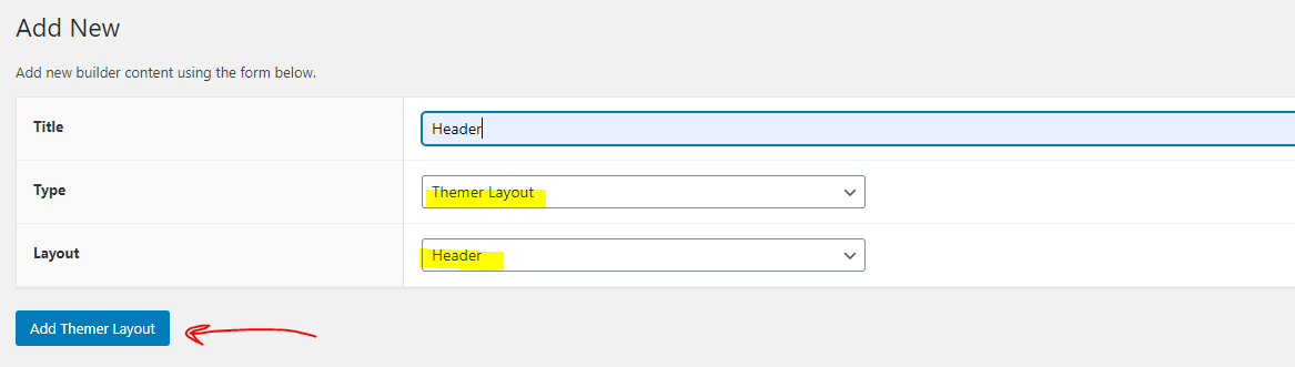
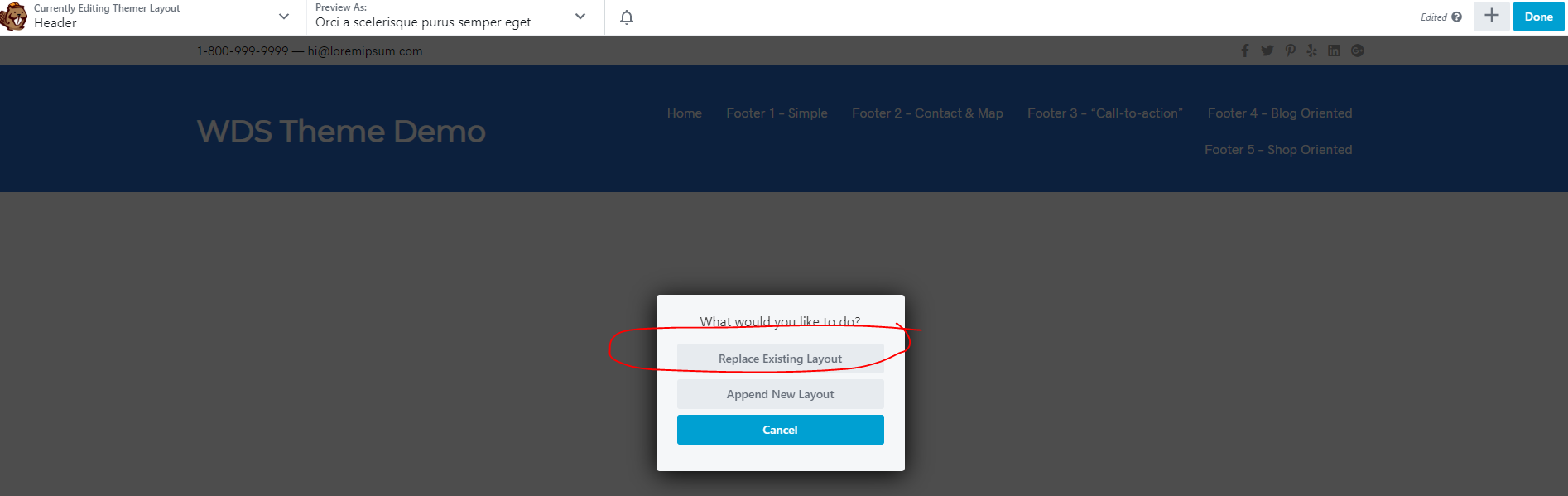
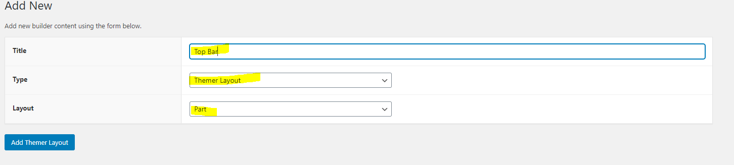
Step 2
Apply Templates to Layouts

Note:
Feel free to adjust the widths of the columns to work with whatever changes you make to the template's components.
Make sure to check these adjustments on tablet and mobile responsive views as well to make sure the layouts appear correct on all screen sizes.
Table of Contents
Add a header to begin generating the table of contents