
How to Use a Vertical Nav-Bar in Beaver Builder Themer
June 5, 2019 | Beaver Builder, Menus, Tips & Tricks, WordPress
Disable Themer Header
Step 1: Turn off Beaver Builder Themer Layout for Header (Click here for more information on Themer Layouts)
If you’re working on a site that has a header set up via themer, you may want to save that header just in case the vertical nav layout doesn’t work and you want to switch back. In this case, to disable the themer header:
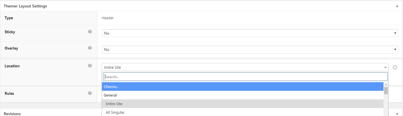
- Go to dashboard > beaver builder > themer layouts
- Click “edit” on the header layout
- Change the “location” from “entire site” to “choose“, then publish
Enable Vertical Header
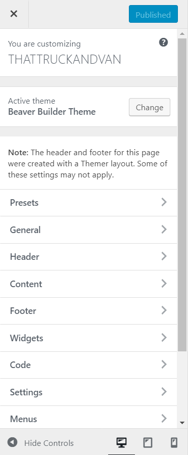
Step 2: Launch Customizer
Step 3: Select “Header” tab from customizer, then Select “Header Layout“.
Then select the “Layout” option. Vertical options include Nav Vertical Left, and Nav Vertical Right. You can also control the Vertical width and padding.
launch customizer 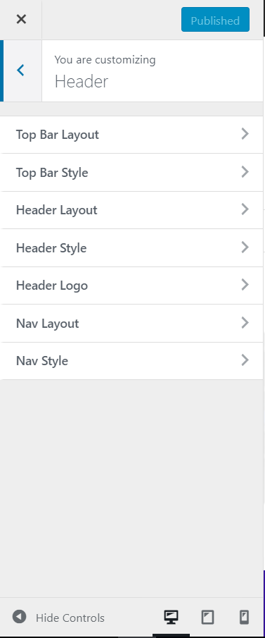
header tab 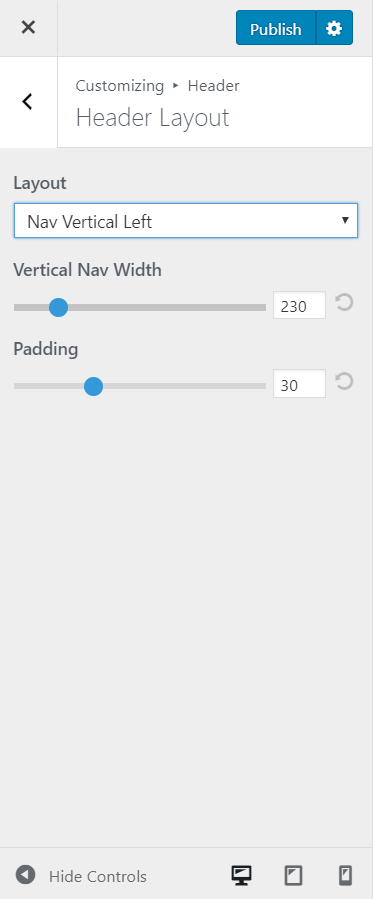
header layout
Important Things to Note
- The only things that can be placed in the vertical nav are the logo, the menu and the search icon. No extra modules can be placed in it.
- If customer has a logo, make sure to upload logo through site settings for it to appear above the navigation.
Tip: The header logo is sized according to the amount of space in the vertical bar. If the logo appears too small, decrease the Padding setting first, then try increasing the Vertical nav width setting. - If the header requires extra content in addition to the components that can be placed in a vertical nav, you should stick to a horizontal header option via beaver themer OR you can enable top bar from the customizer and place the content there instead.
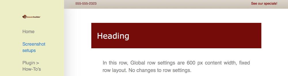
How the Top Bar Works
- You can optionally enable a top bar strip above your header with up to two columns of content. It’s a great place for quick messages or social icons.
- If you select Text for either column, you can enter HTML in the content areas, such as links to email addresses, heading tags, or even a small image.
- If you select Social icons, configure the icons at Customize > General > Social links.
- If you enable just one column, the content is centered. If you enable two columns, the left column is left-justified and the right column is right-justified at larger screen sizes. As the screen is sized smaller, the two columns become stacked and centered.
- The maximum width of the content is controlled by the Content width setting in Customize > General > Layout.
Click here to read more about the top bar layout.
You can set the following styles in the top bar:
- A background color or image in the top bar, with all the usual settings for positioning and sizing the background image.
- Top bar text font color, link color, and hover color.
Click here to read a detailed article on where menu colors come from.
You can use CSS to style items in the top bar if styling is needed beyond what the customizer allows for it. If custom CTA text, buttons or social icons not included in the social links area are required, just choose an HTML box and custom create them in HTML using fontawesome and some CSS skills to style them properly.
Click here to view an example on codepen of how to create custom social icons and style them.
Source: https://kb.wpbeaverbuilder.com/article/155-customizer-settings-the-header-tab