This guide is not only a resource for QA Standards but is a general guide for the proper handling of color contrast. It covers the correct color contrast for text, icons, logos and graphics. Color contrast if very important for readability and the overall design of a site and when building a site, you will want to make sure you follow the guidelines outlined below and in the QA Standards guide.
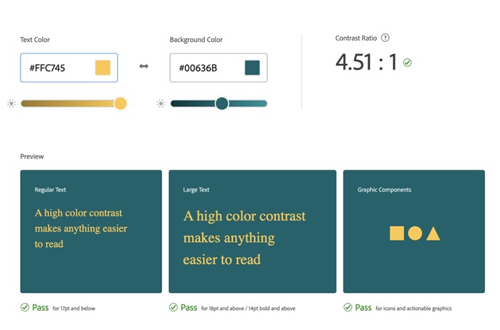
- Color combinations for text, logos, icons and graphics should have a contrast ratio that is at least 4.5:1.
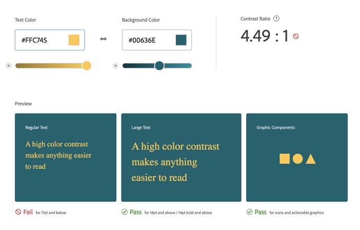
- Even a slightly lower contrast ration can cause readability issues.
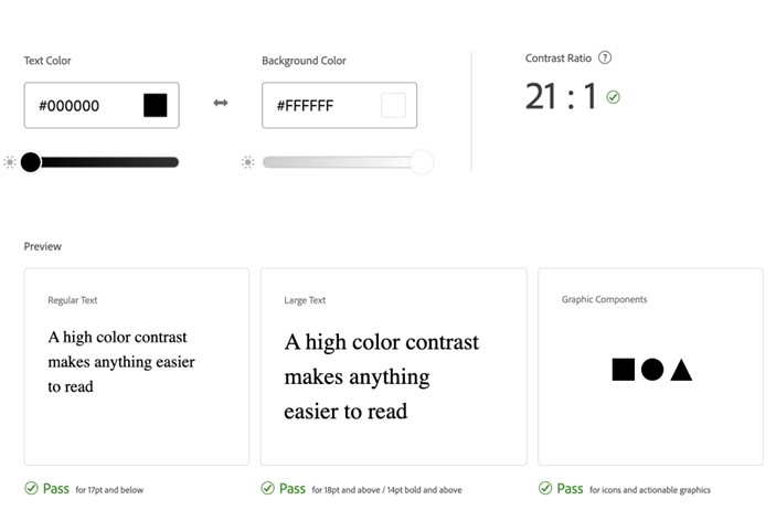
- The highest contrast ratio is between full black (#000000) and full white (#FFFFFF) and is 21 : 1.
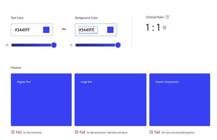
- The lowest contrast ratio is between two of the same color, for example, blue on blue), and is 1 :1.