Call-to-Action
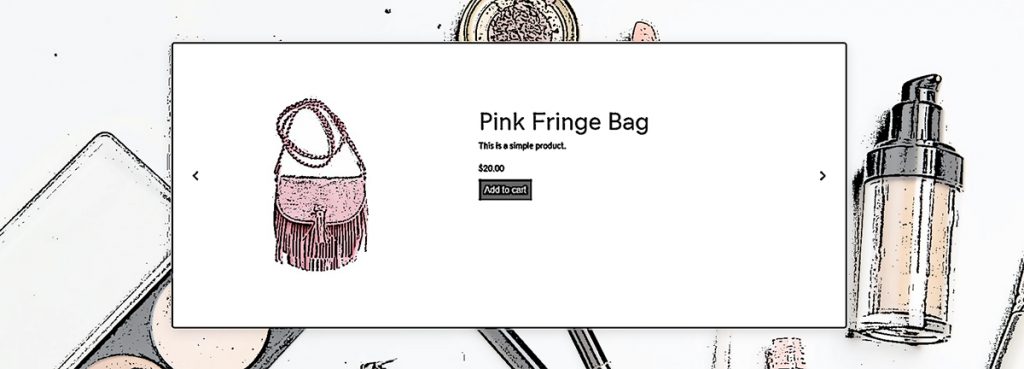
Use this hero layout if you have a premium shop with many products that get regularly added, and you would like for your latest or featured products to be the first thing people see on the site.
Template Type: Hero
Components: Call-to-Action, Posts Module
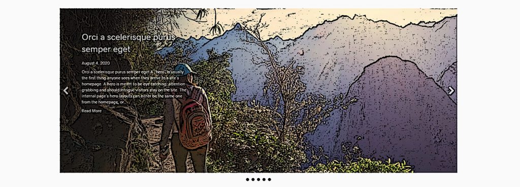
Use this hero layout if you have a blog-centric site with posts that get regularly updated, and you would like for your latest posts to be the first thing people see on the site.
Template Type: Hero
Components: Call-to-Action, Posts Module
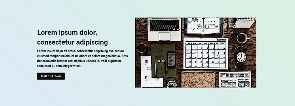
This layout works best for cases where the hero image is too small to fill the screen, or if everything in the image is so important that it can’t be cropped or hidden.
Template Type: Hero
Components: Call-to-Action
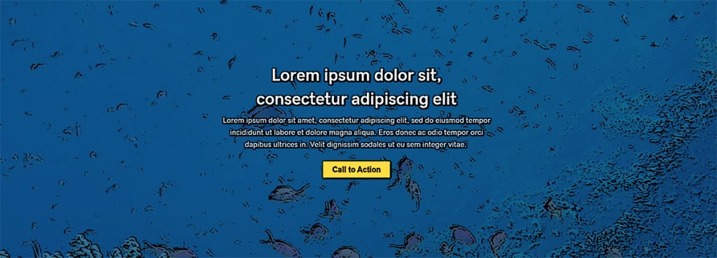
This is a good layout if the hero image is not too busy, has no real focal point or has lots of negative space along the top.
Template Type: Hero
Components: Call-to-Action
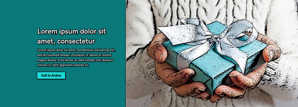
This layout is great for hero images with a center focal point – if you place text over the image, it would cover the important parts, so the content is placed beside the image instead.
Template Type: Hero
Components: Call-to-Action
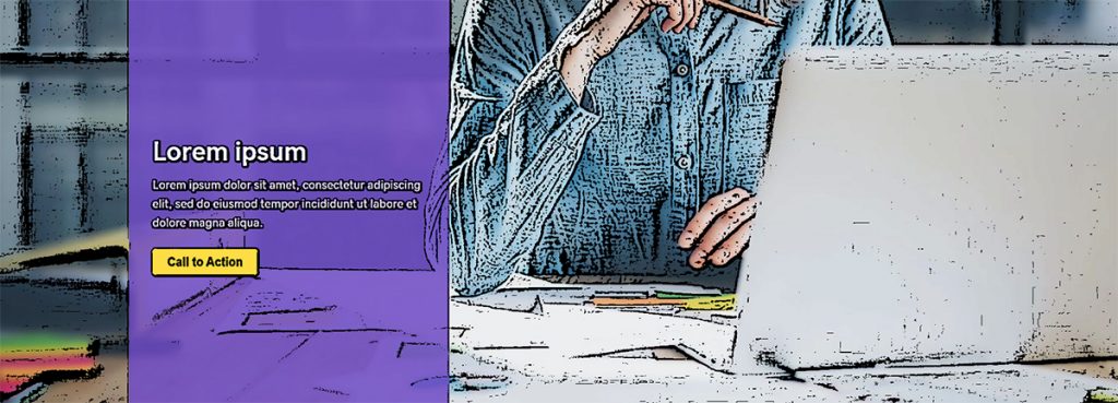
Similar to the “Rule of Thirds” hero layout, but the text content might need more contrast or more of the image might need to show.
Template Type: Hero
Components: Call-to-Action
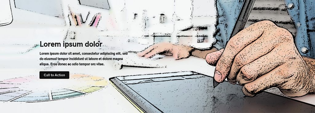
Visually divide the hero section into thirds. The focal point is generally in 1/3 to 1/2 of the image on its right or left. The text content will go on the side opposite the focal point.
Template Type: Hero
Components: Call-to-Action


