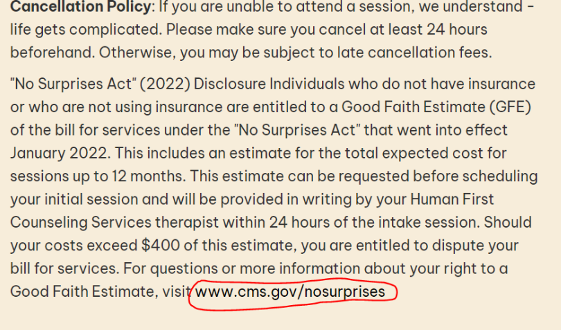
Hyperlink not styled appropriately to stand out as a link
- The hyperlink looks like regular text and does not stand out
- Links do not need to match the websites branding/colors, contrast and readability is more important
- If using a color that is similar to the sites body text then an underline should be used
Example: In this instance, the text is only slightly darker from the surrounding text, and not underlined. Thus, is barely distinguishable as a link, and would be considered an error.
Example(s): In the sites below each one uses a color that is not part of the sites branding/color scheme for links to ensure readability.