
The Business Personality Quiz, How it Works and How to Use it
February 23, 2023 | WooCommerce, WordPress
What is the Business Personality Quiz?
Currently during the design intake process, a WS will walk them through a short branding personality quiz. This quiz is typically for if the customer is newly being onboarded or is rebranding, and if they do not have a concrete idea of what their brand should look like. It can also be used if a customer doesn’t have an example of sites or designs they find visually appealing. The BPQ is hosted on the internal qualify site, the DCT process is paused and the customer is quickly walked through this quiz upon which a PDF of results is generated and attached to modgi, and then the WS continues with the DCT form.
Also, if a customer has been put through the BPQ but also provides visual references of their own, give the pdf a glance, but use the reference provided by the customer for design first. If they already have example links or ideas of what they like, or if they have their own branding of some sort, use all of that as a design reference instead. The BPQ is typically only for customers who don’t know or aren’t sure of what they like, so that if used during the design, they have a higher chance of linking the site that comes back.
How it works
On the BPQ, there are 4 sections:
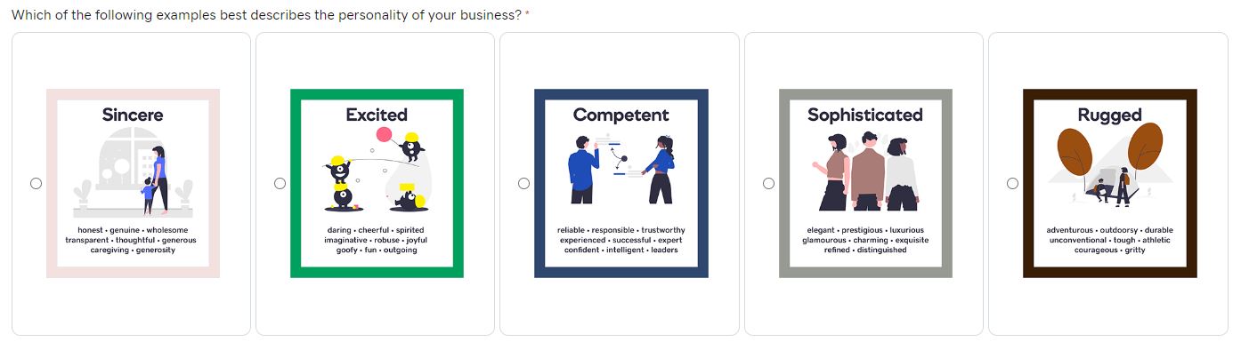
1. Who you are – this shows the customer 5 personalities with words below each that the customer may relate their business to:
- Sincere
- Excited
- Competent
- Sophisticated
- Rugged
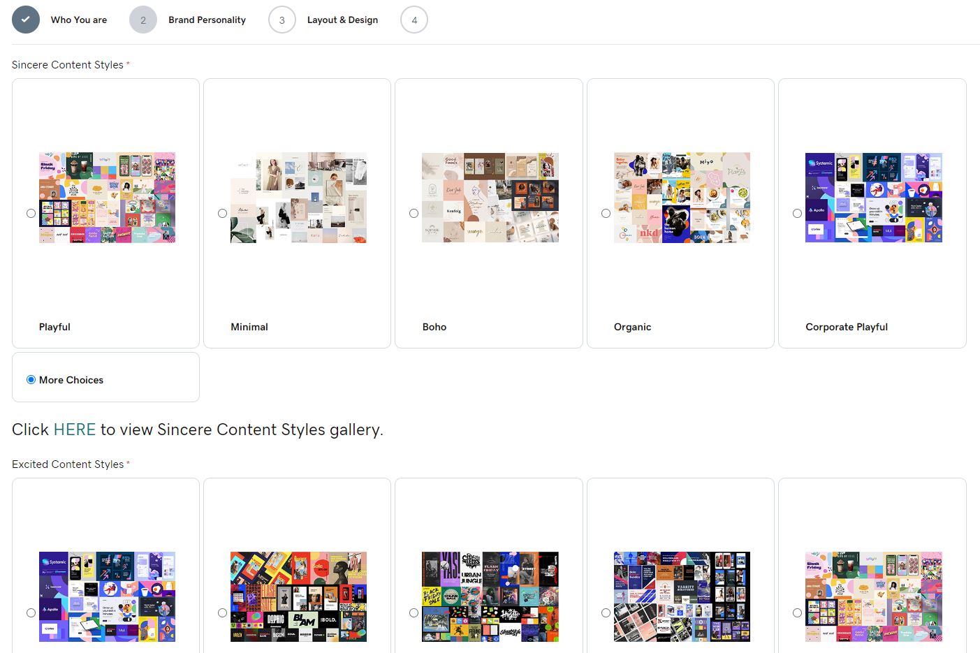
2. Content Styles – this shows the customer 5 content styles that coincide with the personality they chose. If they don’t align with any of the content styles seen, they can view more and look through the content styles associated with the next personality. If they want to see the style collage in detail, they can click the “Click HERE to view Content Styles gallery” link blow the options and see them up close. Since the sit is internal, the customer will only be doing this via the WS screen share and not on their own.
The customers are instructed to look at these styles at a glance, and tell us if they find a certain collage visually appealing. They are also told that these collages act as a sort of “mood board” and visual reference for a builder to understand the design figments they like – these content style collages are not to be replicated and the exact imaging, graphics or fonts are not going to be used from them, so they should not expect this. Each content style has font packages and color palette references the builder will be using instead, in order to make the customer’s website design look similar to the visual reference.
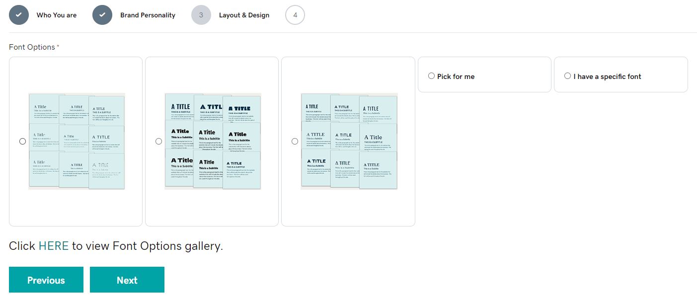
3. Layout & design – there are 6 high level font categories used by our builders – Thick, thin, normal, script, display, handwriting.
Each content style has specific font categories that coincide with it. Based on the brand personality and content style, the layout and design tab will show the customer the coinciding font categories as a visual collage of text. They are instructed to briefly glance at the packages and select the one that has fonts that they find most visually appealing. They can view the font collages up close as well by having the WS click the “Click HERE to view Font Options gallery” link. These packages were all created with fonts that can be found in google fonts. The builder will not have to replicate the exact packages, however if a customer specifically points out a font from one, they can be found on Google fonts. The high level font category associated with each package, contains a list of fonts that are usable for each by a builder.
Example: Thick-Thin-Normal Fonts
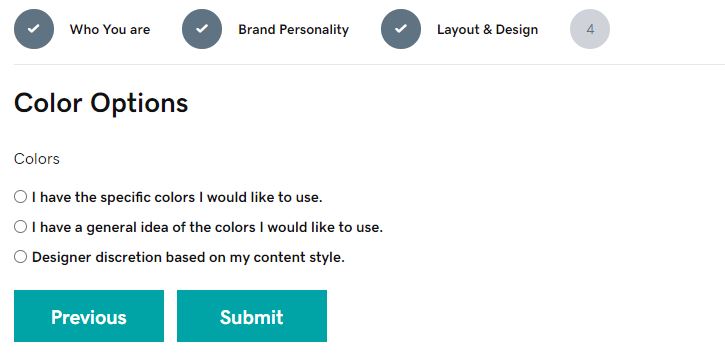
4. Color options – the color options basically asks the customer if they have a specific palette or hex codes, a general idea or description of colors they link or links to them, or if they prefer designer discretion because they do not have any colors associated with tier brand.
The resulting PDF will be downloaded and attached to Modgi by the WS before proceeding with the DCT process.
Interpreting Results
Style Guide – Branding Personality Results:
If a customer wants to know what exact fonts will be used, or if they want to see more of their options, this page will show the WS what font packages are associated with which font categories based on the personalities and content styles. This page can act as like a reference sheet for builders as well, but the builders have a more comprehensive reference sheet on the style guide instead which is discussed below. Each font type card tells you which font categories on style guide to use for certain personalities and content styles. However, instead of any style guide reference links, the font options accordions link directly out to any google fonts that fall under each font category. For example, if a customer is going with “thick” they can flip the thick card, see the categories under it, then choose “condensed sans” and scroll down to font options and expand the coinciding accordion. They will then see a list of google fonts links under this category to choose from.
The color palettes section just shows the exact color palettes associated with each content style so that if a customer doesn’t have a palette or color of their own, and if they like a palette seen on a specific content style, the palette hex codes can be grabbed from here.
On the Style Guide:
In the menu, under Knowledge Base > Design, you will find a sub menu tab item called “Brand Personalities” – Click here to view
This is a page of all the existing Brand Personalities. You can select a Brand Personality and it will list each Content Style and its descriptions. Clicking on a Content Style will show a basic builder reference guide for each individual content style. There will be a description, a close up image of the collage, basic design and imagery rules, the font packages associated with the content style and the actual font category links to their archives on the style guide, and a color palettes section similar to what is present on the qualify site. See an individual content style for example.
On the content style archive, above all the posts, there is a button called “How to Use Content Styles for Website Design” which covers what you will find related to the BPQ in Modgi as a builder, and how to use it. Please make sure you read through this page – Click Here to view
In a future release of DCT, the BPQ will be integrated into it and not be a separate entity on the qualify site. The results and choices made by the customer will determine what colors, fonts and themer templates will be automated into the site via the installation of GD core, rather than all of the templates being automatically placed on every site. At that point, the builder will not have to worry about the BPQ result pdf, and they will be able to use the resulting automated templates already placed on the site and modify them as needed.