Placing Modules Within Tabs – What Works?
January 23, 2019 | Beaver Builder, Known Issues, Tips & Tricks, WordPress
There have always been issues with placing a script-heavy module within another one, and it just shouldn’t be done. A lot of people want to save money on pages, so they try to fit as much content as they can on to one page, placing each separate section in a tab or accordion module. However, depending on the content of this “section” placed in the tab, this can result in a glitchy site, slow loading, inability to save or even open the Beaver Builder interface, misshapen modules and missing items within the tab, etc.
Examples of modules to avoid putting in a tab or accordion:
- Modal Popups
- Masonry/Justified Galleries/Filterable Galleries
- Posts or Products Modules (shortcodes are okay if there’s a max number on the posts, pagination can mess with the tabs’ scripts)
- Image/Product/Post Carousels
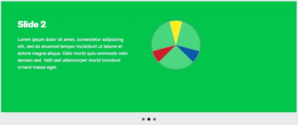
- Content Sliders/Testimonial Sliders
- Other tabs or accordion modules
- Any module with moving parts e.g. ihovers, flip boxes, interactive banners, info circles, etc.
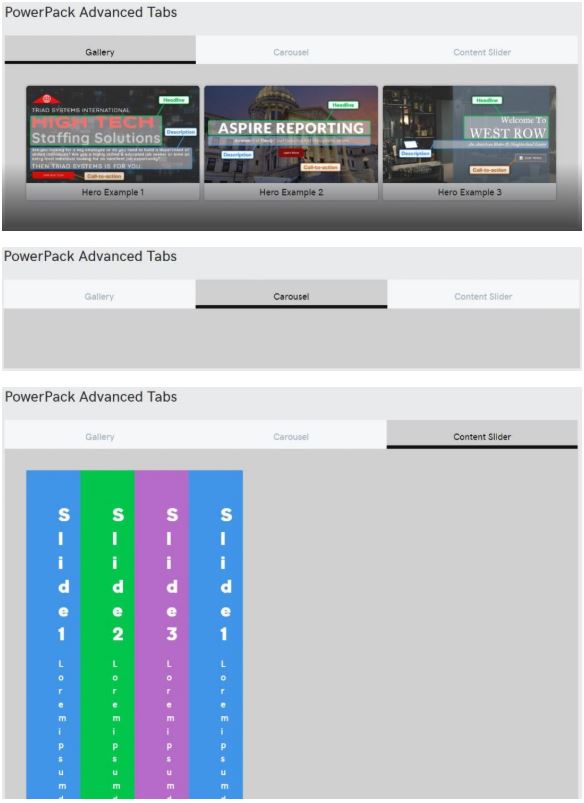
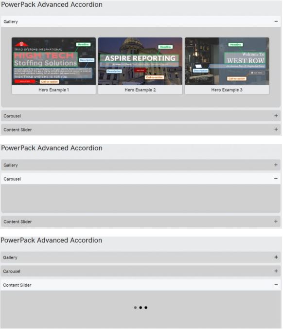
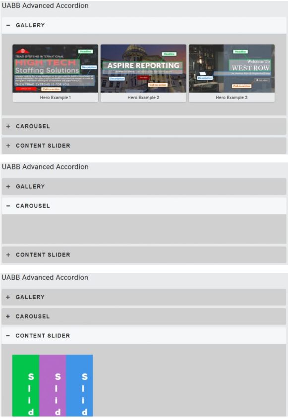
What to expect when you place a gallery, a carousel or a content slider within the following tabs and accordions:
The gallery in “grid” form seems to work out in each of the above, however, I have witnessed it “glitch out” when placed in a column of a saved row when its placed inside a tab.
What can you do when you’re faced with this issue?
Here are a couple ideas:
Use simple layouts:
Its best to stick to images, headings, and text modules only for saved row layouts when working with accordions or tabs. If the customer is adamant on having tabs, tell them to avoid galleries, sliders and script-heavy modules throughout their tabbed content.

Create pages:
If the content in one tab is enough to fill a page of its own, chances are it should be its own page. Create pages for each tab item and place the content on them in an organized fashion. Use whatever modules you’d like to accentuate the content without fear of them not working.
Create posts:
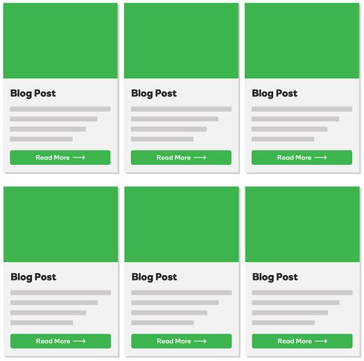
What is the purpose of the content in these tabs? Is it informational and staying the same amount or are they planning to add more tabs? If they are planning to expand in the future, and they want to have the tab content archived on a singular page, it may be beneficial to create the tab content into posts under a category. You can use a posts module to create a grid of post excerpts in place of the tabs.
Create a long scroll with anchor-linked sections:
Lay out the content of each tab in its own row in a long-scroll format down a page. At the top of the page in the hero or below it, place UABB creative links anchored to each section/row. make sure the “scroll-to-top” button is enabled from the customizer to ensure a good experience.
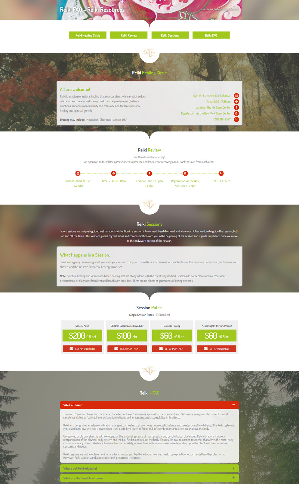
It’s still best to avoid a lot of scripty modules since all the content is still on a singular page and too many of them would slow down the load time, however, they won’t glitch out as in a tab or accordion.


