
Create a Custom Top Bar Using a Menu
May 28, 2019 | Beaver Themer, Menus, Tips & Tricks, WordPress
In the customizer:
Create a new menu and name it. In this example its name is “top bar.”
Use Font Awesome to grab html tags for all the icons you need – for this example we’re using:
Phone: <i class="fas fa-phone-volume"></i>
Envelope: <i class="fas fa-envelope"></i>
Facebook: <i class="fab fa-facebook-f"></i>
Twitter: <i class="fab fa-twitter"></i>
Instagram: <i class="fab fa-instagram"></i>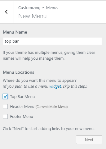
Create a new menu 
Add a custom link 
Find icons on Font Awesome 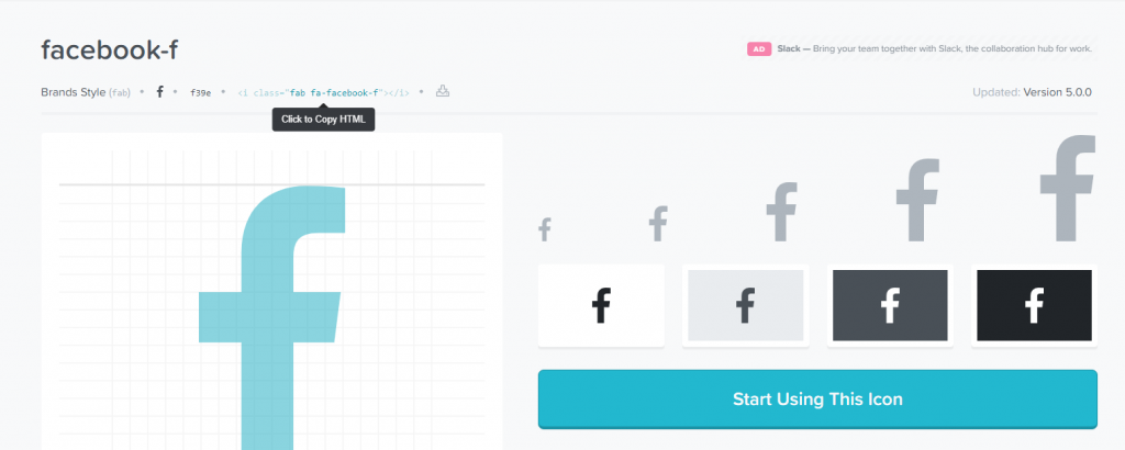
Click to copy HTML
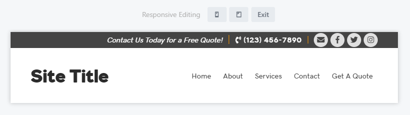
Add custom links to the menu for each menu item and arrange the custom links as seen fit. In this example, the social icons are grouped together at the end, the phone in the middle and the call to action text will be placed at the beginning. The idea is to have this menu put in the header’s top bar to the right. On mobile we’ll remove the call to action text and reduce the link font size so it call all fit in a row.
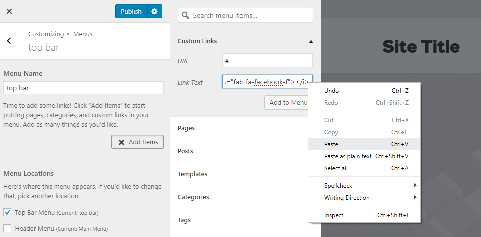
Paste the HTML in the link text area 
Paste the link in the URL area 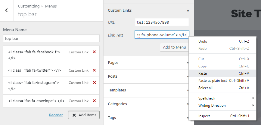
Paste the number beside the phone icon HTML 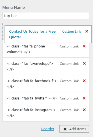
Drag to rearrange the menu items
Then assign custom classes to the menu items. Assign the social icons and email the same custom class so they can all be styled together. Assign the phone number its own class since it will be styled differently. Then assign the call to action text a class different from the other two so it can be targeted and hidden on mobile.
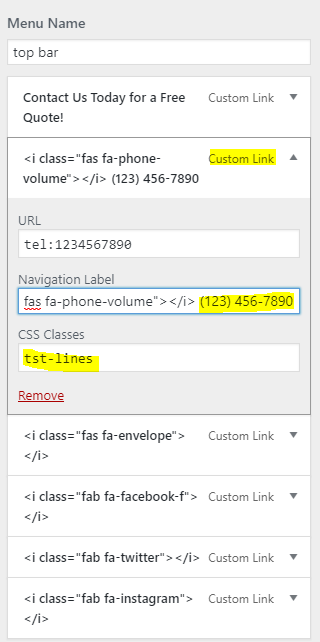
- Link 1: Call to action text – class: “tst-hidemob“
- Link 2: Number – class: “tst-lines“
- Link 3: Email – class: “tst-socicon“
- Link 4: Facebook – class: “tst-socicon“
- Link 5: Twitter – class: “tst-socicon“
- Link 6: Instagram – class: “tst-socicon“
For the number, place the html tag from fontawesome for the phone icon, add a space, and then place the phone number in the “link text” area. For the URL place the phone link to trigger a call: “tel:1234567890.”
For the email, place the html tag from fontawesome for the envelope icon in the “link text” area, and place the email link “mailto:email@site.com” in the URL area.
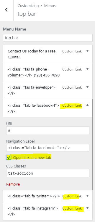

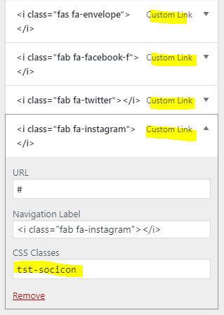
For each of the social icons, paste only the html tag for the icon in the “link text” area and paste the social link in the URL area. Remember to enable “link target” in the screen options so you can have the social links click to open in a new tab.
Publish the menu then edit the themer header and enter the builder view.
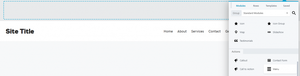
In Beaver Builder:
- Create a top bar row if there isn’t one already and place a standard menu module in the row.
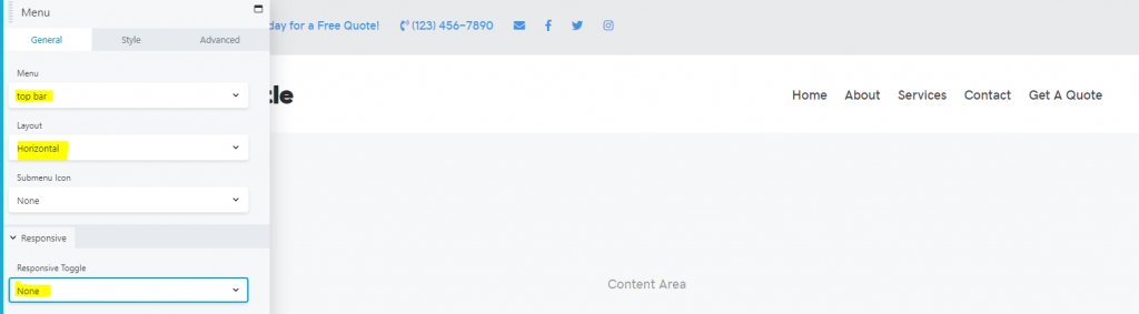
- Select “top bar” from the menu choices to display, keep the layout horizontal and turn off responsive toggle.
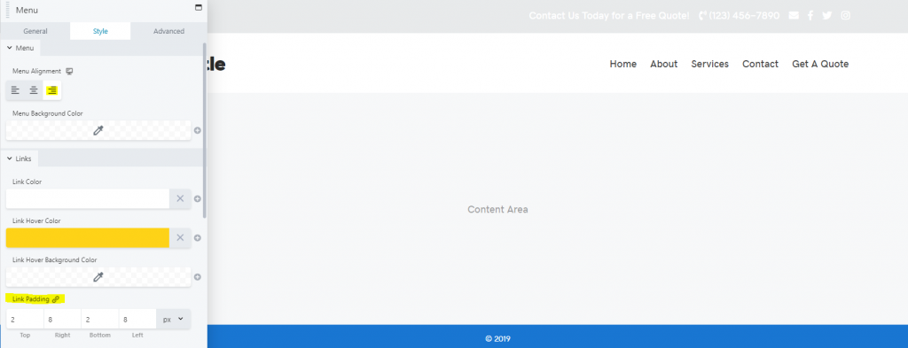
- Style the link colors, align it to the right and adjust the padding to minimize the height of the top bar row.
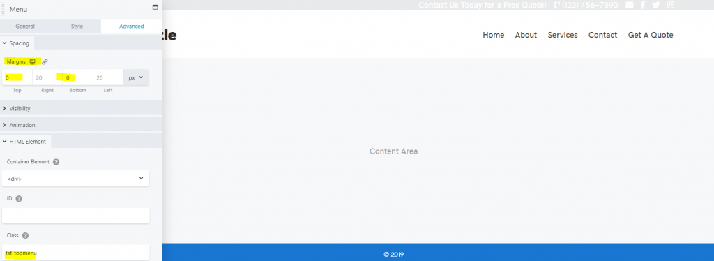
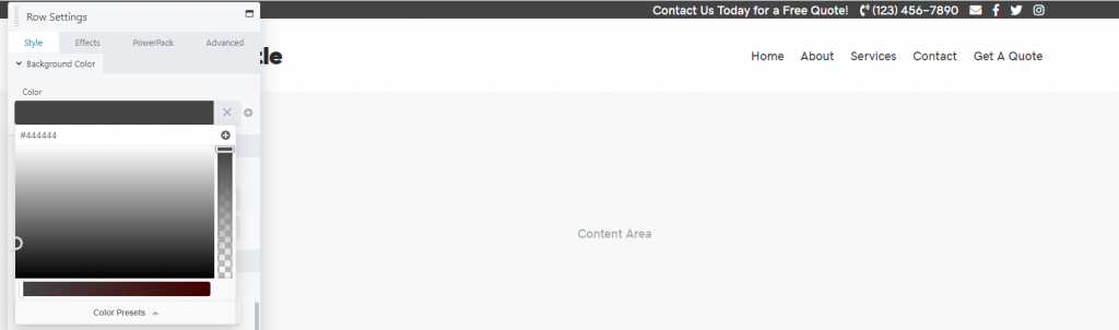
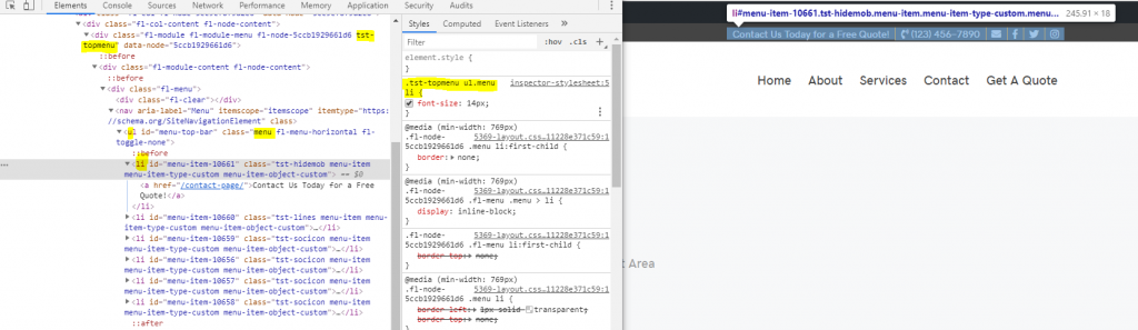
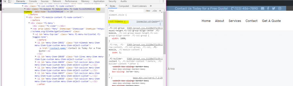
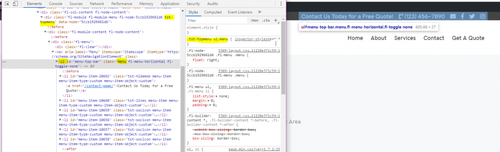
- The advanced tab of the menu settings, remove the margins or adjust them as needed and give the menu module a class of its own (in this example it has been given the class “tst-topmenu“)
- Color the top bar row and style it how you’d like, then publish the header – the rest of the styling will be done with custom CSS.
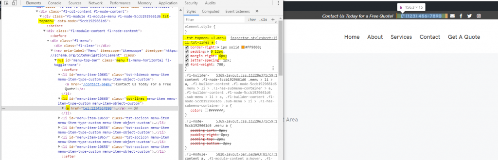
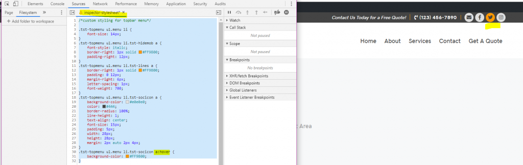
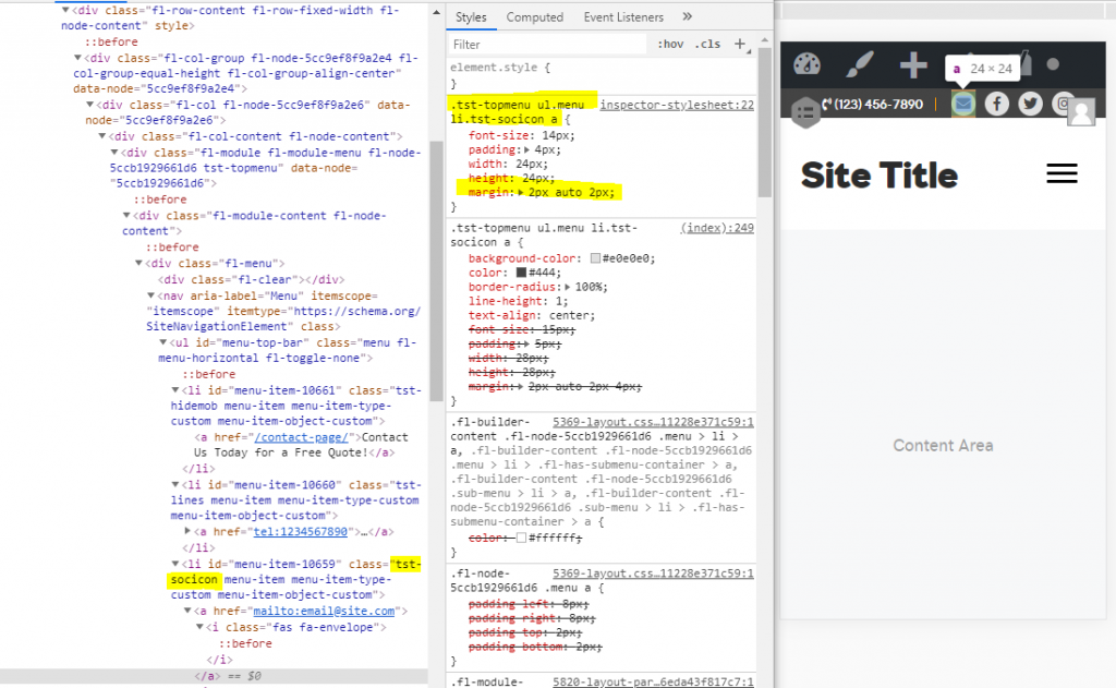
Using the Inspect tool:
- Target the class given to the menu module
- Add a space and target “ul.menu”
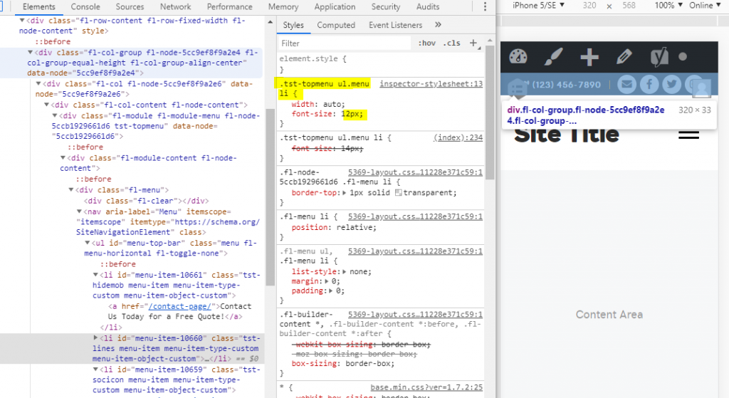
- Add another space and target all “li” items within the menu’s list – give them a font size 14px
The call to action text:
- Target the “li” item within the menu that contains the call to action text “.tst-hidemob“
- Add a space to target the “a” tag within this “li” list item
- Style it how you’d like, then add a border to the right and some padding between the text and the border
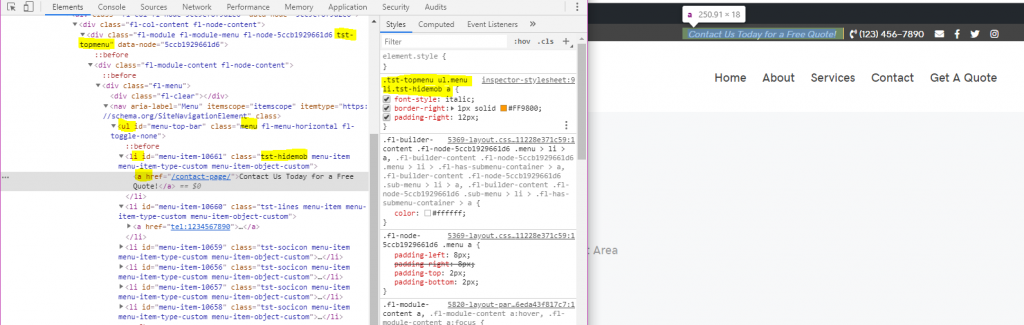
The phone number:
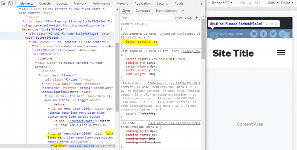
- Target the “li” item within the menu that contains the phone number “.tst-lines“
- Add a space to target the “a” tag within this “li” list item
- Style it how you’d like, then add a border to the right and some padding between the text and the border
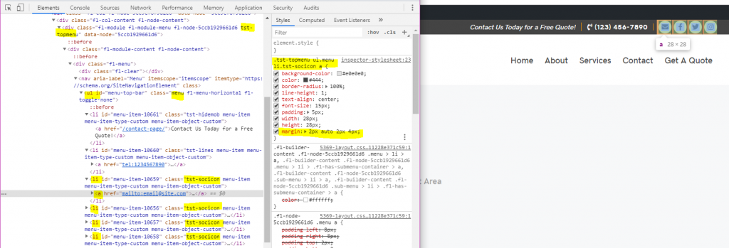
The social icons:
- Target the “li” items within the menu that contain the email and social icons “.tst-socicon“
- Add a space to target the “a” tag within these “li” list items
- Use CSS to style them how you’d like – in this case I gave them a background color added padding and styled them to appear centered within their backgrounds. Notice that the width, height, padding, line height, and font size all contribute to proper styling and centering of these icons.
- The margins set between them are just enough to provide spacing to the left but none to the right
- Remember to style the icon differently for hover action
- Comment out what the CSS does, and paste it in the Additional CSS panel of the customizer
Styling for Mobile:
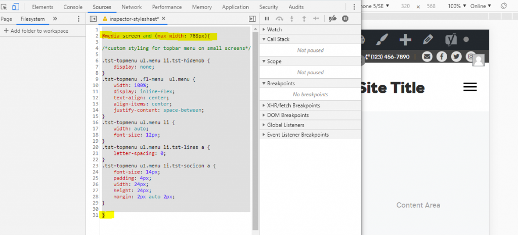
You’ll notice that on mobile, since no responsive toggle was selected, the module auto stacks a horizontal menu to vertical.
- First, target the “li” item within the menu that contains the call to action text “.tst-hidemob” and hide it on mobile so that its out of the way
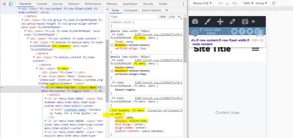
- Then target the class given to the menu module, add a space and target “ul.menu”
- Notice that in the existing CSS, the class “.fl-menu” is placed before the “.menu” class
- In order to override its “display” style without having to use “!important,” we can use the same specificity by placing “.fl-menu” in between “.tst-topmenu” and “ul.menu“
- Using “inline-flex” is a great way to get the list items next to each other in an even and responsive fashion
- Target all “li” items within the menu’s list – give them a font size 12px and width auto
- Target the “li” item within the menu that contains the phone number “.tst-lines” and remove its letter spacing to take up less space

- Target the “li” items within the menu that contain the email and social icons “.tst-socicon” and adjust their properties to evenly reduce their size on mobile screens
- Take the CSS specific to mobile and place it within the media query for screens under 768px
- After pasting the CSS in the customizer, publishing and refreshing, test how it looks on mobile
medium screen size preview 
small screen size preview
You may want to adjust the flex items’ justification to “flex-end” instead of “space-between” in order to align them to the right if that looks better – make sure to adjust margins in between them if you do.
