
Avoiding Duplicate Rows and Modules
August 28, 2023 | Beaver Builder, Beaver Themer, Tips & Tricks
We want to be sure we are building our New Build sites in the most efficient and optimized way possible. This includes ensuring there are no duplicate rows or modules on the page and instead we build them out using the responsive settings on the row or module.
Responsive Settings
All of the Beaver Builder Rows, Columns, and Modules have responsive settings. Currently our default settings for these breakpoints are Mobile 390px, Tablet 768px, Laptop 1366px, and Desktop 1920px. For further instructions please review the guide on how to update responsive breakpoints.
To view the editor in responsive mode you can either hit the “r” key on your keyboard or click on any of the responsive icons in a row, column, or module.
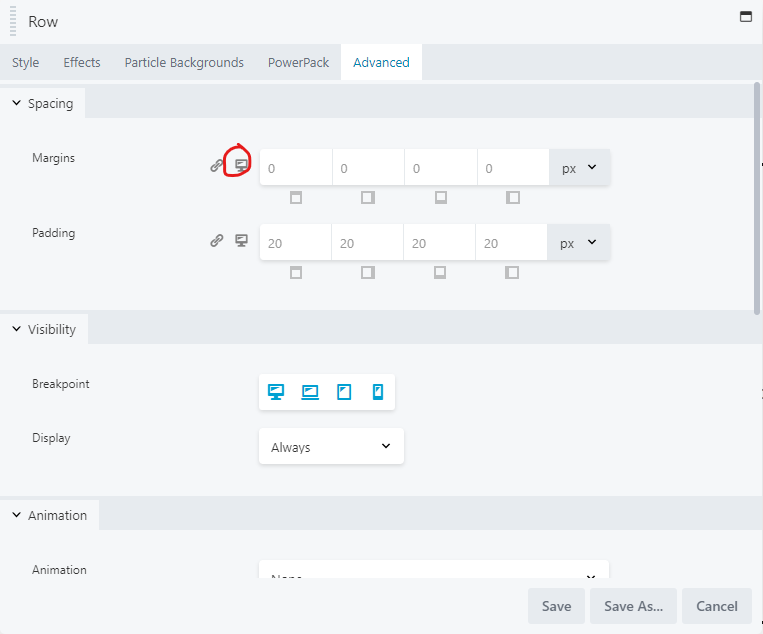
You should always use these settings before any other method of responsive design.
Common Tips and Tricks
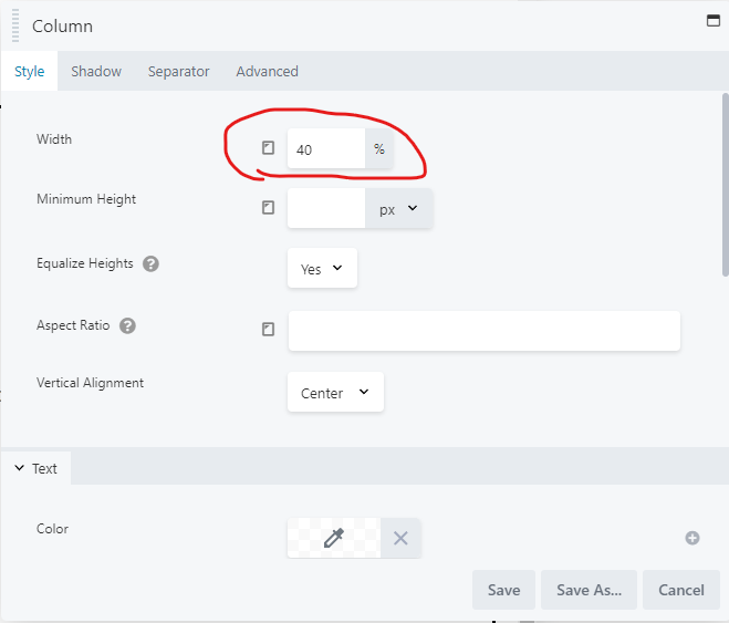
Column widths
You can set column widths for each breakpoint to control the width of each section. If you don’t set a width on the breakpoints, the width will default to the previous breakpoint until it gets to the small device. Small devices will default to 100% width. This can help you to size and reorganize the way columns wrap on different devices. Just be sure each row ends up at 100%.
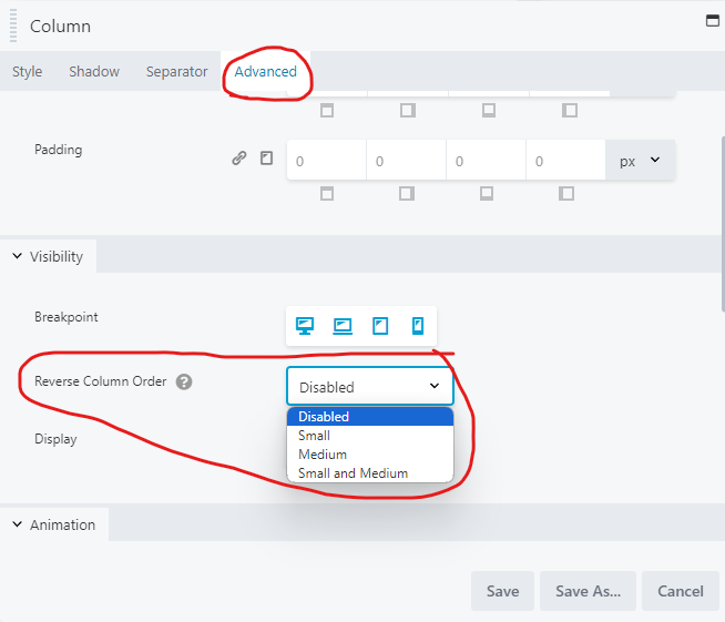
Reverse Columns
In the advanced tab on columns you can reverse the column stacking on medium, small, or both medium and small devices. This is very useful when trying to force the nav menu to be at the bottom of the row.
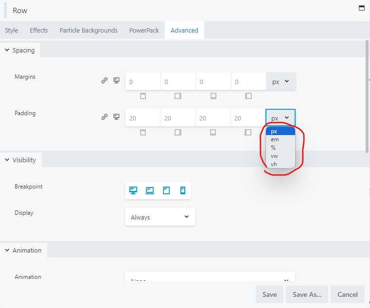
Use %, vw, or vh settings rather than px
To avoid having to manually adjust pixels for margins or padding for each responsive device, you can use %, vw (view width), or vh (view height) instead. These settings will adjust based on the screen size rather than a set pixel size.
You can also set the content width to a fixed width and adjust this to one of the above methods of measurement to ensure the content sizes appropriately rather than trying to get the padding or margins right on every device.
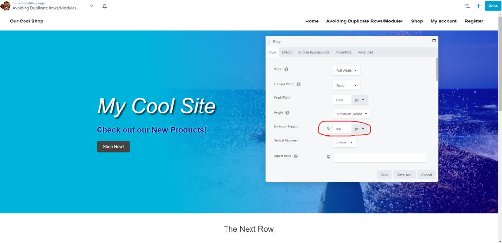
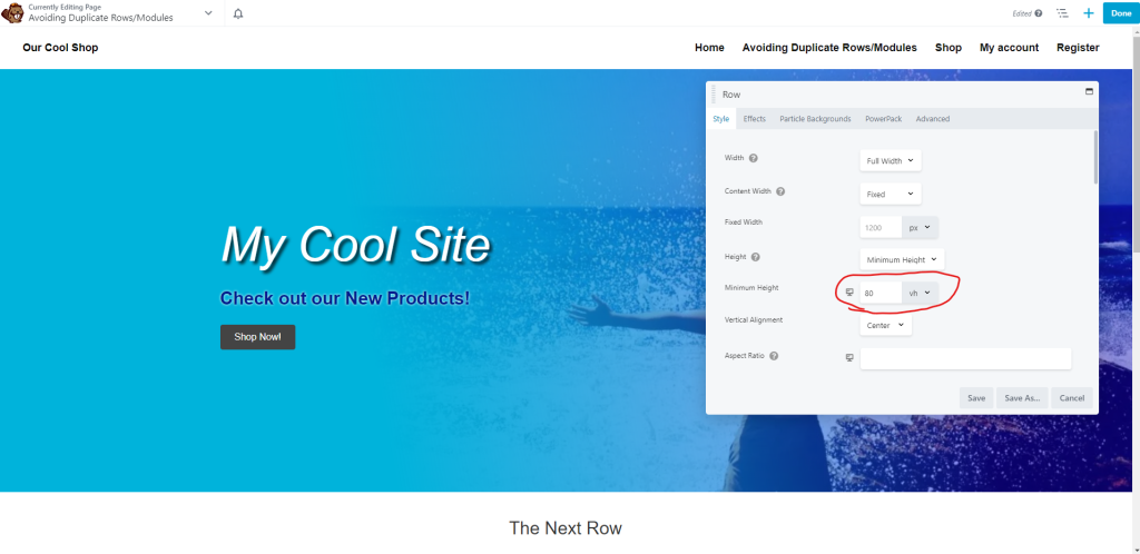
Row Height Setting
The row height has a few different features that can be helpful or cumbersome depending on the screen size.
Setting the height to full height or a set PX might look great on a responsive device but on a desktop might look a bit out of place, or vice versa. To get around this you can set the row height to minimum height and then use vh (view height) to control the way it shows on all screen heights regardless of the actual size of the device you are viewing.
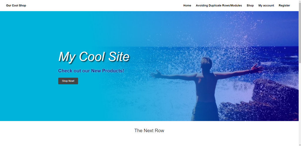
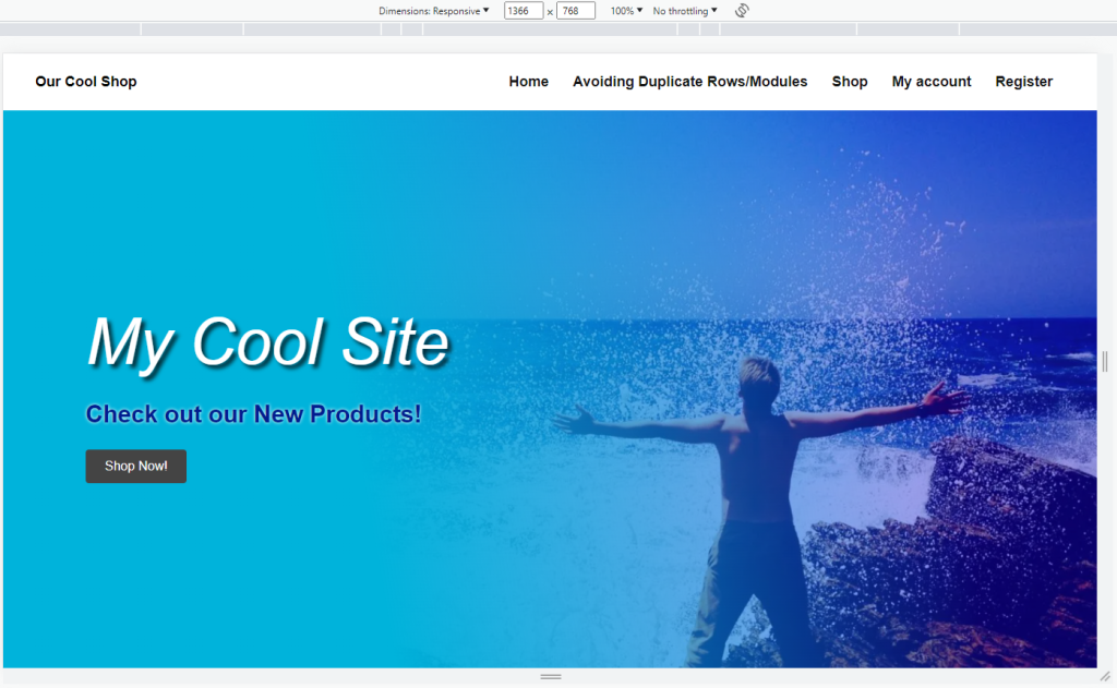
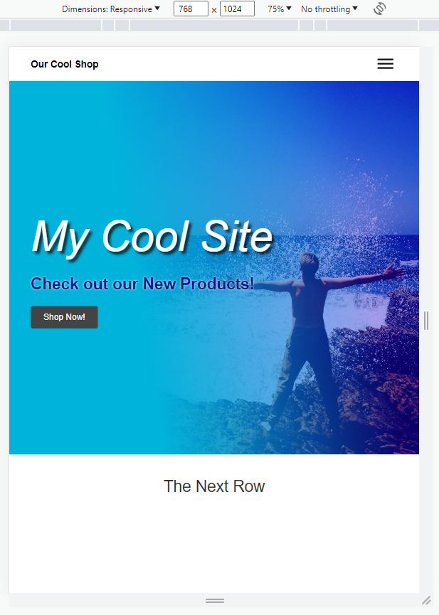
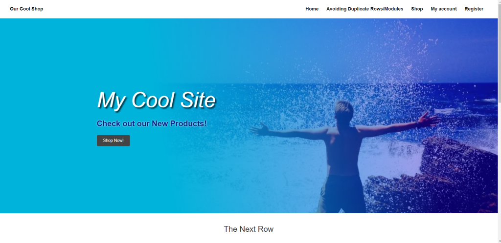
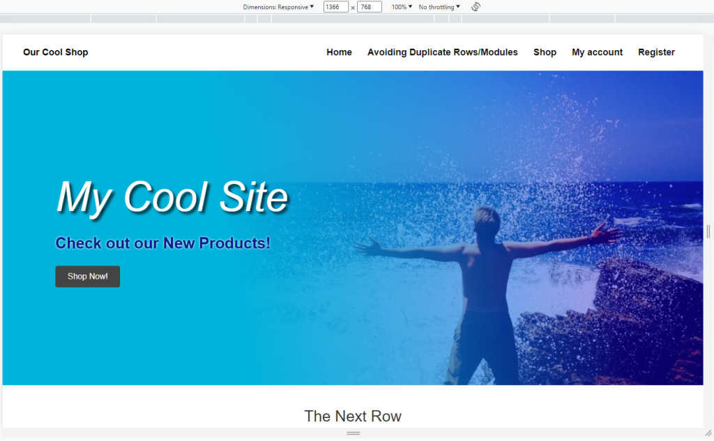
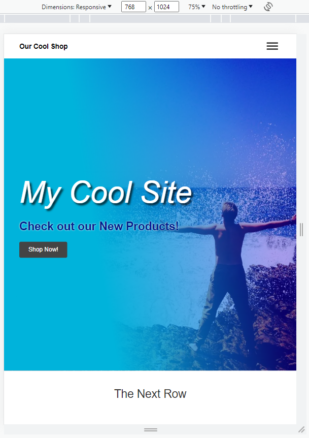
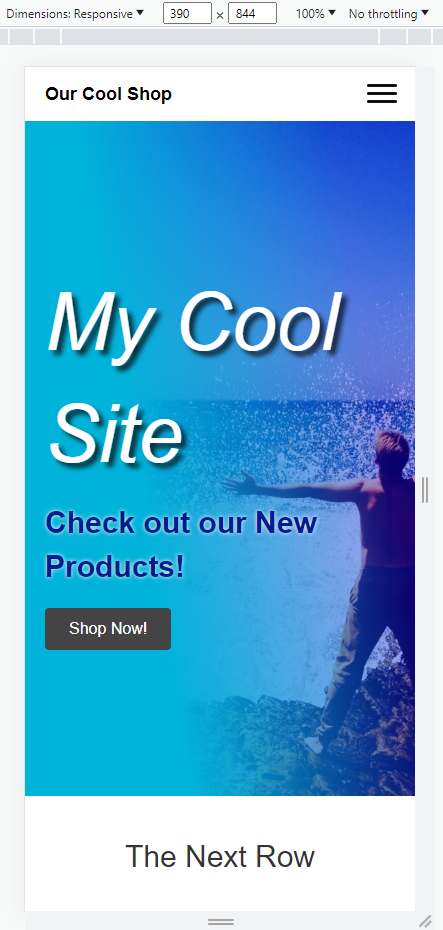
In the below examples you can see how the set pixel height changes noticeably depending on the screen you are looking at where as the view height setting has minimal change if any.
Set PX Example:
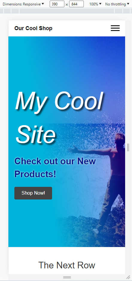
View Height Example:
Display Never
Rows and Modules should never be set to “Display Never”. This causes unnecessary load time on the site slowing down overall performance. Even though these rows, modules or columns do not display on the live site, they still load everything that is on the page regardless of visibility settings.
If you are worried about the customer wanting to bring back content that was previously removed, you should save the row or module using a relevant name and remove it from the page or themer layout.
Exceptions
There are very few exceptions to having multiple rows or modules on a new build. Only the listed exceptions will pass QA.
Split Navigation
When a split nav is requested or utilized on a site, you may use a second menu module that holds the full navigation for responsive devices. This should only be for the menu and only one additional module will be permitted outside of the two for the split nav on larger devices.
Customer requested a very specific look in the responsive views that cannot be done without a duplicate row or module
If the customer specifically called out how they wanted their responsive devices to stack the content, you may use device specific rows or modules.
If they only referenced an example site, without specifically asking for a certain stacking order, you should default to the most optimized version and use a single row or module utilizing the responsive settings.