Vendor Tech QA Guide
WP Dashboard
Changed the Nickname to the Site Name
Upper right corner of WP Dash if logged in as Admin
Users > Admin > Enter Site Name in the Nickname field and then choose the new nickname in the "Display name publicly as" drop down.
Changed the Time Zone needs to the customers location
Settings > General > Time Zone
Deleted the Hello World Post
Posts
Turned off Post Comments
If blogs are not being used at all comments should be turned off by default.
Settings > Discussion > Default post settings > Uncheck "Allow people to submit comments on new posts"
Gravity Forms
Honeypot is enabled
If reCAPTHCA is enabled on the form this can be disregarded.
Forms > Form Settings > Form Options > Anti-spam honeypot is toggled on
Added unique subject line
Form > Notifications > Admin Notification > Subject
Guidelines
Should not contain "New submission from {form_title}"
It should contain a merge tag of some sort to ensure the Subject Line is unique for each entry. For Example: If Name is a field on the form then adding a merge tag to the subject line will help it to remain unique. "{Name:1} Sent you a Message from mycoolwebsite.com"
From email is set to @mydomain.com
Form > Notifications > Admin Notification > From Email
Should be adjusted to something like donotreply@mydomain.com. Should not be "{admin_email}"
Customizer Settings
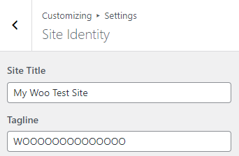
Set Site ID and tagline
Site Title and Tagline should be set to the customers' information
Customize > Settings > Site Identity
Added CSS Template
The CSS template, found here, should be used on all builds regardless of CSS adjustments.
Customize > Additional CSS > Comment out the CSS adding /* before it and */ at the end of it or copy the CSS and delete it, if there aren't any major layout shifts, lots of elements changing when the CSS is removed, it's should be good to go. Do note that some plugins like Events Calendar, Tutor LMS, WooCommerce usually need some css customization, if you notice any we would asume that's good to be in there.
Follow the steps in the video to quickly check how the CSS is changing the website. To make sure that you do not lose the CSS code, you can paste it in another document as a backup. Make sure that you do not click on Publish while there is no CSS inside the styling.
Themer Layouts
Header and footer ARE active
Beaver Builder > Themer Layouts
Header and Footer should be published and both assigned to the entire site. There should only be one of each.
Blog and shop layouts ARE added and assigned correctly
Beaver Builder > Themer Layouts
The blog and shop pages, if applicable, should be set up and assigned accordingly. Please see the documentation here for more information.
Beaver Builder
Did NOT use Multiple rows and/or modules for device breakpoints for website body
The only place where duplication for rows is allowed is in case of header layouts and only in case the headers are complex. For body rows everything can be done from the responsive settings inside Beaver Builder as explained in New Build Workflow > Beaver Builder > Beaver Builder Responsiveness settings.
The example below shows a duplicated section on the homepage: the blue row for desktops/laptops and the red row for tablets/mobiles. This design is incorrect. The section should use a single row, adjusted via responsiveness settings. If encountered, it must be rebuilt as one row.
We can allow module duplication for complex headers, but it should be used sparingly. When reviewing the header layout, there should be no more than three duplicated rows across desktop, tablet, and mobile.
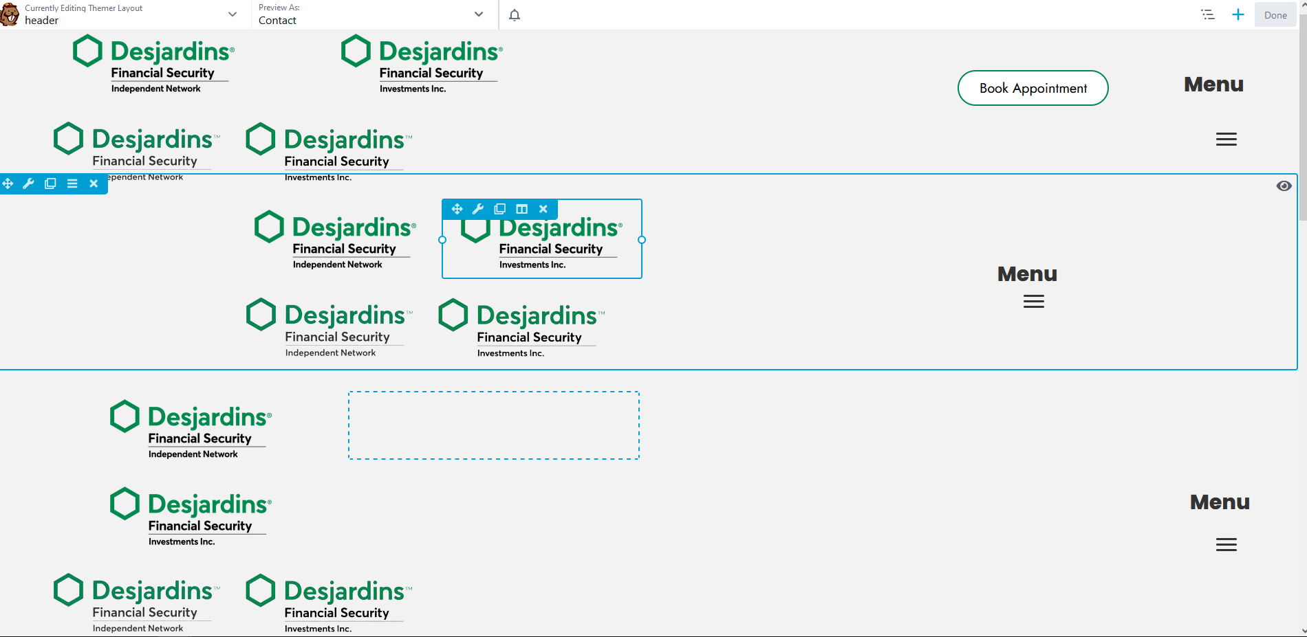
Duplication/multiple rows are allowed for complex headers, duplication must be used efficiently! THE BELOW IS AN EXAMPLE OF DO NOT
The most common place this is seen is in the header and footer layouts, but it has been done in other places as well. We want to make sure we are checking the Header, Footer, and the Home Page at the very least. Open the Beaver Builder Editor for Header, Footer, and/or Pages and look for multiple rows with duplicate content or even duplicated modules. When you hover over these items and an eye displays in the upper right, this indicates that the row, column, or module is set to display on a conditional basis. If you see this it needs to be corrected.
In the example below, you’ll notice three rows, one of which is hidden. This image serves as an example of a header containing only a few elements. For such minimal headers, a single header layout is sufficient, as its modules can be easily customized for different screen sizes.
If the header were more complex—featuring elements such as an email address, phone number, location, opening hours, or informational text in addition to the logo, menu, and button—the designer could duplicate rows to create tailored versions for desktops/laptops and tablets/mobiles. For instance, in a complex header, features like the email address, phone number, or opening hours could be organized under a burger menu on smaller screens to keep the design clean and user-friendly.
However, duplicating rows is unnecessary for simpler headers containing only a logo, menu, and button. The below is an example of HOW TO NOT BUILD A HEADER
Here is another example of a simple header. It includes three rows: the white one represents the desktop/laptop version, the blue one represents the tablet/mobile version, and the red one is a duplicated row that shouldn’t be there. This is purely for demonstration purposes; in a real scenario, a header like this would look different, especially if it included elements such as emails, phone numbers, or opening hours, as explained earlier. The example below is simply a video demonstration to show how to check for duplicate rows and reinforce the concept.
Did NOT use Modules/animations on the home page that effect performance
Please see this comprehensive list of items that should not be included on the homepage unless the customer specifically requested them. This is in the section labeled "Avoid on Homepage"
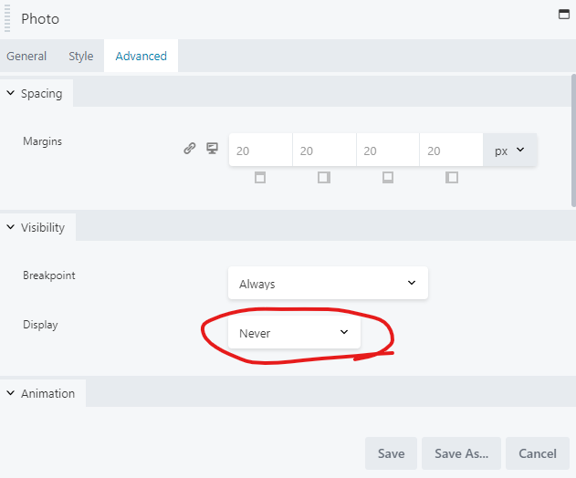
Did NOT set any Modules to display never
While hovering over a module, if you see the eye appear in the upper right corner, this indicates the modules is hidden. We want to make sure we are checking the Header, Footer, and the Home Page at the very least.
To verify, open the module settings, go to the advanced tab, and scroll down to the display settings. If this is set to never, the module should be removed as it causes the content to load unnecessarily.
Did NOT use Modules in place of post type alternatives
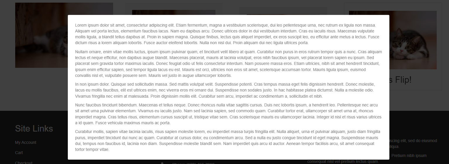
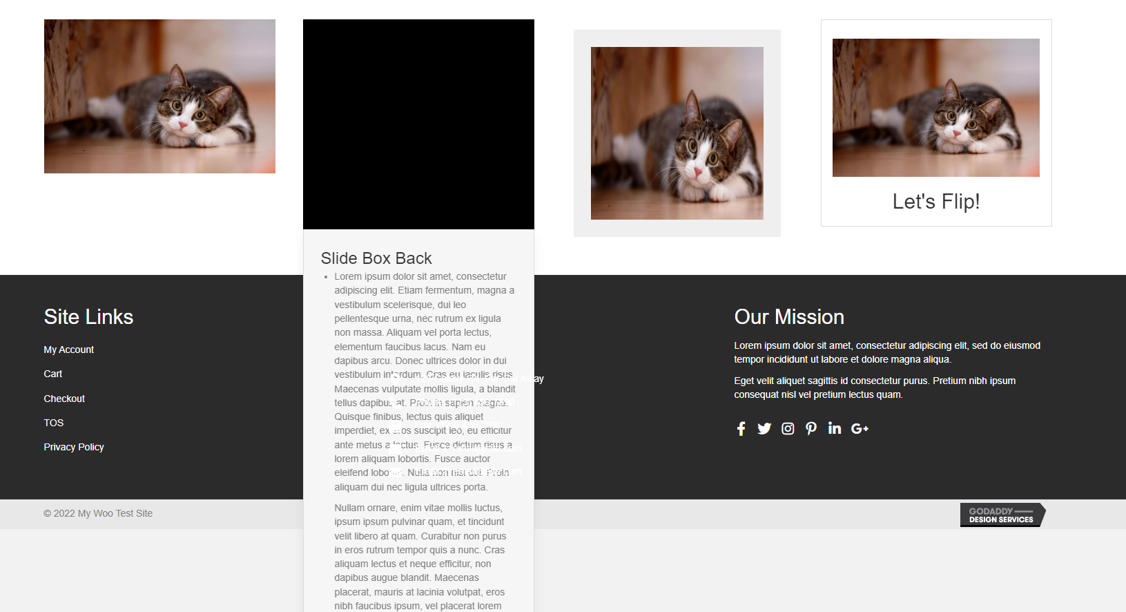
Use of Pop-ups, Sliders, Flip Boxes, etc... that hold large amounts of information that could be dropped in to a template need to be set up as posts or PODs instead. For Example: Team Members are displayed on the site in a single row, each team member has a name, title, image, and bio. If these are set up on any kind of interactive module, they need to be moved to a post or a POD instead. Here are some examples of the interactive modules that should be adjusted.
Before Interaction:
After Interaction:
Pop Up Module
Slider Box
iHover
Flip Box
Optimization
Updated Title tags and/or utilize snippet options
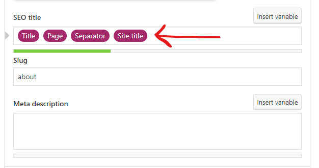
Title Tags should be updated to a unique title (provided by copywriting), and utilize the included snippet options from Yoast.
Page > Edit > Scroll to the Yoast Settings > Adjust the SEO title field
Guidelines
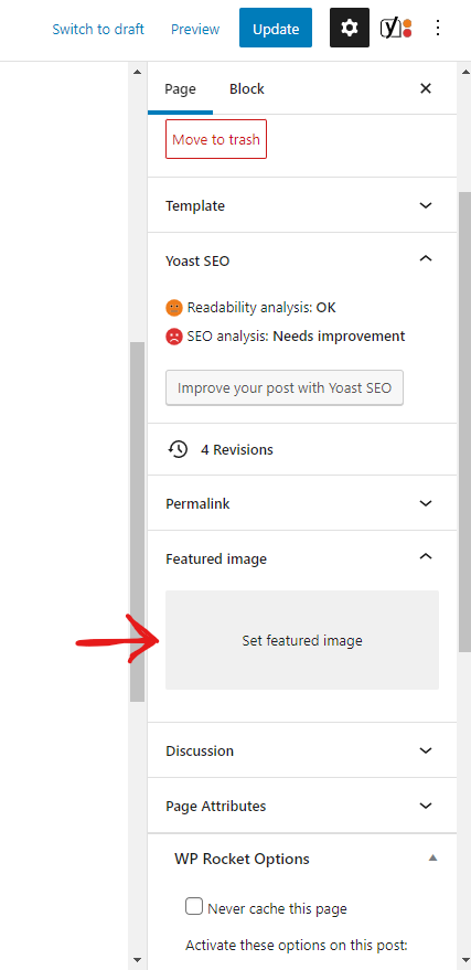
Added a unique Featured image for each page and post
Each page and post should have a unique featured image specific to its respective content. Typically, if you check on at least one post and an internal page, this will determine if the images have been set.
Page/Post > Edit > Featured Image
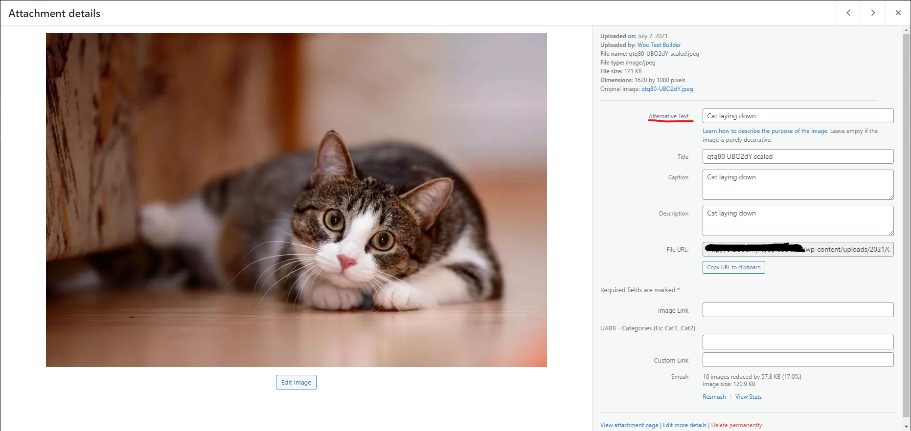
Added Alt tags to all media
This is only applicable for sites that have Marketing Services.
All media items must have alt text. Check out this guide for more info on the dos and don'ts for Alt tags.
Media > Open Image > Alternative Text
Completed everything to optimize GLH score
All steps outlined in this guide should be followed and notated on tickets if the GLH score is under 75
Main checks can be as follows:
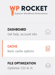
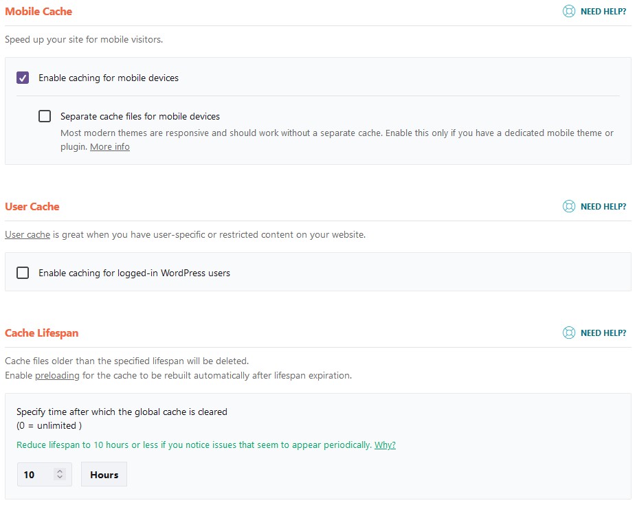
- WP Rocket is Installed and Active

- Enable Caching for Mobile Devices is checked under WP Rocket > Cache > Mobile Cache
- Smush Pro is Installed and Active

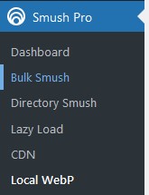
- Local WebP has been set up correctly. To verify go to Smush Pro > Local WebP if the screen says Finish set up, then set up has not been completed.
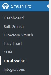
Example of Completed Setup

Example of Incomplete Setup

- Check if Bulk Smush has been completed. Go to Smush Pro > Bulk Smush and see if the page displays that images still need to be smushed. If the Screen says 100%, Bulk Smush has been run.

Functionality
Used correct plugins for customers goals
For Example, If a customer wants to allow access to a specific page to only users with a login, they would need memberships. If that same user should have to pay a one time fee for access, they would need a product set up to connect to the membership. If they want it to be a subscription based access, they need a subscription product connected to the membership. etc...
Used approved plugins and any 1-time use plugins have been removed
No 3rd party or 1 time use plugins should be present on a customers site upon initial delivery. All of our approved plugins can be found here.
Plugins used have been set up correctly and work as intended for the end goal of the site
Plugins should be set up and ready for use in a way that aligns with the site goal. The only time it is acceptable to provide a site with plugins not fully set up, is when either a customer login is required to complete set up, or the customer has not provided the required information to complete the set up.
Woo Settings
Set store address
The store address should be set to the customers' provided main store address.
WooCommerce > Settings > General
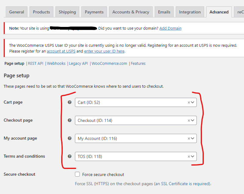
Add and assign store endpoint pages
Store endpoint pages are required for the WooCommerce shop loops to work correctly.
WooCommerce > Settings > Advanced > Page Setup
Correct modules/shortcodes have been used on their respective pages
Each of the shop loop pages should have the correct shortcodes or modules in place. Click here for additional documentation.


