Style a Menu Item to Look Like a Button
May 28, 2019 | Beaver Builder, Menus, Tips & Tricks, WordPress
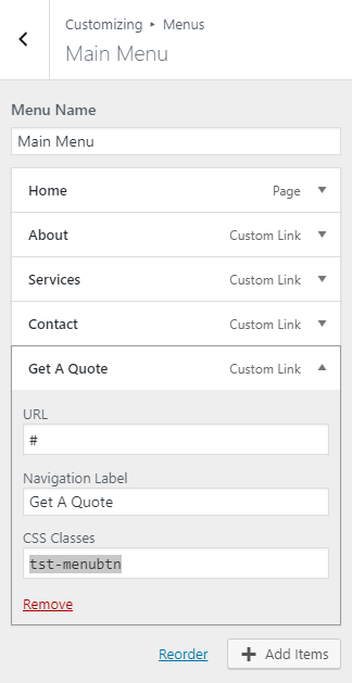
To add a button, first, create a menu item that you want to turn into a button.
Then add a class to that menu item.
It’s a best practice to prefix the class with a letter string unique to you, to avoid conflict with other built-in classes – (“tst-menubtn” is the class given to the menu item “Get a Quote“)
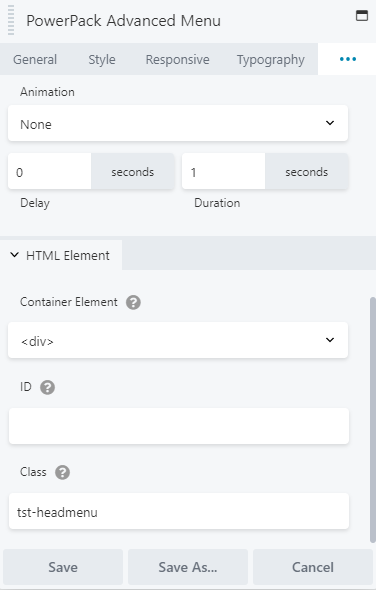
Give a custom class to the header menu module/menu module in the area that you want to create a button as well.

give a class to the menu item you want to style as a button 
give a class to the menu module in the location you want the menu button to appear 
If you’re using the same menu in the footer or in another area, and don’t want a button created around the link there, we can target only the menu in your specified area this way – (“tst-headmenu” is the class given to the header menu module)
/*custom css to style menu item as a button*/

.tst-headmenu ul.menu li.tst-menubtn > a {
    background-color: #4095e8;
    color: #ffffff;
    padding: 8px 12px;
    border-radius: 100px;
}
.tst-headmenu ul.menu li.tst-menubtn a:hover {
    background-color: #ff8351;
}
Source: https://kb.wpbeaverbuilder.com/article/166-add-buttons-to-your-navigation-menu


