Sometimes a site has a large amount of categories, which can cause a bit of a UI issue. Currently, with the Search & Filter plugin, you can choose to use a Dropdown but this limits the selection to a single category. You can also use the Multi-select option but this still does not provide a very clean UI for selecting multiple categories.
We now have a way to make the category filters not just look like a long list of items to select from. This guide will show you how to use Search & Filter with the Checkbox option to create an elegant Accordion style category filter menu. To get started just follow the steps below!
- Download, install, and activate
Search & Filter Pro and Search & Filter Beaver Builder Extension from the Vendor Package Builder
- Create the category hierarchy
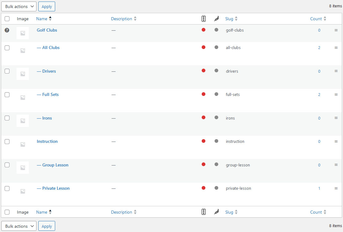
For this example we will be using WooCommerce products but this would apply to post categories or custom Pods taxonomies also. In the example below you will see that we have created a parent category (Golf Clubs & Instruction) followed by the sub-categories including and All category for each. When assigning categories it’s important to remember not to assign them to the Parent category as this will make the filtering not work properly.
Note: If there is already a category hierarchy in place you will have to configure it to follow these guidelines.

- Search & Filter Setup
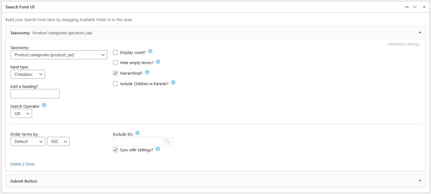
- For the Search & Filter setup you will be adding a Taxonomy field widget (or Category based on the configuration)
- In the Taxonomy Field widget you will select the corresponding Taxonomy (Product categories was used in the example below)
- For Input type you will select Checkbox
- For Search Operator select OR
- And check the box for Hierarchical (leave all other options unchecked)
- Add a Submit Button field widget

- Search & Filter Module Setup
The next step is to add the Search & Filter module to the page or archive- From Beaver Builder Add Search & Filter module
- From the module settings select the corresponding Search & Filter form from the drop
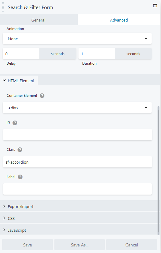
- From the advanced settings tab add a class titled: sf-accordion

- Add CSS to customizer
The final step is to add the CSS and then style to match the site. The CSS is broken down into 2 main sections. The top section is where you will edit to make changes to the styling of the accordions. The bottom section is the global styling and should not be touched.
Search & Filter Accordion CSS
/*-----------------------------------------
Search & Filter Accordion Styling
(use this section to adjust the styling of the accordions)
-----------------------------------------*/

/* heading style*/
.searchandfilter h4
{
	font-size: 18px;
	font-weight: 700;
}

/* accordion button style */
.sf-accordion .searchandfilter ul li label {
	border: 1px solid #d1d1d1;
}
.sf-accordion .searchandfilter ul li label:hover {
	background: #f1f1f1;
}
.sf-accordion .searchandfilter ul li.sf-option-active label {
	background: #f1f1f1;
}

/* accordion icon style */
.sf-accordion .searchandfilter ul li label:after {
	content: "+";
	right: 10px;
}
.sf-accordion .searchandfilter ul li.sf-option-active label:after {
	content: "–";
}

/* accordion dropdown style */
.sf-accordion .searchandfilter ul.children {
	background: #ffffff;
	border: 1px solid #d1d1d1;
}
.sf-accordion .searchandfilter input[type="checkbox"] {
	width: 15px;
	margin-right: 10px;
}
.sf-accordion .searchandfilter ul.children li label {
	width: calc(100% - 25px);
}


/*-----------------------------------------
Search & Filter Accordion Fixes
(the items in this section should not be adjusted)
-----------------------------------------*/
.searchandfilter ul
{
	width: 100%;
	padding: 0;
}
.sf-accordion .searchandfilter ul.children li {
	display: flex;
	flex-wrap: wrap;
	padding: 5px 0;
}
.sf-accordion .searchandfilter ul.children {
	margin-left: 0;
}
.sf-accordion .searchandfilter ul li.sf-level-0 input {
	display: none;
}
.sf-accordion .searchandfilter ul.children li input {
	display: block;
}
.sf-accordion .searchandfilter label {
	width: 100%;
}
.sf-accordion .searchandfilter input[type="checkbox"] {
	margin-top: 0;
}

/* accordion button */
.sf-accordion .searchandfilter ul li label {
	position: relative;
	padding: 10px;
}

/* accordion dropdown */
.sf-accordion .searchandfilter ul.children {
	visibility: hidden;
	border-top: 0;
	height: 0;
	padding: 0;
}
.sf-accordion .searchandfilter ul li.sf-option-active ul.children {
	visibility: visible;
	height: 100%;
	padding: 10px;
}
.sf-accordion .searchandfilter ul.children li label {
	border: 0;
	padding: 0;
}
.sf-accordion .searchandfilter ul.children li label {
	background: none;
}

/* accordion icons */
.sf-accordion .searchandfilter ul li label:after {
	position: absolute;
}
.sf-accordion .searchandfilter ul.children li label:after {
	content: "";
}

/*---------- end s&f accordion ----------*/