Footer [ 3 ] – Retail
Category: Footer | Components: Copyright, GD Badge, Logo, Primary Menu, Secondary Menu, Social Icons, Subscribe Form, WordPress Widgets
Template Details
Use Cases
Use this footer on retail sites with a shop/product-based structure that want to incorporate email marketing. Use this as a base template and feel free to add/remove items based on the customer’s content. When using the email marketing form (in the case that the customer did not provide any information regarding their email marketing platform), please connect this to “email” using the admin email as a temporary solution for the new build. Click here for instructions on setting up the subscribe form.

Component breakdown
- Primary site menu – template uses a standard menu module aligned to the left
- The menu module will appear empty unless you have a menu created and ready to select from the dropdown in the module – so make sure you create a menu first
- Secondary store menu with cart – template uses a standard menu module aligned to the left
- The menu module will appear empty unless you have a menu created and ready to select from the dropdown in the module – so make sure you create a menu using whatever shop-related links you want included in the secondary menu
- To add the cart to the menu, go to dashboard > WooCommerce > Menu Cart Pro > then choose your store menu from the second field that says “Select the menu(s) in which you want to display the Menu Cart” > scroll down and save changes
- Social icons – template uses the standard icon group module – the icons can be added to/removed or swapped out for any other icons from the included icon libraries.
- Copyright bar – template’s bottom row contains a text module with copyright text and an HTML module with the GD badge
© [fl_year] [wpbb site:title]. All Rights Reserved.Note: This section contains HTML. Importing the template can cause the custom code to break – after importing the template, you will want to replace the HTML in the module with the fresh HTML below. Reference Footer Badges for the light option.
<div align="right">
    <a rel="nofollow" href="https://www.godaddy.com/websites/web-design" target="_blank">
        <img alt="GoDaddy Web Design" src="//nebula.wsimg.com/aadc63d8e8dbd533470bdc4e350bc4af?AccessKeyId=B7351D786AE96FEF6EBB&disposition=0&alloworigin=1" />
    </a>
</div>- Logo – template uses a standard photo module with the link set to site URL via field connection which can be swapped with an info box for a text business name, an icon with text, or an image with text – make sure that if you swap the photo module for an infobox the link is set to complete box and site URL via field connection
- Product categories – template uses the default WordPress widget for product categories, with “hide empty categories” enabled
- Subscribe form for leads – template is using PowerPack email subscribe form with service set to email address and account set to email (follow instructions discussed under use cases above on how to set this up)
- The text below the form comes from the form settings > general tab > footer – you can remove this entirely or replace it with some sort of call to action regarding the kind of leads the customer intends to generate with their site
- Feel free to enable/disable fields, change button wording or positioning of the module if certain items were requested over what’s shown in the template.
How to Use
Download & Import Templates
- Choose one of the available template packages to download from the sidebar to the right
- Click the button to download the .xml for the desired template package
- Go to the site you want to import the template on, once you've installed GD Core and set up all the required plugins
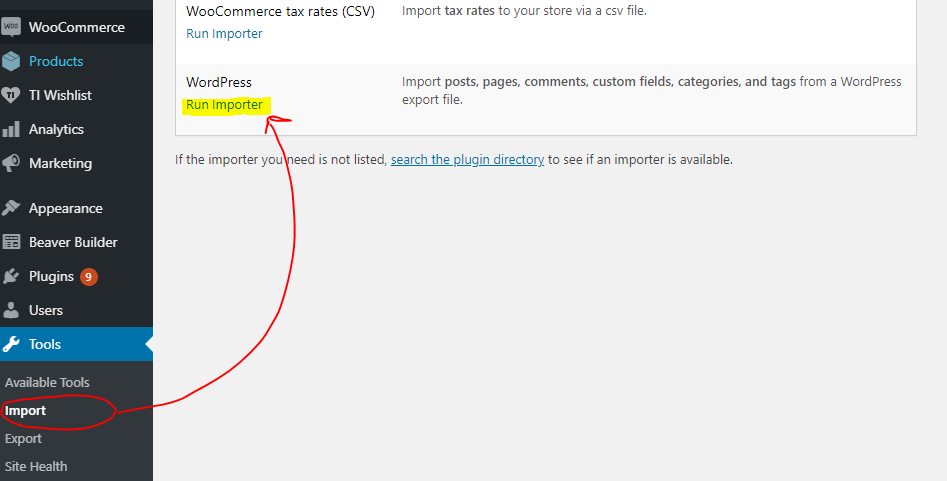
- Go to the dashboard > tools > import - then at the bottom, under WordPress click "install now" > then click "run importer"
- Select your downloaded template package .xml from the "choose file" button > then click "upload file and import"
Apply Templates to Layouts
Note:
Feel free to adjust the widths of the columns to work with whatever changes you make to the template's components.
Make sure to check these adjustments on tablet and mobile responsive views as well to make sure the layouts appear correct on all screen sizes.


