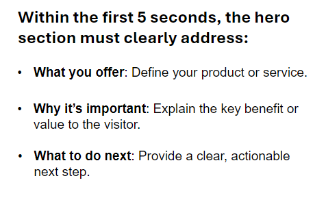
The call-to-action (CTA) in the hero section is the element that drives user interaction. It should be eye-catching, action-oriented, and aligned with your business goals. Here are the best practices for designing an effective CTA in the hero section:
Font Style
Bold and readable
The CTA font should be bold and clear to ensure it stands out. Sans-serif fonts are a popular choice for their clean and modern look.
Consistency with other elements
Use a font style that matches or complements the headline and subheadline but adds enough distinction to draw attention.
Font Size
Readable but not overwhelming
The CTA font should be large enough to grab attention, typically between 16px to 20px. Ensure the text scales appropriately on smaller screens, so it remains easily tappable on mobile devices.
Button size matters
The CTA button should have enough padding (around 10px to 20px) to make it look clickable and inviting without being too large.
Font Color
Contrasting color
The CTA text should be in a color that contrasts with both the button color and the hero background. This ensures maximum readability and impact.
Action-oriented color scheme
Consider using bright, attention-grabbing colors (e.g., orange, red, or bright blue) for the CTA text and background, as long as they complement the overall design.
Placement
Position below the subheadline
The CTA should be placed immediately below the subheadline for a natural flow. This proximity encourages users to take the next step after reading the value proposition.
Prominent and obvious
Make sure the CTA is not buried or overshadowed by other elements. It should have a clear and distinct placement within the hero section.
Button Design
High contrast for visibility
The CTA button color should contrast sharply with the background of the hero image or section, ensuring it stands out. Bright, bold colors work well here.
One primary CTA
Stick to a single, clear CTA in the hero section. Multiple CTAs can dilute the focus and confuse users. If a secondary CTA is needed, use a more subtle design (e.g., outline button).
Rounded corners or sharp edges
Depending on your brand’s style, use rounded corners for a friendly, modern feel or sharp edges for a more professional look.
Hover Effects
Subtle hover interactions
Add a hover effect (like a color change or shadow) to indicate interactivity. Ensure the effect enhances usability without being distracting.
Consistent with the design
Ensure the hover effect matches the overall aesthetic of the hero section and the website.
Whitespace Around the CTA
Breathing room
Give the CTA enough space to stand out. Avoid cluttering the button with other elements, and make sure it has adequate whitespace around it for visual separation.

