Desktop Header & Navigation Best Practices
The header is your store’s control center—it must be clear, intuitive, and conversion-focused to keep users engaged and shopping.

Elements of the Desktop Header
A well-designed header helps customers navigate effortlessly, find products quickly, and complete
their purchase with ease. Headers for Ecommerce Stores generally contain the following:
Logo
Brand Identity & Homepage Anchor
✅ Where should it go?
The top-left logo placement is the safest, fastest, and most intuitive choice
- This is a learned behavior from 97% of websites (Nielsen Norman Group).
- Placing the logo in the center can work for minimalist designs or luxury brands, but it reduces returning visitor speed to homepage by 6% (Baymard Institute).
- Right-aligned logos confuse users and increase time-to-homepage action by 22% (Google UX Research).
✅ Best Practices for Logo Visibility & Design
A well-sized, high-contrast logo improves brand recognition & navigation.
- Ensure the logo is high-contrast against the background (dark logo on light, or vice versa).
- Use a transparent SVG or PNG to avoid pixelation or background issues.
- Keep the height between 40-80px for clean integration into the header.
- The logo should always link to the homepage—users rely on this interaction.
✅ Sticky Header Best Practices
- Sticky headers increase conversions by 8-22% (Baymard Institute).
- Logos in sticky headers should shrink by 20-30% for better visibility (UX Movement).
❌ Avoid complex or overly decorative logo designs
- Thin fonts or intricate details may look great in print but fail in digital headers.
- To address this, ensure there is a “web version” of the logo.
- If the customer comes to you with a complex, overly detailed, or poor quality logo, always suggest that they use the company name in plain text in the header or simplify the logo to just include the company name.


Main Navigation
Primary Categories & User Flow
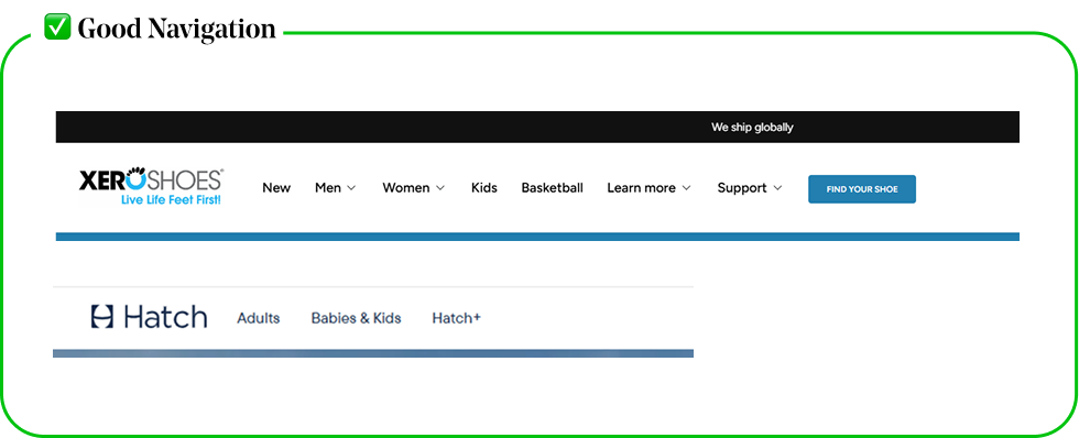
✅ A Strong Navigation Menu Should:
Prioritize Shopping-Related Links
- Focus the main navigation on product categories and high-intent pages (e.g., Shop, New Arrivals, Best Sellers), while moving non-conversion pages (About, Contact, FAQs) to the footer or a secondary menu.
- Rarely if ever use “Home” in the navigation.
Use Clear, Actionable Labels
- Avoid vague terms like “Products” or “Collections”.
- Instead, use descriptive, user-friendly language like “Men’s Running Shoes” or “Skincare Sets”, so customers instantly understand where each link leads.
Be Concise & Scannable
- Limit the number of main navigation links to 5-7 items to prevent overwhelming users and ensure quick decision-making.
- Dropdowns can be used to organize subcategories without cluttering the menu.
✅ Research & UX
- Hick’s Law states that the more choices a user has, the longer it takes to make a decision.
- When users are faced with too many links, they feel overwhelmed and hesitate rather than taking immediate action.
- A study by the NN Group (Nielsen Norman Group) found that simplifying navigation increases conversions because users can find what they need faster. Cluttered Headers
- Increase Bounce Rates & Frustration:
- Google’s UX team found that cluttered headers lead to higher bounce rates because:
- Multiple similar links confuse users rather than guiding them.


Before and After Navigation Menu
❌ Before
- The navigation contains some tabs that are too generic, with a broad "Services" tab that doesn’t clearly communicate the specific offerings.
- Additionally, "About" and "Contact" take up valuable space in the main menu despite not driving conversions. These pages are still important but are better suited for the footer or a secondary menu, allowing the primary navigation to focus on high-value, service-driven links.

✅ After
- The updated navigation breaks services into distinct categories, making it easier for users to find exactly what they need, improving clarity and usability.
- By removing non-conversion-focused links from the main menu, the site keeps users engaged with key services, guiding them toward action rather than passive information.

❌ Avoid
Hamburger only menu on desktop
🔻 A hamburger menu + logo alone is a BAD idea for most desktop eCommerce sites.
✅ Instead, use a visible menu with category links, search, cart, and login icons.

Why Avoid this?
Research & UX
Users Expect Full Navigation on Desktop
- Studies show that hidden navigation (hamburger menus) reduces discoverability by 21% on desktop.
- Visible menus receive 40% more engagement than hidden menus. (Nielsen Norman Group)
Extra Clicks = Higher Drop-off Rates
- A hamburger menu adds an extra step to find key shopping categories.
- Every extra click reduces engagement and conversion rates.
Slower Navigation = Frustration
- Desktop users browse with a mouse, not taps—a visible menu allows instant access.
- Hidden menus slow down navigation and frustrate new visitors.
Store Icons
Cart, Search, Login, & More
✅ Choose the Right Store Icons for Your Header
Prioritize Essential Functions
- Only include icons that improve usability and conversion, such as cart, search, and account/login, while avoiding unnecessary distractions.
Match User Expectations
Use universal, recognizable icons to ensure intuitive navigation:
- a magnifying glass for search
- a shopping bag/cart for checkout
- person/profile for account access
Keep It Minimal & Uncluttered
- Too many icons can overwhelm users, so limit them to 3-5 key actions that directly support shopping behavior, like wishlist, cart, and order tracking.
- Every icon in the header should serve a purpose related to shopping, navigation, or account management—anything else belongs in the menu or footer
❌ What NOT to Do:
Do not Include irrelevant or unnecessary icons
- For example, the search icon if there is only a few or one products.
- Do not space them too close to together or too far apart, or space them inconsistently, or in places no one expects them to be.

❌ Avoid
Social Media icons in the header
🔻 Placing social media links in the header distracts users and leads them away from the site, reducing engagement and conversion rates.


Why Avoid this?
Research & UX Issues
They Distract from Shopping Actions
- Experts have observed that placing social media icons in prominent positions, such as the header, can distract potential buyers, leading to reduced conversions by over 10%. trustsignals.com
They Take Up Valuable Space
- Mobile headers are already limited; adding more elements makes them crowded.
Social Media Links Pull Users Away
- If users click social icons in the header, they leave the site and may not return.
Conversion Rate Impact
- A study highlighted that eCommerce websites experienced a 25% improvement in conversion rates after relocating social media icons from the header to less prominent areas. nooffseasoncards.medium.com
✅ Better placement:
- Footer or “Follow Us” section on product pages.
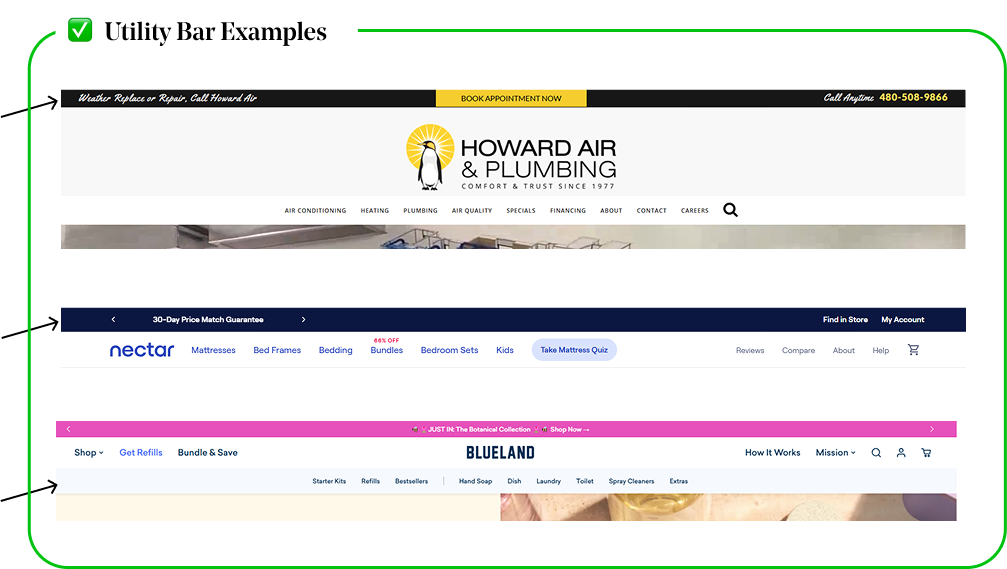
Utility bar
A Static Secondary Header for Key Info & Navigation
✅ What Is a Utility Bar?
- Also called the top bar or secondary navigation, it’s a thin strip located above or below the main navigation that provides quick access to important information or links.
- Ensure readability by using contrasting colors that stand out against the background.
Keep It Slim & Unobtrusive
- The utility bar should be a thin strip that enhances navigation without taking up too much screen space.
✅ What Can You Place in a Utility Bar?
- Promotional Offers – Free shipping, discounts, seasonal sales
- Quick Access Links – Order tracking, FAQs, customer support
- Store Policies – Return policy, sustainability messaging, financing option.
- Localization Options – Language, currency, shipping country selector
- Login/Account Links – Sign in, wishlist, loyalty program
❌ What to Avoid
Don’t include low priority pages
- Pages like "About Us" or "Blog" belong in the footer, not the utility bar.
Do not make It too large
- A utility bar that’s too tall pushes down the main content and distracts from shopping. It should be about half the size of the main navigation.


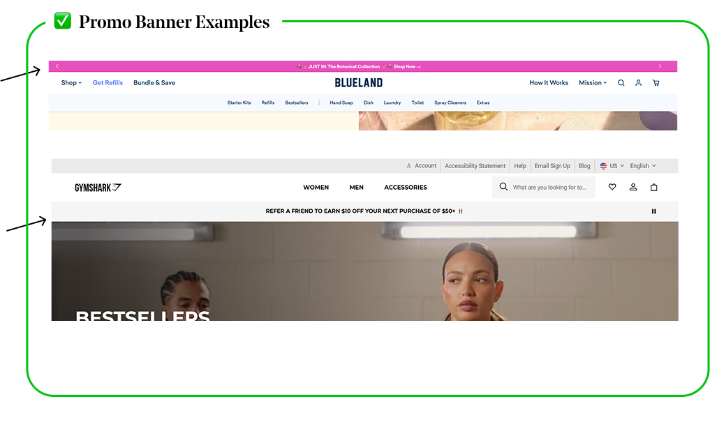
Promo Banner
Highlight promotions, discounts, free shipping offers, or important announcements
✅ When to Use a Promo Banner
- Promote Sales & Special Offers - Use it for discounts, free shipping, or first-time buyer perks to drive conversions.
- Create Urgency - Highlight limited-time deals, restocks, or countdown-based promotions to encourage quick action.
- Share Important Updates - Announce new product launches, store changes, or key events without disrupting the shopping experience.
✅ How Promo Banners Impact Conversions
- Research shows that banners with time-sensitive messaging increase conversions by 28% (CXL Research).
- Users notice promo banners within the first 3 seconds of landing on a site (Nielsen Norman Group).
- Sticky promo bars improve sales by 10-15% (Baymard Institute), especially when promoting free shipping or limited-time discounts.
✅ Best Placement Options
- Above Header (Best for Sales & Announcements) -Most visible, but needs to be subtle.
- Below Header (Best for Free Shipping Promos) - Stays in view without pushing content down.
- Sticky Banner (Best for Flash Sales) - Higher engagement but should be dismissible.
❌ What to Avoid
Too vague
- “Check Out Our Deals” (What deals? No urgency.)
Too long
- “We are currently running a limited-time offer on select products, shop now before it’s too late!”
No action
- “Huge Sale Happening” (Add a CTA like “Shop Now” to drive clicks.)


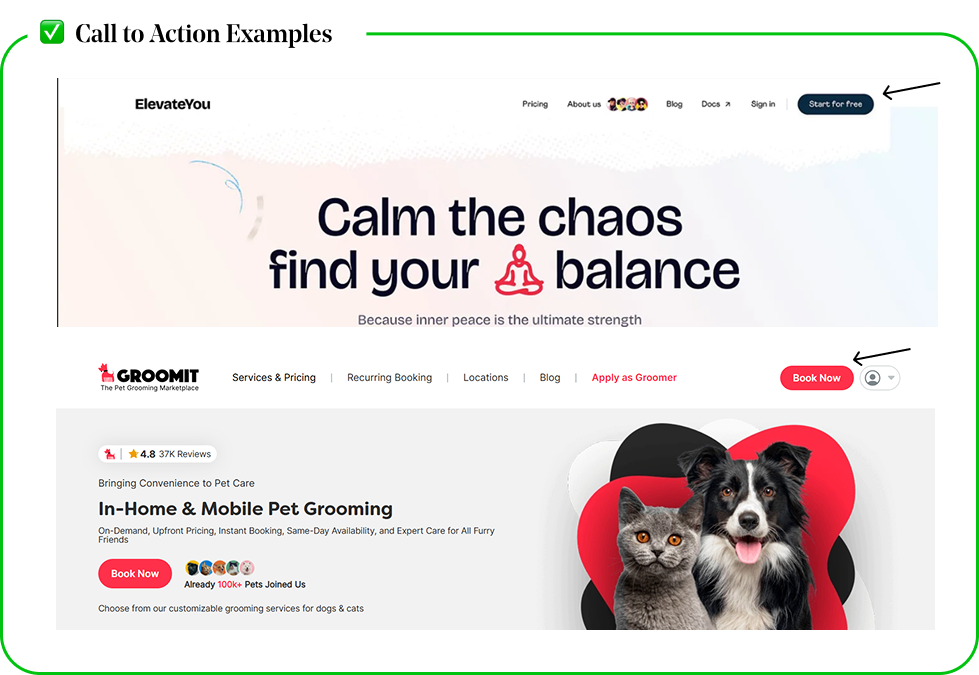
Call to Action buttons
Guide users toward action with an effective header CTA.
✅ Best Placement:
Top right corner of the header
- Users naturally scan websites in an “F” shape, meaning their eyes move from the top left to the top right before scrolling (Nielsen Norman Group).
- Placing the CTA in the top right aligns with this natural behavior, making it instantly visible without distractions.
Make It Clear & Visible
- Use strong, action-driven wording and a high-contrast design that stands out.
- Stick to one primary CTA to avoid confusion and dilution of focus.
✅ Best Practices
Make it stand out
- Use a high-contrast color that differentiates it from other elements.
Keep the text action-driven
- Use clear, concise wording like "Start Your Trial", "Shop Now", or "Subscribe".
Size it appropriately
- It should be large enough to grab attention but not overwhelm the navigation.
❌ CTA in the header is not needed:
The Navigation Already Directs Users to Key Actions
- If the main menu effectively leads users to shop categories, sales, or account access, an extra CTA may be redundant.
A Store Has a Minimalist, Browse-First Experience
- Some brands focus on exploration rather than pushing immediate action (e.g., luxury brands, curated boutiques).


