Hero Section Capture the User s Attention and Instantly Convey Value
The hero section is the first thing users see—make it clear, visually
engaging, and action-driven.
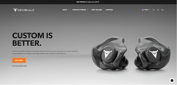
What is the Unique Selling Proposition (USP)?
When a user visits a website, they should immediately know what the business is great at, and what problem it is that they are going to solve for the user. Why are they different from others in their category?
What does the business do better then the rest?
Hero Section Elements
The hero section shapes first impressions, quickly conveys what’s sold, and guides users to act-making it key to conversions.
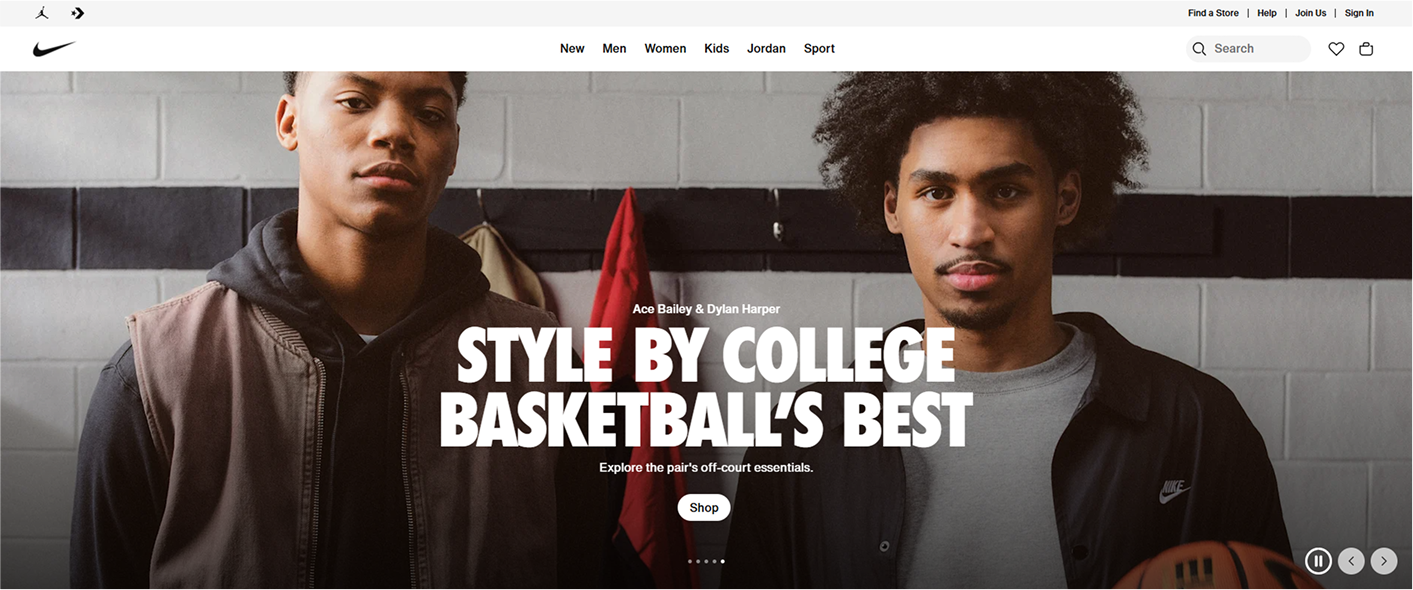
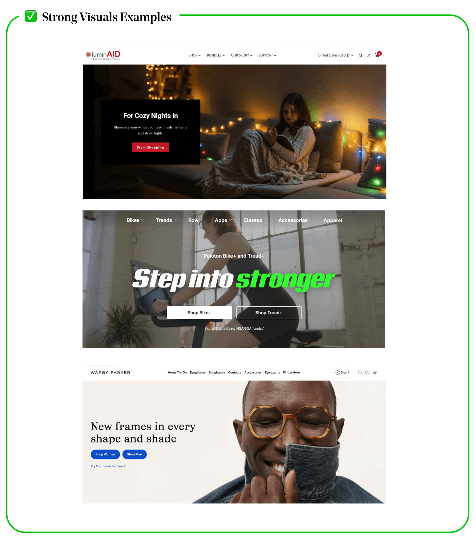
Strong Visuals
A strong visual grabs attention, communicates value instantly, and drives action.
✅ What Makes a Good Hero Image (or Video)?
- The image should immediately tell visitors what the store sells and why it matters.
❌ Bad Example: A generic image of a mountain landscape (no context, no product).
✅ Emotionally Engaging Imagery Triggers Action
- Emotional appeal in visuals increases engagement and memory retention (Harvard Business Review).
- Use aspirational imagery—photos that evoke trust, desire, or relatability.
Good Example: Peloton
- Hero image: A rider mid-exercise, sweating but smiling = Motivation & energy.
- Subconscious trigger: "If they’re enjoying it, I want to feel that too."
❌ Bad Example: A static product image on a white background (no emotion, no energy).
- Show the product being used or benefiting the customer.
✅ The Subject is Clearly Defined with Visual Hierarchy
- The Fitts' Law states that elements closer and easier to recognize get more attention.
- The main subject should be clear, high-contrast, and separated from distractions.
- No clutter, no distractions—just the product and its benefit.
❌ Bad Example: A cluttered kitchen with multiple cleaning products, making the hero image visually chaotic.
- Key Insight: Keep the image focused on one primary subject.
✅ Faces & Eye Gaze Improve Engagement
- Human brains are hardwired to recognize faces (MIT Neuroscience Research).
- Images with faces are processed faster, and eye gaze direction guides user attention.
- Psychological trigger: "This person looks amazing—I want that result."
- Key Insight: Use faces to build trust and direct attention (e.g., the subject looking at a CTA).
Want to boost conversions?
✔ Make your hero image clear, high-quality, and emotionally engaging
✔ Show the product in action with faces, eye gaze, or clear benefits.
✔ Use contrast, focus, and minimal clutter to guide attention.
By following these research-backed principles, your hero section will grab attention, build trust, and drive action.

Compelling Messaging
A great hero message is like a powerful elevator pitch—it grabs attention, creates desire, and drives action in seconds.
✅ Instant Clarity: Users Should “Get It” in 3 Seconds
- Your hero copy must be short, clear, and immediately explain what your store sells.
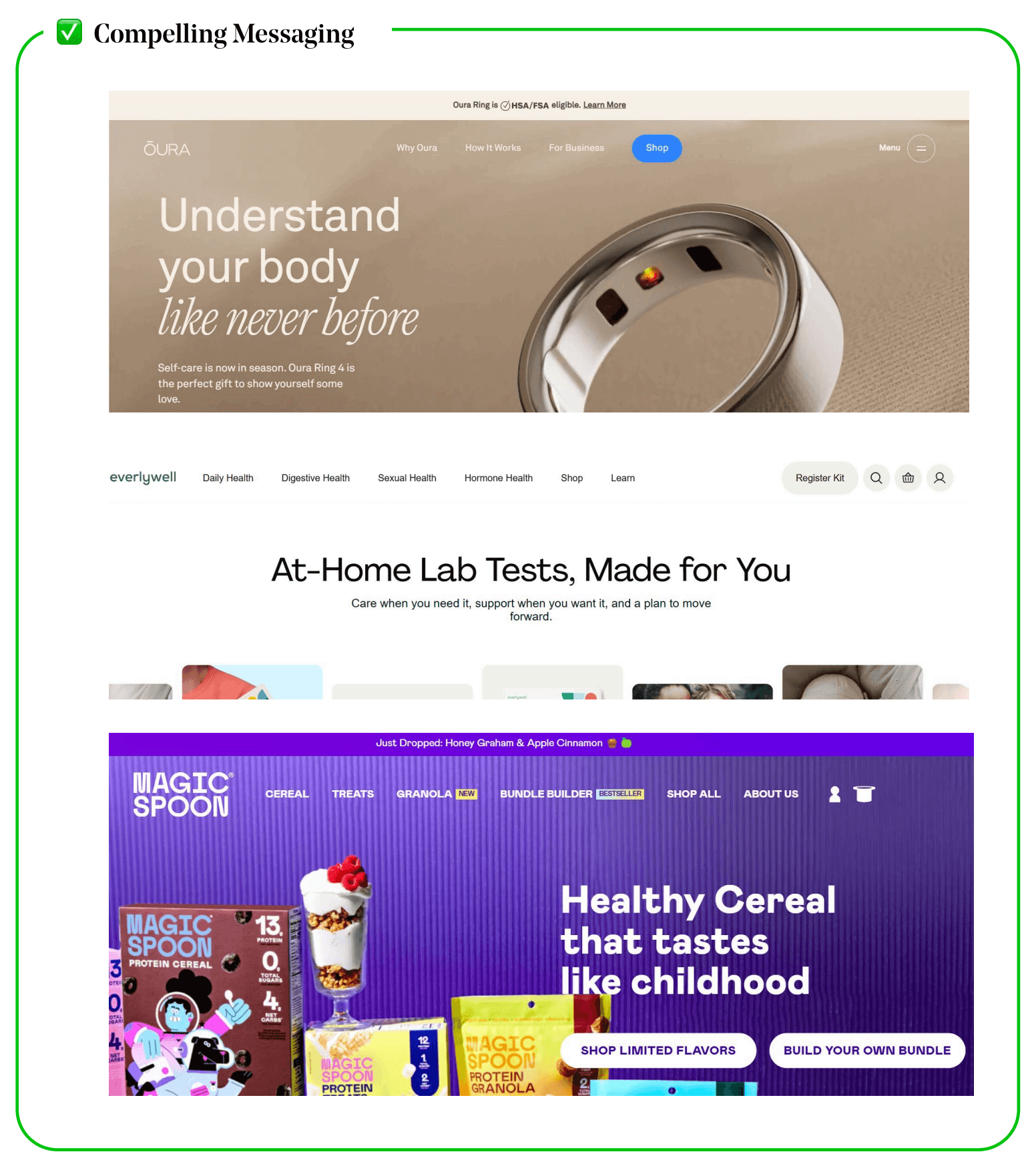
Good Example: Oura Ring
- "Understand Your Body Like Never Before."
- Instantly communicates the product’s purpose (health tracking).
- Creates intrigue without being vague
❌ Bad Example:
🔴 “A Smarter Way to Track Your Wellness Metrics and Optimize Your Sleep and Activity Patterns Daily.” (Too long, cluttered, hard to scan.)
Key Insight: Use concise, powerful phrasing that makes your value crystal clear in seconds.
✅ Focus on the Customer, Not Just the Brand
- Conversion studies show that customer-centric messaging increases engagement by 20-30% (CXL Institute).
- Application: Use words like "you" and "your" instead of "we" and "our company."
Good Example: EverlyWell - "At-Home Lab Tests, Made for You."
- Addresses the customer directly.
- Highlights ease-of-use and personal benefit.
❌ Bad Example:
🔴 "We provide innovative at-home health testing solutions." (Too company-focused.)
Key Insight: Speak to the user’s needs, not just what your company does.
✅ Emotion-Driven & Benefit-Oriented Language
- Emotional engagement leads to stronger recall and increased conversions (Harvard Business Review).
- Your hero message should evoke an aspirational emotion (e.g., confidence, joy, relief, excitement).
Good Example: Peloton - "Workouts That Push You Further."
- Motivational and aspirational.
- Suggests a clear benefit (getting stronger, fitter).
❌ Bad Example:
🔴 "Experience our state-of-the-art fitness technology." (Doesn’t evoke emotion or personal benefit.)
Tell users how they’ll feel after using your product.
✅ Keep It Conversational & Simple
- Research shows that messages written at a 5th-grade reading level increase comprehension and engagement (Nielsen Norman Group).
- Application: Avoid jargon, industry terms, or overly complex phrases.
✅ Use Power Words That Spark Emotion
- Certain words trigger strong emotional responses, making them more memorable and persuasive (University of Southern California).
🔥 High-Impact Words for Hero Sections
- "Effortless" (Makes life easier)
- "Exclusive" (FOMO effect)
- "Instant" (Speed/efficiency)
- "Revolutionary" (Disruptive, new)
- "You Deserve" (Personal, aspirational)

The Perfect Hero Messaging Checklist
✅ Headline under 7 words (instant clarity).
✅ Speaks directly to the user (not just the company).
✅ Emotion-driven (aspirational, problem-solving).
✅ Simple, conversational language (5th-grade level).
✅ Communicates the brand’s unique difference. (Highlight a unique selling proposition (USP) in your hero text.)
Clear Call to Action
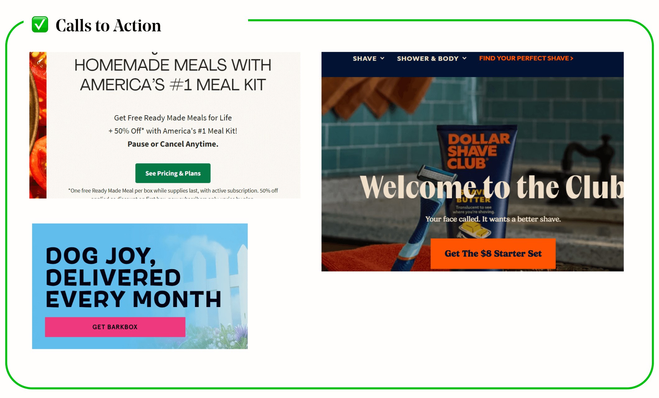
Your Call-to-Action (CTA) is the most critical driver of conversions in your hero section.
✅ Clarity & Actionable Language
- Users Should Know Exactly What Happens Next
- Clarity reduces hesitation—users are 2x more likely to click when they know exactly what happens next (Baymard Institute).
✅ High-Contrast & Visually Standout Design
- The Von Restorff Effect (Isolation Effect) proves that elements that stand out get noticed first (Nielsen Norman Group).
- Use a bold, contrasting button color (e.g., a bright CTA on a neutral background).
- Avoid ghost buttons (low-contrast outlines that blend into the page).
✅ The CTA Should Create a Sense of Urgency
- The Fear of Missing Out (FOMO) effect increases conversions—users are more likely to act when they feel time-sensitive pressure (Journal of Consumer Psychology).
- Add urgency words like “Limited Time,” “Now,” “Exclusive” to trigger immediate action.
✅ Use Microcopy to Reduce Hesitation & Add Trust
- Studies show that reducing perceived risk increases CTA engagement by 30% (CXL Institute).
Add a trust-boosting line beneath the CTA:
- "No Credit Card Required"
- "Free Shipping on Your First Order"
- "30-Day Money-Back Guarantee"

Let s See These Elements in Action
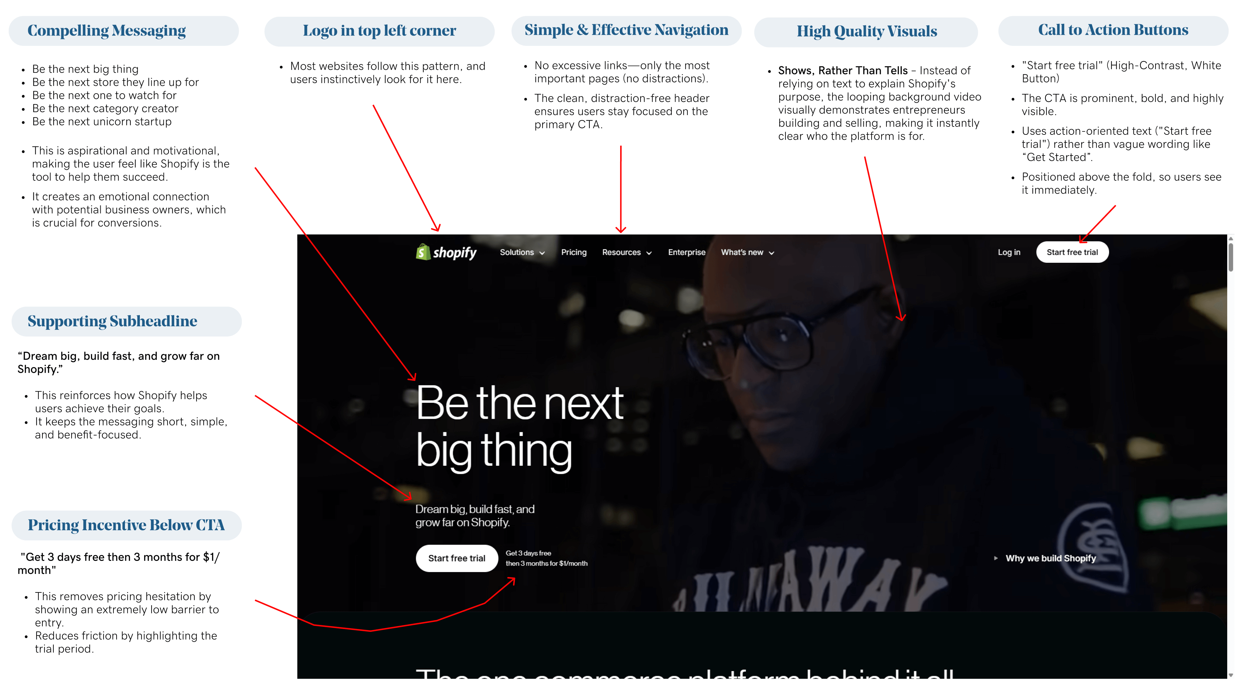
Let’s next examine Shopify’s hero section. They aren’t just stating what they do (“We’re an eCommerce platform”); instead, they tell the user what they can accomplish with Shopify.
Hero/Header Makeover
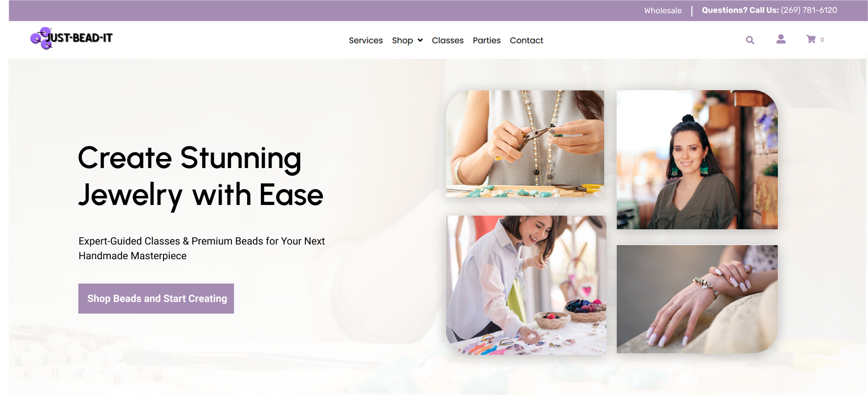
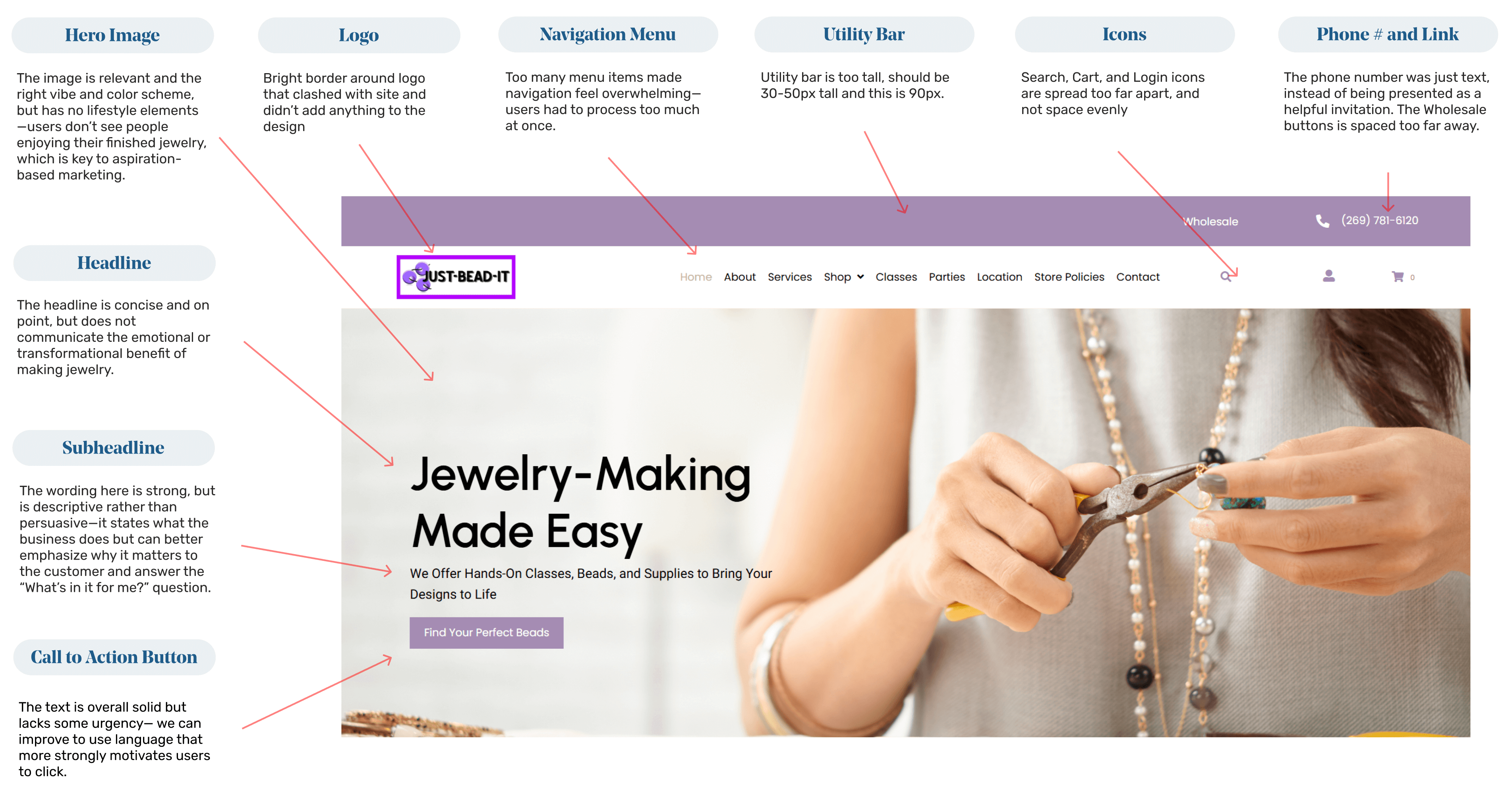
Just Bead It had potential, but with a clearer message, stronger visuals, and a more focused CTA, we transformed its hero section into a high-converting, customer-friendly experience —let’s break it down
After:
