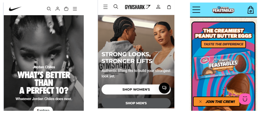
Top Header Bar for Mobile
Mobile Header Must Haves
A mobile eCommerce header should be compact, easy to navigate, and focused on essential shopping actions—ensuring a seamless user experience without unnecessary clutter.

Logo
Small but Recognizable, Placed for Fast Brand Recognition
- The logo is the anchor of brand identity, but it shouldn't dominate the header.
- Placement - Left aligned or centered – This is the industry standard and improves brand recognition & usability.
- Do not right align.Ensure the size is compact but readable – Ideally 120-180px wide, 30-50px tall to fit well with menu and icons.
- Clickable: Always links to the homepage – This helps users reset their journey if they get lost.
Hamburger Menu
Right or Left Aligned & Easy to Tap
- Mobile users expect a hamburger menu for easy access to categories and store pages.
- Use a standard ☰ icon – Users recognize it instantly, no need for text labels.
- Ensure a large tap target – Min. 44x44px so it’s easy to press without frustration.
- Open a full-screen overlay menu – A slide-out drawer with clear categories, search, and account access.
- Never place directly in the center of the header
Cart Icon
Prevents Frustration by Showing What's in the Cart at a Glance
- Users should never wonder if their items are saved—a visible cart summary reassures them.
- Use a cart icon with a badge (🛒 2) – Displaying the number of items in the cart prevents checkout abandonment.
- Ensure one-tap checkout access – The cart icon should always open to the cart or mini-cart summary.
- Make it thumb-friendly – The cart icon should be large enough (min. 44x44px tap target).
Optional Elements for the Mobile Header
Include Only If Relevant


Login/Account Icon
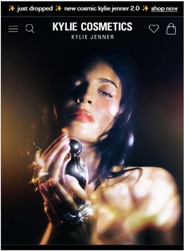
Thin Announcement Bar Above the Header
✅ When to Add:
- If customers frequently reorder or track past purchases (e.g., supplements, meal kits, electronics).
- For subscription or membership-based stores (beauty boxes, software, wholesale portals).
- If customers need saved preferences (fashion wishlists, custom sizing, loyalty programs)
❌ When NOT to Add:
- If guest checkout is the primary option and users don’t need accounts.
- For small stores where users don’t need logins (e.g., boutique, single-product sites).
- If it takes up space needed for more important icons like search or cart.
💡 Common Websites That Use It:
- Subscription services (SaaS, membership sites, beauty & food subscription boxes)
- High-reorder stores (vitamins, skincare, office supplies)
- Wholesale & B2B sites (bulk orders, pricing access)
Promo Banner
Thin Announcement Bar Above the Header
✅ When to Add:
- If you’re running a limited-time promotion
- For key store-wide benefits (e.g., “🚚 Free Shipping Over $50” or “New Arrivals Now Live”).
- To communicate important policie
❌ When NOT to Add:
- If it stacks with multiple other banners (too many promos = visual clutter).
- If the message isn’t time-sensitive or relevant (e.g., a generic “Welcome” message).
- If it pushes critical header elements down (ensure it’s slim, ~30-40px max).
💡 Common Websites That Use It:
- Retail & fashion stores ("20% Off Today Only!")
- Subscription-based services ("Sign up & get your first month free!")
- Stores with free shipping thresholds ("🚚 Free Shipping on Orders Over $50")
Search Icon or Seach bar
For Saving Products & High-Consideration Purchases
✅ When to Add:
- If your store has more than ~20-30 products (faster than browsing categories).
- If users commonly search for specific items (electronics, books, office supplies).
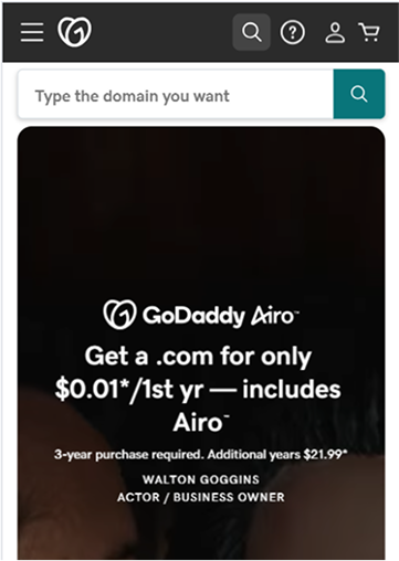
- Usually just an icon, but full search bar can be visible (like on GoDaddy.com) in certain cases
❌ When NOT to Add:
- If the store has very few products (~10 or fewer) (browsing is easier than searching).
- If users don’t typically search for products (e.g., service-based businesses).
- If it takes up valuable header space when navigation is more important.
💡 Common Websites That Use It:
- Multi-category stores (Amazon, Best Buy, department stores)
- High-SKU brands (makeup, clothing, tools, car parts)
- Stores with many product variations (supplements, fragrances, shoes)
Phone Icon
Tap to call
✅ When to Add:
- If direct customer support is essential (e.g., emergency services, medical clinics, custom order businesses).
- For local businesses or appointment-based services (salons, repair shops, restaurants, real estate agents).
- If phone inquiries drive a significant portion of sales (B2B suppliers, custom furniture makers, home services).
❌ When NOT to Add:
- If most customer support is digital (e.g., live chat, email, or automated FAQs).
- For standard eCommerce stores where customers don’t need direct contact before purchasing.
- If space is limited and other elements (like cart/search) are more critical.
💡 Common Websites That Use It:
- Service-based businesses (plumbers, salons, clinics, real estate)
- Local businesses (restaurants, repair shops, in-store pickup services)
- High-ticket sales requiring consultation (custom furniture, B2B, luxury products)
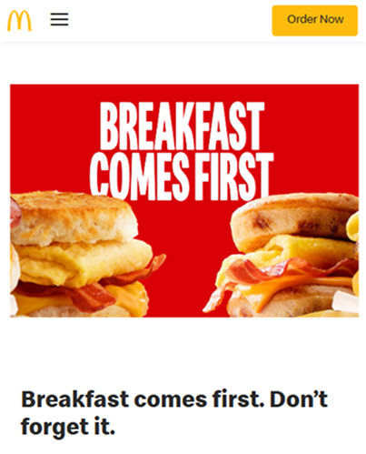
CTA Button
For "Book Now," "Order Now" or Key Actions
✅ When to Add:
- For service-based businesses where bookings are the primary goal (e.g., appointment scheduling, consultations).
- If running a high-impact promotion (e.g., "🔥 Get 20% Off Today!" in a promo bar).
- For single-product or high-focus stores (e.g., "Pre-Order Now" on a new product launch site).
❌ When NOT to Add:
- If it competes with the hero section CTA (CTAs should primarily be in the hero, not the header).
- For large catalogs where navigation is more important (e.g., multi-category online retailers).
- If it clutters the header and reduces readability.
💡 Common Websites That Use It:
- Service-based businesses ("Book Now" for salons, therapists, fitness trainers)
- Single-product stores ("Buy Now" for niche gadgets, health supplements, pre-order sites)
- Promo-heavy stores (Limited-time sales, flash deals, seasonal discounts)
Non Clickable Text Message
Can be useful in certain cases, but it must be brief, valuable, and non-distracting
✅ When to Add:
- For brand trust-building – Short, credibility-boosting messages like "Handmade in the USA | 30-Day Returns."
- For core value propositions – Reinforce a unique selling point (e.g., "100% Organic | Ethically Sourced | Veteran-Owned.").
- If promotions change often – Some brands swap messages regularly (e.g., "Carbon Neutral Shipping!", "Buy Now, Pay Later Available!").
❌ When NOT to Add:
- If it’s too long or takes up too much space – Keep it one short sentence or phrase, max 6-10 words.
- If it repeats information already in the promo banner – No need to say "Free Shipping Over $50" twice.
- If it distracts from primary shopping actions – The header should prioritize search, cart, and menu.
💡 Common Websites That Use It:
- Luxury brands & small businesses – "Handcrafted in Italy | Limited Stock."
- Eco-conscious brands – " Sustainable & Plastic-Free Packaging."
- Customer-trust-driven brands – "⭐ Trusted by 1M+ Customers."
Store Locator/Map Icon
Tap to see a map
✅ When to Add:
- For businesses with multiple locations who have sections or pages dedicated to their locations (retail chains, gyms, service providers).
- If in-store visits are a key part of sales (jewelers, furniture, custom design).
- If you want a quick and easy way to link to google maps so user can get driving directions to your physical location.
❌ When NOT to Add:
- If the business is online-only (no physical locations to visit).
- If location info can be accessed through the footer or menu (saves header space).
- If customers rarely visit stores (wholesale suppliers, digital-only businesses).
💡 Common Websites That Use It:
- Retail chains (Nike, Sephora, Walmart)
- Restaurants & coffee shops (Starbucks, local cafés)
- Service-based businesses (gyms, medical offices, salons)
Support/Help Center
For FAQ, Live Chat, or Customer Support
✅ When to Add:
- If customer questions frequently impact sales (tech products, subscriptions, travel bookings).
- For complex products that require guidance (software, electronics, industrial tools).
- If live chat is a primary support channel (e.g., AI chatbots, personalized shopping assistants).
❌ When NOT to Add:
- If FAQs are better placed in the footer or menu (avoids header clutter).
- If self-service shopping is the norm (clothing, accessories, home goods).
- If support is mainly handled via email or phone.
💡 Common Websites That Use It:
- Tech & electronics (smartphones, laptops, gaming)
- Subscription services (SaaS, membership-based businesses)
- Businesses with complex buying decisions (insurance, finance, travel)
Wishlist Icon
For Saving Products & High-Consideration Purchases
✅ When to Add:
- For high-value items customers compare before purchasing (jewelry, furniture, electronics).
- If users commonly save items for later or create collections (fashion, home decor).
- If gifting is a big part of your business (holiday shopping, wedding registries).
❌ When NOT to Add:
- For low-cost, impulse-buy items where users buy immediately (discount beauty, fast fashion, cheap accessories).
- If data shows very few users engage with it (unused icons add clutter).
- If space is tight and more critical elements (cart, search) are prioritized.
💡 Common Websites That Use It:
- Fashion & apparel (outfits, accessories, styling lookbooks)
- Luxury & high-consideration items (jewelry, watches, furniture)
- Gifting-focused stores (baby gifts, wedding registries, holiday shopping)
