Hero Section For Mobile
Hero Section For Mobile
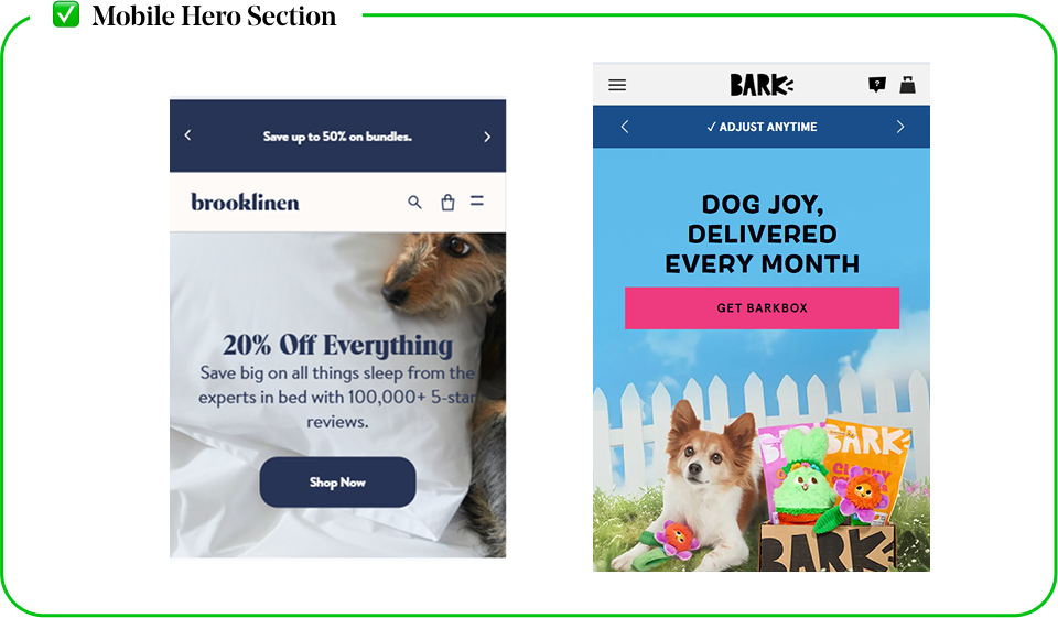
A great mobile hero section is fast, clear, and easy to interact with—guiding users toward conversion without friction.
✅ A Compact, Vertically Optimized Layout (Users Scan, Not Read)
- Studies show that mobile users scan content in 1-2 seconds, so the hero must be minimal and direct (Nielsen Norman Group).
- Application:
- Shorten headlines (no long-winded text).
- Stack elements vertically (centered text and CTA below the image).
- Avoid excess whitespace—every pixel matters on mobile screens.
✅ Mobile-First Image or Video (No Cropped or Misaligned Graphics)
- 85% of mobile users leave if a website looks broken (Google Mobile UX Report).
- Application:
- Use large, high-contrast buttons with at least 44-48px height.
- Avoid ghost buttons (low contrast, hard to see).
- Place the CTA in the center—not tucked in the corner.
✅ Large, Tap-Friendly CTA (No Tiny or Hard-to-Tap Buttons)
- Buttons should be at least 48px tall for easy tapping (Apple Human Interface Guidelines).


