
QA Standards
Tips related to achieving a desirable outcome reliant on certain Beaver Builder Functionality.
Sift through the different possible scenarios to find tips & tricks on the best way to accomplish your goal.
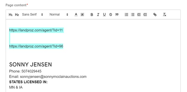
A cta button, hyperlinked text, social media icon, etc, has one of the following errors:
- Leads to a link that was not requested, or a link that is not relevant to the business
- Is different from the link provided by the customer in any way
- The customer provided a link, but the button, text, or hyperlink is deadlinked without justification
- An anchorlink was used when it was not necessary

This will be called out as an error under the following circumstances:
- The hyperlink looks like regular text and does not stand out
If using a color that is similar to the sites body text then an underline should be used
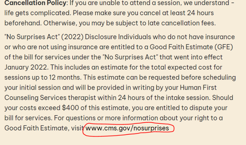
Example: In this instance, the text is only slightly darker from the surrounding text, and not underlined. Thus, is barely distinguishable as a link, and would be considered an error.
Links do not need to match the websites branding/colors, contrast and readability is more important
Example(s): In the sites below each one uses a color that is not part of the sites branding/color scheme for links to ensure readability.

While Apples branding and color scheme uses black and gray, In this example we can see that Apple uses blue to help distinguish their links from the other text.

In this example FedEx has chosen to use a similar blue even though their branding is purple, white and orange.

And once again we can see that UPS has chosen a similar style despite their branding colors of gold and dark brown.