Step 5. Page Build Process: Content
Step 5a. Blocks of Paragraph Text
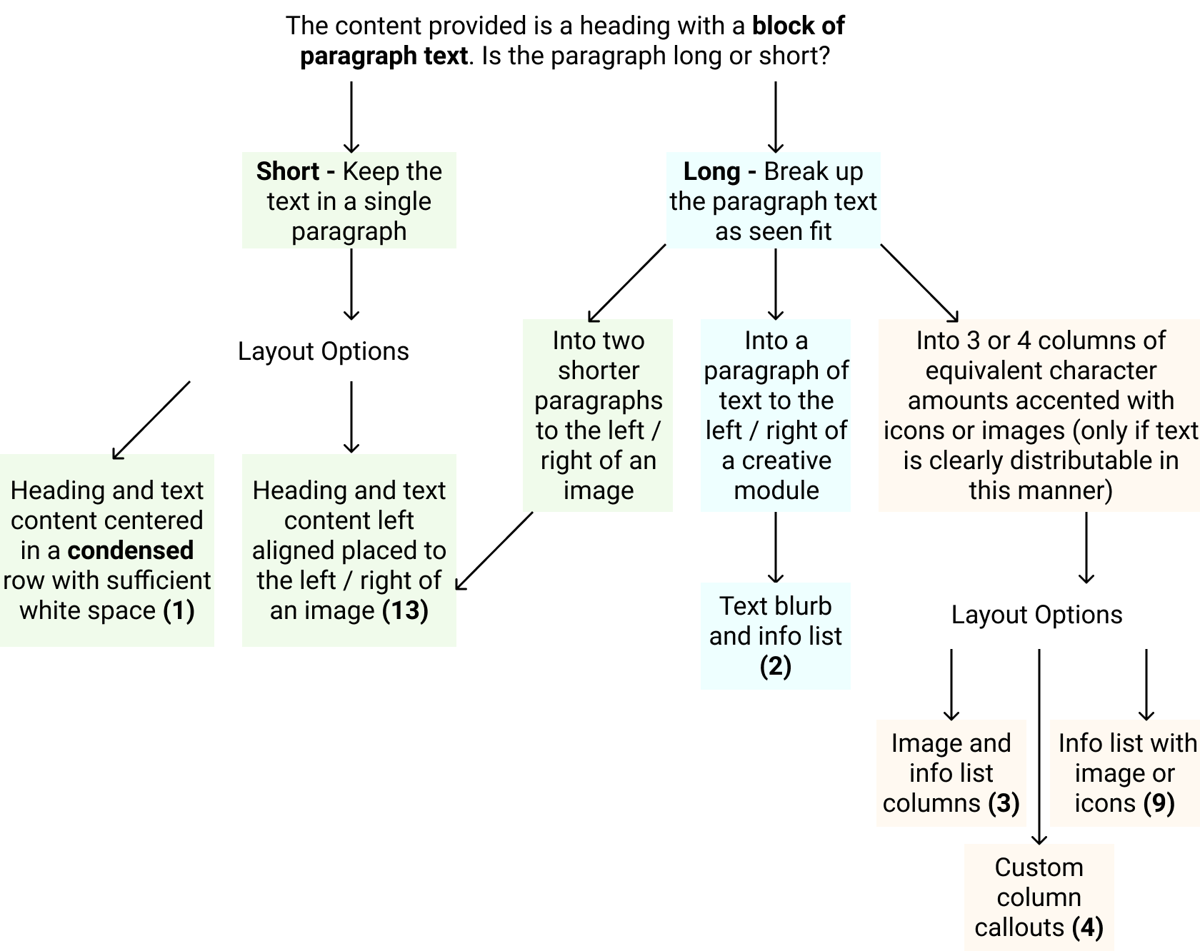
Layouts for Blocks of Text
(1) Short Paragraph & Heading
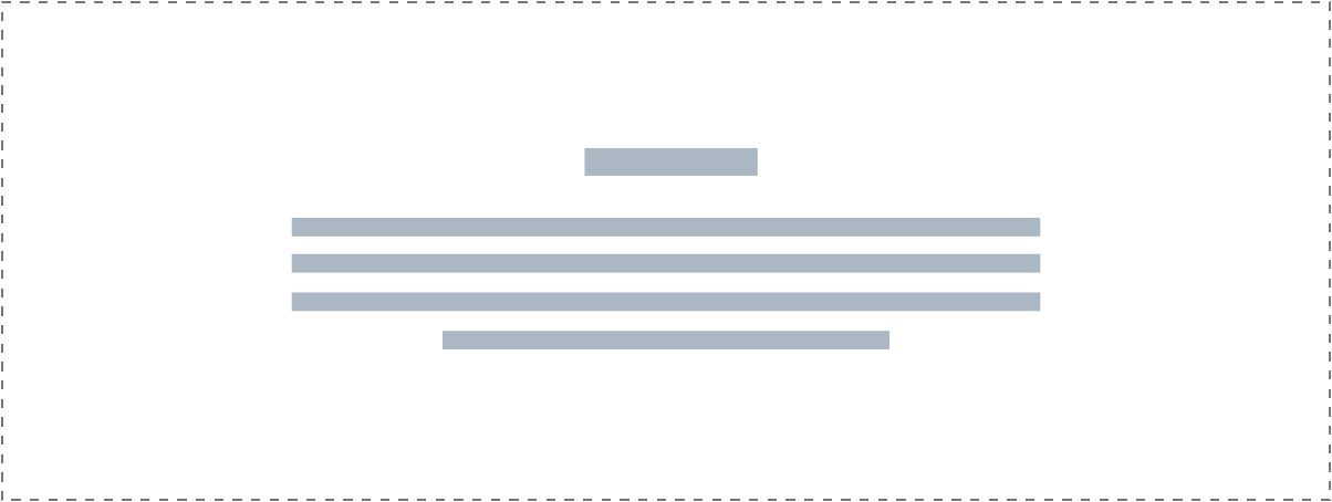
If you want to center a heading and text in a row it must be: short in character length, be condensed in width so it doesn't stretch from one side of the screen to the other, have larger font size, and have sufficient white-space/padding above and below.
Module(s):
Smart Headings
(13) Short Paragraph & Image
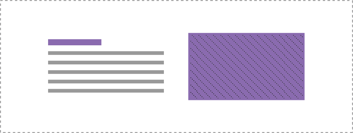
If a heading and paragraph is short in character length and can't be broken up, you can place it to the left or right of an image module. Ensure equal padding on top and bottom of the row.
Module(s):
Smart Headings, Photo
(13) Long Paragraph & Image
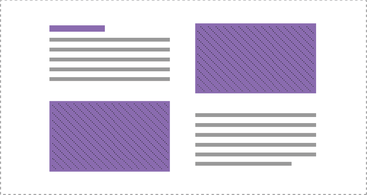
If a heading and paragraph is long in character length, break it up into two paragraphs and place them each to the left or right of an image module.
Module(s):
Smart Headings, Photo, Text Box
Step 5b. Lists or Distributed Content
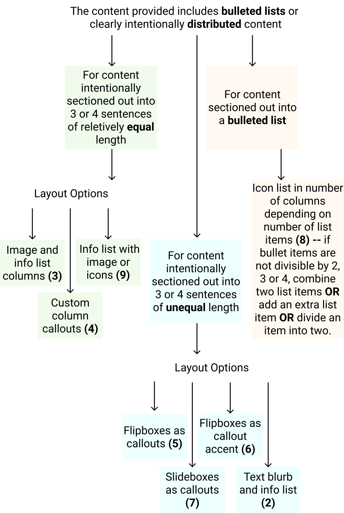
Multiple Sentences - Equal character lengths
Use the following layouts if: You can break up a long paragraph into equally distributed sentences OR if content was already distributed into sentences of equal character lengths.
Module(s):
- UABB Info List (Examples)
- UABB Info Box (Examples)
- PowerPack Icon Number List (Examples)
- Custom Callouts w/ Columns (Tutorial)
Reference the Callouts & Creative Modules page for details on the best modules to use for callouts and how to properly use them.
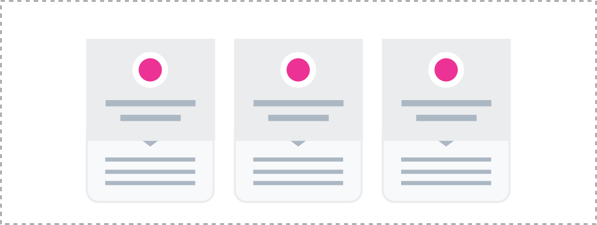
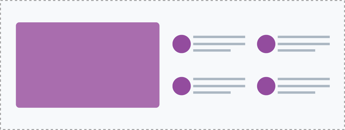
(3) Info List & Image
(4) Custom Column Callouts

(9) Info list with image or icons
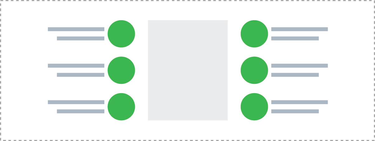
(8) Icon list for bulleted items
Multiple Sentences - Unequal character lengths
Use the following layouts if: You can break up a long paragraph into sentences of unequal character length OR if content was already distributed into sentences/small paragraphs, but their character lengths are unequal.
Module(s):
Reference the Callouts & Creative Modules page - Creative Module Limitations section for details on the best practices for creative modules, how to use them and how not to use them.
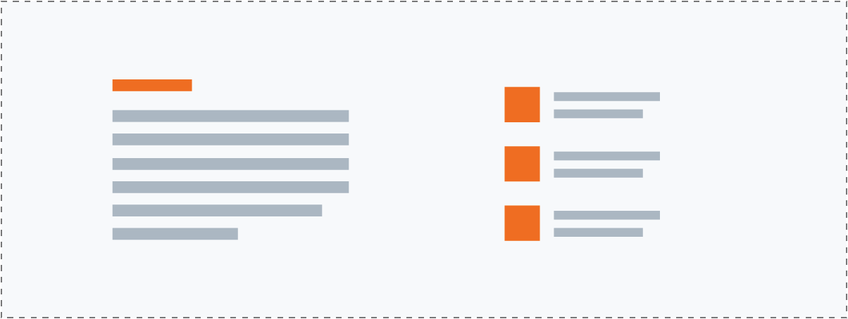
(2) Text blurb & Info List
(5) Flipboxes as Callouts

(6) Flipboxes as Callout Accent
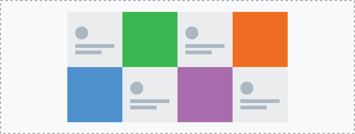
(6) Slideboxes as Callouts
