Standard Modules
It can be difficult to remember all the modules Beaver Builder has that can be used to place content. The WDS Demo Site has a comprehensive overview of all the main modules available with tool tips on any outstanding pointers to keep in mind when choosing the module. Knowing which modules to use and how to properly style them can drastically improve efficiency while also bringing a dull or text-heavy site to life. There are a few modules that are considered standards for basic content placement - these have been listed below. Read through this page to learn about the best modules chosen for content placement and how to make best use of the demo site.
Using The Demo Site
It can be difficult to remember all the modules Beaver Builder has that can be used to place content. The Demo Site has a comprehensive overview of all the main modules available with the exception of the very new additions to Beaver Builder. Since the demo site is shown via screen share to customers by the website specialist reps during the consultation intake process, any style specific or configuration notes must be kept hidden. The demo site has a tool tip feature that can be unlocked via the konami code.
To unlock tool tips:
Go to demo.wdsgallery.com > then execute the following sequence quickly on your keyboard:
When tool tips are unlocked, you should see a red " Hide Tooltips" link to the top left of the screen allowing you to disable them again. If you're a builder, and do not interact with customers, keep it enabled for your own convenience.
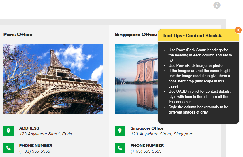
With the tooltip feature unlocked, you should be able to see light-gray "" info icons to the right on module pages or on layouts that have extra information to give you. If the tooltip refers to all the modules on the page, you'll probably see it in the hero row.
For all module / layout-specific tooltips, the icon will appear beside that module or layout. These tooltips can range from telling you which module to select for it or how to style it. For custom layouts as seen in the example image, the tooltips describe how the layouts are made, what modules they're using and how they're styled.
Knowing which modules to use and how to properly style them can drastically improve efficiency while also bringing a dull or text-heavy site to life. There are a few modules that are considered standards for basic content placement, and some modules with limitations that are good for use as creative accents - these have been listed out and discussed in the sections below.
Best Content Modules
Read This First: If you choose to use a certain module for a certain purpose on a site, don't use a different module for the same purpose in a different place on the same site. For example, if you choose the standard button module to use in a CTA row, don't use the PowerPack smart button or UABB button in another place on the site, use the same standard button that you've styled, used the first time and then saved. If the PowerPack or UABB button modules for some reason have more features and you like them for a purpose in another place on the site, use it in all places then, and don't use the standard button at all.
Basic Text Content
Modules Recommended for Basic Text Placement
Headings:
PowerPack Smart Headings - Option for dual heading, Option to enable link, Thorough styling options, Built-in gradient or text shadow options, Option for separator lines/images/icons.
Text content separate from headings:
Standard Text Editor Module - Don’t add any inline styling, use the style tab to modify it as needed - It’s a best practice for consistency to avoid styling text where it isn't needed
List Items
If there are ordered/unordered list items provided in the text content, Don’t just paste the list in the text editor - use any of the following modules depending on the level of styling needed:
UABB info list:
Unique icons or images per list item, Option to link each list item and style the text within them, Option for a heading separate from the text.
PowerPack Icon/number list:
Good for a bulleted list with a single consistently styled icon or number
Regular Page Content
Modules Recommended for Regular Site Content on a page.
Buttons:
Standard Button Module - Most lightweight option and has most of the main features a button needs
PowerPack Smart Button Module - Only use if custom hover effects are not available with Standard Button Module (Do NOT use CSS to add effects to the Standard Button)
Images:
Standard Photo Module or PowerPack Image Module - Both modules allow custom size, crop, borders and shadows, caption styling and custom linking
Gallery:
PowerPack Photo Gallery - Gallery with most styling flexibility
Video:
UABB Video Module - Module with most customizability for videos (uploads and embeds alike) - Allows custom poster, styling and selective video playing options
Blog Posts:
Standard Posts Module or PowerPack Content Grid - Employs many more styling options than any other posts module - Allows post featured images to be cropped to a uniform size which Is great for equal heights.
Tables:
PowerPack Table Module
Gives a standard table layout without involving code, Option to enable scrolling with a custom breakpoint for when the table becomes too long to fit across the screen, Option to enable sorting.
Pricing:
PowerPack Restaurant / Services Menu and/or PowerPack Pricing Table or UABB Price Box
Map:
Don’t use the maps modules as they will require that you have a Google Maps API key, Find the address in Google Maps and then copy the embed code over to a Standard HTML module, Adjust the width of the iframe embed to 100% so its responsive and then adjust the height to the desired amount as needed
Forms:
PowerPack Gravity Forms Styler and/or
PowerPack Subscribe FormAnchor Links:
UABB Creative Links and/or
PowerPack Dot / One Page Navigation
Sliders & Slideshows
Hero or Full-Width Slideshows:
Row background slideshow - Has more transition options but the images don’t really adjust for responsive screens, The content must stay the same across all slides - only the background will change.
Hero or Full-Width Slideshows:
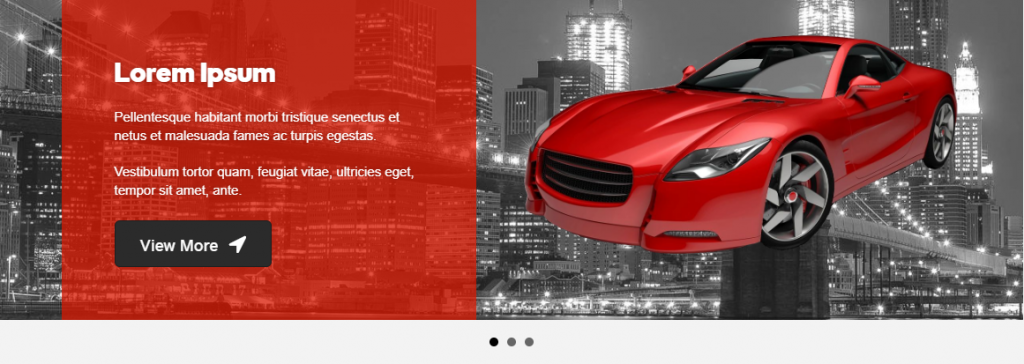
Standard Content Slider - Responsive slides - stacks on mobile and the slide background image adjusts to fit, Option to have different content per slide.
Fixed-Width Slideshows / Image Sliders:
PowerPack Image Carousel - Most customizable module for image sliders, Option to choose from slideshow, coverflow and carousel.
Carousel gives the option for defining number of columns and slides to scroll at a time, give a custom height and style the images to cover or contain the slides
Slideshow gives the option to display thumbnails below the slide show, define a custom height and style the images to cover or contain the slides
Coverflow is a 3D slider option that is super customizable and gives the appearance of something being on display


