Single Product Store Makeover
Nova Baby Home Page
Nova Baby sells lactation cookies crafted with organic, all-natural, preservative-free, and dye-free ingredients designed to support milk production and provide convenient, nutrient-packed snacks for breastfeeding mothers.
Before
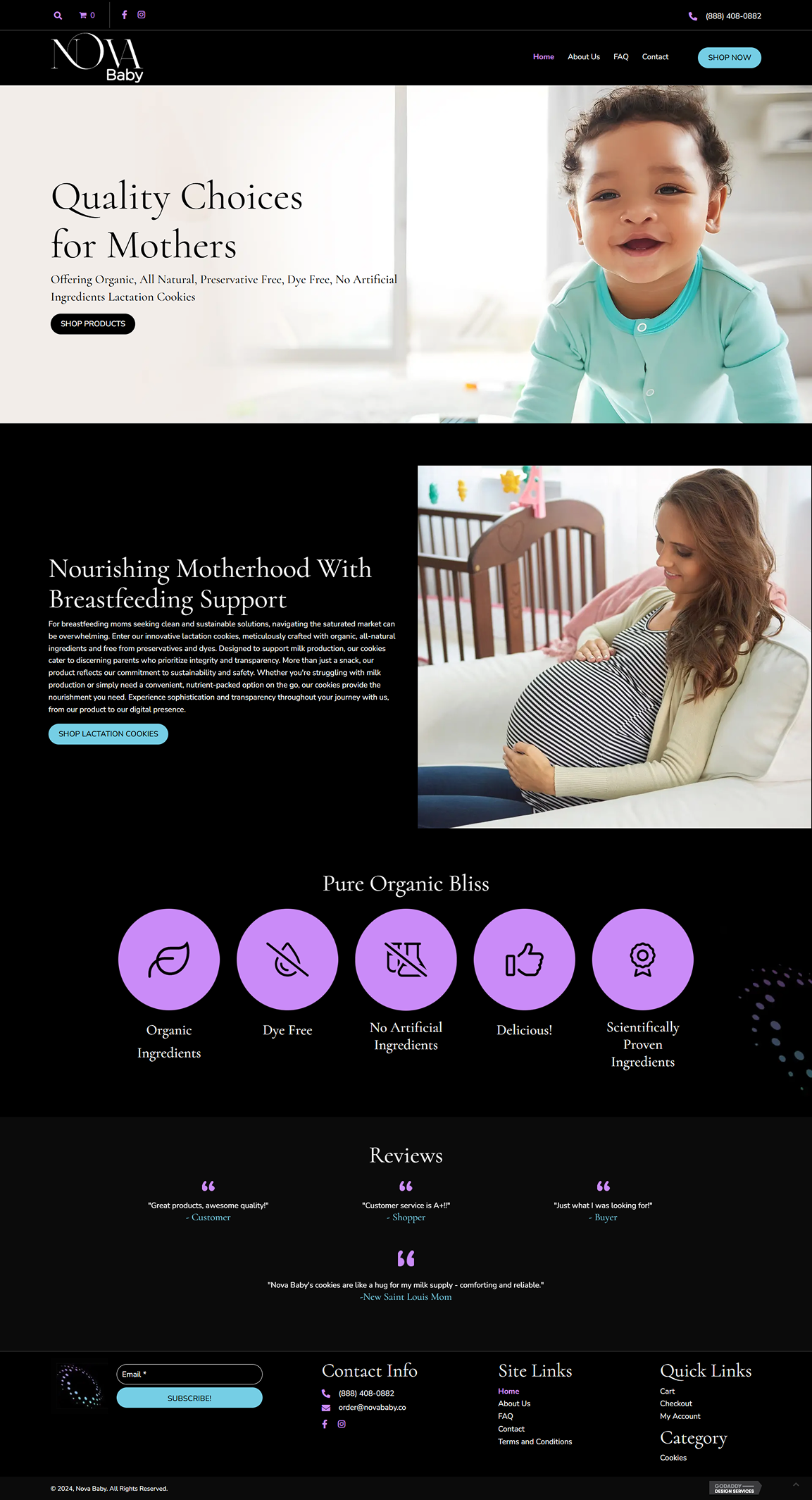
The dark-themed homepage of the original version of the Nova Baby website lacks clear value communication, visual storytelling, and strategic CTA placement. The overall presentation feels too formal and sterile, which conflicts with the nurturing and approachable feel the product is meant to convey.

Capture: Hero Section
Unclear Product Offering
- The dark-themed homepage lacks clear value communication, presenting a formal and sterile appearance that conflicts with the nurturing and approachable feel the product is meant to convey.
- The product is not showcased in the hero section, making it unclear what the website is selling. Users are left guessing rather than being immediately informed.
- The imagery fails to show the cookies in action, such as being eaten or enjoyed by mothers, which would immediately convey the purpose of the product.
- The headline “Quality Choices for Mothers” is vague and does not highlight the unique benefits of the product.
- The CTA button “SHOP PRODUCTS” is too generic, lacking urgency or specific value.
Clarify: Product Overview & UVP
Unclear Unique Value Proposition
- The site fails to clearly communicate what the product is and its unique benefits.
- Information about the cookies being “Organic, All Natural, Preservative Free, Dye Free” is buried and not effectively highlighted.
- The arrangement of benefits is cluttered, and the accompanying headline is weak.
Connect: Emotional Appeal & Social Proof
Insufficient Emotional Appeal
- The site lacks emotional storytelling and aspirational visuals to connect with the target audience.
- Customer reviews are not prominently displayed and are awkwardly laid out, reducing credibility.
Convince: Product Details, Offers, & Urgency
Lack of Info and Urgency
- The site provides excessive information without clearly highlighting benefits.
- No urgency messaging or persuasion elements to encourage immediate action.
Convert: CTA Reiteration
Ineffective Conversion
- CTA buttons are generic and poorly positioned, making them easy to miss.
- Conversion CTA’s are minimal and use different colors
After
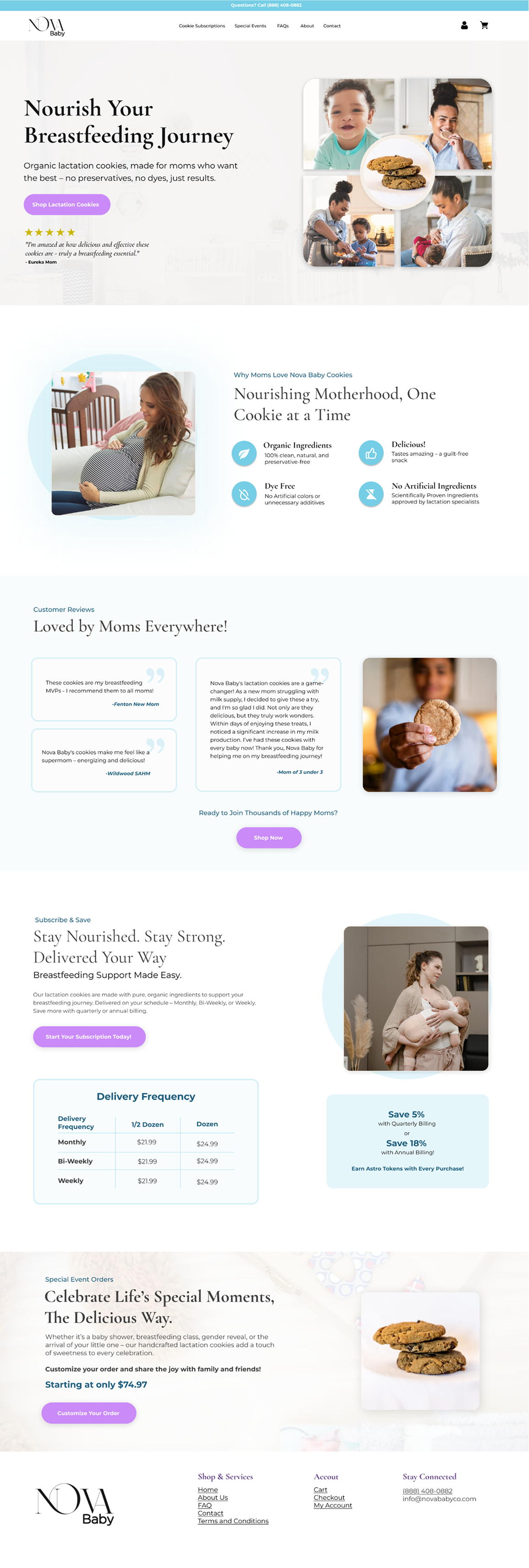
The redesigned Nova Baby homepage corrects the issues of the original by embracing a brighter, more nurturing visual tone while clarifying product value and improving the purchase journey. The updated layout supports a single-product focus with emotional storytelling, simplified benefits, and strategically placed calls-to-action that guide the visitor step-by-step from discovery to purchase.

Capture: Hero Section
Direct, Benefit-Oriented Headline
- The new headline “Nourish Your Breastfeeding Journey” is clear and specific, replacing the vague and generic “Quality Choices for Mothers” from the original.
Supportive Body Copy
- A concise line beneath the headline explains exactly what the product is: “Organic lactation cookies, made for moms who want the best – no preservatives, no dyes, just results.” This was missing entirely in the original hero.
Strong Visual Hierarchy & CTA
- The high-contrast CTA button “Shop Lactation Cookies” is immediately visible and actionable, fixing the weak, generic “Shop Products” button from the original layout.
Emotional Visual Storytelling
- An image grid shows real moments with mothers and babies, plus a centered product photo—clearly communicating the product’s purpose and audience. The original version didn’t show the product at all.
Clarify: Product Overview & UVP
Clear Headline
- The line “Nourishing Motherhood, One Cookie at a Time” immediately communicates the product’s purpose, replacing the vague headline from the original.
Benefit-Driven Icons
- Four icons with short descriptions highlight specific product benefits (organic, dye-free, delicious, no artificial ingredients), making the value easy to skim and understand.
Supportive Context
- The supporting line “Why Moms Love Nova Baby Cookies” frames the section around user value rather than brand claims.
Relatable Imagery
- The image of a pregnant woman in a calm setting reinforces the product’s purpose and audience without adding clutter.
Connect: Emotional Appeal & Social Proof
Stronger Section Heading
- “Loved by Moms Everywhere!” introduces the testimonials with a clear, emotionally driven headline, unlike the original version where reviews were awkwardly placed and lacked visual emphasis.
Multiple Real Testimonials
- Three distinct customer quotes, each attributed with a specific identity, build credibility and relatability—replacing the weak, hard-to-find reviews from before.
Supporting Visual
- A lifestyle image of a woman holding a cookie in the foreground adds authenticity and reinforces the product’s presence in real-life scenarios.
CTA Reintroduction
- A second CTA—“Shop Now”—appears directly beneath the testimonials with the prompt “Ready to Join Thousands of Happy Moms?” to capitalize on social proof and guide users toward action.
Convince: Product Details, Offers, & Urgency
Subscription Breakdown
- A detailed subscription section shows frequency options (Monthly, Bi-Weekly, Weekly) with clear pricing for half dozen and dozen orders—providing structured, practical information that was missing in the original.
Urgency & Value Messaging
- Text blocks highlight cost savings (5% for quarterly, 18% for annual billing) and bonus incentives (“Earn Astro Tokens with Every Purchase!”), creating genuine reasons to act now.
Reinforced Purpose
- The heading “Stay Nourished. Stay Strong. Delivered Your Way” and supporting paragraph clearly explain the convenience and health benefits of the subscription, eliminating confusion seen in the original layout.
Supportive Imagery
- The photo of a mother nursing her baby next to the subscription info connects the service directly to the user’s lifestyle and reinforces relevance.
Convert: CTA Reiteration
Occasion-Based Offer
- The final section reframes the product as a giftable item, using the headline “Celebrate Life’s Special Moments, The Delicious Way” to extend appeal beyond just personal use.
Specific Offer & CTA
- The text “Customize your order” and “Starting at only $74.97” give the user a clear price anchor and unique action path, rather than the generic CTAs in the original site.
Focused Product Visual
- A clean image of stacked cookies on a white background ends the page with clarity, reinforcing product quality and maintaining a consistent aesthetic through to the final CTA.
Visually Consistent CTA Styling
- Every CTA linked to conversion uses the same unique purple gradient seen throughout the site. This consistent, high-contrast styling leverages the Von Restorff Effect to make the CTA stand out and supports conversion by training users to recognize the action path.
Side by Side Comparison


