Skip to content

QA Standards (Internal Builders)

  • Critical Error = Automatic Fail

Site First Impression - 4 points

Site First Impression - 4 points

(3 points)

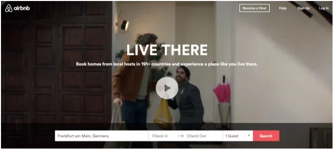
Were you able to conclude who the company is and what they do within 5 seconds?

Even the most user-friendly and attractive websites are not successful when they are not achieving the needs of the company. Ask yourself: Do I as a first time visitor of this site get a clear sense of what they offer and who they are upon arrival at the website? Does the design point the visitors in the direction that they want them to go? Is there a clear strategy that is informing your design? If the answer to any of these questions are no, then the design is not at its full potential. 

Yes
No

(1 point)

Did the site score of 75 on Google Lighthouse

Yes
No, but notated
The test was not run
The test was not run and there were issues with the notations
The test was run, passed, and there were issues with the notations
The test was run, failed, and there were issues with the notations
Contact Info - 3 points

Contact Info - 3 points

This is where we check the basic business information to ensure the pertinent details and motives for the website have been established and adhered to.

(3 points)

Business Contact Info
Acceptable
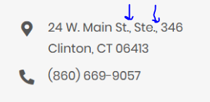
Contact info on website conflicts with intake form
Contact page contains Address/phone/email/hours in wrong or inconsistent format
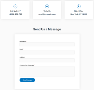
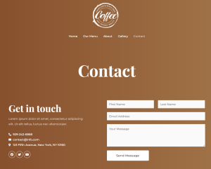
Contact Page laid out poorly or missing provided info
No Contact Page Created (not a simple site)
Logo - 6 points

Logo - 6 points

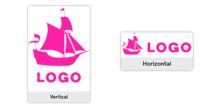
This grades the way the logo was utilized in the header area of the website.

(2 points)

Logo - graphic

Acceptable
Contains background different from rest of header
Could have been cropped but wasn’t or poorly cropped
Logo graphic is blurry

(2 points)

Logo - text

Acceptable
Logo text not aligned properly
Logo text font style not appropriate for industry
Logo text added but not necessary
Logo text was necessary but not added
Logo text too small or too large

(2 points)

Logo - general

Acceptable
Logo was altered in a unapproved way
Logo graphic or text do not link to the home page
Logo is missing or in the wrong place
Wrong Logo used
Logo, text or both have poor contrast against the background
Navigation - 4 points

Navigation - 4 points

(2 points)

Navigation - Function

Acceptable
Anchor link goes to incorrect section
Navigation links go to incorrect page
External links don't open in a new tab
Navigation links missing from menu or in wrong order

(2 points)

Navigation - Style

Acceptable
Hover/active styled poorly
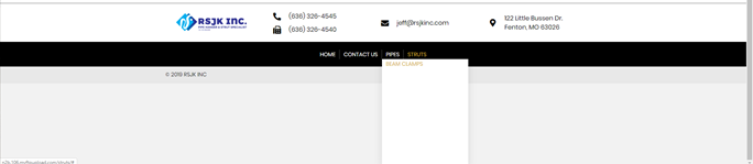
Sub-navigation menu too long
Sub-navigation menu styled poorly
Alignment or spacing is off or inconsistent
One or more page titles are too long or incorrect
Customer provided very specific instructions or reference sites that were ignored
Header - 6 points

Header - 6 points

This grades the overall style and layout of the header

(3 points)

Header - Layout

Acceptable
Customer provided specific instructions ignored without justification
Missing elements called for in Intake Form
Header width not consistent with hero content
Header displays differently between browsers

(3 points)

Header - Style

Acceptable
Sticky nav was used inappropriately
Issues with links or buttons contained within header
Home Hero Section - 11 points

Home Hero Section - 14 points

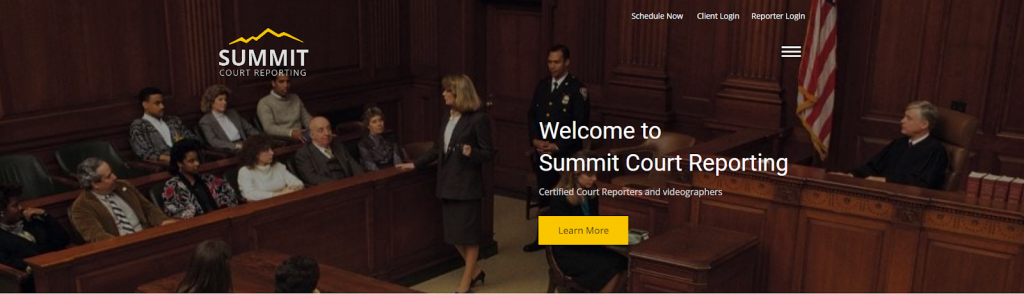
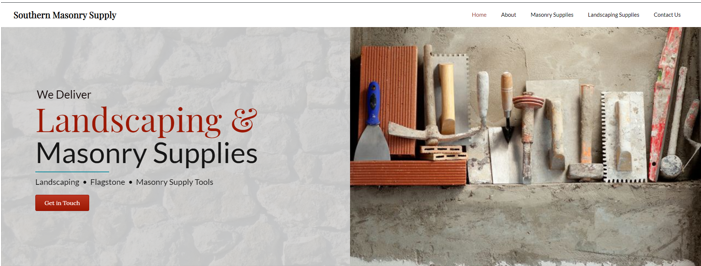
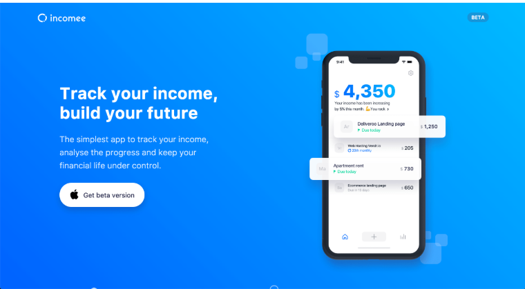
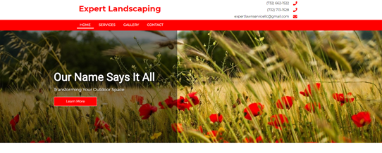
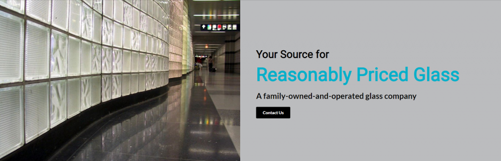
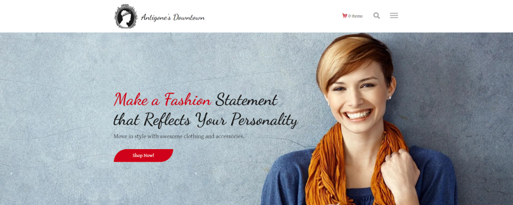
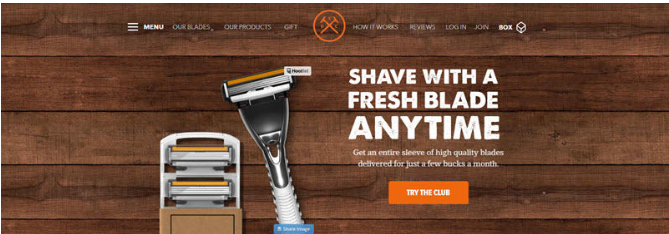
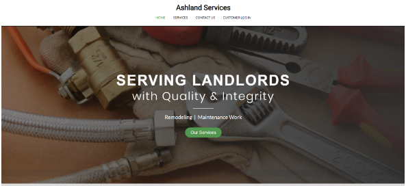
By best practices a good hero typically has a header, some supporting text, and a call-to-action button (or some kind of next steps). These can be accompanied by an image, video, or illustration that support the mission of the page.

(2 points)

Home Hero - Elements

Acceptable
Missing hero heading or CTA when they were requested

(3 points)

Home Hero - Layout

Acceptable
Hero text and CTA not visible in upper fold
Customer provided very specific instructions that were ignored
Text, CTA or logo repeats or is used in both hero and header

(3 points)

Home Hero - Image

Acceptable
Image not relevant to business
Focal point of image is not visible
Hero image is blurry
Incorrect image or video used without justification
More relevant images were available but not utilized
Slideshow using wrong or inappropriate transitions
Background video playback issue
Hero section contains more than one error or has a severe design flaw

(3 points)

Home Hero - Text Styling

Acceptable
Hero text uses colors that clash or poor contrast
Text placed directly over background with text
Incorrect or inappropriate words emphasized within headline

(3 points)

Home Hero - Wording

Acceptable
The text contains critical spelling, grammar, spacing or punctuation error
Hero headline or description contains inaccurate, offensive or misleading information
Customer or WS provided specific text for hero headline that wasn't used or was altered
Hero headline or descriptions contains non American, awkwardly worded phrases or insufficient information
The text contains minor grammatical, spacing, capitalization errors or non-American spelling
Hero heading or description is too long or description is not necessary
Wording in headline is too generic/h1 or description should be swapped with headline
poor copy utilized for the CTA
Footer - 3 points

Footer - 3 points

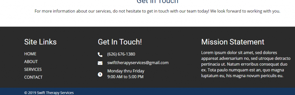
A website footer is found at the bottom of your site pages. It typically includes important information such as a copyright notice, a disclaimer, or a few links to relevant resources

(3 points)

Footer Design and Content
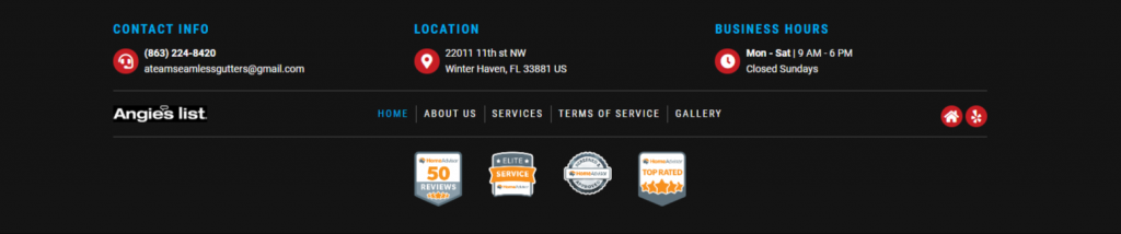
Acceptable
Customer provided very specific instructions or reference sites that were ignored
Contains broken or incorrect links
Too many colors used or poor color contrast
Missing elements called for in Intake Form
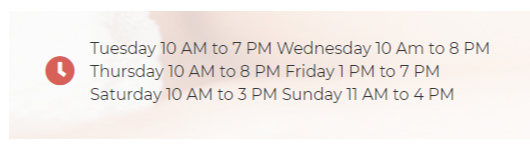
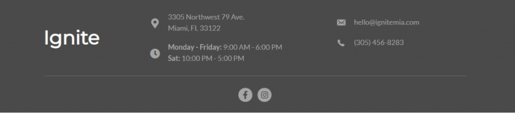
Address/phone/email/hours in wrong or inconsistent format
Lorem ipsum present, spelling errors, html or css displaying, or footer navigation issue
For WooCommerce, TOS link missing from navigation
Interior Hero Section - 3 points

Interior Hero Section - 3 points

This grades the overall style and layout of the interior hero area

(3 points)

Interior Hero Section
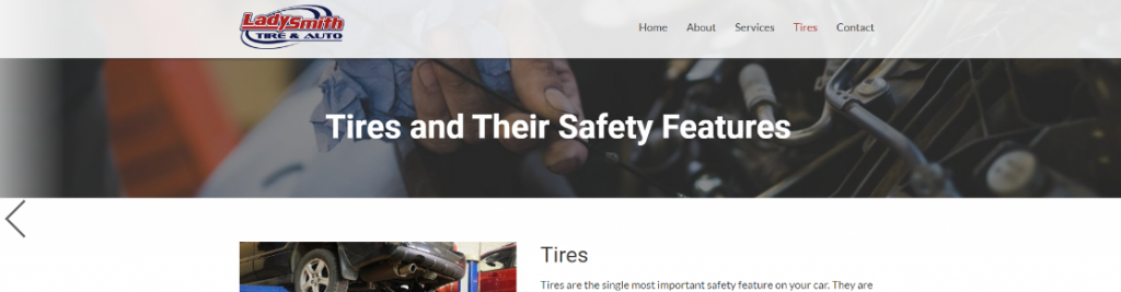
Acceptable
Inconsistent style from page to page
Low quality or inappropriate image
Hero section text too small or large
Typography - 10 points

Typography

Typography - Style

Acceptable
Customer provided specific instructions regarding fonts that were not implemented

Typography - Paragraph Length

Acceptable
Animations present when not requested on home page
Video embeds present when not requested on home page
Slider modules present when not requested on home page
Photo galleries present when not requested on home page
Modal popup modules present when not requested on home page
Particle backgrounds present when not requested on home page
Interactive Callout modules - flipboxes, slideboxes, info circles present when not requested on home page
iFrames/Paypal/script embeds/Nested modules/Chat plugin/Social feed present when not requested on home page
Google Map present when not requested on home page

Typography - Paragraph Alignment

Acceptable
Paragraph text right aligned or justified
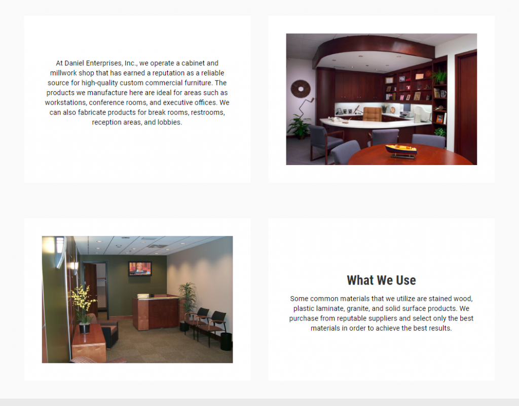
Paragraphs are not aligned between rows

Typography - Paragraph Font

Acceptable
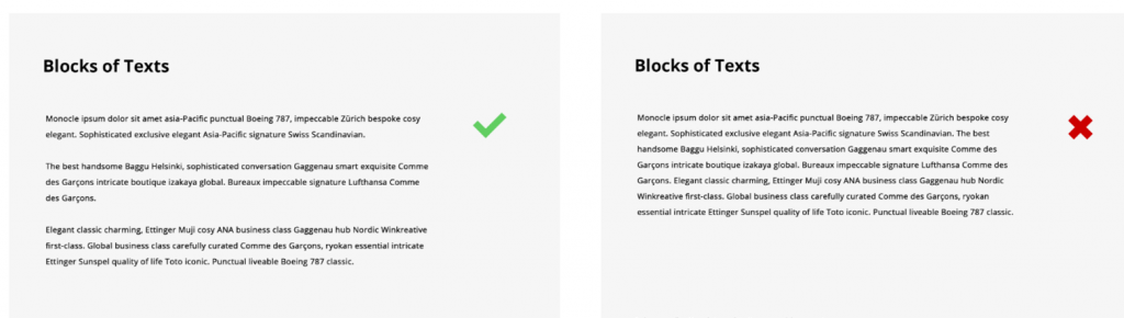
No line break between paragraphs - text dump
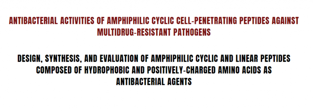
Too much text written in all caps
Poor text formatting including widows, orphans, or inappropriate line breaks

Typography - Headings

Acceptable
The heading contains critical spelling, grammar, spacing or punctuation error
Heading contains inappropriate, offensive, inaccurate or misleading information
The heading contains minor grammatical, spacing, capitalization errors or non-American spelling
Heading contains non-American or awkwardly worded phrases
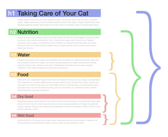
One or more paragraphs are missing headings
Headings not placed in an appropriate place, or is not needed at all
Heading was incorrect, duplicated, or placed over the wrong section or paragraph

Typography - Quality of Copy

Acceptable
Customer provided content was altered in a way that was not requested
Copy contains inappropriate or offensive verbiage
Spelling errors or non-American spelling
Poorly written copy
Grammar errors
Inappropriate use of punctuation or symbols within content
Copy written from incorrect point of view
Site Content - 6 points

Site Content - 6 points

(3 points)

Content - Layout

Acceptable
Overlapping content

(3 points)

Content - Consistency

Acceptable
Different headings styles on each page or on same page
Content or column width not consistent between rows or within single row
Columns with unequal heights within same row
Overall content arrangement inconsistent from row to row within same page
Elements of design inconsistent within same page or between pages
Images, Videos and Icons - 6 points

Images, Videos and Icons - 6 points

(3 points)

Image/Icons/Videos - Quality and Function
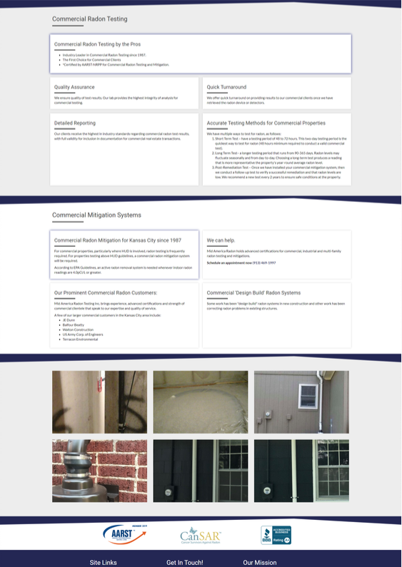
Acceptable
Images or icons are blurry
Images don't click to enlarge in a gallery
Small, low resolution images used when high res images were available
Images or icons not relevant to industry or theme
Images clustered together instead of spread through content
File size for uploaded images or videos are too large, or images/video are broken
Issue with video playback
Relevant images were provided by not utilized where they should have been

(3 points)

Image/Icons - Alignment

Acceptable
Images or icons not cropped, styled or positioned properly
Image heights within same row are inconsistent
Icons not aligned properly with text
Site Functionality - 3 points

Site Functionality - 3 points

This grades the use of modules and plugins on the site

(3 points)

Modules and Plugins
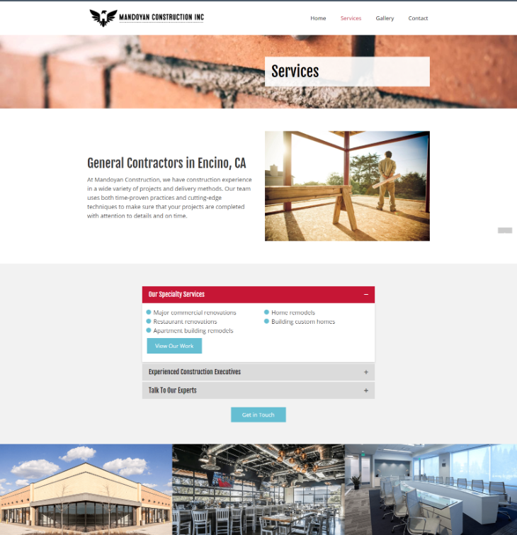
Acceptable
Requested plugin not set up correctly or wasn't set up, or unapproved plugins added
Modules or conflicting scripts breaking CSS
Login, membership, registration, password protected, or any hidden page not set up correctly
Unnecessary elements or poorly formatted product or post page/themer layout
Improper or unnecessary use of creative module, necessary module missing, or wrong module chosen
Colors - 5 points

Colors - 5 points

This grades the use of color on the website

(5 points)

Color
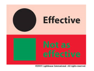
Acceptable
Color or color theme specifically requested by customer not used without justification
Text, containers, or any elements in the content area have poor color contrast
Buttons and Links - 5 points

Buttons and Links - 5 points

(3 points)

Buttons and Links - Style
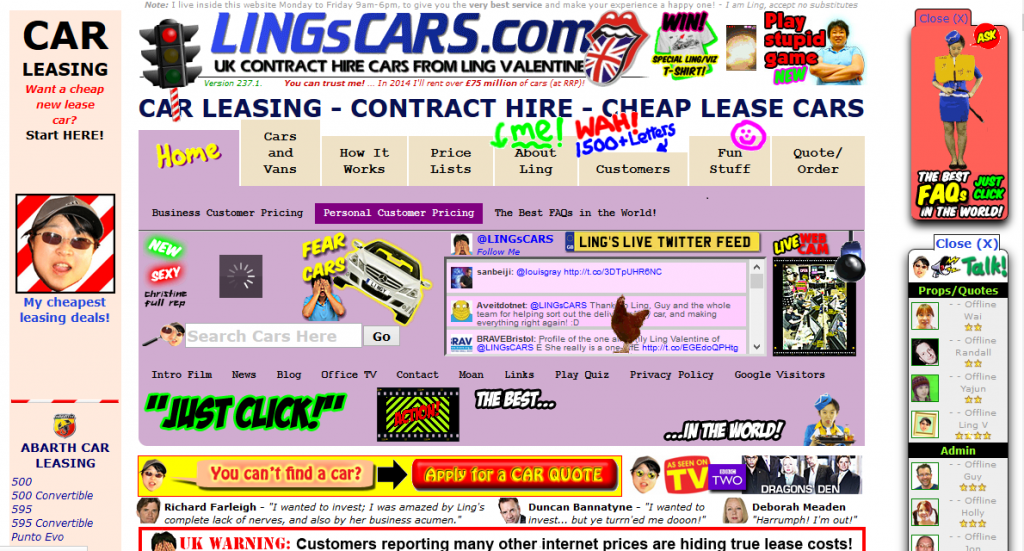
Acceptable
Too many different buttons styles
Hyperlink not styled appropriately
Full URL written out when it should have been a button or text
Button has too much text inside a single button
Buttons/hover/active have poor color contrast, or Inappropriate link or button color
poor copy utilized for the CTA
(2 points)

Buttons and Links - Functionality

Acceptable
Broken links
Buttons or text incorrectly link to destination
External links and linked documents do not open in new window
Urls or other text on page not linked that should be
Urls or other text on page linked that should no be/unnecessary cta's
CTA or buttons with same label have different functions
Hover effect or link only for text, not whole container
Forms and SEO - 4 points

Forms and SEO - 4 points

(3 points)

Contact Forms
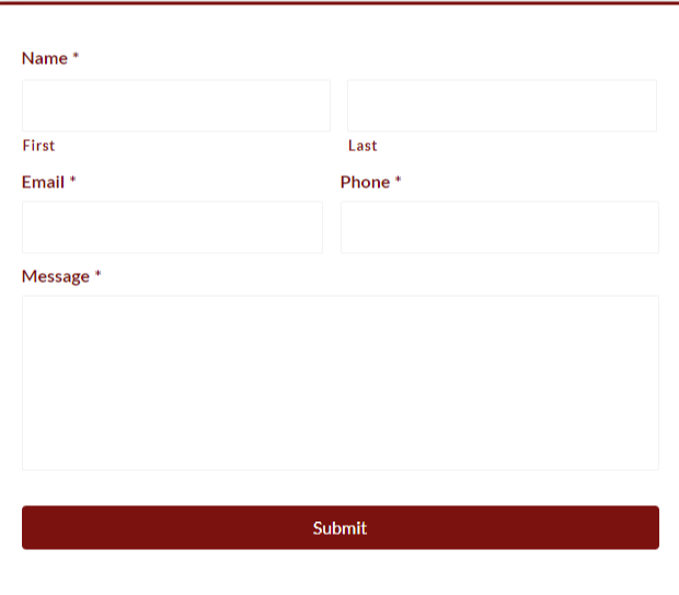
Acceptable
Forms have poor or inconsistent formatting
Requested fields are not present
Incorrect field types used
Confidential information is requested
Form fields text color or background color styled poorly
Forms not functioning properly
(1 point)

SEO

Acceptable
No custom title tag added for home page
Title tag misspelled, added incorrectly, or poorly written
H1 tags missing
More than 1 H1 tag on a page
There is no favicon
Failed SEO Audit
Customer Provided Content - 3 points

Content - 3 points

(3 points)

Necessary Content Missing or content added incorrectly

No
Yes
Minor, or less significant provided content was omitted
Mobile - 360px - 7 points

Mobile - 360px - 7 points

This grades the overall style and layout of the header, nav, and hero on the mobile site.

(3 points)

Mobile Header, Nav and Hero

Acceptable
Overlapping content
Content is aligned, sized or formatted inconsistently or incorrectly
Hero text, hero image, or logo is too large or small
Text is being cut off or single words dropping to second line
Elements showing on mobile that should be hidden
Elements disappear on mobile that should be showing
Hero/nav/header section contains more than one error or a severe design flaw
(3 points)

Mobile Page Content

Acceptable
Overlapping content
Columns widths too narrow
Text or other content aligned inconsistently
Columns or rows have too much or too little padding/margin
Forms do not appear properly
Elements showing on mobile that should be hidden
Elements disappear on mobile that should be showing
(1 points)

Mobile Footer

Acceptable
Footer elements not aligned consistently
Overlapping content
Large gaps between elements
Tablet - 768px - 7 points

Tablet - 768px - 7 points

(3 points)

Tablet Header, Nav and Hero

Acceptable
Poor color contrast or overall poor color choice
Overlapping content
Content is aligned inconsistently or poorly
Hero text, hero image, or logo is too large or too small
Text is being cut off or single words dropping to second line
Too many header elements - looks cluttered
Navigation is styled poorly
Elements showing on tablet that should be hidden
Elements disappear on tablet that should be showing
Hero/nav/header section contains more than one error or has a severe design flaw
(3 points)

Tablet Page Content

Acceptable
Overlapping content
Columns widths too narrow or too wide
Text or other content is aligned inconsistently
Columns or rows have too much or too little padding/margin
Forms do not appear properly
Elements showing on tablet that should be hidden
Elements disappear on tablet that should be showing
Paragraph or heading text too large or too small
(1 points)

Tablet Footer

Acceptable
Footer elements not aligned consistently
Overlapping content
Large gaps between elements
Laptop - 1366px - 4 points

Laptop - 1366px - 4 points

(3 points)

Laptop Header, Nav and Hero

Acceptable
Overlapping content
Content is aligned inconsistently or poorly
Hero text wraps incorrectly
Navigation wraps into two lines
Hero/header/nav section contains more than one error or has a severe design flaw
(1 points)

Laptop Page Content

Acceptable
Overlapping content
Columns appear too narrow or wide
Text no longer fits in its container
Content not properly aligned
Text does not wrap appropriately
Laptop footer elements overlapping, not aligned or has other design issue
Customer WOW Factor

Customer WOW Factor

How would you rate the site?

This is a more subjective grade that expresses the overall impression of the website from the perspective of the customer. It is not scored, but used as a way to categorize the quality of the site.

5 - Wow!
4 - Above Average
3 - Average, could be improved
2 - Below Average - Dull and lacking creativity - needs full polish
1 - Poor - Unacceptable. Will require complete redesign.
Scroll To Top