Text has sizing or styling issues
- Text readability should not be impacted by font size
- 16px-18px is recommended, but this can vary by font
- Font should be consistent with reference sites or customer requests, even if requests are outside the 16px-18px range (unless their request will cause readability issues)
- Body text should be sized and styled consistently throughout the site
- Heading text should be sized and styled consistently throughout the site
- All h1 should be the same, all h2 should be the same, etc
- Bold, underline, italicized, etc., text should be used appropriately and should not cause readability issues
- Should only be used for emphasis or as a stylistic enhancement, such as:
- Emphasizing words or phrases
- Drawing attention to a name or title (for example, a name at the end of a testimonial)
- Full paragraphs should not be styled like this, even if the customer-provided copy features this styling
- Should only be used for emphasis or as a stylistic enhancement, such as:
Example(s):
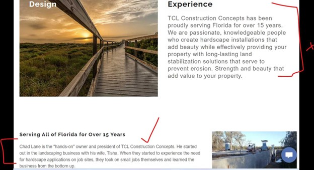
- In this instance, two different body font sizes were used on the website

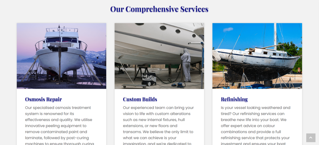
- In this example, the drop shadows make the text appear blurry and are causing readability issues. Typically, drop shadows should be used to enhance the readability of the text. For example, you may want to use a drop shadow to provide contrast when text is over an image.

