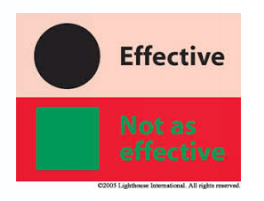
Text, containers, or any elements in the content area have poor color contrast or poor color pairing

Readability
- The visual presentation of body text against its background needs to have a contrast of at least 4.5:1
- Provide good contrast. Make sure the contrast between the text and background is greater than or equal to 4.5:1 for small text and 3:1 for large text. Test your color palette for accessible combinations with Accessible Color Palette Builder or Contrast Grid.
- Measure the contrast between text and background colors with tools like WebAIM’s Color Contrast Checker or Adobe’s color checker
Visual
Shapes, icons, or any other elements on the website need to appear professional and polished against their background. In the below example, you can see the orange color clashes against the blue background.

In summary, color contrast is crucial for both usability and aesthetics in web design. It improves readability, accessibility, and visual hierarchy while also contributing to brand identity and overall design cohesion. By prioritizing proper color contrast, you can create websites that are both user-friendly and visually appealing, leading to a more positive and engaging user experience
